flutter第一章:基础控件
Flutter是谷歌的移动UI框架,可以快速在iOS和Android上构建高质量的原生用户界面。 Flutter可以与现有的代码一起工作。在全世界,Flutter正在被越来越多的开发者和组织使用,并且Flutter是完全免费、开源的。
为何要学习flutter,看下对比就知道了
- Cordova的基础是html和js运行在webview容器里面,通过Cordova提供的接口与硬件通讯;所以它的效率天生收到限制,而且也受到了各个厂商对webkit内核的好坏;比如之前基于国产某Cloud的程序,在华为手机上显示就不正常,花费了不少精力修改。
- RN的效率由于是将View编译成了原生View,所以效率上要比基于Cordova的HTML5高很多,但是它也有效率问题,RN的渲染机制是基于前端框架的考虑,复杂的UI渲染是需要依赖多个view叠加.比如我们渲染一个复杂的ListView,每一个小的控件,都是一个native的view,然后相互组合叠加.想想此时如果我们的list再需要滑动刷新,会有多少个对象需要渲染.所以也就有了前面所说的RN的列表方案不友好。
- Flutter吸收了前两者的教训之后,在渲染技术上,选择了自己实现(GDI),由于有更好的可控性,使用了新的语言Dart,避免了RN的那种通过桥接器与Javascript通讯导致效率低下的问题,所以在性能方面比RN更高一筹;有经验的开发者可以打开Android手机开发者选项里面的显示边界布局,发现Flutter的布局是一个整体.说明Flutter的渲染没用使用原生控件进行渲染。
一,flutter配置
flutter官网 https://flutter.io/get-started/install/
flutter中文网 https://flutterchina.club/get-started/install/
·
1,配置要求:系统window7或更高,AndroidStudio3.0或更高
2,下载Flutter SDK
首先要安装git,随便创建一个文件夹,在本文件夹下执行 git clone -b master https://github.com/flutter/flutter.git
3,配置环境变量
把下载好的Flutter SDK中的bin路径配置到系统PATH中,比如我下载好的路径是C:\flutter\flutter\bin
4,安装依赖库,执行此命令会自动检查依赖,可按照提示安装。
flutter doctor

5,创建项目,选择Flutter Application。项目创建完成后直接运行就ok

二,项目结构
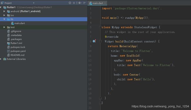
- lib包中是Flutter的源代码
- ios包和andorid分别是不同客户端的项目结构
- pubspec.yaml是Flutter配置文件
三,介绍main.dart代码
1,导入包,此行代码作用是导入了Material UI组件库。
import 'package:flutter/material.dart';
2,main函数程序入口,runApp方法启动flutter应用,它接受一个Widget参数,MyApp就是它的一个实例。
void main() => runApp(new MyApp());
3,应用的结构代码
class MyApp extends StatelessWidget {
  // This widget is the root of your application.
  @override
  Widget build(BuildContext context) {
    return MaterialApp(
      title: 'Welcome to Flutter',
      home: Scaffold(
        appBar: AppBar(
          title: Text('Welcome  Flutter'),
        ),
        body: Center(
          child:  Text('Hello'),
        ),
      ),
      theme:ThemeData(
      primarySwatch: Colors.lightBlue
  ),
    );
  }
}
- MyApp类代表Flutter应用,它继承了 StatelessWidget类,这也就意味着应用本身也是一个widget。
- 在Flutter中,大多数东西都是widget,包括对齐(alignment)、填充(padding)和布局(layout)。
- Flutter在构建页面时,会调用组件的build方法,widget的主要工作是提供一个build()方法来描述如何构建UI界面。
- MaterialApp 是Material库中提供的Flutter APP框架,通过它可以设置应用的名称、主题、语言、首页及路由列表等。MaterialApp也是一个widget。
- Scaffold是Material库中提供的页面脚手架,它包含导航栏和Body以及FloatingActionButton。
- home 为Flutter应用的首页,它也是一个widget。
- appBar是应用的导航栏,可以为应用导航栏设置文字图标等。
- body是应用的主体部分,我们可以在这里边布局我们的页面。
- theme是应用的主题,我们可以为应用设置统一的主题风格。
四,基础Widgets
在Flutter中,几乎所有的对象都是一个Widget。这里Widget和原生控件不同的是,Widget的概念更广泛,不仅表示UI元素,也表示一些功能组件。
1,Text的使用
给一个Text传入一个 Hello,设置对齐方式和样式,可以看出使用很方便,有点像Js。
Text('Hello',
       textAlign: TextAlign.right,
       style: new TextStyle(
       color: Colors.purple,
       fontSize: 40.0,
    )
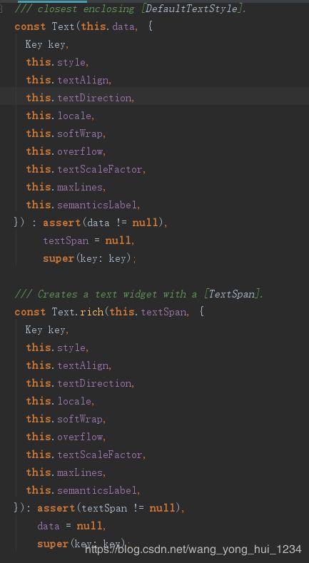
Text类结构

构造方法
常用属性值
| 属性值 | 含义 |
|---|---|
| color | 字体颜色 |
| fontSize | 字体大小 |
| fontWeight | 字体厚度,也就是字体粗细 |
| fontStyle | normal或者italic |
| letterSpacing | 字母间隙(负值可以让字母更紧凑) |
| wordSpacing | 单词间隙(负值可以让单词更紧凑) |
| textAlign | 对齐方式 |
| height | 行高 |
| fontFamily | 字体 |
| softWrap | 是否换行 |
| maxLines | 最大行数设置 |
textAlign对齐方式
文本长度必须要大于文本内容才有效果
class MyApp extends StatelessWidget {
  // This widget is the root of your application.
  @override
  Widget build(BuildContext context) {
    return MaterialApp(
      title: 'Welcome to Flutter',
      home: Scaffold(
          appBar: AppBar(
            title: Text('Welcome  Flutter'),
          ),
          body: Container(
            color: Colors.black,
            width: 400.0,//必须指定宽度,不然没有效果,因为Container是一个包裹的控件。
            child: Text(
              'Welcome to Flutter',
              textAlign: TextAlign.left,//在这可以更改,试试效果。
              style: TextStyle(
                  fontSize: 20.0,
                  fontStyle: FontStyle.italic,
                  color: Colors.white),
            ),
          )),
      theme: ThemeData(primarySwatch: Colors.lightBlue),
    );
  }
}
| 对齐方式 | 示例 |
|---|---|
| TextAlign.left,TextAlign.start 左对齐(默认) |  |
| TextAlign.right,TextAlign.end 右对齐 |  |
| TextAlign.center 居中对齐 |  |
| TextAlign.justify 两端对齐,字符多才有效 |  |
textDirection文本方向
TextDirection.ltr,TextDirection.rtl。效果和TextAlign左对齐,右对齐一样。
softWrap是否自动换行,默认是true
默认和左对齐一样,如果设置为false,超出部分截断。
       Text('Welcome to Flutter Welcome to Flutter Welcome to Flutter Welcome to Flutter Welcome to Flutter',
              softWrap: false,
              style: TextStyle(
                  fontSize: 20.0,
                  fontStyle: FontStyle.italic,
                  color: Colors.white),
            )

overflow文字超出容器如何处理
常用属性TextOverflow.ellipsis,带省略号方式
         Text('Welcome to Flutter Welcome to Flutter Welcome to Flutter Welcome to Flutter Welcome to Flutter',
              overflow: TextOverflow.ellipsis,
              style: TextStyle(
                  fontSize: 20.0,
                  fontStyle: FontStyle.italic,
                  color: Colors.white),
            )

textScaleFactor字体显示倍率
这段代码字体设置为10.0,倍率为2,实际显示的字体为20.0
        Text('Welcome to Flutter Welcome to Flutter Welcome to Flutter Welcome to Flutter Welcome to Flutter',
              overflow: TextOverflow.ellipsis,
              textScaleFactor: 2.0,
              style: TextStyle(
                  fontSize: 10.0,
                  fontStyle: FontStyle.italic,
                  color: Colors.white),
            )
maxLines最大行数
这段代码文字显示两行,超出部分省略号。
         Text('Welcome to Flutter Welcome to Flutter Welcome to Flutter Welcome to Flutter Welcome to Flutter',
              overflow: TextOverflow.ellipsis,
              maxLines: 2,
              textScaleFactor: 2.0,
              style: TextStyle(
                  fontSize: 10.0,
                  fontStyle: FontStyle.italic,
                  color: Colors.white),
            )
RichText字体多样性和Android中的SpannableString类似
RichText 中的文本使用 TextSpan 来定义,而每个 TextSpan 中包含了文本内容和文本样式以及一个子 TextSpan 列表。
            RichText(
                text: TextSpan(
                    text: 'Welcome',
                    style: TextStyle(color: Colors.blueAccent, fontSize: 20.0),
                    children: [
                  TextSpan(
                      text: ' to ',
                      style: TextStyle(color: Colors.red, fontSize: 20.0)),
                  TextSpan(
                      text: 'Flutter',
                      style: TextStyle(color: Colors.green, fontSize: 20.0))
                ]))

2,按钮
Material widget库中提供了多种按钮Widget如RaisedButton、FlatButton、OutlineButton等
有一个onPressed属性来设置点击回调,当按钮按下时会执行该回调,如果不提供该回调则按钮会处于禁用状态,禁用状态不响应用户点击。
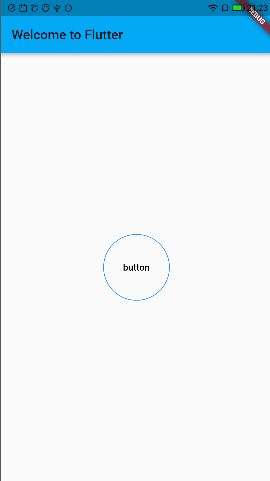
①,RaisedButton
RaisedButton 即"漂浮"按钮,它默认带有阴影和灰色背景。

          RaisedButton(
              child: Text('button'),
              onPressed: () => {},
              elevation: 12.0,//阴影效果
              splashColor: Colors.grey,//按钮渐变
              color: Colors.pinkAccent,//按钮填充颜色
              shape: StadiumBorder() //圆角按钮
           )
②,FlatButton(文字按钮)
FlatButton即扁平按钮,默认背景透明并不带阴影。按下后,会有背景色,还可以添加渐变效果。

        FlatButton(
            onPressed: () =>{},
            child: Text('button'),
            splashColor: Colors.grey,//按钮渐变
          )
也可以在按钮中添加图标
        FlatButton.icon(
            icon: Icon(Icons.add),//添加图标
            onPressed: () =>{},
            label: Text('button'),
            splashColor: Colors.grey,//按钮渐变
          )
③,OutlineButton
OutlineButton默认有一个边框,不带阴影且背景透明。按下后,边框颜色会变亮、同时出现背景和阴影(较弱)
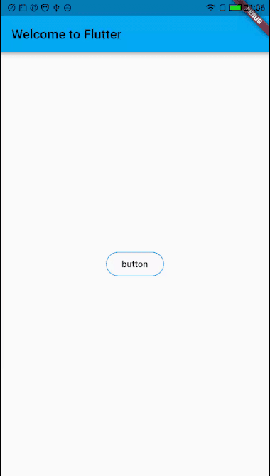
        OutlineButton(
            child: Text('button'),
            onPressed: () => {},
            splashColor: Colors.grey[100], //按钮渐变
            textColor: Colors.black, //文字颜色
            borderSide: BorderSide(
                color: Colors.blue //描边颜色
                ),
            shape: StadiumBorder(), //圆角按钮
            highlightedBorderColor: Colors.grey,//按下边框颜色
          )
④,IconButton
IconButton是一个可点击的Icon,不包括文字,默认没有背景,点击后会出现背景
IconButton(
  icon: Icon(Icons.thumb_up),
  onPressed: () => {},
)
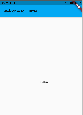
⑤,FloatingActionButton漂浮按钮

class MyApp extends StatelessWidget {
  // This widget is the root of your application.
  @override
  Widget build(BuildContext context) {
    return MaterialApp(
      title: 'Welcome to Flutter',
      home: Scaffold(
        appBar: AppBar(
          title: Text('Welcome to Flutter'),
        ),
        floatingActionButton: FloatingActionButton(
          onPressed: (){},
          child: Icon(Icons.add),
          backgroundColor: Colors.pinkAccent,
        ),
      ),
      theme: ThemeData(primarySwatch: Colors.lightBlue),
    );
  }
}
也可以设置按钮形状,位置

       floatingActionButton: FloatingActionButton(
          child: Icon(Icons.add),
          backgroundColor: Colors.pinkAccent,
          shape:
              BeveledRectangleBorder(borderRadius: BorderRadius.circular(30.0)),//指定按钮形状
        ),
        floatingActionButtonLocation: FloatingActionButtonLocation.centerFloat//漂浮在中间
在按钮中添加文字

       floatingActionButton: FloatingActionButton.extended(
          icon: Icon(Icons.add),
          label: Text('add'),
          backgroundColor: Colors.pinkAccent,
        )
⑥,按钮外观自定义
FlatButton(
  color: Colors.blue,
  highlightColor: Colors.blue[700],
  colorBrightness: Brightness.dark,
  splashColor: Colors.grey,
  child: Text("按钮"),
  shape:RoundedRectangleBorder(borderRadius: BorderRadius.circular(20.0)),
  onPressed: () => {},
)
按钮常用属性值
| 属性值 | 含义 |
|---|---|
| onPressed | 按钮回调 |
| textColor | 按文字颜色 |
| disabledTextColor | 按钮禁用时的文字颜色 |
| disabledColor | 按钮禁用时的背景颜色 |
| highlightColor | 按钮按下时的背景颜色 |
| splashColor | 点击时,水波动画中水波的颜色 |
| colorBrightness | 按钮主题,默认是浅色主题 |
| padding | 按钮的填充 |
| shape | 外形 |
| child | 按钮内容 |
3,Image
Image控件即图片控件,是显示图像的控件,Image控件有多种构造函数。
- new Image,用于从ImageProvider获取图像。
- new Image.asset,用于使用key从AssetBundle获取图像。
- new Image.network,用于从URL地址获取图像。
- new Image.file,用于从File获取图像。
获取网络图片两种方式
    Image(
          image: NetworkImage(
              "https://avatars2.githubusercontent.com/u/20411648?s=460&v=4"),
          width: 100.0,
        )

    Image.network(
            "https://avatars2.githubusercontent.com/u/20411648?s=460&v=4",
           width: 100.0,
        )
从本地文件目录中获取图片
 在工程目录下创建images存放图片
在pubspec.yaml中添加配置
两种方式获取图片
Image(
  image: AssetImage("images/avatar.png"),
  width: 100.0
);
Image.asset("images/avatar.png",
  width: 100.0,
)
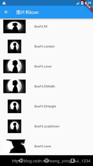
常用属性值
| 属性 | 含义 |
|---|---|
| width | 图片宽度 |
| hgiht | 图片高度 |
| color | 图片的混合色值 |
| colorBlendMode | 混合模式 |
| fit | 缩放模式 |
| width | 图片宽 |
| width | 图片宽 |
fit:该属性用于在图片的显示空间和图片本身大小不同时指定图片的适应模式。适应模式是在BoxFit中定义,它是一个枚举类型,有如下值。
4,Container(容器)
Container在Flutter中太常见了,官方给出的简介,是一个结合了绘制(painting)、定位(positioning)以及尺寸(sizing)widget的widget。在讲Text控件的时候其实已经用到了这个容器。
在容器中放一个按钮,指定宽高为100。
       Container(
            width: 100,
            height: 100,
            child: OutlineButton(
              child: Text('button'),
              onPressed: () => {},
              splashColor: Colors.grey[100], //按钮渐变
              textColor: Colors.black, //文字颜色
              borderSide: BorderSide(
                  color: Colors.blue //描边颜色
              ),
              shape: StadiumBorder(), //圆角按钮
              highlightedBorderColor: Colors.grey,//按下边框颜色
            ),
          )
5,Expanded(容器)
Expanded组件可以使Row、Column、Flex等子组件在其主轴方向上展开并填充可用空间。
在Row使用了Container和Expanded,Container指定宽度为100,可以看出剩下的空间被Expanded填充了。

         Row(
            children: [
              Container(
                width: 100,
                child: OutlineButton(
                  child: Text('button'),
                  onPressed: () => {},
                  splashColor: Colors.grey[100], //按钮渐变
                  textColor: Colors.black, //文字颜色
                  borderSide: BorderSide(
                      color: Colors.blue //描边颜色
                  ),
                  shape: StadiumBorder(), //圆角按钮
                  highlightedBorderColor: Colors.grey,//按下边框颜色
                ),
              ),
              Expanded(
                child: OutlineButton(
                  child: Text('button'),
                  onPressed: () => {},
                  splashColor: Colors.grey[100], //按钮渐变
                  textColor: Colors.black, //文字颜色
                  borderSide: BorderSide(
                      color: Colors.blue //描边颜色
                  ),
                  shape: StadiumBorder(), //圆角按钮
                  highlightedBorderColor: Colors.grey,//按下边框颜色
                ),
              ),

            ],
          )
五,复杂Widgets
1,ListView
上边的demo中用到了ListView,在这详细介绍ListView的使用。这里的ListView和Android中的一样,可以进行滚动。
ListView({
  ...
  //可滚动widget公共参数
  Axis scrollDirection = Axis.vertical,
  bool reverse = false,
  ScrollController controller,
  bool primary,
  ScrollPhysics physics,
  EdgeInsetsGeometry padding,

  //ListView各个构造函数的共同参数
  double itemExtent,
  bool shrinkWrap = false,
  bool addAutomaticKeepAlives = true,
  bool addRepaintBoundaries = true,
  double cacheExtent,

  //子widget列表
  List children = const [],
})
上面参数分为两组:第一组是可滚动widget公共参数;第二组是ListView各个构造函数(ListView有多个构造函数)的共同参数。
-
itemExtent:该参数如果不为null,则会强制children的"长度"为itemExtent的值;这里的"长度"是指滚动方向上子widget的长度,即如果滚动方向是垂直方向,则itemExtent代表子widget的高度,如果滚动方向为水平方向,则itemExtent代表子widget的长度。在ListView中,指定itemExtent比让子widget自己决定自身长度会更高效,这是因为指定itemExtent后,滚动系统可以提前知道列表的长度,而不是总是动态去计算,尤其是在滚动位置频繁变化时(滚动系统需要频繁去计算列表高度)。
-
shrinkWrap:该属性表示是否根据子widget的总长度来设置ListView的长度,默认值为false
。默认情况下,ListView的会在滚动方向尽可能多的占用空间。当ListView在一个无边界(滚动方向上)的容器中时,shrinkWrap必须为true。 -
addAutomaticKeepAlives:该属性表示是否将列表项(子widget)包裹在AutomaticKeepAlive
widget中;典型地,在一个懒加载列表中,如果将列表项包裹在AutomaticKeepAlive中,在该列表项滑出视口时该列表项不会被GC,它会使用KeepAliveNotification来保存其状态。如果列表项自己维护其KeepAlive状态,那么此参数必须置为false。 -
addRepaintBoundaries:该属性表示是否将列表项(子widget)包裹在RepaintBoundary中。当可滚动widget滚动时,将列表项包裹在RepaintBoundary中可以避免列表项重绘,但是当列表项重绘的开销非常小(如一个颜色块,或者一个较短的文本)时,不添加RepaintBoundary反而会更高效。和addAutomaticKeepAlive一样,如果列表项自己维护其KeepAlive状态,那么此参数必须置为false。
ListView简单的使用
      ListView(
          shrinkWrap: true,
          padding: const EdgeInsets.all(20.0),
          children: [
            const Text('你好我是第一项'),
            const Text('你好我是第二项'),
            const Text('你好我是第三项'),
            const Text('你好我是第四项'),
          ],
        )
默认构造函数有一个children参数,它接受一个Widget列表(List)。这种方式适合只有少量的子widget的情况,因为这种方式需要将所有children都提前创建好(这需要做大量工作),而不是等到子widget真正显示的时候再创建。一般这种方式我们很少用到,通常我们显示列表往往都是获取网络数据,动态加载列表。
ListView.builder使用方式,也是上边demo中涉及到的使用方式。
ListView.builder({
  // ListView公共参数已省略
  ...
  @required IndexedWidgetBuilder itemBuilder,
  int itemCount,
  ...
})
- itemBuilder:它是列表项的构建器,类型为IndexedWidgetBuilder,返回值为一个Widget。当列表滚动到具体的index位置时,会调用该构建器构建列表项。
- itemCount:列表项的数量,如果为null,则为无限列表。
看一个示例,列表中显示10条数据,itemCount指定了列表长度为10,itemBuilder构造器,构造数据列表。
          ListView.builder(
            itemCount: 10,//列表长度
            itemExtent: 20.0, //高度为20.0
            itemBuilder: (BuildContext context, int index) {
              return Text("我是第$index条数据",
              style: TextStyle(
                fontSize: 20.0,
                color: Colors.black
              ),);
            })

如果我们想显示列表分割线可以使用ListView.separated,separatorBuilder是分割构造器,构造一条线
       ListView.separated(
          itemCount: 10, //列表长度
          itemBuilder: (BuildContext context, int index) {
            return Text(
              "我是第$index条数据",
              style: TextStyle(fontSize: 20.0, color: Colors.black),
            );
          },
          separatorBuilder: (BuildContext context, int index) {
            return Divider(color: Colors.blue,);
          },
        ),
2,GridView
GridView和ListView使用类似,把上边示例改成GridView。

     GridView.builder(
          gridDelegate: SliverGridDelegateWithFixedCrossAxisCount(
              crossAxisCount: 3, //每行三列
              childAspectRatio: 1.0 //显示区域宽高相等
          ),
          itemCount: 10, //列表长度
          itemBuilder: (BuildContext context, int index) {
            return Icon(Icons.free_breakfast);
          },
        )
在这里需要知道的是gridDelegate参数,类型是SliverGridDelegate,它的作用是控制GridView子widget如何排列(layout)。SliverGridDelegate是一个抽象类,子类SliverGridDelegateWithFixedCrossAxisCount和SliverGridDelegateWithMaxCrossAxisExtent。
SliverGridDelegateWithFixedCrossAxisCount构造函数
该子类实现了一个纵轴为固定数量子元素的layout算法,其构造函数为:
SliverGridDelegateWithFixedCrossAxisCount({
  @required double crossAxisCount,
  double mainAxisSpacing = 0.0,
  double crossAxisSpacing = 0.0,
  double childAspectRatio = 1.0,
})
- crossAxisCount:纵轴子元素的数量。此属性值确定后子元素在纵轴的长度就确定了。
- mainAxisSpacing:主轴方向的间距。
- crossAxisSpacing:纵轴方向子元素的间距。
- childAspectRatio:子元素在纵轴长度和主轴长度的比例。由于crossAxisCount指定后子元素纵轴长度就确定了,然后通过此参数值就可以确定子元素在主轴的长度。
SliverGridDelegateWithMaxCrossAxisExtent构造函数
该子类实现了一个纵轴子元素为固定最大长度的layout算法,其构造函数为:
SliverGridDelegateWithMaxCrossAxisExtent({
  double maxCrossAxisExtent,
  double mainAxisSpacing = 0.0,
  double crossAxisSpacing = 0.0,
  double childAspectRatio = 1.0,
})
- maxCrossAxisExtent:为子元素在纵轴上的最大长度。
- childAspectRatio:所指的子元素纵轴和主轴的长度比为最终的长度比。
有关GridView使用就介绍到这里,如果想了解其他使用方式可以去官网查看。
3,SingleChildScrollView
SingleChildScrollView和Android中的ScrollView类似,可以让子Widget实现滑动。

省略了更多的Text,只要一直添加布局超出屏幕就能看出效果。
      SingleChildScrollView(
          child: Center(
            child: Column(
              children: [
                Text("滑动"
                ,style: TextStyle(
                    fontSize: 30.0
                  ),),
                SizedBox(height: 80.0,),
                Text("滑动"
                  ,style: TextStyle(
                      fontSize: 30.0
                  ),),
               //省略剩下的Widget
              ],
            ),

          ),
        )
4,线性布局Row和Column
Row可以在水平方向排列其子Widget,Column可以在垂直方向排列其子Widget,和Android中的LinearLayout类似。
Row({
  ...
  TextDirection textDirection,
  MainAxisSize mainAxisSize = MainAxisSize.max,
  MainAxisAlignment mainAxisAlignment = MainAxisAlignment.start,
  VerticalDirection verticalDirection = VerticalDirection.down,
  CrossAxisAlignment crossAxisAlignment = CrossAxisAlignment.center,
  List children = const [],
})
- textDirection:表示水平方向子widget的布局顺序。
- mainAxisSize:表示Row在主轴(水平)方向占用的空间。
- mainAxisAlignment:表示子Widgets在Row所占用的水平空间内对齐方式。
- verticalDirection:表示Row纵轴(垂直)的对齐方向。
Column和Row的属性类似,不再介绍。下面是两个使用的例子,一个文字一个图片水平和垂直显示。


   //水平显示
   Row(
    mainAxisAlignment: MainAxisAlignment.center,
    children: [
      Text("我是文字"),
      Icon(Icons.access_alarm),
    ]
    //垂直显示
    Column(
     mainAxisAlignment: MainAxisAlignment.center,
     children: [
      Text("我是文字"),
      Icon(Icons.access_alarm),
    ]
5,Flex(弹性布局)
Flex可以让布局更加灵活,比如可以指定Widget按一定的比例等比例缩放。Flex一般和Expanded配合使用
Flex({
  ...
  @required this.direction, //弹性布局的方向, Row默认为水平方向,Column默认为垂直方向
  List children = const [],
})
Flex的三个子widget按1:2:3来占据水平空间

       Flex(
            direction: Axis.horizontal,
            children: [
              Expanded(
                flex: 1,
                child: Container(
                  height: 30.0,
                  color: Colors.blueAccent,
                ),
              ),
              Expanded(
                flex: 2,
                child: Container(
                  height: 30.0,
                  color: Colors.black,
                ),
              ),
              Expanded(
                flex: 3,
                child: Container(
                  height: 30.0,
                  color: Colors.amber,
                ),
              ),
            ],
          )
flutter常用Widget就介绍到这里,下一篇会继续讲解flutter的其他部分。