很不幸,我是个非常善变的人,这有可能是我到目前为止碌碌无为的原因吧,上次着色器语法还没翻译完,现在又发现了新的有趣的东西,
这个是我在做相关图形识别工作时,碰到图形识别的问题,查到的线索,我目前所知道的就是,现在很多图形识别系统,对Gabor滤波器都有
使用。就知道这么多,我甚至不知道我要用Gabor来做什么,所以我找了点资料,准备翻译一下,潜下心来研究,看看到底能不能从根本上
搞清楚这个东西。
英文水平有限,自己理解加词典翻译的,这方面的中文资料都是没头没尾的贴公式,我虽然学历不高,但是我认为程序界的学术氛围,需要每个
有心的程序员去努力营造,如果我有分身术,我恨不能学好外语,把老外的精华都给翻译过来,真心希望大家指正,一起学习有用的知识。
废话说太多了,开始翻译。
这个应该是一个关于Gabor滤波器可视化教学项目的报告。但是通过这份报告还是可以比较直观的学习到一些东西的。
源PPT位置http://www.cs.umd.edu/class/spring2005/cmsc838s/assignment-projects/gabor-filter-visualization/report.pdf
Gabor 滤波器可视化
摘要
我们将呈现一个重要的信号处理技术----- 一个 Gabor 过滤器序列与一个图片的响应关系的
可视化系统。在做这个之前, 一个必须被克服的问题是在一个静态的图像中,没有办法呈现多维空间。
我们使用一个交互式的工具去改变投影维度的可视范围,
We use an interactive widget to change the visible range of the projected dimensions,
并且附加上在这个投影维度总结关系的图像
and additional graphics which summarize the responses in the projected dimensions.
这样,即使我们通过2维投影观察这个4维信号空间
Thus, though we view this four-dimen sional space through 2-dimensional projections,
我们也能让用户理解所有的维度,而不止是这个投影的平面。
we allow the user to understand all dimensions, not just the plane of projection.
我们发现这个实现了的系统在对于更好的理解Gabor滤波器反映是有所帮助的。
We found that the implemented system helped in getting a better understanding of Gabor filter responses.
我们认为 相关的交互式工具和总结图表的使用可能在更普遍的可视化设置中有用处。
We think that use of a domain dependent interaction tool and additional summarization graphics may be useful in a more general Information Visualization setting.
通用术语
Gabor过滤器,信息可视化,高维数据
Gabor Filters, Information Visualization, High Dimensional Data
关键词
Gabor过滤器,信息可视化,高维数据
Gabor Filters, Information Visualization, High Dimensional Data
1.介绍
空间频率和它们的方向是图像中的纹理的非常重要的特征Spatial frequencies and their orientations are important characteristics of textures in images.
图像2 展示了有特征频率和方向的空间纹理的例子
Figure 2 shows examples of spatial textures with characteristic frequency and orientations.
这个图像的频率特征可以使用类似傅里叶分析这样的频谱分析法去进行分析。
The frequency characteristics of images can be analyzed using spectral decomposition methods like Fourier analysis.
我们将对1维信号下的光谱分析进行简单的阐述
We will illustrate spectral analysis for the simpler case of 1D signals.
思考图像1(a)中的正弦曲线。
Consider the sinusoid shown in Figure1(a).
其傅里叶频谱的量如图1(b)---其峰值与正弦曲线的频率有关。
The magnitude of its Fourier spectrum is shownin Figure 1(b)
- the peak corresponds to the frequency of the sinusoid
图像1(c)显示了另外一个正弦曲线,它的频率是之前那个的2倍;
Figure 1(c) shows another sinusoid whose frequencyis double that of the previous one;
图像1(d) 显示了它的频谱的量
Figure 1(d) shows the magnitude of its spectrum.
假设我们把这两个正弦曲线相加,那么我们将获得一个如图像1(e)中所示的信号
Suppose we add these two sinusoids then we will obtain a signal as shown in Figure 1(e)
对这个信号进行频谱分析将显示这两个信号的组合----在图像1(f)中有两个峰值与组合的正弦曲线相关。
Doing a spectral analysis on this would show the composition of the signal - the two peaks in Figure 1(f) correspond to the component sinusoids.
傅里叶分析已经被证明是信号处理中最强力的工具之一了。
Fourier analysis has proven to be one of the most powerful tools in signal processing.
然而,傅里叶分析的一个关键问题在于其频谱特征是取自于图像中不同部分混合在一起组成的。
However,a key problem with Fourier analysis is that spectral features from different parts of the image are mixed together.
很多图像分析应用,例如,物体识别,追踪等等,
Many image analysis applications, e.g. object recognition, tracking,etc.,
需要空间局部特征。
require spatially localized features.
Gabor过滤器是完成这个任务,提取空间局部频率特征[1,2]的一个流行工具。
Gabor filters are a popular tool for this task of extracting spatially localizedspectral features [1, 2].
图像1:(a)&(b)一个正弦曲线和他的频谱。(c)一个有两倍频率的正弦曲线,
(d)它的频谱。(e)两个正弦曲线的组合和(f)他们的频谱
图像2: 图像中的空间频率的例子
(a) 竖直条形 - 频率的方向是水平的
(b) 弯曲的条形
一个Gabor
滤波器序列与一个图片的响应关系包含4个维度------两个直接与图片平面相关
A Gabor filter bank’s response to an image consists of 4 dimensions - two of which directly correspond to the image plane.
将一个4D空间在屏幕上进行可视化是困难的。
Visualizing a 4D space on a screen is difficult.
我们这篇论文的焦点就是为这个问题提供一个好的交互接口。
The focus of our paper is to provide a good interactive interface for this.
为了更好的描述这个问题,我们先对Gabor过滤器进行更深一步的介绍。
To give a better description of the problem, we first introduce Gabor Filters in more depth.
然后我们将讨论我们的接口以及它与当前在信息可视化中的工作的关系。
Then we will discuss our interface and its relation to current work in Information Visualization.
1.1 介绍Gabor滤波器
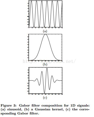
一个Gabor过滤器是通过使用高斯函数调制一个正弦曲线得到的。
A Gabor filter is obtained by modulating a sinusoid with a Gaussian.
在1维情况下,一个1维正弦被使用高斯函数调制。
For the case of one dimensional (1D) signals, a 1D sinusoid is modulated with a Gaussian.
这个滤波器将因此反映出一些频率。
This filter will therefore respond to some frequency,
但是只是在一个局部的信号中。这再图像3中进行了阐述。
but only in a localized part of the signal. This is illustrated in Figure 3.
图像3:Gabor滤波器作用于1D信号:(a)正弦曲线,(b)一个高斯核,(c)与此关联的Gabor滤波器。
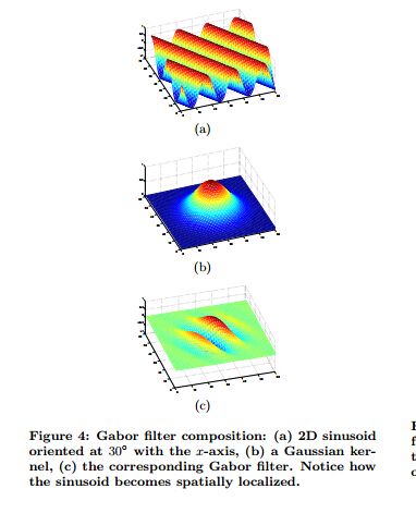
对于2D信号,例如图片,考虑图像4(a)中的正弦曲线。
For 2D signals such as images,consider the sinusoid shown in Figure4(a).
通过组合高斯函数(Figure 4(b))
By combining this with a Gaussian (Figure 4(b)),
我们得到一个Gabor滤波器-图像4(c)
we obtain a Gabor filter - Figure 4(c).
图像4:Gabor滤波器组合:(a)2D 正弦,方向为与x轴呈30度夹角,(b)一个高斯核
(c)相关的Gabor滤波器。注意正弦是怎么变成空间局部的
使 g(x, y, θ, φ) 成为定义一个Gabor滤波器的函数,中心在原点, θ为空间频率,φ是方向。
Let g(x, y, θ, φ) be the function defining a Gabor filter centered at the origin with θ as the spatial frequency and φ as the orientation.
我们可以观察Gabor滤波器为:
We can view Gabor filters as:
表明σ,高斯核的标准差取决于要度量的空间频率,也就是θ.
It has been shown that σ, the standard deviation of the Gaussian kernel depends upon the spatial frequency to measured,i.e. θ.
在我们的例子中σ = 0.65θ。图像5展示了一些Gabor滤波器的3D图和强度图在图片平面的振幅。
In our case, σ = 0.65θ. Figure 5 shows 3D plots of some Gabor filters and the intensity plots of their amplitudes in the image plane. 、
见[3]查看2D Gabor滤波器的交互式工具。
See [3] for an interactive tool to explore 2D Gabor filters.
图像5:不同发频率和方向的Gabor滤波器。第一列战士他们的3D图像
第二列,强度图和它们沿着图片平面的振幅
Gabor滤波器对于一个图像的反映通过2D
卷积操作获得
The response of a Gabor filter to an image is obtained by a 2D convolution operation.
使 I(x, y)表示图片,G(x, y, θ, φ)表示频率 θ 方向φ的Gabor滤波器在图片(x,y)点的反映。
Let I(x, y) denote the image and G(x, y, θ, φ) denote the response of a Gabor filter with frequency θ and orientation φ to an image at point (x, y) on the image plane.
G(.) 获得方式如下:
G(.) is obtained as
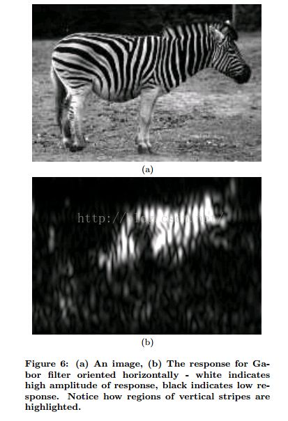
考虑图6(a)中图像中的斑马
Consider the image of a zebra shown in Figure 6(a).
如果我们在这个图片上的水平方向上提供一个Gabor滤波器
If we apply a Gabor filter oriented horizontally on this image
那么它将在斑马身上所有有水平条纹的地方给出一个很高的反映
then it will give high responses wherever there are horizontal stripes present on the zebra.
图像6(b)显示出 对于这幅图,这样一个水平方向的Gabor滤波器所反映出的振幅
Figure 6(b) shows the amplitude of the response of such a horizontally oriented Gabor filter for the image.
图像6:(a)一个图片,(b)水平方向Gabor滤波器作出反映----白色代表反映的高振幅
黑色代表低反应度。注意竖直方向的条纹是怎么被高亮出来的。
1.2前人作出的努力
GRID法则 [4]提供了一个处理多维数据的常规策略
The GRID principles [4] provide a general strategy for dealing with multi-dimensional data.
我们在这里使用了这些法则去知道我们的接口设计。
We have used these principles here to guide our interface design.
这些法则将指出我们开始将我们的4维空间可视化成2维投影,
These principles would dictate that we begin to visualize our 4-dimensional space by looking at the 2-dimensional projections,
并且这已经被证明对我们有用。
and this has proven useful to us.
接下来就是排序都有哪些投影是值得我们考虑的。
The next dictate is to rank which projections are worth considering.
这里,我们不需要不断变化地做这个
Here, we do not need to do this dynamically,
因为我们总是投影相同的4个维度。
since we are always projecting the same 4 dimensions.
因此我们可以提前预测哪两个维度投影起来会比较有指导意义
We can therefore predict in advance which 2-dimensional projections are informative.
如我们待会要讨论的细节,这些投影面是(x,y)平面,和(θ, φ) 平面。
As we will discussin detail later,, these projections are the (x, y) plane,and the(θ, φ) plane.
我们发现如果给了用户这些投影,其他的可能的投影面则
很少添加。
We found that if the user is given these projections,the other possible projections add little.
Gross等人使用投影[5]提供了一个用于生成静态可视化Gabor滤波器的方法。
Gross et.al.present an approach for generating static visualization of Gabor filter responses using projections [5].
然而,由于很多4维空间都与相同的投影面相关了,简单的静态展示这些2维投影没办法给出一个让人满意的4维数据的印象,
However, simply showing these 2-dimensional projections statically does not give a satisfactory impression of the 4-dimensional data,since many 4-dimensional spaces correspond to the same projections.
所以我们在我们的可视化中包含了两个技术去给出一个对于数据更为丰富的印象。
We therefore included two techniques in our visualization to give a richer impression of the data.
首先,我们设计了一个简单的接口,它允许用户与投影交互:用户可以限定投影维度中的哪些部分可见。
First,we designed a simple interface which allows the user to interact with the projections: the user can restrict what parts of the projected dimensions are visible.
其次,我们增加了 可视化的 给出这些投影维度的信息是从哪里来的。
Second, we include additional visualizations to give information about where in the projected dimensions the data came from.
2. 我们的方法
2.1 一维可视化
我们已经设计了一个简单的方式去观察Gabor滤波器在一维中的反映。
We have devised a simple way to view the responses of Gabor filters in one dimension.
这些滤波器反映可以在一个静态的一维图表中被很好的总结。
These filter responses can be nicely summarized in a static one-dimensional graph.
这是很有趣的,也为我们的二维滤波器的方法提供了介绍。
This is interesting in its own right,and also provides an introduction to our approach for two dimensional filters.
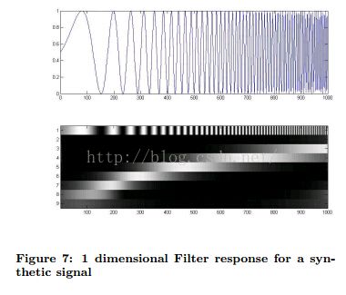
将一维Gabor滤波器序列的反映 用G(x, θ)表示,x为位置,θ为频率
Take the response of a one-dimensional Gabor filter bank to to be G(x, θ),where x is ’position’ and θ is frequency、
通过创建一个由x和θ索引的数组并且将反映的强度编码成颜色,
By creating an array indexed by x and θ and encoding the strength of the response as color,
我们可以可视化整个滤波器序列在一个图上的反映
we can visualize the entire filter bank response in a single figure.
例如合成信号上的例子,见图7和图8
For examples on synthetic signals, see Figures 7 and 8.
图7:1维滤波器在合成信号上的反映
图8:1维滤波器在合成信号上的反映
.一个真实的信号作为例子,见图9。观察真实的信号
For an example from a real signal,see see Figure 9.Observe that for real signals,
非常难预测一个滤波器组将如何反映一个给定的信号
it is very difficult to predict how a filter bank will respond to a given signal.
这就是这个工作的主要动机。
This is the major motivation for this work
图9:1维滤波器在一个真实信号上的反映
2.2 其它可行性
直接扩展1D可视化的方法,可以将一个矩阵强度图像简单呈现在屏幕上。
A straight forward extension of the 1D visualization approach would be to simply show a matrix of intensity plots on the screen.
每个强度图将显示Gabor滤波器在一个特定方向上的振幅和频率
Each intensity plot would show the amplitude of Gabor filters for a particular orientation and frequency
频率可以沿着矩阵的行变化,而方向可以沿着矩阵的列变化。
The frequency could vary along the row in the matrix and orientation could vary along the columns.
这个方法的问题在于缺乏用户通过滤波器序列参数与之互动的能力。
The problem with this approach is the lack of ability of the user to interact with the filter bank parameters.
通常用户更倾向于可以选择Gabor滤波器的方向和频率的范围然后观察它们对整个图像产生的影响的方式。
Typically users like to be able to choose ranges of orientations and frequencies of the Gabor filter bank and to observe the responses over the whole image.
自然图像很少能对特定的频率或方向作出响应,而是其响应在散布在这些参数之上。
Natural images rarely respond to specific frequencies or orientation but rather exhibit a spread over these parameters.
参数范围的可选择能力对更好的理解反映的特性是有所帮助的。
Ability to dynamically choose the range of parameters helps in better understanding of the response characteristics.
另外一个问题是
屏幕的语用学。
Another issue is the pragmatics of screen real estate.
通常计算机视觉研究中感兴趣的图像的尺寸是 300 × 200.
Typical images of interest in computer vision research are of size 300 × 200.
假设视频屏幕的分辨率是1024× 768并且我们可以使用强度图占据整个屏幕,
Assuming that the video screen resolution is 1024 × 768 and we can occupy the whole screen with the intensity plots,
我们只能显示3个方向和3个缩放。
we can show only 3 orientations and 3 scales.
即使缩小图片的规模为原有的一半也只会分别增加到7.
Even downsizing the image by half will only increase these to 7 and 7 respectively.
缩小图片还可能会引发进一步的可视化问题
Downsizing further might pose problems in visualization.
医学成像也同时包含多种形式的可视化图片[6,7,8].
Medical imaging also involves visualizing images with multiple modalities simultaneously [6, 7, 8].
然而这里重点指的是捕捉3D人体结构.
However, here the emphasis is on capturing the 3D human body structure.
通常的方法是将不同的图片平面叠放在另外一个上面,并且允许用户对这些平面进行切片。
The usual approach is to stack the different image planes on top of one other and allowing the user to slice the across these planes.
注意,在我们方法中我们正在处理的是4维 只有两个维度有详细的空间含义。另外的维度将被通过人为的堆叠图像平面创建。
Notice that in our case we are dealing with 4 dimensions where only two have any explicit spatial meaning.The other dimension would be created artificially by stacking the image planes.
选择一个范围的参数需要旋转图像平面的堆栈并选择一个量。
Choosing a range of parameters would involve rotating the stack of image planes around and choosing a volume.
在文献中已经证明可视化期间进行3d旋转经常丢失方向,因为很难去跟踪一个要研究帧
It has been cited in visualization literature that 3D rotations during visualizations are often disorienting as it is difficult to keep track of a frame of reference over the course of interaction.
在我们的工作中,我们把自己限制在2d可视化中,尝试去得到最好的交互体验。
In our work, we have tried to get the best possible interaction while confining ourselves to 2D visualization.
另一个选择是复用我们可视化Gabor滤波器反应到1D信号的方法。
Another option would be to reuse our approach of visualizing Gabor filter responses to 1D signals.
用户可以被给予一个接口,让他/她可以 将图片切成条。
The user could be given an interface to enable him/her to slice an image into a strip.
然后我们将不同频率的Gabor 滤波器施加到这个条形上并且把它们按照图7显示的方式堆叠到一起。
Then we could apply Gabor filters of different frequencies along this strip and stack them as shown in Figure 7.
然而,同时观察不同方向上的反映是非常困难的。
However, it would be difficult to simultaneously view responses for multiple orientations.
并且, 图片有一个内在的2D结构-沿着1D条形施加滤波器将丢失这个结构。
Moreover, images have an inherently 2D structure - applying filters along 1D strips will ignore this.
平行坐标系是一个可视化多维数据[9, 10]经常使用的方式。
Parallel coordinates are a popular approach for visualizing multi-dimensional data [9, 10].
每个维度沿着轴线画出,并且所有的轴线都被平行于其它轴线放置。
Each dimension is plotted along an axis and all axes are placed parallel to one another.
每个高维度中的数据点都通过与轴线关联的线段表现。
Each data point in the high dimensional space is represented by correspondingly joining the axes with line segments.
在我们的做法中,两个维度在图片平面上,所以把它们画在平行坐标系中可能不是一个好主意(图10)
In our case, two of the dimensions are coordinates on the image plane and hence plotting them on parallel coordinates might not be a good idea. (Figure 10)
星形坐标系是另外一个经常用到的可视化多维度数据的工具[11]。但是,它可能在我们这种情况下不适用因为有两个维度时有详细的空间意义的。
Star Coordinates is another popular visualization tool for multi-dimensional data [11]. However, it might not useful in our case as two of the dimensions have explicit spatial meaning.
2.3 Our Approach
现在,对于一个两维度Gabor滤波器序列。
Now, for a two dimensional Gabor filter bank,
情况变的更加复杂。使G(x, y, θ, φ)为这样一个序列的反映,
the situation is much more difficult. Take the response for such a bank to be G(x, y, θ, φ),
当(x, y)为与输入信号相关的滤波器的位置。
where (x, y) is the position of the filter relative to the input signal,
θ是滤波器的频率,φ是滤波器的方向。
θ is the frequency of the filter,and φ is the orientation of the filter.
很明确的一点是,没有可以让我们展示整个滤波器序列的反映的静态表示方法。
It is clear that no static presentation will allow us to view the response of the entire filter bank.
这里我们的观念是,为了给用户一个对于4维度滤波器序列的理解,交互式必须的。
Here we adopt the philosophy that, in order to give a users an understanding of the response of this 4 dimensional filter bank, interaction is necessary.
我们也觉得2维投影是观察数据的最好方式
We feel that 2 dimensional projections are again the best way to view this data.
所以,我们的方法是基本遵守GRID原则的,但是不像通常那样给出。
Thus, our approach is essentially inline with the GRID principles, but applied in an unusualway.
在这里显而易见的是,观察4个维度,会有6个可能的投影--为什么不简单的展示他们就完事了呢?
The obvious thing here, would be to observe that with 4 dimensions, there are 6 possible projections- why not simply show them and be done with it?
这里有两个原因。
There are two reasons.
首先一部分原因是因为这6个投影中的大部分是没有含义的
The first and minor reason is that most of these 6 projections are not meaningful.
例如, (y, φ) 平面上的投影就很难解释。
For example, a projection onto the (y, φ) plane is difficult to intepret.
这里确实只有两个投影有正常的含义:在 (x, y)平面上的投影和 (θ, φ) 平面上的投影。
There are really only two projections with natural interpretations: onto the (x, y)plane, and onto the (θ, φ) plane.
其次,最主要的原因,对于全部投影我们有太多的数据了。
The second and more important reason, is that we have too much data for full projections.
如果我们简单的将数据投影到(x, y)平面上,我们将可以观察到图像中每个点最大程度的反映,
If we simply project the data downwards onto the (x, y) plane, we will be able to see the maximum filter response for each image point,
但是我们将不知道是滤波器的哪部分做出的反映。
but we will have no idea what part of the filter gave this response.
我们通过两个途径去克服这个问题,首先,我们允许用户投影到这个平面
We combat this problem in two ways. First, we allow users to project onto this plane,
但是我们允许他们去限制其它维度的哪些部分被投影。
but we also allow them to restrict what portions of the other dimensions are projected.
其次,我们使用附加图去展示 最大值是来自其它维中的哪个。
Secondly,we use additional plots to show where in the extra dimensions the maximum value came from.
我们的界面有5个图像:
Our interface has five plots:
1.原图像。
1. Original image.
2.G图:Gabor 滤波器反映在(x, y)平面上的投影。
2. G plot: the (x, y) projection of the Gabor filter responses.
3.θ 图:展示对应于图片平面上的不同点的Gabor 滤波器上最大反映的频率。
3. θ plot: this shows frequency of maximal Gabor filter response for different points on the image plane.
4.φ图:展示对应于图片平面上的不同点的Gabor 滤波器上最大反映的方向。
4. φ plot: this shows the orientation of maximal Gaborfilter response for different points on the image plane.
5. Gabor滤波器反映在(θ, φ)平面上的投影。
5. (θ, φ) projection of the Gabor filter responses.
另外,我们有两个交互窗体:
In addition, we have two interaction widgets:
1. (θ, π) 交互窗体:
1. (θ, π) interaction widget:
显示在(θ, φ)投影平面上,用于限制Gabor 滤波器序列的参数的范围。
this is shown on the (θ, φ) projection plane and is used to restrict the range of parameters of the Gabor filter bank.
用户在滤波器序列的频率和方向的维度上选择一个范围:(θmin, φmin) → (θmax, φmax).
The user selects a range in the frequency and orientation dimensions of the filter bank: (θmin, φmin) → (θmax, φmax).
然后程序去查找,对于每对 (x, y),
The program then finds, for every pair (x, y), the θ and φ such that G(x, y, θ, φ) is maximum,
subject to θmin ≤ θ ≤ θmax, φmin ≤ φ ≤ φmax. The three figures,namely (x, y) projection,
θ plot and φ plot show G, θ and φ for each point on the image.


