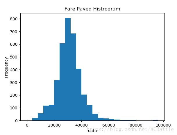
频率分布直方图
import pandas as pd
import matplotlib.pyplot as plt
import numpy as np
path7 = './data.csv'
titanic = pd.read_csv(path7)
print(titanic.describe())
df = titanic['data'].sort_values(ascending = False)
binsVal = np.arange(0,100000,4000)
plt.hist(df, bins = binsVal)
plt.xlabel('data')
plt.ylabel('Frequency')
plt.title('Fare Payed Histrogram')
plt.show()
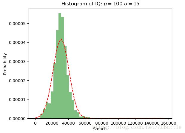
正态分布直方图
import numpy as np
import matplotlib.mlab as mlab
import matplotlib.pyplot as plt
import os
x = []
csvFile1 = open('G:/Test/5-25/data.csv','r',newline='')
with csvFile1 as f:
for line in f.readlines():
x.append(int(line.split(',')[0]))
mu = np.mean(x)
sigma = np.std(x)
num_bins = 50
n, bins, patches = plt.hist(x, num_bins, normed=1, facecolor='green', alpha=0.5)
y = mlab.normpdf(bins, mu, sigma)
plt.plot(bins, y, 'r--')
plt.xlabel('Smarts')
plt.ylabel('Probability')
plt.title(r'Histogram of IQ: $\mu=100$ $\sigma=15$')
plt.subplots_adjust(left=0.15)
plt.show()
饼图
import pandas as pd
import matplotlib.pyplot as plt
import numpy as np
path7 = './data.csv'
titanic = pd.read_csv(path7)
class1 = (titanic['class'] == 1).sum()
class2 = (titanic['class'] == 2).sum()
class3 = (titanic['class'] == 3).sum()
class4 = (titanic['class'] == 4).sum()
proportions = [class1,class2,class3,class4]
plt.pie(
proportions,
labels = ['class1', 'class2','class3','class4'],
shadow = False,
colors = ['blue','red','green','yellow'],
explode = (0.15 , 0 , 0 , 0 ),
startangle = 90,
autopct = '%1.1f%%'
)
plt.axis('equal')
plt.title("Sex Proportion")
plt.tight_layout()
plt.show()
