Python库Matplotlib绘图教程
第一部分:基本参数
导入绘图包
import matplotlib.pyplot as plt
import numpy as np- 使用
from pylab import *一次导入matplotlib.pyplot和numpy也可以,但是不推荐,推荐像上面一样分别导入,以防导入中出现错误而难以检查。
生成模拟数据点
X = np.linspace(-np.pi, np.pi, 256,endpoint=True)
C,S = np.cos(X), np.sin(X)- arange()类似于内置函数range(),通过指定开始值、终值和步长创建表示等差数列的一维数组,注意得到的结果数组不包含终值。
- linspace()通过指定开始值、终值和元素个数创建表示等差数列的一维数组,可以通过endpoint参数指定是否包含终值,默认值为True,即包含终值。
绘图
# 创建一个 8 * 6 点(point)的图,并设置分辨率为 80
figure(figsize=(8,6), dpi=80)

# 创建一个新的 1 * 1 的子图,接下来的图样绘制在其中的第 1 块(也是唯一的一块)
subplot(1,1,1)

X = np.linspace(-np.pi, np.pi, 256,endpoint=True)
C,S = np.cos(X), np.sin(X)

# 绘制余弦曲线,使用蓝色的、连续的、宽度为 1 (像素)的线条
plot(X, C, color="blue", linewidth=1.0, linestyle="-")

# 绘制正弦曲线,使用绿色的、连续的、宽度为 1 (像素)的线条
plot(X, S, color="green", linewidth=1.0, linestyle="-")

# 设置横轴的上下限
xlim(-4.0,4.0)

# 设置横轴记号
xticks(np.linspace(-4,4,9,endpoint=True))

# 设置纵轴的上下限
ylim(-1.0,1.0)

# 设置纵轴记号
yticks(np.linspace(-1,1,5,endpoint=True))

# 以分辨率 72 来保存图片
# savefig("exercice_2.png",dpi=72)

# 在屏幕上显示
show()
绘图过程关键步骤
- 1、要定义一个
figure
matplotlib.pyplot.figure(num=None, figsize=None, dpi=None, facecolor=None, edgecolor=None, frameon=True, FigureClass=
figure(figsize=(8,6), dpi=80)这里只指定了figure大小,分辨率dpi,还有下面的参数:
num:figure对象标记
facecolor:背景颜色
edgecolor:边框颜色
2、用
plot在figure上画点matplotlib.pyplot.plot(*args, **kwargs)plot传入序列数据,传入一个序列的时候,横轴显示的是序列里元素的索引,纵轴显示的是序列里的数字,传入两个序列的时候,取最短的那个序列长度,在横轴和纵轴上画点。有如下参数:
线条属性:实线,虚线,点横线等等
线条标记:点,正方形,星型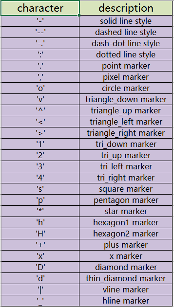
线条颜色:蓝,红,青,绿,黄,黑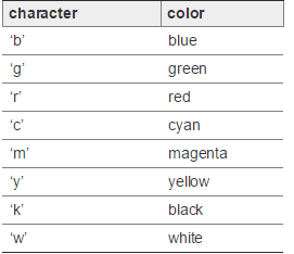
- 3、设置横轴、纵轴上下限以及刻度
xlim(-4.0,4.0)
ylim(-1.0,1.0)#起始点和结束点
xticks(np.linspace(-4,4,9,endpoint=True))
yticks(np.linspace(-4,4,9,endpoint=True))#刻度,传入的参数是列表List,如果要显示字符,就传入两个列表,一个是刻度,一个是要显示在坐标轴上的字符。- 4、显示或者保存图片
savefig("exercice_2.png",dpi=72)
show()第二部分:figure图的嵌套
import matplotlib.pyplot as plt

# 定义figure
fig = plt.figure()

# 定义数据
x = [1, 2, 3, 4, 5, 6, 7]
y = [1, 3, 4, 2, 5, 8, 6]

# figure的百分比, 从figure 10%的位置开始绘制, 宽高是figure的80%
left, bottom, width, height = 0.1, 0.1, 0.8, 0.8
# 获得绘制的句柄
ax1 = fig.add_axes([left, bottom, width, height])
# 绘制点(x,y)
ax1.plot(x, y, 'r')
ax1.set_xlabel('x')
ax1.set_ylabel('y')
ax1.set_title('test')

# 嵌套方法一
# figure的百分比, 从figure 10%的位置开始绘制, 宽高是figure的80%
left, bottom, width, height = 0.2, 0.6, 0.25, 0.25
# 获得绘制的句柄
ax2 = fig.add_axes([left, bottom, width, height])
# 绘制点(x,y)
ax2.plot(x, y, 'r')
ax2.set_xlabel('x')
ax2.set_ylabel('y')
ax2.set_title('part1')

# 嵌套方法二
plt.axes([bottom, left, width, height])
plt.plot(x, y, 'r')
plt.xlabel('x')
plt.ylabel('y')
plt.title('part2')

plt.show()
- 结果
(1)设置坐标轴的范围:
axis([xmin xmax ymin ymax]);
(2)设置坐标轴的间距:
set(gca, ‘XTick’, [xmin:间距:xmax]);
set(gca, ‘YTick’, [ymin:间距:ymax]);
(2)设置有格子:
grid on
(3)如果想取消x或者y轴的格子,可以设置:
set(gca, ‘Xgrid’, ‘off’)默认值为on,设置关掉x轴上的格子
(4)去掉坐标的边框:
box off
(5)设置坐标轴的名字:
xlabel(‘xname’);
(6)设置图例:
legend(‘lenname1’,’lenname2’);
(7)设置图例的位置:
在figure图上放好图例,然后右键生成代码即可。
(8)设置figure的名字:
figure(‘name’,”)
(9)在一个figure画不同的plot图:
使用方法:subplot(m,n,p)或者subplot(m n p)。
subplot是将多个图画到一个平面上的工具。其中,m表示是图排成m行,n表示图排成n列,也就是整个figure中有n个图是排成一行的,一共m行,如果m=2就是表示2行图。p表示图所在的位置,p=1表示从左到右从上到下的第一个位置。
eg:
把绘图窗口分成两行两列四块区域,然后在每个区域分别作图,基本步骤:
subplot(2,2,1); % 2、2、1之间没有空格也可以
在第一块绘图
subplot(2,2,2);
在第二块绘图
subplot(2,2,3);
在第三块绘图
subplot(2,2,4);
在第四块绘图
(10)一个图中画多条曲线
plot(x1,y1,”,”,x2,y2,”,”) ”表示分别设置属性
第三部分:其他设置
设置1:图像的大小设置。
如果已经存在figure对象,可以通过以下代码设置尺寸大小:
f.set_figheight(15)
f.set_figwidth(15)若果通过.sublots()命令来创建新的figure对象, 可以通过设置figsize参数达到目的。
f, axs = plt.subplots(2,2,figsize=(15,15))设置2:刻度和标注特殊设置
描述如下:在X轴标出一些重要的刻度点,当然实现方式有两种:直接在X轴上标注和通过注释annotate的形式标注在合适的位置。
其中第一种的实现并不是很合适,此处为了学习的目的一并说明下。
先说第一种:
正常X轴标注不会是这样的,为了说明此问题特意标注成这样,如此看来 0.3 和 0.4的标注重叠了,当然了解决重叠的问题可以通过改变figure 的size实现,显然此处并不想这样做。
怎么解决呢,那就在 0.3 和 0.4之间再设置一个刻度,有了空间后不显示即可。
代码如下:
# -*- coding: utf-8 -*-

import matplotlib.pyplot as plt
fig = plt.figure(figsize=(3, 3))
ax = fig.add_subplot(1, 1, 1, frameon=False)
ax.set_xlim(-0.015, 1.515)
ax.set_ylim(-0.01, 1.01)
ax.set_xticks([0, 0.3, 0.4, 1.0, 1.5])
#增加0.35处的刻度并不标注文本,然后重新标注0.3和0.4处文本
ax.set_xticklabels([0.0, "", "", 1.0, 1.5])
ax.set_xticks([0.35], minor=True)
ax.set_xticklabels(["0.3 0.4"], minor=True)

#上述设置只是增加空间,并不想看到刻度的标注,因此次刻度线不予显示。
for line in ax.xaxis.get_minorticklines():
line.set_visible(False)

ax.grid(True)
plt.show()
最终图像形式如下:
当然最合理的方式是采用注释的形式,比如:
代码如下:
# -*- coding: utf-8 -*-

import matplotlib.pyplot as plt
import numpy as np

# Plot a sinc function
delta=2.0
x=np.linspace(-10,10,100)
y=np.sinc(x-delta)

# Mark delta
plt.axvline(delta,ls="--",color="r")
plt.annotate(r"$\delta$",xy=(delta+0.2,-0.2),color="r",size=15)
plt.plot(x,y)设置3:增加X轴与Y轴间的间隔,向右移动X轴标注一点点即可
显示效果对比:
设置前:
设置后:
两张的图像的差别很明显,代码如下:
# -*- coding: utf-8 -*-

import matplotlib.pyplot as plt

fig = plt.figure()
ax = fig.add_subplot(111)
plot_data=[1.7,1.7,1.7,1.54,1.52]
xdata = range(len(plot_data))
labels = ["2009-June","2009-Dec","2010-June","2010-Dec","2011-June"]
ax.plot(xdata,plot_data,"b-")
ax.set_xticks(range(len(labels)))
ax.set_xticklabels(labels)
ax.set_yticks([1.4,1.6,1.8])

# grow the y axis down by 0.05
ax.set_ylim(1.35, 1.8)
# expand the x axis by 0.5 at two ends
ax.set_xlim(-0.5, len(labels)-0.5)

plt.show()设置4:移动刻度标注
上图说明需求:
通过设置 set_horizontalalignment()来控制标注的左右位置:
for tick in ax2.xaxis.get_majorticklabels():
    tick.set_horizontalalignment("left")
当然标注文本的上下位置也是可以控制的,比如:
ax2.xaxis.get_majorticklabels()[2].set_y(-.1)当然控制刻度标注的上下位置也可以用labelpad参数进行设置:
pl.xlabel("...", labelpad=20) 或:
ax.xaxis.labelpad = 20具体设置请查阅官方文档,完整的代码如下:
# -*- coding: utf-8 -*-

import matplotlib.pyplot as plt
import numpy as np
import datetime

# my fake data
dates = np.array([datetime.datetime(2000,1,1) + datetime.timedelta(days=i) for i in range(365*5)])
data = np.sin(np.arange(365*5)/365.0*2*np.pi - 0.25*np.pi) + np.random.rand(365*5) /3

# creates fig with 2 subplots
fig = plt.figure(figsize=(10.0, 6.0))
ax = plt.subplot2grid((2,1), (0, 0))
ax2 = plt.subplot2grid((2,1), (1, 0))
## plot dates
ax2.plot_date( dates, data )

# rotates labels
plt.setp( ax2.xaxis.get_majorticklabels(), rotation=-45 )

# shift labels to the right
for tick in ax2.xaxis.get_majorticklabels():
    tick.set_horizontalalignment("right")

plt.tight_layout()
plt.show()设置5:调整图像边缘及图像间的空白间隔
图像外部边缘的调整可以使用plt.tight_layout()进行自动控制,此方法不能够很好的控制图像间的间隔。
如果想同时控制图像外侧边缘以及图像间的空白区域,使用命令:
plt.subplots_adjust(left=0.2, bottom=0.2, right=0.8, top=0.8,hspace=0.2, wspace=0.3)设置6:子图像统一标题设置。
效果如下(subplot row i):

思路其实创建整个的子图像,然后将图像的刻度、标注等部分作不显示设置,仅仅显示图像的 title。
代码如下:
import matplotlib.pyplot as plt

fig, big_axes = plt.subplots(figsize=(15.0, 15.0) , nrows=3, ncols=1, sharey=True)

for row, big_ax in enumerate(big_axes, start=1):
    big_ax.set_title("Subplot row %s \n" % row, fontsize=16)

    # Turn off axis lines and ticks of the big subplot
    # obs alpha is 0 in RGBA string!
    big_ax.tick_params(labelcolor=(0,0,0,0), top='off', bottom='off', left='off', right='off')
    # removes the white frame
    big_ax._frameon = False

for i in range(1,10):
    ax = fig.add_subplot(3,3,i)
    ax.set_title('Plot title ' + str(i))


fig.set_facecolor('w')
plt.tight_layout()
plt.show() 设置7:图像中标记线和区域的绘制
效果如下:
代码如下:
import numpy as np
import matplotlib.pyplot as plt

t = np.arange(-1, 2, .01)
s = np.sin(2*np.pi*t)

plt.plot(t, s)
# draw a thick red hline at y=0 that spans the xrange
l = plt.axhline(linewidth=4, color='r')

# draw a default hline at y=1 that spans the xrange
l = plt.axhline(y=1)

# draw a default vline at x=1 that spans the yrange
l = plt.axvline(x=1)

# draw a thick blue vline at x=0 that spans the upper quadrant of
# the yrange
l = plt.axvline(x=0, ymin=0.75, linewidth=4, color='b')

# draw a default hline at y=.5 that spans the middle half of
# the axes
l = plt.axhline(y=.5, xmin=0.25, xmax=0.75)

p = plt.axhspan(0.25, 0.75, facecolor='0.5', alpha=0.5)

p = plt.axvspan(1.25, 1.55, facecolor='g', alpha=0.5)

plt.axis([-1, 2, -1, 2])

plt.show()