Typography
San Francisco (SF) is the system typeface in iOS. The fonts of this typeface are optimized to give your text unmatched legibility, clarity, and consistency. Download the San Francisco family of fontshere.
iOS uses San Francisco as the system font for Latin, Greek and Cyrillic alphabets, and a variety of other typefaces for other scripts.
Emphasize important information.Use font weight, size, and color to highlight the most important information in your app.
强调重要信息。使用粗字体,字号和颜色来高亮app里最重要的信息
If possible, use a single typeface.Mixing several different typefaces can make your app seem fragmented and sloppy. Consider using one typeface and just a few font variants and sizes.
尽可能使用单一字体。混合多种不同字体可能使你的app看起来风格不统一和粗心。考虑使用一种字体和仅仅几种字体变种和大小。
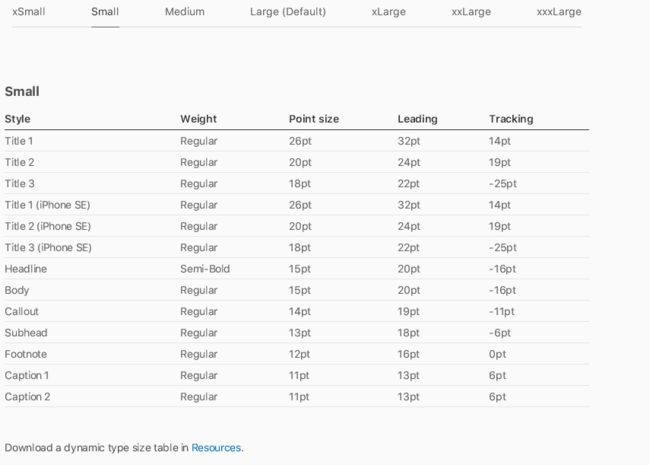
Use built-in text styles whenever possible.The built-in text styles let you express content in ways that are visually distinct, while retaining optimal legibility. These styles are based on the system fonts and allow you to take advantage of key typographic features, such as Dynamic Type, which automatically adjusts tracking and leading for every font size. iOS includes the following text styles:
尽可能使用内置的文本样式。内置的字体样式让你的内容清晰易读。这些样式是基于系统字体的允许你利用关键的排版特性,例如动态类型,自动调整跟踪每种字体大小的行距。iOS包括以下文本样式
Make sure custom fonts are legible.Custom typefaces are supported on iOS, but are often tough to read. Unless your app has a compelling need for a custom font, such as for branding purposes or to create an immersive gaming experience, it’s usually best to stick with the system fonts. If you do use a custom font, make sure it’s easily readable, even at small sizes.
确保定制的字体是易于理解的。定制的字体在iOS是支持的,但是经常难以阅读。除非你的app有一个强制需求定制字体,例如品牌目的来创造一个沉浸式的游戏体验,最好与系统字体一致。如果你使用一个定制字体,确保它是易于阅读的,即时在很小的字号时。
Implement accessibility features for custom fonts.System fonts automatically react to accessibility features like bold text and larger type. Apps using custom fonts should implement the same behavior by checking whether accessibility features are enabled and registering for notifications when they change. SeeAccessibility.
实现定制字体的可访问性。系统字体自动对可访问性特性做出回应,例粗文本和大字号。App使用定制字体应该实现相同的行为,通过检查可访问性是否可行,当他们改变时为通知登记。SeeAccessibility.
Dynamic Type Sizes
冬天字体大小
The San Francisco typeface was designed to be highly legible at both small and large sizes. Dynamic Type provides additional flexibility by letting readers choose their preferred text size.
Prioritize content when responding to text-size changes.Not all content is equally important. When someone chooses a larger size, they want to make the content they care about easier to read; they don’t always want every word on the screen to be larger.
Larger Accessibility Type Sizes
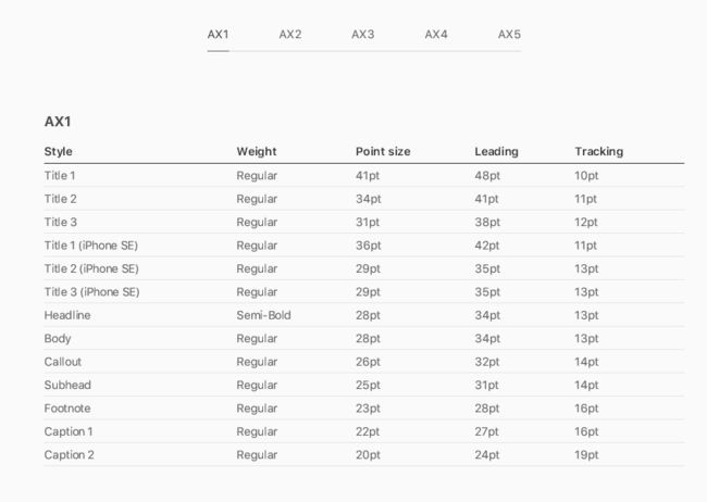
In addition to the standard dynamic type sizes, the system offers a number of even larger type sizes for users with accessibility needs.
Font Usage and Tracking
Use the correct font variant in interface mockups.Use SF Pro Text for text 19 points or smaller, and SF Pro Display for text 20 points or larger. When you use San Francisco for text in standard controls like buttons and labels, iOS automatically applies the most appropriate variant based on the point size and the user’s accessibility settings. Adjust tracking—the spacing between letters—appropriately.
In iOS 10, the San Francisco variants were SF UI Text and SF UI Display.


