Layout
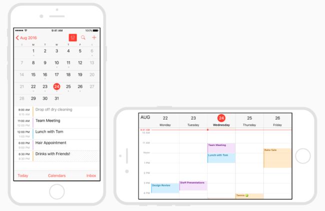
People generally want the ability to use their favorite apps on all of their devices and in any orientation. In iOS, interface elements and layouts can be configured to automatically change shape and size on different devices, during multitasking on iPad, in split view, and when the screen is rotated. It’s essential that you plan ahead and design an app that provides a great experience in any context.
用户一般希望在任何方向都能使用他们喜欢的app在他们所有设备上。在iOS上,界面元素和布局可以被配置成在不同的设备下自动改变形状和大小,在iPad多任务时,在分割视图,和屏幕被旋转时。你提前计划和设计在任何环境提供良好体验一个app,是很有必要的。
Maintain focus on the current content during context changes.Content is your highest priority. Changing focus when the environment changes can be disorienting, frustrating, and make people feel like they’ve lost control of the app.
在环境改变时维持关注当前内容。内容是你的最高优先级。当环境改变关注会令人迷惑,沮丧,和使用户觉得失去了对app的控制。
Ensure primary content is clear at its default size.People shouldn’t have to scroll horizontally to read important text, or zoom to see primary images, unless they choose to change the size.
确保主要内容在它初始大小是清晰的。用户不应该不得不横向滑动来阅读重要文本,或者缩放来查看主要图片,除非他们选择改变大小。
Maintain an overall consistent appearance throughout your app.In general, elements with similar functions should look similar.
贯穿app维持一个一致的外观。一般,有相同功能的元素应该看起来相似。
Use visual weight and balance to convey importance.Large items catch the eye and appear more important than smaller ones. Larger items are also easier to tap, which is especially important when an app is used in distracting surroundings, such as in the kitchen or a gym. In general, place principal items in the upper half of the screen and—in a left-to-right reading context—near the left side of the screen.
使用可见的权重和平衡来传达重要性。大的项目捕获眼球,看起来比小的项目更重要。大些的项目也更容易被点击,当在容易分心的环境使用app时这点特别重要,例如在厨房或健身房。一般,将主要的item放在屏幕上半边-在一个从左到右的阅读环境-靠近屏幕的左边。
Use alignment to ease scanning and to communicate organization and hierarchy.Alignment makes an app look neat and organized, helps people focus while scrolling, and makes it easier to find information. Indentation and alignment can also indicate how groups of content are related.
使用对齐来减少浏览和传达组织结构和层级。对齐使得一款app看起来整洁和有组织,帮助用户专注当滚动时,和使得找信息变得容易。缩进和对齐也可以表明相关的内容如何组织。
Avoid gratuitous layout changes.Just because someone rotates a device doesn’t mean the entire layout needs to change. For example, if your app shows a grid of images in portrait mode, it doesn’t have to present the same images as a list in landscape mode. Instead, it might simply adjust the dimensions of the grid. Try to maintain a comparable experience in all contexts.
避免无理由的布局改变。仅仅因为某人旋转一个设备不意味着整个布局需要改变。例如,如果你的app在竖屏模式显示一个图表表格,在横屏模式它不必要呈现相同的图像。取而代之,它可能仅仅改变grid的维度。尝试在所有环境维持一个相同的体验。
If possible, support both portrait and landscape orientations.People prefer to use apps in different orientations, so it’s best when you can fulfill that expectation.
如果可能,支持竖屏和横屏两种模式。用户希望在不同的方向使用app,所以你最好满足这个期望。
If your app supports only one orientation, support both variants.If it’s essential that your app run in a single orientation, make sure it supports both orientation variants. For example, if your app only runs in landscape mode, it should be usable regardless of whether the Home button is on the left or the right. If the device is rotated 180 degrees while using your app, your app should respond by rotating its content 180 degrees. If your app doesn't rotate automatically when someone holds the device wrong, they'll know instinctively to rotate it. You don't need to tell them.
如果你的app只支持一个方向,支持不同的变体。若果你的app必须运行在单一的方向,确保它支持两种方向的变种。例如,如果你的app只能运行在横屏模式,它应该可用不管Home button是在左边还是右边。如果设备旋转180度,app的内容也应该跟着旋转180度。如果你的app不自动旋转,当某人拿设备的方向不对,他们本能知道要旋转它,你不需要告诉他们。
Customize your app’s response to rotation according to context.A game that lets people move a character by rotating the device, for example, probably shouldn’t switch orientations during gameplay. It could, however, display menus and intro sequences based on the current orientation.
定制你的app根据环境回应旋转。一个游戏允许用户移动一个角色通过旋转设备,例如,也许不应该转换方向在玩游戏时。它可以,无论怎样,显示菜单和介绍顺序基于当前方向。
Provide ample spacing for interactive elements.Try to maintain a minimum tappable area of 44pt x 44pt for all controls.
为交互元素提供足够空间。尝试为所有控制提供一个最小44pt*44pt的可点击范围。
Be prepared for text size changes.People expect most apps to respond appropriately when they choose a different text size in Settings. To accommodate some text-size changes, you might need to adjust the layout. For more information about text usage in your app, seeTypography.
为文本大小改变做好准备。用户期望所有app反应正常当他们在Settings中选择一个不同的文本字体。为了适应一些字体大小改变,你可能需要改变布局。For more information about text usage in your app, seeTypography.
For developer guidance on adaptivity, seeAuto Layout Guide.