So you want to create an infographic, and you’ve stumbled upon our tool. You’ve seen some examples and you’re ready to go. Do you really need to read yet another guide on how to make an infographic? I’m going to be honest and say, no, if you know what you want, and you have a very clear picture in your head of what you want to create, then go straight ahead and just do it.
你想创建信息图,也已经找到了工具,看过一些例子之后你准备着手去做。你真的需要再读一篇指导如何创作信息图的文章吗?坦白地说,不,如果你知道你想要什么,并且对于你想创的东西头脑中有一个非常清晰的画面,那就直接动手去做好了。
But if you’re the kind of person that appreciates learning about the creation process or you have about 15 minutes or so to kill, then I think it will be well worth your time. We will try and make it less painful with plenty of practical pointers and real life examples.
但是,如果你是那种喜欢学习创作过程的人,或者你还有15分钟的时间需要打发,那我想你值得那么做。 我们会通过大量的练习以及实例,试着不那么痛苦。
We use a 5 step process when we create infographics:
1. Select a story for the infographic
2. Choose a type of infographic
3. Get the relevant data
4. Design the infographic
5. Promote the infographic
我们通过5个步骤创建信息图:
1.为信息图选择一个故事
2.选择信息图的一种类型
3.获取相关数据
4.设计信息图
5.推广信息图
1. Select a story for your Infographic
1、为信息图选择一个故事
This is the hardest part. What should your infographic be about? What is the core message you want to deliver? For us, this is a discovery process. There are two approaches:
这是最难的一步。你的信息图应该是关于哪方面的?你想要传递的核心信息是什么?对我们来说,这是一个发现的过程。
这里介绍两种方法:
Data driven approach – this is where you already have data and you want to tell the story based on your data. Essentially, you use the data to drive the storyline. While it may seem obvious that you should always look at your data to outline your story, we argue that there are many pitfalls to this approach and is often the #1 mistake everyone makes when creating infographics. When is this approach relevant? When you have a unique set of data, or if you’re part of a data science team that has uncovered news worthy insights from your data.
数据驱动方法——这种方法是,你已经有了数据,并且你想要依据自己的数据创建故事。基本上,是用数据推动故事情节。显而易见地是,你应该时刻查看你的数据来勾勒你的故事,需要注意的是,这种方法有很多陷阱,而且往往是每个人都会犯的错误。这种方法在什么情况下适用?当你有一套独特的数据,或者你是一个数据科学团队的一分子,并从你的数据中发现了有价值的观点。
Problem/Question approach – this approach requires you to first think about the problem you’re trying to solve or the questions you’re trying to answer with your story. This usually requires you to put yourself in your readers’ shoes to discover an impactful story angle that has the following properties:
问题驱动方法--这种方法要求你首先思考你试图解决的问题,或者,你想要通过你的故事来回答的问题。这通常需要你站在你上司的角度去发现一个有效的故事角度,它具有以下特征:
● Solves or helps a burning pain. Example – Take back your mornings
● Provides useful and practical answers/solutions to everyday questions. Example – What’s the best sleeping position for you?
● Reframes conventional questions differently. Example –Why Austin sucks
● Challenges popular beliefs or the status quo. Example – Superbowl ads aren’t expensive enough
● Provides an unconventional answer to a common question. Example – How colors affect conversions
● 解决或帮助一个燃烧的痛苦。例如,收回你的早晨
● 为日常问题提供有用且实际的答案/解决方案。例如:最好的睡眠位置是怎样?
● 以不同方式重新解析传统问题。例如:为什么奥斯丁吮吸
● 挑战流行的信念或现状。例如–超级广告并不昂贵
● 为一个寻常的问题提供一个不同寻常的答案。例如颜色如何影响转换???
If you want to dive deeper into how to discover great stories, read 3 Powerful Questions to Discover Your Infographic Story. Regardless of the approach, your story should provide some practical utility, surprise or challenge to the reader.
如果你想更深入研究如何发现伟大的故事,阅读《三大关键问题来发现你的信息图故事》。不管方法怎样,你的故事要能够为读者提供一些实际的效用,惊喜或挑战。
At the end of this step, you should have a subject of the story and some points or questions your infographic addresses. Something like this:
最后,你故事要有一个主题和几个你的信息图解决的点或问题。像这样的一些:
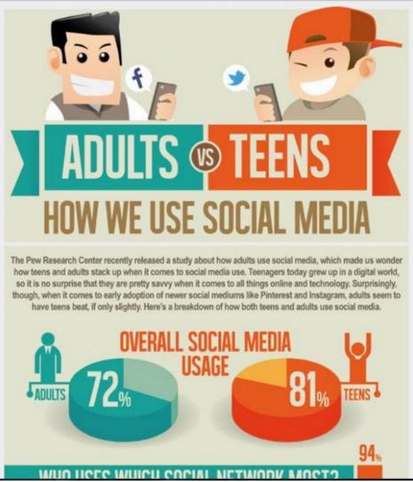
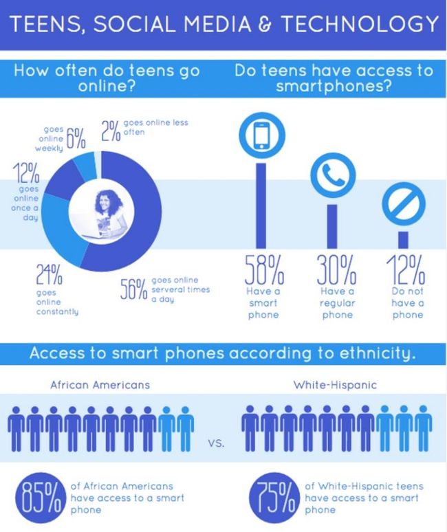
Subject: Teens and social media usage
主题:青少年和社交媒体的使用
As a marketer, I'd like to know how teens are using social media. I've heard that Facebook is not as relevant for teens as they are for adults. How big are the other social networks compared to Facebook?
作为一个营销者,我想知道青少年是如何使用社交媒体的。我听说相比成年人,脸谱网与青少年的关联并不大。相比脸谱网,他们与其他社交网络的关联有多大?
Questions answered: Which social media networks do teens use the most? Is there a difference between different groups of teens? Is there anything surprising about teen behavior vs adult behavior on social media? Are Snapchat and Instagram that big among teens? What insights can marketers gain from this data?
问题回答:社交媒体网络是青少年使用最多的吗?青少年的不同群体之间有区别吗?在社交媒体上,青少年的行为与成人的行为相比有什么令人惊讶的吗?Snapchat和Instagram在青少年中使用数量有那么大吗?营销人员从这个数据可以获得怎样的结论?
2. Choose the type of Infographic to visualize your story
2.选择图表类型使你的故事可视化
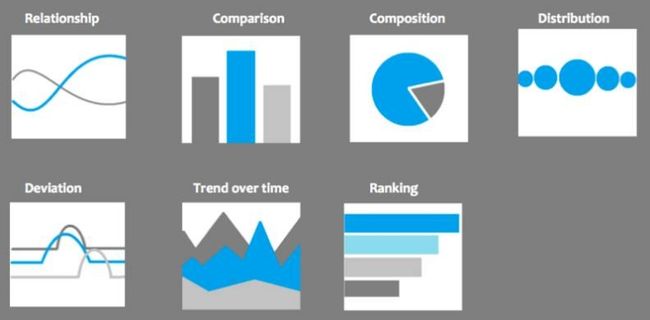
You’ve got your story. Now you have to choose the type of infographic you want to use. Wait, there are different types of infographics? In fact, there are loosely 10 different types of infographics. Before you roll your eyes, here are all 10 types:
你已经得到了你的故事。现在你要选择使用的图表类型。等等,信息图有不同类型?事实上,宽松地来讲,有10种不同类型的信息图表。在你转动你的眼睛之前,这里是算不10种类型:
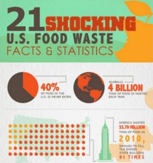
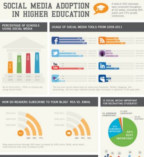
Statistical Infographics – shows a summary or overview of data with one or more graphs, tables or lists.
统计信息图–显示总体或对数据的概括,用一个或多个图形,表格或列表。
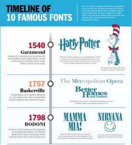
Timeline Infographics (time-oriented) – shows progress of information over a chronological time period.
时间轴信息图(时间导向)——按照时间顺序展示信息的发展。
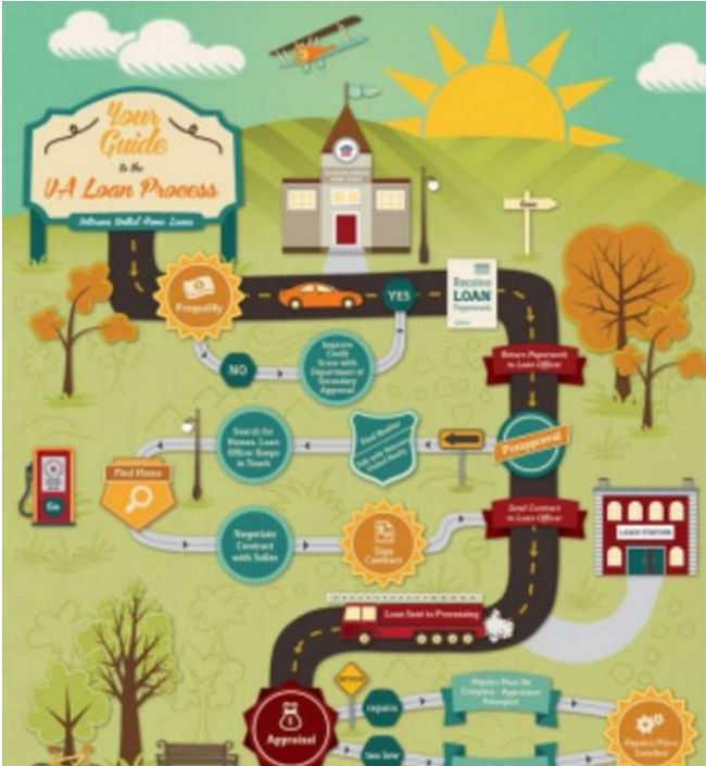
Process Infographics – demonstrates a linear or branching process as a how to, teaches the workings of an object or flow chart showing choices in a decision process.
进程信息图——演示了一种线性或分支的进程,作为一种方法,讲授一个物体的运行,或者是一个流程展示一个决策过程中的各种选择。
Informational Infographics – are most likely a poster that summarizes topic with some extra bits of information.
信息图表——更像是一张海报,用一些额外的信息总结主题。
Geographic Infographics – displays data with a location map.
地理信息图——用一张地理位置图展示数据。
Compare/Contrast Infographics – illustrates notable similarities or differences as a “this versus that” infographic or as a table or simple list.
比较/对比信息图——展示显著的相似或差异作为”这与那相比"信息图,或一个表格或列表。
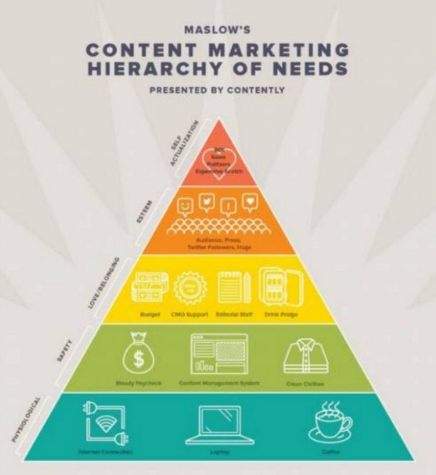
Hierarchical Infographics – demonstrates a chart with levels.
层级信息图——通过不同层级展示一个图表。
Research-based Infographics – similar to the statistical infographic, but based on research. Can be used to compare unlike items with popular sets of data
调研为基础的信息图——类似于统计信息图,但基于调研生成。可以被用于比较不同的条目的各组数据。
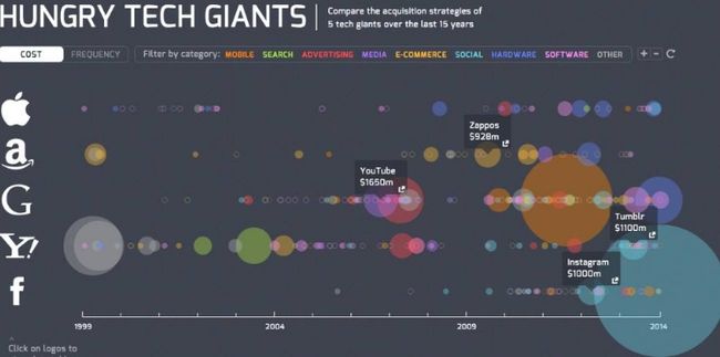
Interactive Infographics – gives viewers the control to modify the infographic and is web-based.
交互图——观看者可以调整信息图的展示,这种图是用于网页的。
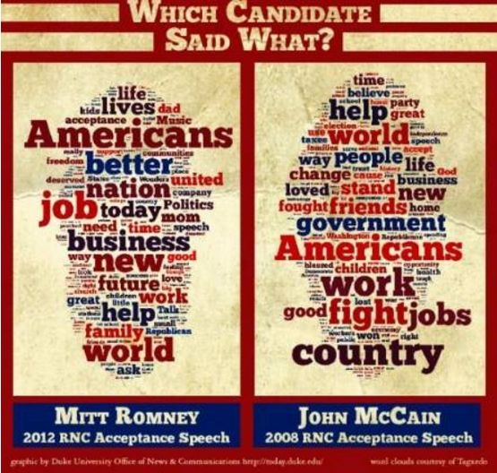
Word cloud Infographics – displays a cluster of words to show associations between words and concept.
词汇云图——通过一团词汇展示词汇与概念之间的联系。
How you want your story to be told determines which type of infographic you should choose. Want to visualize a story about running barefoot in the ruins of a lost civilization in Mexico? You can use a timeline infographic if you want to focus on the history of running barefoot. Or a compare infographic if you want to focus on comparing running barefoot versus running with shoes. Or a statistical infographic if you want to just focus on the benefits of running barefoot with data or numbers.
你讲述故事的方式决定了你应该选择哪种图表类型。想把一个关于“赤脚在墨西哥失落文明的废墟中奔跑”的故事视觉化?如果你想专注于光脚跑步的历史,可以使用时间轴图表。或者如果你想重点比较赤脚跑步与穿鞋跑步的话,可以用一个比较图表。如果你只想通过数据或数字专注于赤脚跑步的好处,可以用一个统计图表。
At the end of this step, you should have a good idea of what type of infographic you want to create.
这一步骤的最后,对于你想创建什么类型的图表,你需要有一个好主意。
3. Get the relevant data for your story
More boring stuff next – getting the data. There are 3 approaches to getting your data to make your infographic.
Your own data – if you took the data driven approach to infographics, you are probably using your own data. Even if you didn’t, your organization or company may have data on the subject or story you want to write about. Ask around. Send some emails.
下一个更无聊的东西——获取数据。获取数据有3种方法。
你自己的数据——如果你采用数据驱动类型的信息图,你可能就要使用自己的数据。即使你没有,你的组织或公司可能有你要写的主题或故事的相关数据。问问周围人。写些电子邮件。
Original research – OC (original content) is king! Nothing beats OC. You don’t need a research team or a data scientist for this. And unless you’ve got a big budget don’t even think of paying a research or marketing firm for this. You can roll your own survey research with a tool like survey monkey or Google Forms. Or with manual coding of data. We’re writing an article about how we do our own research. I’ll add a link to it here once it’s done.
原创调研——OC(原创内容)为王!没有什么比得过OC。你不需要一个研究团队或数据科学家。除非你有一个大的预算,甚至不要企图为此付出一个调研或营销公司。你可以用一个工具,如 survey monkey 或Google Forms来开始你自己的调研。或用手工编码的数据。我们正在写一篇文章关于我们如何做自己的研究的。一旦完成,我会在这里添加一个链接到那篇文章。
Data sources – there are plenty of public and private data sources out there. Here is a short list:
数据资源——大量的公共数据源和私人数据源。这里是一个简短的清单:
Data.gov – this is the US government’s open data website. You can search for all kinds of public data from healthcare data to economic data. It takes a bit of digging to get the datasets, but worth exploring.
Data.gov——这是美国政府的数据开放网站。你可以搜索各种类型的公共数据,从医疗保健数据到经济数据的。得到数据包需要一点挖掘,但值得探索。
UN data – UN data is international/world data on a variety of subjects such as employment, poverty, population, export/import numbers, growth,..etc. There are 34 databases in total and you can filter by country.
UN data——UN data是国际/世界数据,包含各种主题,如就业、贫困、人口、出口/进口数量、增长等。共有34个数据库,你可以根据国家筛选。
Google Public Data – Google has a search engine specifically for searching publicly available data. This is a good place to start as you can search a large amount of datasets in one place.
Google Public Data ——谷歌有一个专门用于搜索公开可用数据的搜索引擎。这是一个开始收集的好地方,因为你可以在这一个地方搜索大量的数据集。
Pew Research Data – Pew Research is think tank that does a lot of research and polling in the areas of public interest such as internet, science and technology trends, global attitudes, religion and public life, and social and demographic trends. This is one of my favorite places to visit. They also publish excellent reports and make all their datasets available for download.
Pew Research Data ——Pew Research是智囊团,因为它在公共利益的各个领域做了大量的研究和民
意调查,如互联网,科学和技术趋势,全球态度,宗教和公共生活,以及社会和人口趋势。这是我最喜欢访问的地方之一。他们还发布了优秀的报告,并且所有数据集都可供下载。
World Bank – The World bank has a lot of financial and economic data. Great if you want high level data.
World Bank——世界银行有大量的金融和经济数据。非常给力,如果你想要高水平的数据。
World Economic Forum – WE forum has more nuanced data on a variety of topics. Their data are embedded in their reports.
World Economic Forum——WE论坛上有各种主题的更精准的数据。他们的数据嵌入在他们的报告中。
Statista – this is data aggregator that has thousands of data sets. It is a paid service though you do get some interesting data sets unavailable publicly.
Statista——这里是数据聚合,有成千上万的数据组。这是一个有偿的服务,虽然你确实得到了一些有趣的数据组,不可公开。
The rough guide here is to find at least one data set or number per story point. At the end of this step, you should have all the data you need to start putting your infographic together.
大致指引到在这里,每个故事点至少能找到一个数据集或数字。这一步的最后要说的是,你应该收集所有需要的数据,然后把你的信息图整理一起。
4. Design your infographic
设计你的信息图形
Ok – you’ve got the story, the type of infographic and the data. Now you have to put them all together into an attractive looking infographic. I’m not going to lie. For a non-designer, creating a beautiful infographic from scratch is not easy. I’m sorry if you were led to believe that you can click a few buttons and magic appears.
Ok——现在你已经有了故事,信息图表和数据类型。现在你要把它们放在一起,组成一个有视觉吸引力的图表。不是我要说谎。对一个一个非设计师而言,从零开始创建一个漂亮的图表没那么容易。如果有人让你相信你可以点击几个按钮然后魔术就会出现,那我很抱歉。
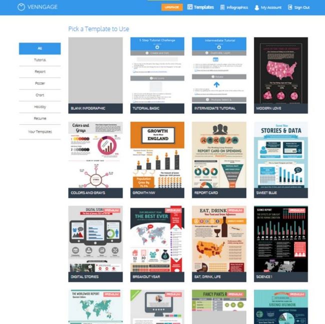
Personally, I’ve been doing this for years and I still kind of suck at it. My infographics still look amateurish. How did I get better? By looking and copying the best infographics out there, and by using ready made templates. That’s why Venngage has templates – to inspire and hopefully make your job easier.
就我个人而言,我已经做了很多年了,但我仍然做得有点烂。。。我的图表看起来还是业余的。我怎么会变得更好?通过观察和模仿最棒的图表,利用现成的模板。这就是Venngage会有模板的原因——鼓舞并希望使你的工作更轻松。
Here is the hack I still use today:
这是我今天仍然使用的方法:
1. Go to Pinterest and search for “Infographics”.
2. Go to the Templates page of Venngage (you have to be logged in).
3. Pick one or a few you like. Then use that as the base style.
4. Create an outline of the infographic with all the charts and elements (on paper)
5. Create the infographic on a tool like Venngage (using the outline and template)
6. Change the color, fonts and other elements to create your own style derivative.
1.去Pinterest,搜索“图表”。
2.去venngage模板页面(你需要登录)。
3.选择一个或几个你喜欢的。然后使用该作为基本样式。
4.创建所有的图表和图表元素的轮廓(在纸上)
5.在类似venngage的工具上创建图表(使用大纲和模板)
6.改变颜色,字体和其他元素创建你自己的风格衍生物。
On color schemes:
The best way to pick a good color scheme is to look at other infographics for inspiration. Or if you like a particular color, you can use Color Lovers to find color schemes that match a particular color. It’s a great tool. I use it all the time.
关于配色方案:
选择一个好的配色方案最好的办法就是看看其他图表寻找灵感。或者如果你喜欢一个特定的颜色,你可以使用 Color Lovers 找到匹配特定颜色的配色方案。这是一个伟大的工具,我一直在使用它。
On fonts:
I’m not a big fan of using many different fonts. Two is often enough. Stick to one type of font – either Sans Serif types or Serif type fonts, for consistency. What’s the difference?
关于字体:
我不是一个使用许多不同的字体的大粉丝。一般两种字体就够了。坚持一种字体——要么无衬线字体要么衬线字体,保持一致性。有什么区别?
Left is an example of a serif font, the right is sans serif
左边是衬线字体的一个例子,右边是无衬线字体的
A lot of people will tell you to use Sans Serif fonts for a more modern digital look and Serif fonts for more traditional print look. I think it depends on what you want and your style. My go-to font is Helvetica or Arial but that is because I’m a minimalist. But I recently read an article on the NYT about how Sans Serif fonts makes us believe something is true. People trust old school fonts more for conveying information. Go figure.
很多人会告诉你使用无衬线字体看起来更具现代数码感,衬线字体更具传统的印刷感。我认为这取决于你想要什么以及你的风格。我一惯使用的字体是Helvetica或Arial,但这是因为我是一个极简主义者。但我最近读了NYT 上的一篇文章,关于“无衬线字体使我们相信有些事是真的”。对于传达信息人们相信旧的学校字体更多一些。仔细想一想...
On layouts:
Pick a layout and put everything together. Stick with a simple grid for symmetry and ease of reading. I’m a stickler for symmetry and uneven margins bother me more than they should. The infographic should be well balanced. If you stick to a grid system, you should be fine. If you’ve created an outline or picked a template, you should just follow that layout.
关于布局:
选择一个布局,把所有内容放在一起。考虑对称性和易用性阅读,坚持一个简单网格。我是一个对称强迫症患者,两边不相等的留白会让我很难受。一张信息图应该是平衡的。如果你坚持一个网格系统,应该很好。如果你已经创建了一个轮廓或选择了一个模板,你应该遵循其布局。
On chart types:
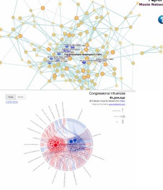
Most people have the tendency to think that data visualization has to be big and complex in order to deliver an impact. How many people actually know how to interpret a dense network diagram or something like a chord diagram?
关于图表类型:
大多数人都有这样的倾向,认为数据可视化必须是大的和复杂的,以传达一种影响力。有多少人真的知道如何诠释一个密集的网络图或像和弦图一样的东西?
Stick to charts you would expect in an Excel spreadsheet – bar, column, line, pie or bubble charts. Or better still, just use words and numbers if charts aren’t necessary. Tell your readers the story point instead of expecting them to interpret the data.
坚持使用你会在一个Excel电子表格中期望得到的图表——栏,列,行,饼图或气泡图。或者更好的是,只用的文字和数字,如果图表是没有必要。把故事点告诉你的读者,而不是期望让他们去搞懂数据。
It’s all about readability. In the age of newspapers, editors used to tell their writers to stick to a grade 5-7 readability level when writing articles. Keep the charts simple, guys.
这都是关于可读性。在报纸时代,编辑曾告诉他们的作家写文章时要坚持5-7年级水平的可读性。请保持简单的图表,伙计们。
On outlines:
关于草稿:
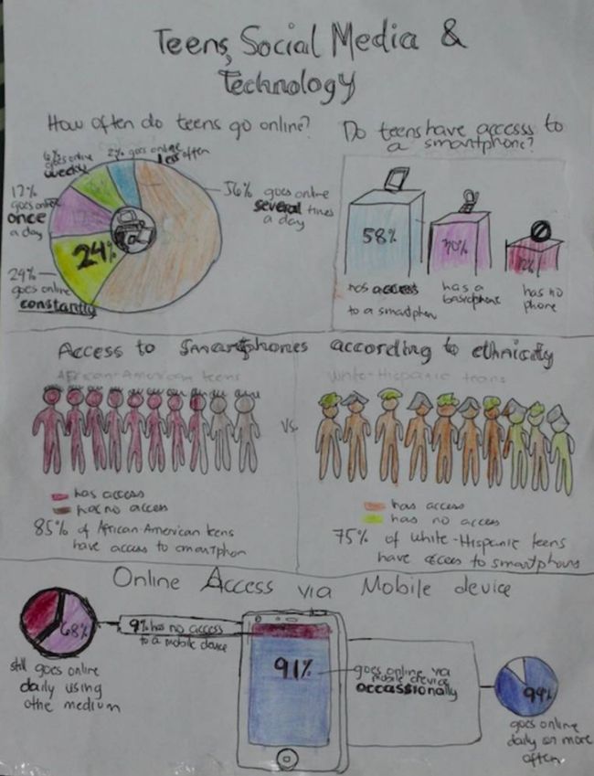
Before you dive into actually creating the infographic, it is a good idea to create an outline on paper. It helps with organizing the flow of the story. Here’s an example of one we recently did. (This one has a bit more detail than the usual outline, but you get the point)
在你开始实际地创建的图表之前,先画草稿是一个好主意,它有助于组织故事的流程。这里是我们最近做的一个例子。(这个比一般草图有更多的细节,但你可以看得懂)
Lastly, you use a digital tool to get it all together, with a proper headline, sub headers and additional information such as sources and a call to action. For example, from the outline above, we created this (click on it to see the full infographic):
最后,用一个数字工具,把其所有内容整理到一起,加一个适当的标题,子标题和额外的信息,如来源和电话。例如,从上面的草图,我们创造了这个(点击查看完整图表):
5. Promote your infographic
5.推广你的信息图
Congratulations! You’re finally done with the infographic. Not really. If you’re creating the infographic for marketing purposes, you’ve got one more step, and that’s promoting it. After all, there is no point creating content if no one sees it, is there?
恭喜你!终于完成了这张信息图。不完全是。如果你创建的是营销目的的信息图,你还有一步要做,就是推广它。归根结底,如果没有人看到,创作内容是没有意义的,对吧?
Here are some methods on how to promote your infographics:
关于如何推广你的信息图这里有一些方法:
● Share on all your social channels
● Send out an email newsletter. Check out how to make emails more engaging with infographics here.
● Ask your advocates to share explicitly.
● Post it on social discovery sites like Stumbled Upon, Reddit, Imgur..etc.
● Outreach – find bloggers who will benefit from sharing your infographic. I wrote a bit about this in How we got 200k signups with an Infographic.
● 在你所有的社交渠道分享
● 发送电子邮件。点这里查看怎样通过信息图使电子邮件更令人愉快。
● 要求你的支持者明确地分享。
● 把它张贴在社交搜索网站像Stumbled Upon、Reddit、Imgur等。
● 外展——找那些可以分享你的信息图表并从中获益的博客。关于这个我在“我们如何通过一个图表获得200K的注册量”写了一点。
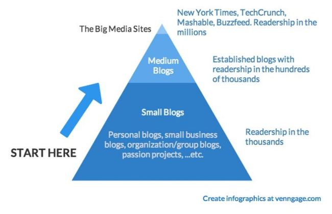
If you’re not a big brand with a large following, you’ll get limited mileage on most of these methods without determined effort on outreach. Outreach is an unavoidable necessity. It’s like cold calling and door to door selling. It works, but usually not how you would expect it to. You have to start small, at the bottom of the influencer pyramid and work your way up.
如果你不是一个拥有大批追随者的大品牌,通过大多数这些方法不在外展上下一番苦功夫你很难得到较大的推广范围。外展具有不可避免的必要性。这就像是打电话和上门推销。它有作用,但通常不是你会期望的那样。你必须从小事做起,从影响力金字塔的底层,努力一步步提升上去。
That’s it. Thanks for making it this far. Hopefully this was somewhat useful. Let us know if you need more details on any of the steps above. Comment below or send us an email at [email protected].
就这些。感谢你坚持了这么多。希望这篇文章对你有点用处。如果上述任何步骤你需要更多的细节,请让我们知道。
译者:Color
原文链接: https://venngage.com/blog/how-to-make-an-infographic-in-5-steps/
声明:本文由设计夹翻译小组成员Color翻译,如需转载,请申请授权并保留译者全部信息,转载合作请添加微信:sezign01
