This is going to be a recap of my learning CSS. mainly focus on some tricks that I have encountered.
** Cascade Order (increasing priority) **
- External
- In the
- Inline style attribute
- Using
!important
also the priority is dependent on position in document
.intro {
    color: #444;
}
.intro {
    color: #555;
} // this color will be shown
Float
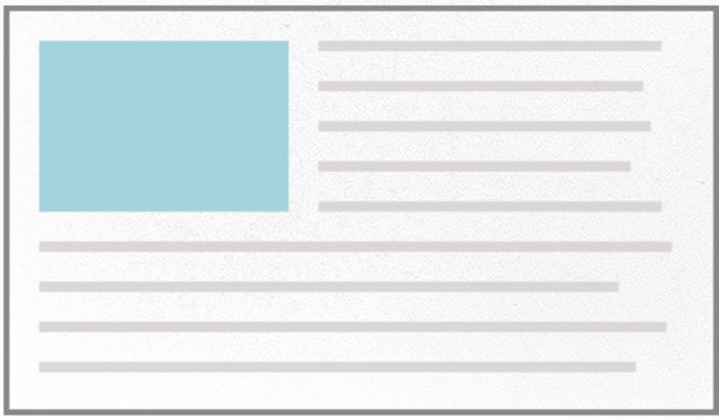
Its main function is to remove elements from the document flow and moves them to a specified edge
- Other content within the parent element will wrap around floats
float: left /right /none /inheret
- Stacking order
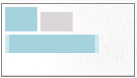
Floated elements stack up to the parent edge, (you can imagine there is gravity pulling elements from one side). then move down to the next available edge
Be aware with elements that have different heights
Ok, we now have some knowledge of what float does. And here comes the most confusing problem along with floating, and the reason why we need to use clear technique
*** the problem***
Generally, the element will stay right within the border of its parent element.
however, if this element got floated, it would jump out of normal flow and at the same time parent container collapse.
solution
first lets assume this situation happens.
- clear with a subsequent element
- use
overflow: hiddenonwrapper
don't forget to addfloat: left;onfooter.
this solution works except for one situation which usesbox-shadowon the child elements - clearfix
.clear:after{
    clear: both;
    content: "";
    display: table;
}
let's see how float is useful
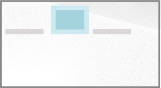
- Generate a horizontal menu
The priority of a selector
we can use following number to represent the priority of selectors
for example -->
p { color: #aaa; }   //           0,0,0,1
.intro { color: #bbb;} //         0,0,1,0
#bingo {color: #ccc;} //          0,1,0,0
 //  1,0,0,0
p { color: #eee !important;}         //  dominant over others
following demo
will show red because the red number outweighs blue one
     haha
     lala


#content p{
    color: red;  // 0,1,0,1
}

.line {
    color: blue; // 0,0,1,0
}
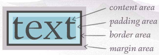
The box model
Width
Total calculated box width =
content width +
padding width +
border width
p {
    boder: 5px solid red;
    padding-left: 10px;
    padding-right: 5px;
    width: 100px;
}
then the total width is 5+10+5+100 = 125px
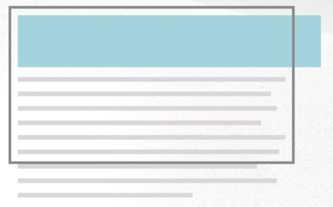
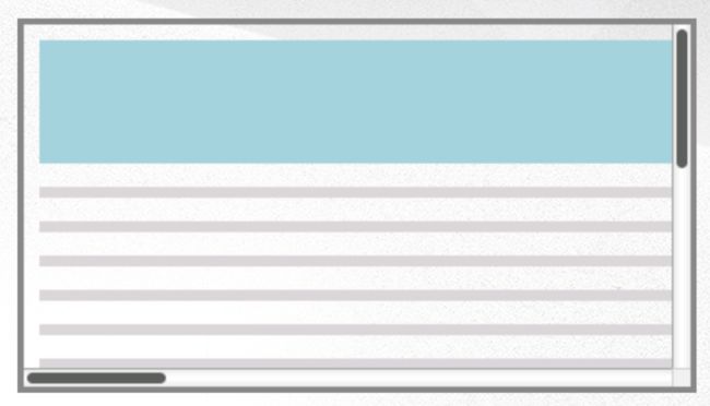
Overflow property
overflow: visible /auto /hidden /scroll
-
visible: the default value, which allows content to extend beyong container boundries.
-
auto: adds a scrollbar as needed when content overflows
-
hidden: hides content that extends beyond the container
-
scroll: adds a scrollbar at all times, ever if unneeded
Positioning
position: static /relative /absolute /fixed
elements have a position value of static by default
Using a value other than static causes an object to become a positioned element
Positioned elements may use the top, left, bottom, and right properties for placement
- Relative positioning
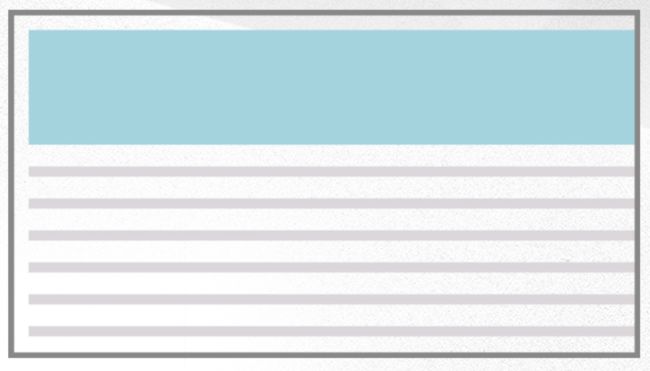
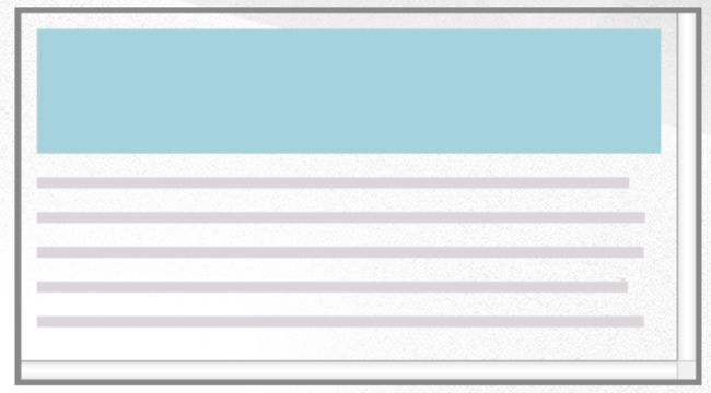
Renders in the normal flow, then shifted via positioning properties
demo - Absolute positioning
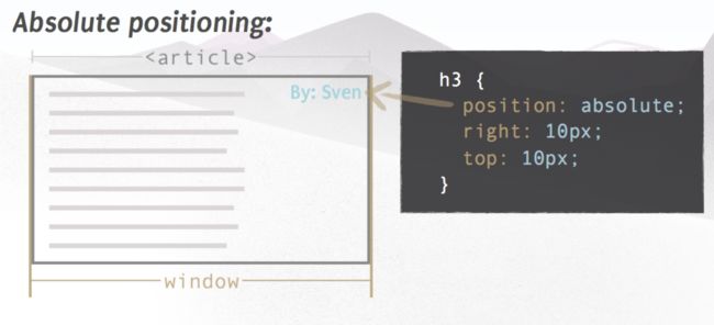
Takes an element out of the normal flow for manual positioning
    New Snowshoes
    By Garret
     This season's hot styles, available now!

h3{
    position: absolute;
    right: 10px;
    top: 10px;
}
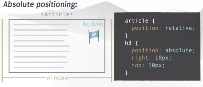
*Notice the position is relative to the window object *
if you want the position is relative to parent. then need to make parent
not static. Generally we make parent
relative so that it would stay in flow.
- Z-index
-
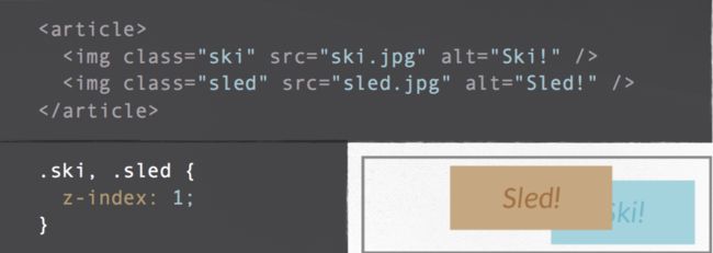
No z-index or equal z-index == overlap determined by placement in DOM
- Elements must be positioned for z-index to take effect. User
relativeif you're not interested in moving the object - Higher values appear above lower values
Display
display: none, block, inline, inline-block
- Block elements
- Stretch the full width of their container
- Behave as though there is a line break before and after the element
- Full box model can be manipulated
- Tags that are block-level by default: ,
,andthrough- Inline elements
- Typically found within block-level elements
- Only take up the space of the content inside
- Do not generate a line break before and after the content
- Tags that are inline-level by default:
,,,
- Inline-block elements
Same flow as an inline element but behave as a block element
Centering
- Centering a block-level element
- Define a width, and the element width must be less than that of the parent container
-
maring: 0 auto;
- Centering inline and inline-block elements
text-align: center
CSS Safety
- margin collapsing
only vertical margin collapse, and horizontal margin never collapse W3.Collapsing margins will not occur when one or more block element has: - Padding or border
- Relative or absolute positioning
- A float left or right
Image
image usage
content should be marked up as inline images
Layout elements should be defined as background images
image replacement
text-indent: -9999px;sprite and base-64 encode
