探索单一变量:
2.1 分析单一变量
To understand
- the types of values they take on,
- what the distributions look like,
- whether there are missing values or outliers,
通常用histograms, box plots, frequency polygons这些基础的但是很有用的TOOLS来分析单变量,经常还需要调整x轴的尺度和 bin width。
还经常做数据变形transforming to uncover hidden patterns of our data.
2.2 MARKDOWN Tutorial:


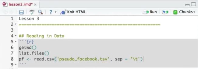
2.3 伪Facebook用户数据的处理
- 查看文件夹中所有的文件:list.files()
- 设置目录路径: setwd('目录地址')
- 查看当前路径: getwd()
- 读入分隔符为制表符的文件: pf <- read.csv('xx.tsv', sep = '\t')
-
查看数据集中的变量名:names(pf) 这里pf是数据集
2.4 分面facet
qplot(x = dob_day, data = pf) +
scale_x_continuous(breaks = 1:31) +
facet_wrap(~dob_month, ncol = 3)


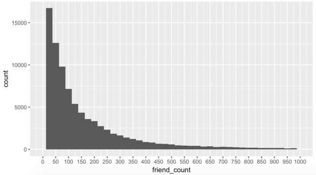
2.5 限制轴 Limiting the Axes
qplot(x = friend_count, data = pf, xlim = c(0,1000))
qplot(x = friend_count, data = pf) +
scale_x_continous(limits = c(0,1000))
2.6 调整组宽 Bin Width
qplot(x = friend_count, data = pf, binwidth = 25) +
scale_x_continuous(limits = c(0, 1000), breaks = seq(0, 1000, 50))
2.7 在上面已经调整Bin Width的情况下继续调整,观察不同性别的分组会有怎样的差异:
qplot(x = friend_count, data = pf, binwidth = 25) +
scale_x_continuous(limits = c(0, 1000), breaks = seq(0,1000, 50)) +
facet_wrap(~gender)

可见,上图中有男、女、NA,在R中NA代表missing value.
2.8 生成子数据集(subset),排除掉NA:
qplot(x = friend_count, data = subset(pf, !is.na(gender)),
binwidth = 10) +
scale_x_continuous(limits = c(0, 1000), breaks = seq(0, 1000, 50)) +
facet_wrap(~gender)

2.9 除了subset取子集的方法,还有一种方法:
qplot(x = friend_count, data = na.omit(pf), binwidth = 10) +
scale_x_continuous(lim = c(0, 1000), breaks = seq(0, 1000, 50)) +
facet_wrap(~gender)

但是这种方法不仅是排除了gender 我NA的情况,也去掉了其他missing values.
2.10 按性别“划分”的统计学, “by” 命令,by命令的第1个参数是变量,第2个是分类变量,第3个是函数function.
table(pf$gender)
by(pf$friend_count, pf$gender, summary)
可以看出来男性朋友多还是女性朋友多?我们通过中位数来看

2.11 查看使用时长Tenure, 使用了颜色填充,在这里组宽是30,代表30天,一个月
qplot(x = tenure, data = pf, binwidth = 30,
color = I('black'), fill = I('#099DD9'))

2.12 上面是按月来看的,接下来看看每年用户数:
qplot(x = tenure/365, data = pf, binwidth = 1,
color = I('black'), fill = I('#F79420'))

2.13 为了使上面的图形更好看,将bin width调整成0.25
qplot(x = tenure/365, data = pf, binwidth = 0.25,
color = I('black'), fill = I('#F79420'))

2.14 为了使横坐标x更直观,调整一下x坐标轴的参数
qplot(x = tenure/365, data = pf, binwidth = 0.25,
color = I('black'), fill = I('#F79420')) +
scale_x_continuous(breaks = seq(1,7,1), limits = c(0, 7))

2.15 标记图形,Labeling Plots
qplot(x = tenure/365, data = pf,
xlab = 'Number of years using Facebook',
ylab = 'Number of years in sample',
color = I('black'), fill = I('#F79420')) +
scale_x_continuous(breaks = seq(1,7,1), limits = c(0, 7))

2.16 用户年龄
用户年龄:
qplot(x = age, data = pf)

qplot(x = age, data = pf, binwidth = 1,
fill = I('#5760AB')) +
scale_x_continuous(breaks = seq(0, 113, 5))

2.17 转换数据Transforming Data, 常用的方法是取log值、平方根
qplot(x = friend_count, data = pf)
summary(pf$friend_count)
summary(log10(pf$friend_count + 1))
summary(sqrt(pf$friend_count))
2.18 将原始值和变形之后的值做出直方图
library(gridExtra)
- 方法1:
p1 <- qplot(x = friend_count, data = pf)
p2 <- qplot(x = log10(friend_count + 1), data = pf)
p3 <- qplot(x = sqrt(friend_count), data = pf)
grid.arrange(p1, p2, p3, ncol = 1)

- 方法2:
p1 <- ggplot(aes(x = friend_count), data = pf) + geom_histogram()
p2 <- p1 + scale_x_log10()
p3 <- p1 + scale_x_sqrt()
grid.arrange(p1, p2, p3, ncol = 1)

2.19 添加定标层Add a Scaling Layer
logScale <- qplot(x = log10(friend_count), data = pf)
countScale <- ggplot(aes(x = friend_count), data = pf) +
geom_histogram() +
scale_x_log10()
grid.arrange(logScale, countScale, ncol = 2)
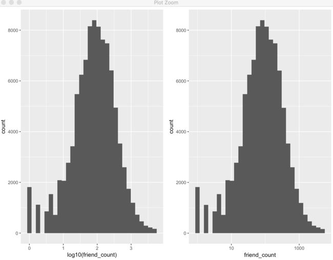
- 添加了之后,x轴的label变成friend_count了:
qplot(x = friend_count, data = pf) +
scale_x_log10()

2.20 频率多边形
original:
qplot(x = friend_count, data = subset(pf, !is.na(gender)),
binwidth = 10) +
scale_x_continuous(lim = c(0, 1000), breaks = seq(0, 1000, 50)) +
facet_wrap(~gender)

modified to frequent polygons:因为qplot默认如果是单变量的话就是直方图
qplot(x = friend_count, data = subset(pf, !is.na(gender)),
binwidth = 10, geom = 'freqpoly', color = gender) +
scale_x_continuous(lim = c(0, 1000), breaks = seq(0, 1000, 50))

可见,好处就是一幅图中可以画出多个变量。然而,男性朋友多还是女性朋友多,不能单凭count值来判断,对y轴的变量做修改:
qplot(x = friend_count, y = ..count../sum(..count..),
data = subset(pf, !is.na(gender)),
xlab = 'Friend Count',
ylab = 'Proportion of Users with that friend count',
binwidth = 10, geom = 'freqpoly', color = gender) +
scale_x_continuous(lim = c(0, 1000), breaks = seq(0, 1000, 50))

频率多边形---- www_likes变量:
qplot(x = www_likes, data = subset(pf, !is.na(gender)),
geom = 'freqpoly', color = gender) +
scale_x_continuous()
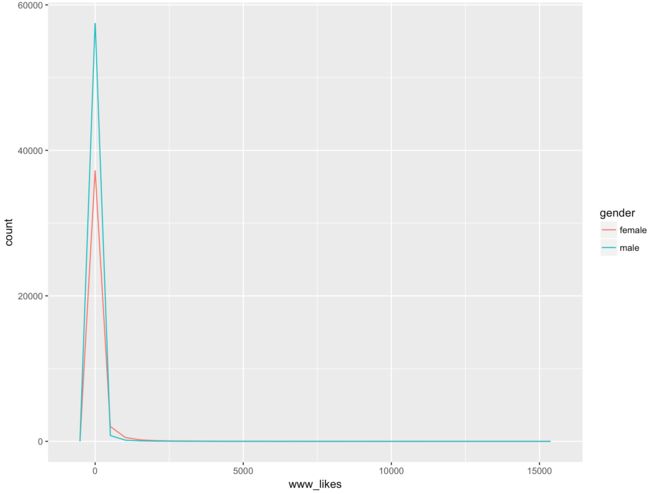
这幅图是长尾的,看不出什么来,下面尝试变形取log值观察图形是否改善:
qplot(x = www_likes, data = subset(pf, !is.na(gender)),
geom = 'freqpoly', color = gender) +
scale_x_continuous() +
scale_x_log10()

2.21 网页端上的“点赞”数:男性多还是女性多?可以用by函数来回答:

2.22 Histograms 直方图
qplot(x = friend_count, data = subset(pf, !is.na(gender)),
binwidth = 25) +
scale_x_continuous(limits = c(0, 1000), breaks = seq(0, 1000, 50)) +
facet_wrap(~gender)

Box Plots 箱线图
qplot(x = gender, y = friend_count,
data = subset(pf, !is.na(gender)),
geom = 'boxplot')

可见,异常点非常的多,这里异常点的定义是超过了1.5倍的IQR
箱子中间的横线是median值
让我们调整一下y轴的值域,使得箱型图内部更明晰,有2种方法做到:
方法1:使用ylim来调整:
qplot(x = gender, y = friend_count,
data = subset(pf, !is.na(gender)),
geom = 'boxplot', ylim = c(0, 1000))

方法2: 使用scale_y_continuous调整:
qplot(x = gender, y = friend_count,
data = subset(pf, !is.na(gender)),
geom = 'boxplot') +
scale_y_continuous(limits = c(0, 1000))

2者得到的图是一样的
在这里,使用 coord_cartersian方法比前面2种方法更好:
qplot(x = gender, y = friend_count,
data = subset(pf, !is.na(gender)),
geom = 'boxplot') +
coord_cartesian(ylim = c(0, 1000))

我们的目的是想知道男性朋友多还是女性朋友多,图中可见女性中位数值要略高,把图zoom in 之后看个清楚:
qplot(x = gender, y = friend_count,
data = subset(pf, !is.na(gender)),
geom = 'boxplot') +
coord_cartesian(ylim = c(0, 250))

可见,75%的女性有的朋友少于大概250, 男性更低。再查看统计量:
by(pf$friend_count, pf$gender, summary)

得到的统计数据显示,75%的女性的朋友数少于242个,25%的女性朋友书超过了244个。从数据来看,女性的朋友数多于男性的。
接着,来看一下friendships_initiated 朋友发起数这个变量的情况:
qplot(x = gender, y = friendships_initiated,
data = subset(pf, !is.na(gender)), geom = 'boxplot') +
coord_cartesian(ylim = c(0, 500))

看起来,女性的中位数似乎略高于男性的,zoom in一下查看:
qplot(x = gender, y = friendships_initiated,
data = subset(pf, !is.na(gender)), geom = 'boxplot') +
coord_cartesian(ylim = c(0, 150))

这样看起来,女性的确比男性略高,再用by函数查看具体统计量:
by(pf$friendships_initiated, pf$gender, summary)
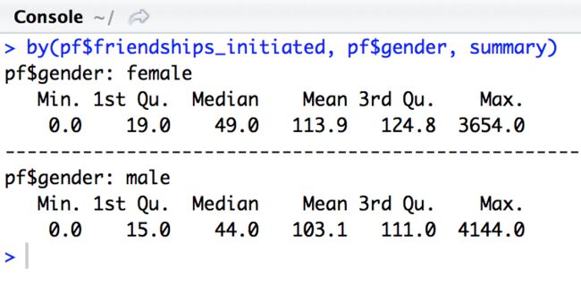
用统计量,就能知道结果,为什么我们还要给他们制作箱线图呢?
- 这是因为,从箱线图中我们可以看到分布,我们的分类变量中每个分段的中间50%值,还能感知到异常值,所以得到的信息量大于仅仅只看统计值。
回顾(Review):
- 本小节学习了仔细观察数据集中单个变量的重要性,了解所呈现数值的类型和其分布的形式,以及是否有缺失值或异常值。
- 我们的做法是某种程度上使用直方图、箱线图和频数多边形,这些都是可视化和了解单变量的最基本的、最重要的工具。
- 我们还对这些图形进行了调整,比如,更改一些轴上的极限、调整了直方图上的组距、用对数对变量进行了变换、或者将其变成二进制来发现数据后面隐藏的模式(uncover hidden patterns)。
author: 快乐自由拉菲犬Celine Zhang