python数据可视化:使用Bokeh(上)
数据
一份关于保险的数据:链接在此。
数据描述
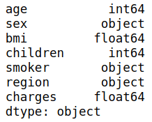
- age:年龄
- sex:性别
- bmi:体重指数(BMI)是基于身高和体重的体脂指标
- children:孩子个数
- smoker:是否吸烟
- region:区位
- charges:收费
预处理
import numpy as np
import pandas as pd
from bokeh.io import output_file, show, output_notebook, push_notebook
from bokeh.plotting import figure
from bokeh.models import ColumnDataSource, HoverTool  # Dataframe处理,hover组件
from bokeh.layouts import row, column, gridplot  #布局相关部件
from bokeh.models.widgets import Tabs, Panel
from bokeh.palettes import Spectral6  # 导入colormap
from bokeh.transform import linear_cmap
from bokeh.io import export_png  # 保存为png
import warnings
output_notebook()
warnings.filterwarnings('ignore')

# 数据导入
insurance = pd.read_csv('insurance.csv')
insurance.head()

# 查看数据类型
insurance.dtypes
# 查看缺失值, 没有缺失值
insurance.isna().sum()

# 数据描述
insurance.describe(include='all')

没有缺失值
Bokeh
Bokeh (Bokeh.js) 是一个 Python 交互式可视化库,支持现代化 Web 浏览器,提供非常完美的展示功能。Bokeh 的目标是使用 D3.js 样式提供优雅,简洁新颖的图形化风格,同时提供大型数据集的高性能交互功能。Boken 可以快速的创建交互式的绘图,仪表盘和数据应用。
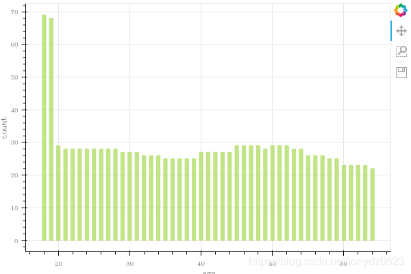
条形图
# 获取年龄分布
age = insurance.sort_values('age').age.value_counts(sort=False)

# 设置长宽,xy轴标题,功能表等
p = figure(plot_width=600, plot_height=400,x_axis_label = "age",
           y_axis_label = "count",tools = "pan,box_zoom,save")
# 直立条状图绘制,通过bottom和top控制条位置,color设置颜色,alpha设置不透明度,width控制间隔
p.vbar(x=age.index, width=0.5, bottom=0, top=age.values,
       color="#B3DE69", alpha=0.8)
# show显示图
export_png(p, 'vbar.png')
show(p)
折线图
# 求不同age的平均bmi
age_avg_bmi = insurance['bmi'].groupby(insurance.age).mean()

# 设置长宽,xy轴标题,功能表等
p = figure(plot_width=600, plot_height=300,x_axis_label = "age",
           y_axis_label = "bmi",tools = "pan,box_zoom,save")
#
p.line(x=age_avg_bmi.index, y=age_avg_bmi.values, line_width=3)
p.circle(x=age_avg_bmi.index, y=age_avg_bmi.values, fill_color='white',size=8)
# show显示图
export_png(p, 'line.png')
show(p)

虽然不明显但是还是有随年龄的增长bmi逐渐提高的趋势
散点图
# 用法跟seaborn有些像,用ColumnDataSource获取一个DataFrame的数据
source = ColumnDataSource(insurance)
# 设值数据选取方式
p = figure(tools="box_select,lasso_select")
# 被选中的数据会发生颜色上的变化
p.circle(x="bmi",y="charges",source = source, color = "black",
        selection_color = "orange",   # 选取的数据颜色变化
        nonselection_fill_alpha = 0.2,  # 未被选取数据透明度
        nonselection_fill_color = "blue")  # 未被选取数据颜色变化
show(p)

Hover用法
hover = HoverTool(tooltips = [("children","@children")], mode="hline")
# 设值数据选取方式
p = figure(tools=[hover, 'crosshair'])
# 被选中的数据会发生颜色上的变化
p.circle(x="age",y="charges",source = source, color = "green",
        hover_color = "red")   # 鼠标悬停是颜色更改
show(p)

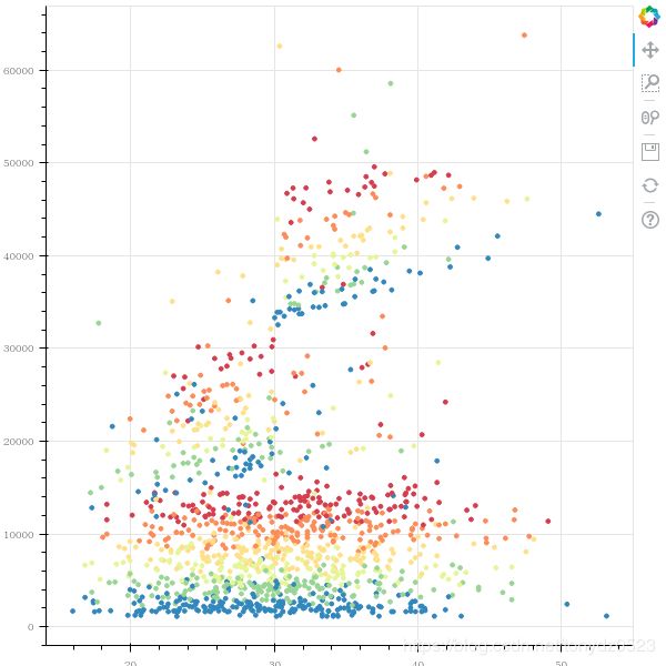
colormap使用
mapper = linear_cmap(field_name='age', palette=Spectral6 ,low=min(insurance.age) ,high=max(insurance.age))
p = figure()
# 被选中的数据会发生颜色上的变化
p.circle(x="bmi",y="charges",source = source, color = mapper)   # 鼠标悬停是颜色更改
export_png(p, 'scatter.png')
show(p)
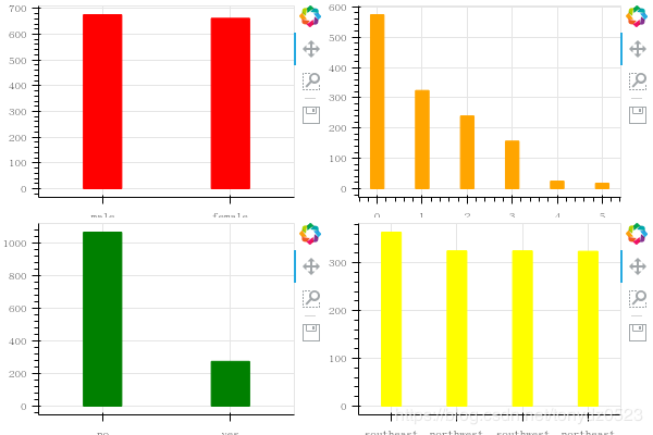
分区域布局
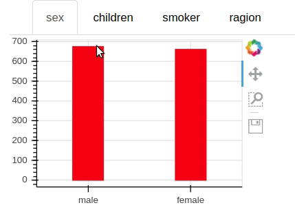
# 获取相关性别数据分类
sex = insurance.sex.value_counts()
p1 = figure(x_range=sex.index.tolist(), tools = "pan,box_zoom,save",
           plot_width=300, plot_height=200)
p1.vbar(x=sex.index, bottom=0, width=0.3,
        top=sex.values, color="red")
# 不同孩子数的人数
children = insurance.children.value_counts()
p2 = figure(tools = "pan,box_zoom,save",
           plot_width=300, plot_height=200)
p2.vbar(x=children.index, bottom=0, width=0.3,
        top=children.values, color="orange")
# 获取是否吸烟人数
smoker = insurance.smoker.value_counts()
p3 = figure(x_range=smoker.index.tolist(), tools = "pan,box_zoom,save",
           plot_width=300, plot_height=200)
p3.vbar(x=smoker.index, bottom=0, width=0.3,
        top=smoker.values, color="green")
# 获取区域数据
region = insurance.region.value_counts()
p4 = figure(x_range=region.index.tolist(), tools = "pan,box_zoom,save",
           plot_width=300, plot_height=200)
p4.vbar(x=region.index, bottom=0, width=0.3,
        top=region.values, color="yellow")
layout1 = row(p1, p2)
layout2 = row(p3, p4)
layout_c = column(layout1, layout2)
export_png(layout_c, 'layout.png')
show(layout_c)
标签布局
tab1 = Panel(child = p1,title = "sex")
tab2 = Panel(child = p2,title = "children")
tab3 = Panel(child = p3,title = "smoker")
tab4 = Panel(child = p4,title = "ragion")
tabs = Tabs(tabs=[tab1,tab2,tab3,tab4])
show(tabs)