React ECharts 使用后小结
react ECharts 使用后小结
本文主要讲述在react中使用ECharts图表工具echarts-for-react,文中列举出三个例子,即饼图Pie 折线图Line 柱状图Bar.
安装依赖echarts-for-react
npm install echarts-for-react --save
效果图
饼图Pie

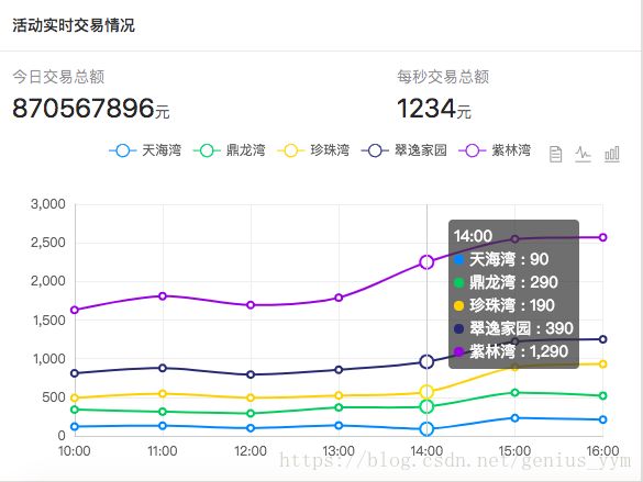
折线图Line
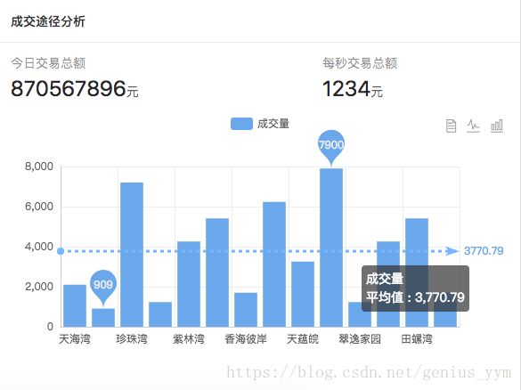
柱状图Bar
使用
1. 基本使用
import ReactEcharts from 'echarts-for-react';
var echartsOption = { } //配置项
render() {
 return (
  <ReactEcharts
    ref={(e) => { this.echartsElement = e }}
    option={echartsOption}
    theme="clear"
 />
 )
}
2.案例使用
针对不同的图表,只需改echartsOption配置即可
// 饼图Pie
var colorArr = ['#1890ff', '#2fc25b', '#facc14', '#223273', '#8543e0', '#13c2c2', '#3436c7', '#f04864'];
var echartsOption = {
  tooltip: {
      trigger: 'item',
      formatter: "{a}
{b}: {c} ({d}%)"
  },
  legend: {
      orient: 'vertical',
      x: 'left',
      data:['天海湾','鼎龙湾','珍珠湾','翠逸家园','紫林湾'] //需要对应 series 的 name值
  },
  color: colorArr,
  series: [
      {
        name:'访问来源',
        type:'pie',
        radius: ['50%', '70%'],
        avoidLabelOverlap: false,
        label: {
          normal: {
              show: false,
              position: 'center'
          },
          emphasis: {
              show: true,
              textStyle: {
                  fontSize: '20',
                  fontWeight: 'bold'
              }
          }
        },
        labelLine: {
            normal: {
                show: false
            }
        },
        data:[ //由于颜色的原因,这里应该对数据做一下排序~
          {value:1548, name:'天海湾'},
          {value:510, name:'鼎龙湾'},
          {value:338, name:'珍珠湾'},
          {value:265, name:'翠逸家园'},
          {value:220, name:'紫林湾'}
        ]
      }
  ]
};
//折线图Line
var colorArr = ['#1890ff', '#2fc25b', '#facc14', '#223273', '#8543e0', '#13c2c2', '#3436c7', '#f04864'];
var echartsOption = {
  title: {
      text: ' '
  },
  tooltip: {
      trigger: 'axis'
  },
  legend: { //需要对应 series 的 name值
      data:['天海湾','鼎龙湾','珍珠湾','翠逸家园','紫林湾']
  },
  color: colorArr,
  grid: {
      left: '3%',
      right: '4%',
      bottom: '3%',
      containLabel: true
  },
  toolbox: {
      feature: {
        dataView : {show: true, readOnly: false},
        magicType : {show: true, type: ['line', 'bar']},
        // saveAsImage: {} //存取为图片
      }
  },

  xAxis: {
      type: 'category',
      boundaryGap: false,
      data: ['10:00','11:00','12:00','13:00','14:00','15:00','16:00']
  },
  yAxis: {
      type: 'value'
  },
  series: [
      {
          name:'天海湾',
          type:'line',
          stack: '总量',
          data:[120, 132, 101, 134, 90, 230, 210]
      },
      {
          name:'鼎龙湾',
          type:'line',
          stack: '总量',
          data:[220, 182, 191, 234, 290, 330, 310]
      },
      {
          name:'珍珠湾',
          type:'line',
          stack: '总量',
          data:[150, 232, 201, 154, 190, 330, 410]
      },
      {
          name:'翠逸家园',
          type:'line',
          stack: '总量',
          data:[320, 332, 301, 334, 390, 330, 320]
      },
      {
          name:'紫林湾',
          type:'line',
          stack: '总量',
          data:[820, 932, 901, 934, 1290, 1330, 1320]
      }
  ]
};
//柱状图Bar
var echartsOption = {
  title : {
    text: ' ',
    subtext: ' '
  },
  tooltip : {
    trigger: 'axis',
    axisPointer : {// 坐标轴指示器,坐标轴触发有效
      type : 'line'// 默认为直线,可选为:'line' | 'shadow'
    }
  },
  legend: {
    data:['成交量']
  },
  toolbox: {
    show : true,
    feature : {
      dataView : {show: true, readOnly: false},
      magicType : {show: true, type: ['line', 'bar']},
    }
  },
  calculable : true,
  xAxis : [
    {
      type : 'category',
      data : ['天海湾','鼎龙湾','珍珠湾','翠逸家园','紫林湾', '田螺湾', '香海彼岸', "花城都汇", "天蕴皖",'珍珠湾','翠逸家园','紫林湾', '田螺湾', '香海彼岸']
    }
  ],
  yAxis : [
    {
      type : 'value'
    }
  ],
  series : [
      {
          name:'成交量',
          type:'bar',
          data:[2100, 909, 7200, 1232, 4256, 5409, 1700, 6232, 3256, 7900, 1232, 4256, 5409, 1700],
          markPoint : {
              data : [
                  {type : 'max', name: '最大值'},
                  {type : 'min', name: '最小值'}
              ]
          },
          markLine : {
              data : [
                  {type : 'average', name: '平均值'}
              ]
          }
      }
  ]
};
最后
具体配置项,可以直接访问官网http://echarts.baidu.com/api.html#echarts,
或者点击这里查看常用的具体配置项https://blog.csdn.net/genius_yym/article/details/80886792