Python点滴(三)—pandas数据分析与matplotlib画图
本篇博文主要介绍使用python中的matplotlib模块进行简单画图功能,我们这里画出了一个柱形图来对比两位同学之间的不同成绩,和使用pandas进行简单的数据分析工作,主要包括打开csv文件读取特定行列进行加减增加删除操作,计算滑动均值,进行画图显示等等;其中还包括一段关于ipython的基本使用指令,比较naive欢迎各位指正交流!
mlp.rc动态配置
你可以在python脚本或者python交互式环境里动态的改变默认rc配置。所有的rc配置变量称为matplotlib.rcParams 使用字典格式存储,它在matplotlib中是全局可见的。rcParams可以直接修改,如:
import matplotlib as mpl
mpl.rcParams['lines.linewidth'] = 2
mpl.rcParams['lines.color'] = 'r'
Matplotlib还提供了一些便利函数来修改rc配置。matplotlib.rc()命令利用关键字参数来一次性修改一个属性的多个设置:
import matplotlib as mpl
mpl.rc('lines', linewidth=2, color='r')
在日常的数据统计分析的过程当中,大量的数据无法直观的观察出来,需要我们使用各种工具从不同角度侧面分析数据之间的变化与差异,而画图无疑是一个比较有效的方法;下面我们将使用python中的画图工具包matplotlib.pyplot来画一个柱形图,通过一个小示例的形式熟悉了解一下mpl的基本使用:
#!/usr/bin/env python
# coding: utf-8
#from matplotlib import backends
import matplotlib.pyplot as plt
import matplotlib as mpl
mpl.use('Agg')
import numpy as np
from PIL import Image
import pylab

custom_font = mpl.font_manager.FontProperties(fname='C:\\Anaconda\\Lib\\site-packages\\matplotlib\\mpl-data\\fonts\\ttf\\huawenxihei.ttf')
# 必须配置中文字体,否则会显示成方块
# 所有希望图表显示的中文必须为unicode格式,为方便起见我们将字体文件重命名为拼音形式 custom_font表示自定义字体

font_size = 10 # 字体大小
fig_size = (8, 6) # 图表大小

names = (u'小刚', u'小芳') # 姓名元组
subjects = (u'物理', u'化学', u'生物') # 学科元组
scores = ((65, 80, 72), (75, 90, 85)) # 成绩元组


mpl.rcParams['font.size'] = font_size   # 更改默认更新字体大小
mpl.rcParams['figure.figsize'] = fig_size   # 修改默认更新图表大小
bar_width = 0.35   # 设置柱形图宽度

index = np.arange(len(scores[0]))

# 绘制“小明”的成绩 index表示柱形图左边x的坐标
rects1 = plt.bar(index, scores[0], bar_width, color='#0072BC', label=names[0])
# 绘制“小红”的成绩
rects2 = plt.bar(index + bar_width, scores[1], bar_width, color='#ED1C24', label=names[1])

plt.xticks(index + bar_width, subjects, fontproperties=custom_font)        # X轴标题
plt.ylim(ymax=100, ymin=0)        # Y轴范围

plt.title(u'彩虹班同学成绩对比', fontproperties=custom_font)     # 图表标题

plt.legend(loc='upper center', bbox_to_anchor=(0.5, -0.03), fancybox=True, ncol=2, prop=custom_font)
# 图例显示在图表下方 似乎左就是右,右就是左,上就是下,下就是上,center就是center
# bbox_to_anchor左下角的位置? ncol就是numbers of column默认为1


# 添加数据标签 就是矩形上面的成绩数字
def add_labels(rects):
    for rect in rects:
        height = rect.get_height()
        plt.text(rect.get_x() + rect.get_width() / 2, height, height, ha='center', va='bottom')
        # horizontalalignment='center' plt.text(x坐标,y坐标,text,位置)
        # 柱形图边缘用白色填充,为了更加清晰可分辨
        rect.set_edgecolor('white')

add_labels(rects1)
add_labels(rects2)


plt.savefig('scores_par.png')   # 图表输出到本地
#pylab.imshow('scores_par.png')
pylab.show('scores_par.png')    # 并打印显示图片


ipython:
run命令, 运行一个.py脚本, 但是好处是, 与运行完了以后这个.py文件里的变量都可以在Ipython里继续访问;
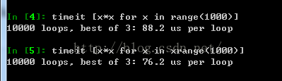
timeit命令, 可以用来做基准测试(benchmarking), 测试一个命令(或者一个函数)的运行时间,
debug命令: 当有exception异常的时候, 在console里输入debug即可打开debugger,在debugger里, 输入u,d(up, down)查看stack, 输入q退出debugger;
$ipython notebook会打开浏览器,新建一个notebook,一个非常有意思的地方;
alt+Enter: 运行程序, 并自动在后面新建一个cell;
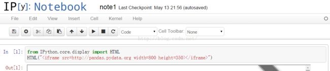
在notebook中是可以实现的
from IPython.core.display import HTML
HTML("")
import datetime

import pandas as pd
import pandas.io.data
from pandas import Series, DataFrame
pd.__version__
Out[2]:
'0.11.0'
In [3]:
import matplotlib.pyplot as plt
import matplotlib as mpl
mpl.rc('figure', figsize=(8, 7))     # rc设置全局画图参数
mpl.__version__
Out[3]:
'1.2.1'
labels = ['a', 'b', 'c', 'd', 'e']
s = Series([1, 2, 3, 4, 5], index=labels)
s
Out[4]:
a 1
b 2
c 3
d 4
e 5
dtype: int64
In [5]:
'b' in s
Out[5]:
True
In [6]:
s['b']
Out[6]:
2
In [7]:
mapping = s.to_dict() # 映射为字典
mapping
Out[7]:
{'a': 1, 'b': 2, 'c': 3, 'd': 4, 'e': 5}
In [8]:
Series(mapping) # 映射为序列
Out[8]:
a 1
b 2
c 3
d 4
e 5
dtype: int64pandas自带练习例子数据,数据为金融数据;
aapl = pd.io.data.get_data_yahoo('AAPL',
                                 start=datetime.datetime(2006, 10, 1),
                                 end=datetime.datetime(2012, 1, 1))
aapl.head()
df = pd.read_csv('C:\\Anaconda\\Lib\\site-packages\\matplotlib\\mpl-data\\sample_data\\aapl_ohlc.csv', index_col='Date', parse_dates=True)
df.head()
df.index
ts = df['Close'][-10:]   #截取'Close'列倒数十行
ts
df[['Open', 'Close']].head() #只要Open Close列
New columns can be added on the fly.
df['diff'] = df.Open - df.Close   #添加新一列
df.head()
...and deleted on the fly.
del df['diff']
df.head()