本文主要为笔者学习kaggle实战项目“Daily sea ice exten data”时心得笔记,项目主要利用NSIDC提供的每日海冰面积(sea ice extent)数据进行数据分析,学习源代码为Mathew Savage:visualisation of sea-ice data,仅供交流参考。
- kaggle实战之海冰面积序列数据的分析(1):库的载入
- kaggle实战之海冰面积序列数据的分析(2):数据预处理
- kaggle实战之海冰面积序列数据的分析(3):时间序列分析
3 时间序列分析
3.1 海冰的逐日变化
因为数据直接为每日数据,因此无需进行数据处理。通过想x-y折线图表现出逐日变化。
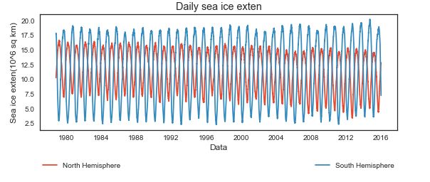
- 主体figure
plt.figureplt.plot
通过plt.figure(figsize=(9,3))指定纸张大小,将两副图叠加绘制
plt.figure(figsize=(9,3))
plt.plot(north.index,north['Extent'],label="North Hemisphere")
plt.plot(south.index,south['Extent'],label="South Hemisphere")
- 图例legend
plt.legend
#add plot legend and titles
plt.legend(bbox_to_anchor=(0.,-.363,1.,.102),loc=3,ncol=2,mode="expand",borderaxespad=0)
bbox_to_anchor=(0.,-.363,1.,.102)指定锚点 (x,y,width,height)一般只用x,y
loc=3表示图标位于左下,也可以使用·loc=“lower left·”这里可以省略
ncol=2表示图标有几列,这里是两列
mode=expand {"expand", None}水平填充满坐标区域摆放
borderaxespad=0 边界与坐标轴之间的距离
- 标题和x/y轴标签 title&label
plt.titleplt.xlabelplt.ylabel
plt.ylabel("Sea ice exten(10^6 sq km)")
plt.xlabel('Data')
plt.title('Daily sea ice exten')
3.2 海冰的逐年变化
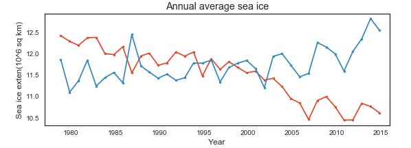
3.2.1 时间序列的resample
重采样指将时间序列从一个频率转换到另外一个频率,包括downsampling(高频到低频)和upsampling(低频到高频)
resample的相关参数:
- freq='12m','5min','Second(15)' 采样频率
- how='mean','sum','max',‘min’,'fist','last','median' 采样方式(‘ohlc’金融计算开盘收盘最高最低的采样方式)
- axis=0 采样的轴
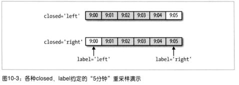
- closed=‘right’,'left' 即时间哪一段是包含的
- label=‘right’,‘left’ 时间哪一段是标记的9:30-9:35 默认right即为9:35标记
- loffset=None/‘-1s’ 用于聚合标签调早1秒
- kind=None 聚合到时期‘period’或‘timestamp’,默认聚集到时间序列的索引类型
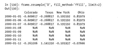
- fill_method ffile或者bfill
- limit=none 填充期数
需要对数据求月平均,这里使用了north.resample即panda对象的resample方法来进行重采样
例子
各区间哪边是闭合的?如何标记哪个?
降采样 -聚合 close、label
ts.resample('5min',how='sum')
groupby采样:
ts.groupby(lambda x:x.month).mean()
ts.groupby(lambda x:x.weekday).mean()
升采样:插值!fill_method limit
df_daily=frame.resample('D',fill_method='ffill')
3.2.2 对海冰序列进行降频处理
由‘D’转为‘12M’采样,采样方式为求平均
#resample raw data into annual averages
northyear=north.resample('12M',how='mean')
southyear=south.resample('12M',how='mean')
默认右边封闭,标记右边。因为最初和最末的数据可能会不全,因此将其删去。
#remove the initial and final itmes as they are averageed incoorrectly
northyear=northyear[1:-1]
southyear=southyear[1:-1]
3.2.2 绘图
#plot
plt.figure(figsize=(9,3))
plt.plot(northyear.Year,northyear['Extent'],marker='.',label='North hemisphere')
plt.plot(southyear.Year,southyear['Extent'],marker='.',label='South Hemisphere')
#add plot legend and title
plt.xlabel('Year')
plt.ylabel('Sea ice exten(10^6 sq km)')
plt.title('Annual average sea ice')
plt.xlim(1977,2016)
- 通过
plt.xlim对坐标进行限制
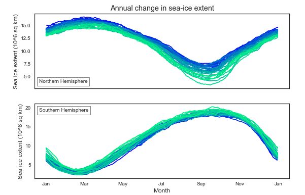
3.3 海冰的逐月变化
#difine date range to plot between
start=1978
end=dt.datetime.now().year+1
画两幅子图使用plt.subplots,通过设置sharex共享x轴,返回f-画布控制对象,axarr图形控制对象。
#defien plot
f,axarr=plt.subplots(2,sharex=True,figsize=(9,6))
设置主坐标格标注格式axarr.xaxis.set_major_formatter(mdates.DateFormatter("%b"))
绘图时的颜色循环绘图,因此需要渐变色
axarr.set_pro_cycle(plt.cycler('color',plt.cm.winter(np.linspace(0,1,len(range(sater,end)))))
#orgnise plot axxes
month_fmt=mdates.DateFormatter("%b")
axarr[0].xaxis.set_major_formatter(month_fmt)
axarr[0].set_prop_cycle(plt.cycler('color',plt.cm.winter(np.linspace(0,1,len(range(start,end))))))
axarr[1].set_prop_cycle(plt.cycler('color',plt.cm.winter(np.linspace(0,1,len(range(start, end))))))
设置子图的图例和坐标,使用axarr.set_xlabel,axarr.set_ylabel,axarr.set_title设置坐标名和标题名
axarr.add_artist(AnchoredText())添加文本框,loc指文本框位置
#add legend and title
axarr[0].set_ylabel('Sea ice extent (10^6 sq km)')
axarr[1].set_ylabel('Sea ice extent (10^6 sq km)')
axarr[1].set_xlabel('Month')
axarr[0].set_title('Annual change in sea-ice extent');
axarr[0].add_artist(AnchoredText('Northern Hemisphere', loc=3))
axarr[1].add_artist(AnchoredText('Southern Hemisphere', loc=2))
作者绘图并不是通过计算海冰月平均来展现每月的变化。而是通过循环绘制每年的海冰变化。因此这里需要在一张图上循环绘图。为了使得绘图都在同一个坐标上,认为设定将‘Year’值都定位了1972年。不需要采样,直接绘图即可。
# loop for every year between the start year and current
for year in range(start, end):
    # create new dataframe for each year,
    # and set the year to 1972 so all are plotted on the same axis
    nyeardf = north[['Extent', 'Day', 'Month']][north['Year'] == year]
    nyeardf['Year'] = 1972
    nyeardf['Date'] = pd.to_datetime(nyeardf[['Year','Month','Day']])
    nyeardf.index = nyeardf['Date'].values

    syeardf = south[['Extent', 'Day', 'Month']][south['Year'] == year]
    syeardf['Year'] = 1972
    syeardf['Date'] = pd.to_datetime(syeardf[['Year','Month','Day']])
    syeardf.index = syeardf['Date'].values
   # plot each year individually
    axarr[0].plot(nyeardf.index,nyeardf['Extent'], label = year)
    axarr[1].plot(syeardf.index,syeardf['Extent'])
3.4 小结
本章学习重点:时间序列数据的重采样,x-y轴图的绘制。
3.5 完整代码
plt.figure(figsize=(9,3))
plt.plot(north.index,north['Extent'],label="North Hemisphere")
plt.plot(south.index,south['Extent'],label="South Hemisphere")

#add plot legend and titles
#plt.legend(bbox_to_anchor=(0.,-.363,1.,.102),loc=3,ncol=2,mode="expand",borderaxespad=0)
plt.legend(bbox_to_anchor=(0.1,-0.1,0.8,0),ncol=2,mode="expand",borderaxespad=0)

plt.ylabel("Sea ice exten(10^6 sq km)")
plt.xlabel('Data')
plt.title('Daily sea ice exten')

#difine date range to plot between
start=1978
end=dt.datetime.now().year+1

#defien plot
f,axarr=plt.subplots(2,sharex=True,figsize=(9,6))

#orgnise plot axxes
month_fmt=mdates.DateFormatter("%b")
axarr[0].xaxis.set_major_formatter(month_fmt)
axarr[0].set_prop_cycle(plt.cycler('color',plt.cm.winter(np.linspace(0,1,len(range(start,end))))))
axarr[1].set_prop_cycle(plt.cycler('color',plt.cm.winter(np.linspace(0,1,len(range(start, end))))))

#add legend and title
axarr[0].set_ylabel('Sea ice extent (10^6 sq km)')
axarr[1].set_ylabel('Sea ice extent (10^6 sq km)')
axarr[1].set_xlabel('Month')
axarr[0].set_title('Annual change in sea-ice extent');
axarr[0].add_artist(AnchoredText('Northern Hemisphere', loc=3))
axarr[1].add_artist(AnchoredText('Southern Hemisphere', loc=2))

# loop for every year between the start year and current
for year in range(start, end):
  # create new dataframe for each year,
  # and set the year to 1972 so all are plotted on the same axis
  nyeardf = north[['Extent', 'Day', 'Month']][north['Year'] == year]
  nyeardf['Year'] = 1972
  nyeardf['Date'] = pd.to_datetime(nyeardf[['Year','Month','Day']])
  nyeardf.index = nyeardf['Date'].values

  syeardf = south[['Extent', 'Day', 'Month']][south['Year'] == year]
  syeardf['Year'] = 1972
  syeardf['Date'] = pd.to_datetime(syeardf[['Year','Month','Day']])
  syeardf.index = syeardf['Date'].values

  # plot each year individually
  axarr[0].plot(nyeardf.index,nyeardf['Extent'], label = year)
  axarr[1].plot(syeardf.index,syeardf['Extent'])