Text Field and Text Area Widgets
文本框和文本域部件


Text fields and text areas are form controls that users can type responses into in the web browser.
文本字段和文本区域是用户可以在web浏览器中输入响应的表单控件。
Use a text field widget when prototyping a form field for which a short (single-line) response is expected, such as a username or password field. (These are also good for search fields.)
当原型化一个表单字段时,需要一个简短的(单行)响应,例如用户名或密码字段,请使用文本字段小部件。(这些也适用于搜索字段。)
Use the text area widget when prototyping a form field for which a long (multi-line) response is expected, such as a feedback form.
当原型化一个表单字段时,需要很长(多行)的响应(如反馈表单),请使用文本区域小部件。
Note
提示Text areas are just multi-line text fields, and they behave the same as text fields in the web browser (except with respect to input types, which are exclusive to text fields).
文本区域只是多行文本字段,它们的行为与web浏览器中的文本字段相同(除了输入类型之外,输入类型是文本字段独有的)。
1、Hint Text
提示文本

You can add hint text to a text field/area using the Hint Text field in the More Properties menu at the top-right of the Interactions pane. Hint text will appear in a text field/area until the user interacts with it, at which time it will disappear to allow the user to fill in the input as needed.
您可以使用** interaction 窗格右上角的More Properties菜单中的提示文本**字段向文本字段/区域添加提示文本。提示文本将出现在文本字段/区域中,直到用户与之交互,这时提示文本将消失,以便用户根据需要填写输入。
Hint text is grey by default and appears in the font applied to the text field/area. To change the hint text's styling, select the :hint style effect at the top of the Interactions pane.
提示文本默认为灰色,并以应用到文本字段/区域的字体显示。要更改提示文本的样式,请在** interaction 窗格的顶部选择:hint** style效果。
You can choose whether the hint text will be hidden after the text field/area has been focused or after the user starts typing. Use the Hide After dropdown in the More Properties menu to make your selection.
您可以选择提示文本是在文本字段/区域被聚焦后隐藏,还是在用户开始输入后隐藏。使用更多属性菜单下拉菜单中的**隐藏来进行选择。
2、Input Types (Text Fields Only)
输入类型(仅限文本字段)
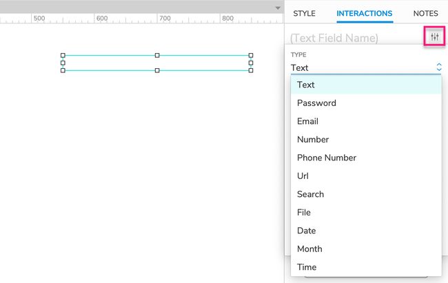
You can give text field widgets different input types to denote their function in a user input form. Use the Type dropdown in the More Properties menu in the Interactions pane to select the input type for a text field.
可以为文本字段小部件提供不同的输入类型,以在用户输入表单中表示它们的功能。使用** interaction 窗格中的More Properties菜单中的Type**下拉菜单为文本字段选择输入类型。
Keep in mind that web browsers often apply their own styling to certain types of text fields. In addition, when you select a text field on a mobile device, some field types will cause a different type of keyboard to appear, such as a number keypad instead of the alphanumeric keyboard.
请记住,web浏览器经常对某些类型的文本字段应用它们自己的样式。此外,当您在移动设备上选择文本字段时,某些字段类型将导致出现不同类型的键盘,例如数字键盘而不是字母数字键盘。
Note
提示Text field types are a feature of HTML, not an invention of Axure's — we're just giving you access to them. As such, you'll find that certain field types are more applicable to working in Axure RP than others.
文本字段类型是HTML的一个特性,而不是Axure的发明——我们只是让您访问它们。因此,您会发现某些字段类型比其他字段类型更适合在Axure RP中工作。
The different types of fields and the results of using that field type are as follows:
不同类型的字段和使用该字段类型的结果如下:
Text: Default setting used for basic text entry
文本:用于基本文本条目的默认设置Password: Text is masked as it is entered
密码:文本在输入时被屏蔽Email: May prompt an email keyboard on mobile devices
电子邮件:可能提示移动设备上的电子邮件键盘Number: Only accepts numeric input, may prompt a numeric keyboard on mobile devices
Number:只接受数字输入,可在移动设备上提示数字键盘Phone Number: May prompt a dial pad on mobile devices
电话号码:可提示移动设备上的拨号板URL: May prompt a URL-entry keyboard on mobile devices
URL:可能会在移动设备上提示URL输入键盘Search: May add a search button to keyboard on mobile devices. Some web browsers may add an "X" icon you can click to clear the field
搜索:可以在移动设备的键盘上添加一个搜索按钮。一些web浏览器可能会添加一个“X”图标,您可以单击该图标来清除字段File: Changes the text field into a file-upload button in the web browser, which will open the device’s file browser when clicked (though it is not possible to upload a file to an Axure RP prototype)
文件:将文本字段更改为web浏览器中的文件上传按钮,单击该按钮将打开设备的文件浏览器(尽管无法将文件上传到Axure RP原型)。Date: May prompt a browser-styled date picker or calendar control
Date:可能会提示一个浏览器样式的日期选择器或日历控件Month: May prompt a browser-styled month and year picker
月份:可能会提示一个浏览器样式的月份和年份选择器Time: May prompt a browser-styled time picker
时间:可能会提示一个浏览器风格的时间选择器
3、Tab Order
Tab顺序
Tab order for text fields, text areas, and other form widgets is determined by their layer depth, as shown in the Outline pane. You can learn more about this and how to change a widget's tab order in the Organizing Widgets article.
文本字段、文本区域和其他表单小部件的选项卡顺序由它们的层深度决定,如Outline窗格中所示。您可以在小部件组织文章中了解更多关于这方面的信息,以及如何更改小部件的选项卡顺序。
Special Properties
特殊属性

3.1、Maximum Length (Text Fields Only)
最大长度(仅限文本字段)
You can use the Max Length field in the More Properties menu in the Interactions pane to specify the maximum length of entry a text field will accept. The field will stop accepting additional text input once the maximum character length has been reached.
您可以使用** interaction 窗格中的More Properties菜单中的Max Length**字段来指定文本字段将接受的最大输入长度。一旦达到最大字符长度,字段将停止接受额外的文本输入。
3.2、Read Only
只读
When you set a text field/area to "read only," the text already on the widget can be seen and selected in the web browser, but it can't be changed by the user. To set a text field/area to read only, check the Read Only checkbox in the More Properties menu in the Interactions pane.
当您将文本字段/区域设置为“只读”时,小部件上已经存在的文本可以在web浏览器中看到和选择,但是用户不能更改它。要将文本字段/区域设置为只读,请选中** interaction 窗格中的More Properties菜单中的 read only **复选框。
4、Special Interactions
特殊交互
4.1、Capturing and Evaluating the Entered Text
获取并计算输入的文本
You can access the text entered in a text field or text area via the text on widget value option in actions and conditions. For example, you can set the value of a global variable to the text on a text field/area in order to carry that text over to a different page. You can also evaluate a text field or text area's text in a condition to only execute a certain case if the text matches a particular value, as you might do when verifying a username and password combination.
您可以通过操作和条件中的text on widget value选项访问在文本字段或文本区域中输入的文本。例如,可以将全局变量的值设置为文本字段/区域上的文本,以便将该文本转移到另一个页面。您还可以对文本字段或文本区域的文本求值,以便仅在文本匹配特定值的情况下执行特定情况,就像验证用户名和密码组合时所做的那样。
4.2、Submit Button
提交按钮

Pressing the ENTER key while a text field or text area has focus in the web browser can fire the Click or Tap event of another widget on the page, known as the text field/area's "submit button."
当文本字段或文本区域在web浏览器中有焦点时,按ENTER键可以触发页面上另一个小部件的单击或点击事件,称为文本字段/区域的“提交按钮”。
To assign a submit button to a text field/area, use the Submit Button dropdown in the More Properties menu in the Interactions pane to choose from a list of eligible widgets.
要将一个提交按钮分配给一个文本字段/区域,使用** interaction 窗格中的More Properties菜单中的提交按钮**下拉菜单从一个合格的小部件列表中进行选择。