4.1 Third Qualitative Variable 第三个定性变量
ggplot(aes(x = gender, y = age),
data = subset(pf, !is.na(gender))) + geom_boxplot() +
stat_summary(fun.y = mean, geom = 'point', shape = 4)

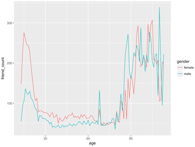
ggplot(aes(x = age, y = friend_count),
data = subset(pf, !is.na(gender))) +
geom_line(aes(color = gender), stat = 'summary', fun.y = median)
library(dplyr)
####### 方法1:
age_gender_groups <- group_by(pf, age,gender)
pf.fc_by_age_gender <- summarise(age_gender_groups,
mean_friend_count = mean(friend_count),
median_friend_count = median(friend_count),
n = n())
####### 方法2:chain functions together %>%
pf.fc_by_age_gender <- pf %>%
filter(!is.na(gender)) %>%
group_by(age, gender) %>%
summarise(mean_friend_count = mean(friend_count),
median_friend_count = median(friend_count),
n = n()) %>%
ungroup() %>%
arrange(age)
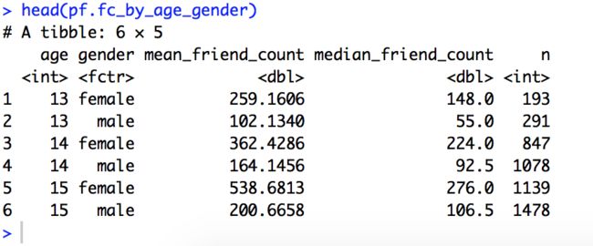
head(pf.fc_by_age_gender)
4.2 Plotting Conditional Summaries Solution
ggplot(aes(x = age, y = median_friend_count),
data = pf.fc_by_age_gender) +
geom_line(aes(color = gender))

Reshaping Data 重塑数据
install.packages('reshape2')
library(reshape2)
pf.fc_by_age_gender.wide <- dcast(pf.fc_by_age_gender,
age ~ gender,
value.var = 'median_friend_count')
head(pf.fc_by_age_gender.wide)
- dcast 从long变成wide
- nill 从wide变成long
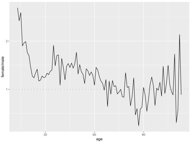
4.3 Ratio Plot Solution 比率图
ggplot(aes(x = age, y = female / male),
data = pf.fc_by_age_gender.wide) +
geom_line() +
geom_hline(yintercept = 1, alpha = 0.3, linetype = 2)
- 可见,年轻女性的朋友数量中位数甚至超过同龄男性的2.5倍
4.4 第三个定量变量
- 之前我们添加了第三个定型变量,现在看看添加一个新的定量变量:
pf$year_joined <- floor(2014 - pf$tenure/365)
我们在这里进行了向下取整
Cut a Variable 切割一个变量:
summary(pf$year_joined)
table(pf$year_joined)
- (2004-2009]
- (2009-2011]
- (2011-2012]
- (2012-2014]
pf$year_joined.bucket <- cut(pf$year_joined,
c(2004, 2009, 2011, 2012, 2014))
4.5 Plotting it All Together 绘制在一起
table(pf$year_joined.bucket, useNA = 'ifany')
table(pf$year_joined.bucket)
x轴:age, y轴:friend_count, 颜色变量:gender:
ggplot(aes(x = age, y = friend_count),
data = subset(pf, !is.na(gender))) +
geom_line(aes(color = gender), stat = 'summary', fun.y = median)
颜色用year_joined.bucket来分割:
ggplot(aes(x = age, y = friend_count),
data = subset(pf, !is.na(year_joined.bucket))) +
geom_line(aes(color = year_joined.bucket),
stat = 'summary',
fun.y = median)

4.6 练习任务:绘制总均值
(1) Add another geom_line to code below
to plot the grand mean of the friend count vs age:
ggplot(aes(x = age, y = friend_count),
data = subset(pf, !is.na(year_joined.bucket))) +
geom_line(aes(color = year_joined.bucket),
stat = 'summary',
fun.y = mean) +
geom_line(stat = 'summary',
fun.y = mean,
linetype = 2)

4.7 练习任务:Friending Rate Solution
with(subset(pf, tenure >= 1), summary(friend_count / tenure))
4.8 练习任务:申请好友数
Create a line graph of mean of friendships_initiated per day (of tenure)
vs. tenure colored by year_joined.bucket.You need to make use of the variables tenure,
friendships_initiated, and year_joined.bucket.You also need to subset the data to only consider user with at least
one day of tenure.
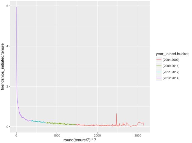
ggplot(aes(x = tenure, y = friendships_initiated/tenure),
data = subset(pf, tenure > 0)) +
geom_line(aes(color = year_joined.bucket), stat = 'summary', fun.y = mean)

- 我们发现,噪音蛮强的,
- 下面通过调整bin_width来降低噪音
ggplot(aes(x = round(tenure/7)7, y = friendships_initiated/tenure),
data = subset(pf, tenure > 0)) +
geom_line(aes(color = year_joined.bucket), stat = 'summary', fun.y = mean)
ggplot(aes(x = round(tenure/30)30, y = friendships_initiated/tenure),
data = subset(pf, tenure > 0)) +
geom_line(aes(color = year_joined.bucket), stat = 'summary', fun.y = mean)

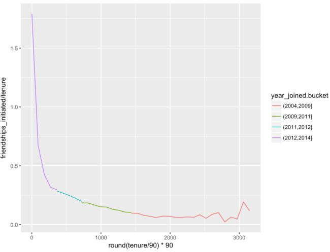
ggplot(aes(x = round(tenure/90)*90, y = friendships_initiated/tenure),
data = subset(pf, tenure > 0)) +
geom_line(aes(color = year_joined.bucket), stat = 'summary', fun.y = mean)
4.9 Bias-Variance Tradeoff Revisited 偏差方差折中
将平滑器添加到该图表:
ggplot(aes(x = tenure, y = friendships_initiated / tenure),
data = subset(pf, tenure >= 1)) +
geom_smooth(aes(color = year_joined.bucket))
-
在平滑版本中,我们依然看见新好友数随着使用时间的增加而下降

4.10 Yogurt!
Histograms Revisited
yo <- read.csv('yogurt.csv')
str(yo)
Change the id from an int to a factor 重访直方图
yo$id <- factor(yo$id)
str(yo)
qplot(data = yo, x = price, fill = I('#F79420'))
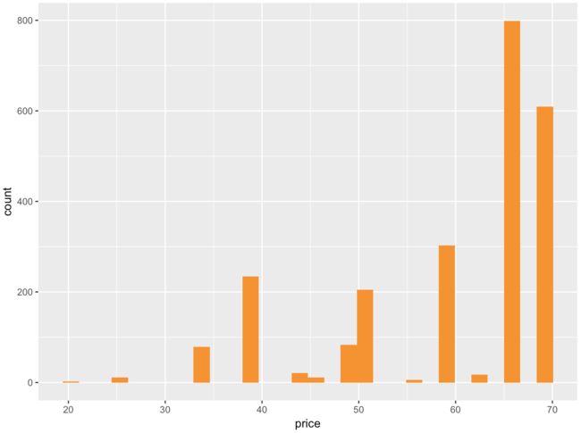
上图直方图太过于离散
调整一下组距
qplot(data = yo, x = price, fill = I('#F79420'), binwidth = 10)

- 调整之后的图形,会错过相邻价格的一些空白空间的观测值
这个直方图是一个有偏差的模型
4.11 Number of Purchases
summary(yo)
length(unique(yo$price))
table(yo$price)
str(yo)
yo$all.purchases <- yo$strawberry + yo$blueberry + yo$pina.colada + yo$plain + yo$mixed.berry
- 或者嫌上面的语句太繁琐的话,就用transform语句来做
yo <- transform(yo, all.purchases = strawberry + blueberry + pina.colada + plain + mixed.berry)
创建新的直方图,用我们上面刚创造的变量:总购买量
qplot(x = all.purchases, data = yo, binwidth = 1,
fill = I('#099DD9'))

- 从上图可见,大多数的家庭每次只买1-2份
qplot(x = time, y = price, data = yo)
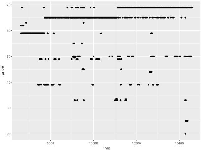
- 上图的重叠点太多,改用ggplot作图,用jitter抖动来减少重叠
ggplot(aes(x = time, y = price), data = yo) +
geom_jitter(alpha = 0.25)

- 可见,随着时间的推移,酸奶的价钱在涨,但是也不乏一些低价酸奶,有可能是商家活动
4.12 Looking at Samples of Households 查看家庭样本
Set the seed for reproducible results
set.seed(4239)
sample.ids <- sample(levels(yo$id), 16)
ggplot(aes(x = time, y = price),
data = subset(yo, id %in% sample.ids)) +
facet_wrap( ~ id) +
geom_line() +
geom_point(aes(size = all.purchases), pch = 1)

4.13 Scatterplot Matrices 散点图矩阵
library(GGally)
theme_set(theme_minimal(20))
Set the seed for reproducible results
set.seed(1836)
散点图对于数值变量来说很好,但是对于分类变量来说没啥意思,刨除掉2个分类变量:
pf_subset <- pf[, c(2:15)]
names(pf_subset)
ggpairs(pf_subset[sample.int(nrow(pf_subset), 1000), ])
- 上图可见,对角线以上的是相关系数
4.14 Even More Variable 更多变量
nci <- read.table('nci.tsv')
changing the columns to produce a nicer plot:
colnames(nci) <- c(1:64)
Create a Heat Map!热图
melt the data to long format:
library(reshape2)
nci.long.samp <- melt(as.matrix(nci[1:200, ]))
names(nci.long.samp) <- c('gene', 'case', 'value')
head(nci.long.samp)

make the heat map:
ggplot(aes(y = gene, x = case, fill = value),
data = nci.long.samp) +
geom_tile() +
scale_fill_gradientn(colours = colorRampPalette(c('blue','red'))(100))

小结:探索多变量这一块中学到了什么
- 我们采取你以前课程中学习的许多基本技巧,并对其扩展,以便一次调查多个变量的模式
- 我们从简单的散点图入手,并绘制前面学过的条件总结,例如为多个组添加总结
- 然后我们尝试采用一些技术来一次检查大量的变量,例如散点图矩阵和热图
- 我们还学会了如何重塑数据:从每种情况一行的广泛数据变成每个变量组合一行的总和数据
- 将数据在long和wide格式之间往返移动
author: 快乐自由拉菲犬Celine Zhang