效果展示图:
复习:
布局模型三种方式:流动模型、浮动模型、层模型
1.浮动float
left right none
清除浮动clear:left || right || both
浮动会使父元素塌陷,造成结构不能按照正常的顺序显示,会影响其他结构:
1.1 给父元素设置高度
1.2 外墙法
1.3 可以在父元素后面同级元素上设置清除浮动
1.4 内墙法:父元素内部的结尾处添加一个空的div,设置clear:both;
1.5 overflow:hidden || auto || scroll;
1.6 利用伪元素::after(建议)
ele:after{
display:block;
height:0;
content:””;
clear:both;
visibility:hidden;
zoom:1;
}
2.设置元素不可见
visibility:hidden; 元素消失占位
display:none; 元素消失消失不占位
opcity 设置元素的不透明度,属性值从 0-1 从完全透明到完全不透明
3. 背景相关属性
Background-color 背景颜色
Background-image 背景图片
Background-repeat 设置背景图片的平铺方式
属性值:
Repeat
Repeat-x
Repeat-y
No-repeat
Round
Space
Background-size:图片的宽度 图片的高度;
属性值可以是 百分比 像素值
注:如果只有一个参数,那么默认是宽度,高度自适应
Background-position:距离左边距离 距离上边的距离;
属性值可以是 百分比 英文字母 像素值
设置大背景居中 Background-position:50% top;
Background-attachment:scoll || fixed; 设置背景图片是否随页面滚动
注意;这个地方与元素位置无关,相对的是当前页面
多背景复合写法:
如果有多个背景图片,那么背景颜色的位置需要加在最后一个背景图片的前面
Background:image1 position/size repeat,
Image2 position/size repeat,
Color lastimage position/size repeat;
一、
雪碧图
又叫CSS精灵,CSSSprite;
引入雪碧图好处,减少http请求,可以使页面加载速度更快
雪碧图实现:利用背景相关属性实现,关键在于background-position位置的调整
淘宝案例:
特殊字母案例:
HTML代码:
- 充话费
- 旅行
- 旅行
- 旅行
- 旅行
- 旅行
- 旅行
- 旅行
- 找服务
- 旅行
- 找服务
- 找服务
CSS代码:
*{margin: 0;padding: 0;}
a{text-decoration: none;color: black;}
li{list-style: none;}
.ml1{
margin-left: 1px;
}
ul{
width: 291px;
height: 230px;
margin: 100px auto;
background: #f4f4f4;
/*overflow: hidden;*/
}
li{
float: left;
width: 72px;
height: 76px;
margin-top: 1px;
font-size: 12px;
text-align: center;
background: white;
}
i{
display: block;
height: 24px;
width: 26px;
margin:13px auto;
background: url(./images/csssprite.png) -23px -26px;
/*border: solid 1px;*/
}
li:nth-of-type(2) i{
background-position: -95px -26px;
}
li:nth-of-type(3) i{
background-position: -169px -26px;
}
li:nth-of-type(4) i{
background-position: -241px -26px;
}
li:nth-of-type(5) i{
background-position: -23px -102px;
}
li:nth-of-type(6) i{
background-position: -95px -102px;
}
li:nth-of-type(7) i{
background-position: -169px -102px;
}
li:nth-of-type(8) i{
background-position: -241px -102px;
}
li:nth-of-type(9) i{
background-position: -23px -178px;
}
li:nth-of-type(10) i{
background-position: -95px -178px;
}
li:nth-of-type(11) i{
background-position: -169px -178px;
}
li:nth-of-type(12) i{
background-position: -241px -178px;
}
二、单行文本溢出省略号
/*设置单行文本溢出 省略号*/
text-overflow: ellipsis;
/*设置强制不换行*/
white-space: nowrap;
/*溢出隐藏*/
overflow: hidden;
三、选项卡制作
HTML代码:
- 谱写中朝友谊新篇,维护半岛和平稳定
- 习大大出席金正恩举行的欢送仪式 结束访问回到北京
- 谱写中朝友谊新篇,维护半岛和平稳定
- 北京跨河桥也能成跳台?护城河边练跳水,您不要
- 国内新闻国内新闻国内新闻国内新闻
- 国内新闻国内新闻国内新闻国内新闻
- 国内新闻国内新闻国内新闻国内新闻
- 国内新闻国内新闻国内新闻国内新闻
- 世界杯世界杯世界杯世界杯
- 世界杯世界杯世界杯世界杯
- 世界杯世界杯世界杯世界杯
- 世界杯世界杯世界杯世界杯
CSS代码:
*{margin: 0;padding: 0;}
li{list-style: none;}
.clear:after{
display: block;
height: 0;
content: "";
clear: both;
visibility: hidden;
}
.container{
width: 300px;
margin: 100px auto;
padding: 10px;
/*border: groove 1px;*/
}
ul.menu{
box-sizing: border-box;
width: 282px;
margin: auto;
}
ul.menu li{
float: left;
width: 80px;
height: 30px;
line-height: 30px;
text-align: center;
border: solid 1px gray;
border-bottom: none;
}
ul.menu li:nth-of-type(2){
margin: 0 18px;
}
ul.menu li.on{
border-top-width: 2px;
border-bottom:solid 2px white;
}
ul.menu li:hover{
border-top-width: 2px;
border-bottom:solid 2px white;
/*设置鼠标样式*/
cursor: pointer;
}
.content{
box-sizing: border-box;
width: 300px;
margin-top: -2px;
padding: 20px 10px;
line-height: 32px;
border: solid 1px;
border-top-width: 2px;
}
.content>ul.hid{
display: none;
}
.content li{
/*设置单行文本溢出 省略号*/
text-overflow: ellipsis;
/*设置强制不换行*/
white-space: nowrap;
/*溢出隐藏*/
overflow: hidden;
}
四、定位position
4.1 盒子模型:
W3C盒子模型 与 IE盒子模型
盒子组成:margin border padding content
4.2 布局模型:
流动模型flow
display:block || inline || inline-block;
浮动模型 float
Float:left || right;
层模型 layer
Position:relative || absolute || fixed || sticky;
4.3 相对定位:relative
相对于自己本身,进行位置的移动,还占有原来的位置,并没有脱离标准流
配合四个方向值 top right bottom left
多个盒子存在的情况下,可能会形成压盖效果
div{
height: 200px;
width: 200px;
}
.box1{
background: red;
}
.box2{
/*设置相对定位*/
position: relative;
/*配合方向值进行偏移*/
top: -100px;/*向上走100个像素*/
left: 100px;/*向右走100个像素*/
background: yellow;
}
.box3{
background: blue;
}
4.4 绝对定位:absolute
绝对定位和浮动一样,脱离了标准流;会让出原来的位置;
配合方向值,相对于具有position相关属性的祖先元素
不写方向值,在父元素左上角
一般情况下,按照 父相子绝
盒子2
*{
margin: 0;
padding: 0;
}
.container{
margin: 100px;
padding: 100px;
border: solid 1px;
position: relative;
}
div{
height: 200px;
width: 200px;
}
.box1{
background: red;
}
.box2{
/*设置相对定位*/
/*position: relative;*/
background: yellow;
}
p{
background: orange;
/*设置绝对定位*/
position: absolute;
/*设置左上角*/
top: 0;
left: 0;
}
h1{
height: 100px;
width: 100px;
background: palegreen;
position: absolute;
left: 0;
}
.box3{
background: blue;
}
4.5 固定定位fixed
和绝对定位一样,脱离了标准流;让出标准流位置
配合方向值,它只相对于视口进行位置的设置

div{
height: 200px;
width: 200px;
}
.box1{
background: red;
}
.box2{
background: yellow;
}
.box3{
background: blue;
}
a{
position: fixed;
right: 100px;
bottom: 140px;
}
4.6 粘性定位sticky
header部分header部分header部分header部分header部分header部分header部分header部分header部分header部分header部分header部分header部分
header部分header部分header部分header部分header部分header部分header部分header部分header部分header部分header部分header部分header部分
header部分header部分header部分header部分header部分header部分header部分header部分header部分header部分header部分header部分header部分
body{height:5000px;margin: 0;padding: 0;}
.header{
width: 100%;
height: 100px;
color: white;
position: fixed;
top: 0;
background: #000000;
}
.main{
width: 100%;
height: 200px;
margin: 200px 0 0;
background: yellow;
}
.nav{
width: 80%;
margin: auto;
background: #E3E3E3;
position: sticky;
top: 100px;
}
ul{
overflow: hidden;
}
li{
list-style: none;
float: left;
padding: 20px 60px;
}
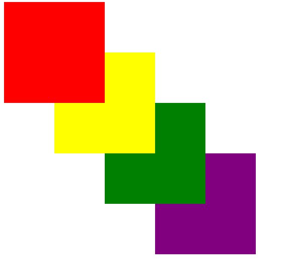
五、压盖效果及顺序
浮动、固定定位和绝对定位,使元素脱离标准流,形成压盖效果;
相对定位没有脱离标准流,但是也可以形成压盖效果;
更多的时候,压盖效果我们用定位来完成,那么多个元素形成压盖效果时,就会存在压盖顺序的问题;
到底哪一个显示在上层,默认是后面的层叠掉前面的,脱离文档流的压盖标准流的;但是我们也可以通过属性 z-index 进行修改;
z-index 值越大,越靠上。
不设置定位,z-index是无效的
div{
height: 200px;
width: 200px;
}
#wrap{
/*border: solid 4px blueviolet;*/
position: relative;
}
div#box1{
background: red;
/*position: absolute;
top: 0px;
left: 0px;
z-index: 100;*/
}
div#box2{
background: yellow;
position: absolute;
top: 100px;
left: 100px;
/*z-index: 10;*/
z-index: -1;
}
div#box3{
background: green;
position: absolute;
top: 200px;
left: 200px;
/*设置层叠顺序*/
/*z-index: 1;*/
z-index: -10;
}
div#box4{
background: purple;
position: absolute;
top: 300px;
left: 300px;
/*z-index: 0;*/
z-index: -100;
}

关注VX公众号“icketang” 免费领取华为荣耀商城项目实战视频教程