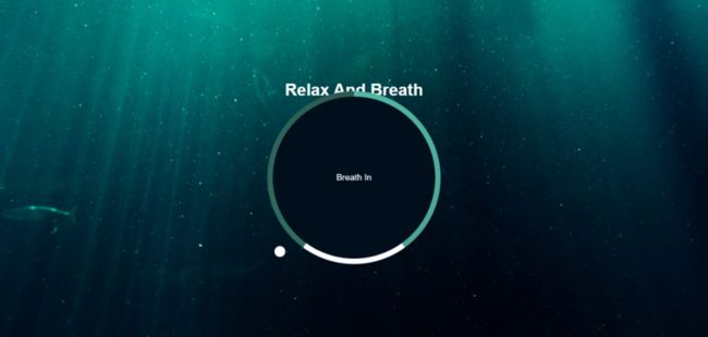
用css3动画实现的一个简单炫酷效果,最终的效果图如下:
页面结构(index.html):
  Document


  Relax And Breath
script.js:
const container = document.querySelector('.container');
const text = document.querySelector('#text');

const totalTime = 7500;
const breathTime = (totalTime/5)*2; //呼吸的时间为3s
const holdTime = totalTime/5;    //保持呼吸的时间为1.5s
console.log(breathTime);

breathAnimation();    //一开始自执行breathAnimation函数
function breathAnimation(){
  text.innerHTML = 'Breath In';
  container.className = 'container grow';    //给container添加grow类,实现放大效果

  setTimeout(function(){
    text.innerHTML = 'Hold On';
    setTimeout(function(){
      text.innerHTML = 'Breath Out';
      container.className = 'container shrink';//给container添加shrink类,实现缩小效果
    },holdTime)
  },breathTime)
}

setInterval(breathAnimation,totalTime);    //重复执行
样式(style.css):
*{
  margin: 0;
  padding: 0;
  box-sizing: border-box;
}

body{
  background: url('./img/bg.jpg') no-repeat center center /cover;
  min-height: 100vh;
  font-family: Arial, Helvetica, sans-serif;
  color: #fff;
  overflow: hidden;
  display: flex;
  flex-direction: column;
  align-items: center;
  justify-content: center;
}
/*注意设置margin为auto*/
.container{
  position: relative;
  width: 300px;
  height: 300px;
  display: flex;
  align-items: center;
  justify-content: center;
  transform: scale(1);
  margin: auto;
}

/*使用圆锥渐变作为背景,宽高比.container稍大,同时z-index要设为-2,因为还有一层为.circle,最外层是文字*/
.gradient-circle{
  position: absolute;
  left: -10px;
  top: -10px;
  background: conic-gradient(
    #55b7a4 0%,
    #4ca493 40%,
    #fff 40%,
    #fff 60%,
    #336d62 60%,
    #2a5b52 100%
  );
  width: 320px;
  height: 320px;
  border-radius: 50%;
  z-index: -2;
}

/z-index为-1,为中间黑色的圆/
.circle{
  position: absolute;
  left: 0;
  top: 0;
  width: 300px;
  height: 300px;
  background-color: #010f1c;
  border-radius: 50%;
  z-index: -1;
}

/*.pointer-container是小球外面的容器,其高设置为190,是因为其中150为半径,还有40为top-40,这样就会绕着圆心转,且不会换到里面来,注意transform-origin为中下方*/
.pointer-container{
  position: absolute;
  width: 20px;
  height: 190px;
  top: -40px;
  left: 140px;
  /* background-color: red; */
  transform-origin: bottom center;
  animation: rotate 7.5s linear forwards infinite;
}

/*小球*/
.pointer{
  width: 20px;
  height: 20px;
  background-color: #fff;
  border-radius: 50%;
}

/*设置小球转圈的效果*/
@keyframes rotate{
  from{
    transform: rotate(0deg);
  }to{
    transform: rotate(360deg);
  }
}
.container.grow{
  animation: grow 3s linear forwards;
}
.container.shrink{
  animation: shrink 2s linear forwards;
}
@keyframes grow{
  from{
    transform: scale(1)
  }to{
    transform: scale(1.2);
  }
}

@keyframes shrink{
  from{
    transform: scale(1.2)
  }to{
    transform: scale(1);
  }
}
如果.container的margin不设置为auto或者一个具体的值,就会造成下图的效果,文字和圆挤在一块:
同时我把.pointer-container里面的 background-color: red; 添上就会更加理解为什么要把.pointer-container的高度设置为190px.另外如果不把transform-origin设置为bottom center它就会如图中标注的默认点旋转,这并不是我们想要的效果.

还有个细节就是.shrink的动画时间我设置成了两秒,其实按照js里面的breath out这段时间应该为3s,但是为了从breath out到breath in有个缓冲的效果,就设置成了2s,不然breath out到breath in没有一个过渡,会显得突兀不好看.
好啦,结束咯.下次再更新.记录学习成长过程,fighting!