前端必学的6个HTML+CSS特效
前言:学习不能止步于收藏,必须自己来一遍,加入自己的思考。
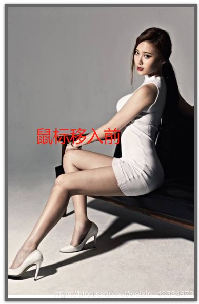
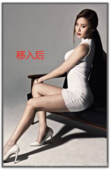
1.图片慢慢靠近
当我们在看图片时,可能觉得图片有点小,那我们就给用户一种体验,当用户把鼠标移入时,图片慢慢变大。
效果图:
知识点:
- CSS3之“过渡”:transition()----定义如何放大图片和放大过程的时间
- CSS3之“2D转换”:transform:scale()----放大图片
- CSS3之“溢出”:overflow:hidden----当图片放大时,溢出要隐藏
代码:
<div class="imgDiv">
    <img src="https://timgsa.baidu.com/timg?image&quality=80&size=b9999_10000&sec=1589451318456&di=6aa6f77e865a4b51ab43b265753ab260&imgtype=0&src=http%3A%2F%2Fb-ssl.duitang.com%2Fuploads%2Fitem%2F201506%2F27%2F20150627225153_AwJYF.thumb.700_0.jpeg">
</div>

.imgDiv{
    width:300px;
    overflow: hidden;
    box-shadow: 0 1px 4px rgba(0,0,0,0.6);
    border:5px solid rgba(0,0,0,0.6);
    box-sizing: border-box;
}
.imgDiv img{
    width:300px;
}
.imgDiv img:hover{
    transform:scale(1.1) ;
    transition: 0.5s linear;
}
2.给放大的图片加特效
知识点:
1. CSS之“filter”。
2. CSS灰色滤镜:grayscale()
3. CSS深褐色滤镜:sepia()
代码:
.imgDiv{
    width:300px;
    overflow: hidden;
    border:5px solid rgba(0,0,0,0.6);
    box-sizing: border-box;
    display: flex;
    flex:auto;
    margin-top:100px;
    margin-left:100px;
}
.imgDiv img{
    width:300px;
    filter:grayscale(100%);<-新增->
}
.imgDiv img:hover{
    transform:scale(1.1) ;
    transition: 0.5s linear;
    filter:grayscale(0);<-新增->
}
效果图:
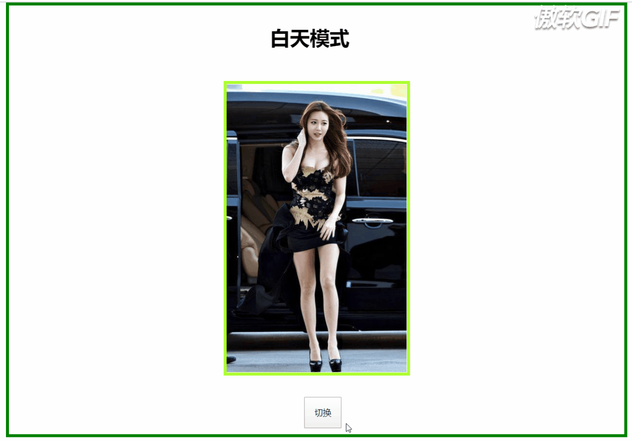
3.软件的白天与黑夜模式
知识点:
- CSS之滤镜:invert()—将图片颜色反转,当图片颜色为白色时,invert(0)为白;invert(1)为黑;反之。
<div id="body">
    <div class="text"><h1 id="text">白天模式</h1></div>
<div class="imgDiv">
    <img src="https://timgsa.baidu.com/timg?image&quality=80&size=b9999_10000&sec=1589524167527&di=c6cd44a0f1e364a7d37a08e8a61d52b6&imgtype=0&src=http%3A%2F%2Fhbimg.b0.upaiyun.com%2F80833e85c3cdc40a722f7d914761bee6e175abf3bcc6f-deDZNA_fw658">
</div>
<div class="container" id="container">
    <button (click)="translate()">切换</button>
</div>
</div>


isChange:boolean=true;
  translate(){
    var body=document.getElementById("body");
    var text=document.getElementById("text");
    var container=document.getElementById("container");
    if(this.isChange){
      body.setAttribute("style","filter:invert(100%)");
      text.innerHTML="白天模式";
      this.isChange=false;
    }else{
      body.setAttribute("style","filter:invert(0%)");
      text.innerHTML="黑夜模式";
      this.isChange=true;
    }
  }
效果图:
注意:
- 这不是“正经”的白天与黑夜模式,因为在父元素设置了反转滤镜之后,其子元素的颜色也会被反转。这样会导致像图片这类型的子元素失去本该有的样子。
- 在运用反转滤镜,需先给元素设置背景颜色,否则不起作用。
- 反转滤镜不只是对黑白反转,每种颜色有对应的反转。
4.CSS过渡实现白天\黑暗模式
知识点:
1. CSS之过渡:transition
2. 在这里子元素也用到了上面的invert(),将字体换色,也可以直接用js将字体的color属性转换,但滤镜效率更高
代码:
<div id="body">
    <div id="translate"></div>
    <div class="text"><h1 id="text">白天模式</h1></div>
<div class="imgDiv">
    <img src="http://img5.imgtn.bdimg.com/it/u=2473598420,2292311239&fm=26&gp=0.jpg">
</div>
<div class="container" id="container">
    <button (click)="translate()">切换</button>
</div>
</div>

<-只展示id=translate的css->
#translate{
    position: absolute;
    width:0px;
    height:0px;
    transition:width 2s,height 2s;
    background-color:black;
}

export class HoverToLargeImageComponent implements OnInit {
  isChange:boolean=true;
  translate(){
    var text=document.getElementById("text");
    var translate=document.getElementById("translate");
    if(this.isChange){
      translate.setAttribute("style","width:990px;height:690px;");
      text.innerHTML="黑夜模式";
      text.setAttribute("style","filter:invert(100%)")
      this.isChange=false;
    }else{
      translate.setAttribute("style","width:0px;height:0px");
      text.innerHTML="白天模式";
      text.setAttribute("style","filter:invert(0)")
      this.isChange=true;
    }
  }
}
效果图:
注意:
- 这个白天/黑夜模式是不会影响其它元素背景色,因此字体颜色如果为白色或黑色的就需要随着切换模式来字体颜色,否则字体看不见。
- 有兴趣的可以将
小容器移动到大容器任意部位,例如移到中间,设置使得效果向两边延伸或以圆的方式呈现。
5. 混合模式
知识点:
- CSS之混合模式:mix-blend-mode
- 该属性有16个值:
1.normal 正常
2.multiply 正片叠底
3.screen 滤色
4.overlay 叠加
5.darken 变暗
6.lighten 变亮
7.color-dodge 颜色减淡
8.color-burn 颜色加深
9.hard-light 强光
10.soft-light 柔光
11.difference 差值
12.exclusion 排除
13.hue 色相
14.saturation 饱和度
15.color 颜色
16.luminosity 亮度
代码:
<div class="container">
    <h1>混合模式学习</h1>
</div>
<div class="first background"><div class="middle"></div></div>
<div class="second background"><div class="middle"></div></div>
<div class="third background"><div class="middle"></div></div>
<div class="fourth background"><div class="middle"></div></div>

.first{
    background-image: url(https://source.unsplash.com/1920x1080?city);
}
.second{
    background-image: url(https://source.unsplash.com/1920x1080?landscape);
}
.third{
    background-image: url(https://source.unsplash.com/1920x1080?portrait);
}
.fourth{
    background-image: url(https://source.unsplash.com/1920x1080?stars);
}
.container,.middle:before{
    height: 200px;
    width:300px;
    position: fixed;
    box-sizing: content-box;
    top:50%;
    left:50%;
    transform: translate(-50%,-50%);
    text-align: center;
    line-height: 200px;
    mix-blend-mode: lighten;
}
.container{
    background-color:cornsilk;
    z-index: 10;
}
.background{
    height:750px;
    width:1500px;
    position: relative;
    margin:0px auto;
    background-size: cover;
    background-repeat: no-repeat;

}
.middle:before{
    content:"  ";
    padding:50px;
}


.middle{
    position: absolute;
    width:500px;
    height:100%;
    margin-left: 500px;
    clip:rect(auto,auto,auto,auto);
}
.first .middle:before{
    background-color: red;
    mix-blend-mode: lighten;
}
.second .middle:before{
    background-color:gold;
    mix-blend-mode: difference;
}
.third .middle:before{
    background-color: aqua;
    mix-blend-mode: color-dodge;
}
.fourth .middle:before{
    background-color: brown;
    mix-blend-mode: soft-light;
}
效果:
注意:
- z-index属性:z-index属性设置元素的堆叠顺序。拥有更高堆叠顺序的元素总会处于堆叠顺序较低的元素的前面。
所在的HTML位置,本该被后面的元素覆盖而无法显示出来,但使用了z-index之后就可以解决元素覆盖问题。
- isolation属性:隔离,主要与mix-blend-mode属性一起使用,将混合模式只应用于某一个元素或某一组元素。可取值:auto|isolate(创建新的堆叠上下文)。使用了isolate之后,该元素就不会再与父元素混合,而是与它的子元素混合。
- 这里用了四张图片,四种不同的混合属性值和背景色,感受混合模式的炫。
6. 视觉效果差,超炫酷
知识点:
- CSS之背景固定:background-attachment
上代码:
<div class="container">
    <div class="parallax-img">
        <div class="title">
            <h1>因为爱,所以爱</h1>
        </div>
    </div>
   <div class="myLove">
       <div><img src="http://f.hiphotos.baidu.com/zhidao/pic/item/a50f4bfbfbedab642e3fbc9af436afc379311e1e.jpg"></div>
       <div class="article">
           <article>与你一见如故,是我今生最美丽的相遇。
        与你一诺相许,是我素色年华里最永恒的风景。
        一直想说,无论走到哪里,最想去的是你的身边。
        愿我们彼此相爱,一直到时间的尽头。
        我相信我们可以一起,等青丝变白发。
        你在,我在,就是海枯石烂。
        没有过多的华丽,只有一句我喜欢你,却能让彼此牵挂于心。
        亲爱的,你知道吗,哪怕遍体鳞伤,我仍有爱你的余力。
        有的人你只看了一眼,却影响其一生。
        生活就像是包饺子,不管你是什么馅,我都会紧紧的把你包在我心里,任生活的沸水怎样煮,都磨不掉		      我对你的爱!
        好久没有见你了,心中十分挂念,可是又不敢去看你,因为害怕打扰你,你会不开心,所以我尽力的控制自己思念的心。

不知道这些日子,你是不是跟我一样,牵挂你,想念你;我是真的特别想你,想看看你的笑,想看看你纯真的脸;想着你,我就特别来劲,晚上都无法睡好!
            </article>
        </div>
   </div>
   <div class="parallax-img1">
       <div>
           <h1>我爱你,无畏人海的拥挤</h1>
       </div>
   </div>
   <div class="parallax-img2">
    <div>
        <h1>你小心一吻便颠倒众生  一吻便救一个人</h1>
    </div>
   </div>
 </div>


.container {
    height: 100vh;
}
.parallax-img {
    background-attachment: fixed;
    background-position: center;
    background-repeat: no-repeat;
    background-size: cover;
    height: 100%;
    background-image: url("http://ppe.oss-cn-shenzhen.aliyuncs.com/collections/182/7/thumb.jpg");
}
.title{
    position: relative;
    width:300px;
    height: 150px;
    left: 50%;
    top:50%;
    transform: translate(-50%,-50%);
    background-color: gray;
    line-height: 150px;
    text-align: center;
    color:tan;
}
.myLove{
    display: flex;
    height:400px;
    width:100%;
    background-color: gray;
}
.myLove div{
    width:30%;
    height: 80%;
    margin-left: 100px;
    margin-top:50px;
}
.myLove div img{
    width:100%;
    height:100%;
}
.myLove .article{
    margin-left: 250px;
}
.parallax-img1 {
    background-attachment: fixed;
    background-position: center;
    background-repeat: no-repeat;
    background-size: cover;
    height: 100%;
    background-image: url("http://ppe.oss-cn-shenzhen.aliyuncs.com/collections/182/5/thumb.jpg");
}

.parallax-img2{
    background-attachment: fixed;
    background-position: center;
    background-repeat: no-repeat;
    background-size: cover;
    height: 100%;
    background-image: url("http://ppe.oss-cn-shenzhen.aliyuncs.com/collections/181/10/thumb.jpg");
}
.parallax-img1 div,.parallax-img2 div {
    position: relative;
    left: 50%;
    top:50%;
    transform: translate(-50%,-50%);
    background-color: gray;
    width:40%;
    height:50px;
    text-align: center;
    color: tan;
}
效果图:
注意:
- 如果能录全屏则效果更佳,但由于图片上传大小限制,只能录制中间部分和快速拉过。如果喜欢,可以自己试试,代码已全部粘贴出来。
- 其实就是一个CSS属性的知识,就看你如何配置图片、色效使效果更炫酷。
- 图片能决定视图效果,因此,上面三张图片来源于原博客。