数据的探索性分析(EDA)
探索性数据分析(EDA)
文章目录
- 探索性数据分析(EDA)
- 什么叫探索性数据分析
- 探索性分析的步骤
- 实战案例
- 简略浏览数据
- 数据分析
- 分析预测值(price)
- price的分布
- price的正态转化
- 求偏度(Skewness)和峰度(Kurtosis)
- 查看数据特征
- 类型特征分析
- 数字特征分析
- 类别特征分析
- 用pandas_profiling生成数据报告
什么叫探索性数据分析
探索性数据分析(Exploratory Data Analysis,简称EDA),摘抄网上的一个中文解释,是指对已有的数据(特别是调查或观察得来的原始数据)在尽量少的先验假定下进行探索,通过作图、制表、方程拟合、计算特征量等手段探索数据的结构和规律的一种数据分析方法。当我们面对各种杂乱的“脏数据”时,往往不知所措,不知道从哪里开始了解目前拿到手上的数据时候,探索性数据分析就非常有效。分析完的数据可以用于接下来的机器学习或者深度学习,相当于在直接运用前对数据进行清洗。
探索性分析的步骤
- 形成假设,确定主题去探索
- 清理数据,处理脏数据
- 评价数据质量,可以对不同质量的数据作权重处理
- 数据报表
- 探索分析每个变量
- 探索每个自变量与因变量之间的关系
- 探索每个自变量之间的相关性
- 从不同的维度来分析数据
实战案例
Datawhale 零基础入门数据挖掘(二手车交易价格预测)
- 语言:Python
- import库:数据科学库:pandas、numpy、scipy
- 可视化库:matplotlib、seabon
简略浏览数据
通过pandas中的read_csv函数导入Train和Test两个数据集后,通过Train_data.head().append(Train_data.tail())简略观察数据可以看到
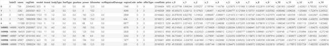
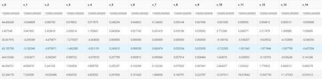
通过Train_data.shape可以得到训练集中有150000条数据,共31种。通过Train_data.describe()统计相关数据:

数据分析
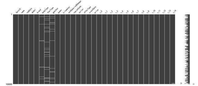
观察统计数据我们可以看出model有一个空值(count是非空值总数);bodyType、fuelType、gearbox存在5000到9000左右的空值,看下图也能看出空值分布较为随机(msno.matrix(Train_data.sample(10000))取一万个样本观察缺省值)。鉴于这几个数据都是类型数据,除gearbox只有0和1外,其他两个不好做取平均处理,matrix并且可能对价格产生较大影响,先不做处理,具体处理选定模型后分析。
数据中的power也就是汽车功率的范围是[ 0, 600 ],但由上表可以看出power中最大值为19312,处于75%的值又为150,可以看出存在一部分(25%一下)不合理数据,可以对>600的数据做抹去处理或者取正常部分的平均值处理。
kilometer也就是汽车行驶里程的数据可以看到50%以上都是15万km,不合常理,可以做权重较低的处理。
price中最大价格为99999,显然也是不正常数据,需要进行处理。
观察上面统计表可以发现里面没有notRepairedDamage这一列信息,用Train_data.info()可以看出只有这一列是object类型,我们可以用Train_data['notRepairedDamage'].value_counts()显示他的几个不同的值:
0.0    111361
-       24324
1.0     14315
Name: notRepairedDamage, dtype: int64
可以看出-是他的缺省值,是空缺数据最多的,暂时让其为空。
再查一下上表中没有的seller和offerType两列数据可以得出:
0    149999
1         1
Name: seller, dtype: int
0    150000
Name: offerType, dtype: int64
可以删掉这两列数据。
del Train_data["seller"]
del Train_data["offerType"]
还有bodyType、fuelType、gearbox这三个类别数据,同样做以上处理进行观察:
0.0    41420
1.0    35272
2.0    30324
3.0    13491
4.0     9609
5.0     7607
6.0     6482
7.0     1289
Name: bodyType, dtype: int64
0.0    91656
1.0    46991
2.0     2212
3.0      262
4.0      118
5.0       45
6.0       36
Name: fuelType, dtype: int64
0.0    111623
1.0     32396
Name: gearbox, dtype: int64
表面来看不存在异常
分析预测值(price)
price的分布
总体分布(当试验次数无限增大时,试验结果的频率值就成为相应的概率,除了抽样造成的误差,精确地反映了总体取值的概率分布规律,这种整体取值的概率分布规律通常称为总体分布。):
import scipy.stats as st
y = Train_data['price']
plt.figure(1); plt.title('price')
sns.distplot(y, kde=False)
用几种概率类型进行拟合:
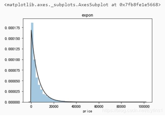
指数分布(st.expon):
plt.figure(1); plt.title('expon')
sns.distplot(y, kde=False, fit=st.expon)
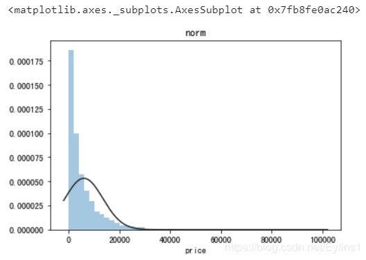
正态分布(st.norm):
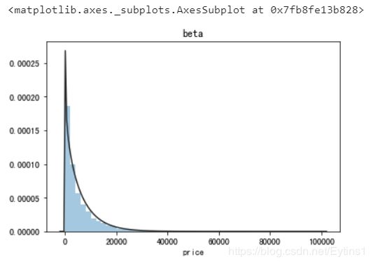
beta分布(st.beta):
无界约翰逊分布(st.johnsonsu):
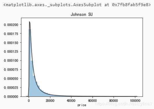
观察上面几种拟合图像,可以看出指数分布、beta分布、无界约翰逊分布的拟合很出色,其中无界约翰逊分布的拟合最好。
price的正态转化
大部分数据分析都希望原始数据是满足正态分布的定距变量,所以在回归之前我们最好对不满足正态分布的price进行转换,使得price尽量拟合上面的正态分布。
正态转化有四个步骤:
- 计算数据的分布状况及两个参数:偏度(Skewness)和峰度(Kurtosis)。
- 根据变量的分布形状和参数,决定是否转换
- 如果需要做正态转换,根据变量的分布形状,确定相应的转换公式
- 再次检验转换后的变量的分布形状,如果没有解决问题,或者甚至恶化,就需要再从第二步或第三步做起,然后再回到第一步的检验,直到拿到令人满意的结果。
求偏度(Skewness)和峰度(Kurtosis)
偏度是判断曲线是否对称的指标,如果偏度为0,则分布完全对称,若偏度为正值,则说明该变量的分布为正偏态,反之为负偏态。
峰度是判断曲线陡峭和平缓的指标,如果峰度为0,则说明变量分布合适;若为正值,则分布陡峭,为负值则分布平缓,由上面所得到的分布图来看,预计为正值
print("Skewness: %f" % Train_data['price'].skew())
print("Kurtosis: %f" % Train_data['price'].kurt())
Skewness: 3.346487
Kurtosis: 18.995183
再求Train_data的两个参数:
Train_data.skew(), Train_data.kurt()
我这里只粘贴有价值的数据
skew:
 name                 5.576058e-01
 regDate              2.849508e-02
 model                1.484388e+00
 brand                1.150760e+00
 power                6.586318e+01
 kilometer           -1.525921e+00
 regionCode           6.888812e-01
 creatDate           -7.901331e+01
 v_0                 -1.316712e+00
 v_1                  3.594543e-01
 v_2                  4.842556e+00
 v_3                  1.062920e-01
 v_4                  3.679890e-01
 v_5                 -4.737094e+00
 v_6                  3.680730e-01
 v_7                  5.130233e+00
 v_8                  2.046133e-01
 v_9                  4.195007e-01
 v_10                 2.522046e-02
 v_11                 3.029146e+00
 v_12                 3.653576e-01
 v_13                 2.679152e-01
 v_14                -1.186355e+00
 kurt:
 name                     -1.039945
 regDate                  -0.697308
 model                     1.740483
 brand                     1.076201
 power                  5733.451054
 kilometer                 1.141934
 regionCode               -0.340832
 creatDate              6881.080328
 v_0                       3.993841
 v_1                      -1.753017
 v_2                      23.860591
 v_3                      -0.418006
 v_4                      -0.197295
 v_5                      22.934081
 v_6                      -1.742567
 v_7                      25.845489
 v_8                      -0.636225
 v_9                      -0.321491
 v_10                     -0.577935
 v_11                     12.568731
 v_12                      0.268937
 v_13                     -0.438274
 v_14                      2.393526
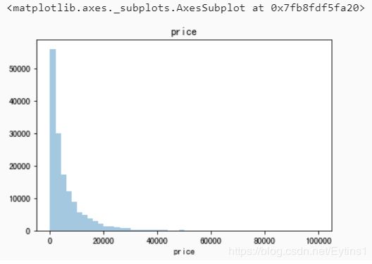
查看price的频数
plt.hist(Train_data['price'], orientation = 'vertical',histtype = 'bar', color ='red')
plt.show()
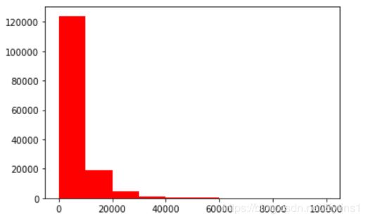
可以看到大于20000的值极少,可以作为不正常值忽略。
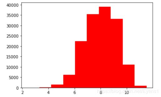
log变换price之后的分布较均匀,可以进行log变换进行预测,这也是预测问题常用的trick
plt.hist(np.log(Train_data['price']), orientation = 'vertical',histtype = 'bar', color ='red')
plt.show()
查看数据特征
首先分离预测值:
Y_train = Train_data['price']
分离出数字特征和类型特征:
numeric_features = ['power', 'kilometer', 'v_0', 'v_1', 'v_2', 'v_3', 'v_4', 'v_5', 'v_6', 'v_7', 'v_8', 'v_9', 'v_10', 'v_11', 'v_12', 'v_13','v_14' ]
categorical_features = ['name', 'model', 'brand', 'bodyType', 'fuelType', 'gearbox', 'notRepairedDamage', 'regionCode',]
类型特征分析
特征nunique分布:
# 特征nunique分布
for cat_fea in categorical_features:
    print(cat_fea + "的特征分布如下:")
    print("{}特征有{}个不同的值".format(cat_fea, Train_data[cat_fea].nunique()))
    print(Train_data[cat_fea].value_counts())
可以得出结果:
name特征有99662个不同的值
model特征有248个不同的值
brand特征有40个不同的值
bodyType特征有8个不同的值
fuelType特征有7个不同的值
gearbox特征有2个不同的值
notRepairedDamage特征有2个不同的值
regionCode特征有7905个不同的值
数字特征分析
numeric_features.append('price')
相关性分析:
price_numeric = Train_data[numeric_features]
correlation = price_numeric.corr()
print(correlation['price'].sort_values(ascending = False),'\n')
price        1.000000
v_12         0.692823
v_8          0.685798
v_0          0.628397
power        0.219834
v_5          0.164317
v_2          0.085322
v_6          0.068970
v_1          0.060914
v_14         0.035911
v_13        -0.013993
v_7         -0.053024
v_4         -0.147085
v_9         -0.206205
v_10        -0.246175
v_11        -0.275320
kilometer   -0.440519
v_3         -0.730946
Name: price, dtype: float64
热力图分析:
f , ax = plt.subplots(figsize = (7, 7))
plt.title('Correlation of Numeric Features with Price',y=1,size=16)
sns.heatmap(correlation,square = True,  vmax=0.8)
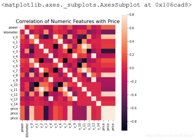
其中有几项与价格相关性较高。
del price_numeric['price']
类别特征分析
类别特征箱形图可视化
categorical_features = ['model',
 'brand',
 'bodyType',
 'fuelType',
 'gearbox',
 'notRepairedDamage']
for c in categorical_features:
    Train_data[c] = Train_data[c].astype('category')
    if Train_data[c].isnull().any():
        Train_data[c] = Train_data[c].cat.add_categories(['MISSING'])
        Train_data[c] = Train_data[c].fillna('MISSING')

def boxplot(x, y, **kwargs):
    sns.boxplot(x=x, y=y)
    x=plt.xticks(rotation=90)

f = pd.melt(Train_data, id_vars=['price'], value_vars=categorical_features)
g = sns.FacetGrid(f, col="variable",  col_wrap=2, sharex=False, sharey=False, size=5)
g = g.map(boxplot, "value", "price")
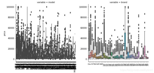
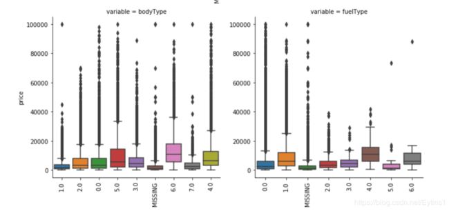
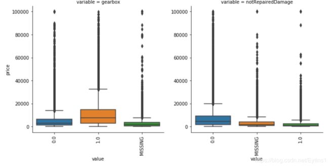
可以看到品牌24价格特别高,价格基本处于20000以上,可能是某种高档品牌,之前20000以上的价格数据被认定为不正常数据,现在认定为正常数据也没什么问题。
用pandas_profiling生成数据报告
用pandas_profiling生成一个较为全面的可视化和数据报告(较为简单、方便) 最终打开html文件即可
import pandas_profiling
pfr = pandas_profiling.ProfileReport(Train_data)
pfr.to_file("./example.html")