Measuring Data Skew
Now that you know how to make histograms, did you notice how the plots have "shapes?"
These shapes are important because they can show us the distributional characteristics of the data. The first characteristic we'll look at is skew.
现在你已经知道如何制作直方图了,你注意到这些地块有“形状”吗?
Skew refers to asymmetry in the data. When data is concentrated on the right side of the histogram, for example, we say it has a negative skew. When the data is concentrated on the left, we say it has a positive skew.
偏度是指数据中的不对称。 当数据集中在直方图的右侧时,例如,我们说它有负偏移。 当数据集中在左侧时,我们说它有一个正的偏移。
We can measure the level of skew with the skew function. A positive value indicates a positive skew, a negative value indicates a negative skew, and a value close to zero indicates no skew.
我们可以用偏斜函数来衡量偏斜的程度。 正值表示正偏斜,负值表示负偏斜,接近零的值表示无偏斜。
- Assign the skew of
test_scores_positivetopositive_skew. - Assign the skew of
test_scores_negativetonegative_skew. - Assign the skew of
test_scores_normaltono_skew
# We've already loaded in some numpy arrays. We'll make some plots with them.
# The arrays contain student test scores that are on a 0-100 scale.
import matplotlib.pyplot as plt

# See how there's a long slope to the left?
# The data is concentrated in the right part of the distribution, but some people also scored poorly.
# This plot has a negative skew.
plt.hist(test_scores_negative)
plt.show()

# This plot has a long slope to the right.
# Most students did poorly, but a few did really well.
# This plot has a positive skew.
plt.hist(test_scores_positive)
plt.show()

# This plot has no skew either way. Most of the values are in the center, and there is no long slope either way.
# It is an unskewed distribution.
plt.hist(test_scores_normal)
plt.show()

# We can test how skewed a distribution is using the skew function.
# A positive value means positive skew, a negative value means negative skew, and close to zero means no skew.


from scipy.stats import skew
positive_skew = skew(test_scores_positive)
negative_skew = skew(test_scores_negative)
no_skew = skew(test_scores_normal)

#######output#####
 negative_skewfloat ()
-0.6093247474592195
 positive_skewfloat ()
0.5376950498203763
 no_skewfloat ()
0.0223645171350847
9. Checking for Outliers with Kurtosis
Kurtosis is another characteristic of distributions. Kurtosis measures whether the distribution is short and flat, or tall and skinny. In other words, it assesses the shape of the peak.
峰度是分布的另一个特征。 峰度测量分布是短而扁平的,还是高而瘦。 换句话说,它评估峰值的形状。
"Shorter" distributions have a lower maximum frequency, but higher subsequent frequencies. A high kurtosis may indicate problems with outliers (very large or very small values that skew the data).
“较短”分布具有较低的最大频率,但较高的后续频率。 高峭度可能表示异常值问题(非常大或非常小的值会使数据偏斜)。
- Assign the kurtosis of
test_scores_platytokurt_platy. - Assign the kurtosis of
test_scores_leptotokurt_lepto. - Assign the kurtosis of
test_scores_mesotokurt_meso.
import matplotlib.pyplot as plt

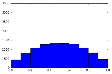
# This plot is short. It is platykurtic.
# Notice how the values are distributed fairly evenly, and there isn't a large cluster in the middle.
# Student performance varied widely.
plt.hist(test_scores_platy)
plt.ylim(0,3500)
plt.xlim(0,1)
plt.show()

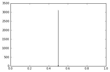
# This plot is tall. It is leptokurtic.
# Most students performed similarly.
plt.hist(test_scores_lepto)
plt.ylim(0,3500)
plt.xlim(0,1)
plt.show()

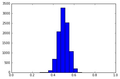
# The height of this plot neither short nor tall. It is mesokurtic.
plt.hist(test_scores_meso)
plt.ylim(0,3500)
plt.xlim(0,1)
plt.show()

# We can measure kurtosis with the kurtosis function.
# Negative values indicate platykurtic distributions, positive values indicate leptokurtic distributions, and values near 0 are mesokurtic.
from scipy.stats import kurtosis
kurt_platy = kurtosis(test_scores_platy)
kurt_lepto = kurtosis(test_scores_lepto)
kurt_meso = kurtosis(test_scores_meso)

##########
 kurt_leptofloat ()
0.023335026722224317
 kurt_platyfloat ()
-0.9283967256161696
 kurt_mesofloat ()
-0.042791859857727044
10. Modality
Modality is another characteristic of distributions. Modality refers to the number of modes, or peaks, in a distribution.
形态是分布的另一个特征。 形态是指分布中的模式或峰的数量。
Real-world data is often unimodal (it has only one mode).
真实世界的数据往往是单峰分布的(它只有一种模式)。
- Plot
test_scores_multi, which has four peaks.
import matplotlib.pyplot as plt

# This plot has one mode. It is unimodal.
plt.hist(test_scores_uni)
plt.show()

# This plot has two peaks. It is bimodal.
# This could happen if one group of students learned the material and another learned something else, for example.
plt.hist(test_scores_bi)
plt.show()

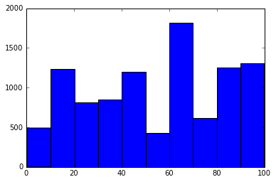
# More than one peak means that the plot is multimodal.
# We can't easily measure the modality of a plot, like we can with kurtosis or skew.
# Often, the best way to detect multimodality is to examine the plot visually.
plt.hist(test_scores_multi)
plt.show()
11. Measures of Central Tendency
Now that we know how to measure the characteristics of a distribution, let's look at central tendency measures.
现在我们知道如何衡量分布的特征,我们来看看集中趋势测度。
Central tendency measures assess how likely the data points are to cluster around a central value.
集中趋势测量评估数据点围绕中心值聚集的可能性。
The first one we'll look at is the
mean. We've calculated mean before, but let's explore it further.
我们要看的第一个是平均值。 我们之前已经计算出平均值,但让我们进一步探索它。
The mean is just the sum of all of the elements in an array divided by the number of elements.
- Compute the mean of
test_scores_normal, and assign it tomean_normal. - Compute the mean of
test_scores_negative, and assign it tomean_negative. - Compute the mean of
test_scores_positive, and assign it tomean_positive.
import matplotlib.pyplot as plt
# Let's put a line over our plot that shows the mean.
# This is the same histogram we plotted for skew a few screens ago.
plt.hist(test_scores_normal)
# We can use the .mean() method of a numpy array to compute the mean.
mean_test_score = test_scores_normal.mean()
# The axvline function will plot a vertical line over an existing plot.
plt.axvline(mean_test_score)

# Now we can show the plot and clear the figure.
plt.show()

# When we plot test_scores_negative, which is a very negatively skewed distribution, we see that the small values on the left pull the mean in that direction.
# Very large and very small values can easily skew the mean.
# Very skewed distributions can make the mean misleading.
plt.hist(test_scores_negative)
plt.axvline(test_scores_negative.mean())
plt.show()

# We can do the same with the positive side.
# Notice how the very high values pull the mean to the right more than we would expect.
plt.hist(test_scores_positive)
plt.axvline(test_scores_positive.mean())
plt.show()

mean_normal = test_scores_normal.mean()
mean_negative = test_scores_negative.mean()
mean_positive = test_scores_positive.mean()
 mean_normalfloat64 ()
49.23213521195251
 mean_positivefloat64 ()
16.607018116017176
 mean_negativefloat64 ()
83.627606422256036
12. Calculating the Median
Median is another measure of central tendency. This is the midpoint of an array.
To calculate the median, we need to sort the array, then take the value in the middle. If there are two values in the middle (because there are an even number of items in the array), then we take the mean of the two middle values.
The median is less sensitive to very large or very small values (which we call outliers), and is a more realistic center of the distribution.
中位数对于非常大或非常小的值(我们称之为离群值)较不敏感,并且是分布的更实际的中心。
- Plot a histogram for test_scores_positive.
- Add a green line for the median.
- Add a red line for the mean.
# Let's plot the mean and median side-by-side in a negatively skewed distribution.
# Unfortunately, arrays don't have a nice median method, so we have to use a numpy function to compute it.
import numpy
import matplotlib.pyplot as plt

# Plot the histogram
plt.hist(test_scores_negative)
# Compute the median
median = numpy.median(test_scores_negative)

# Plot the median in green (the color argument of "g" means green)
plt.axvline(median, color="g")

# Plot the mean in red
plt.axvline(test_scores_negative.mean(), color="r")

# Notice how the median is further to the right than the mean.
# It's less sensitive to outliers, and isn't pulled to the left.
plt.show()


plt.hist(test_scores_positive)
plt.axvline(numpy.median(test_scores_positive), color="g")
plt.axvline(test_scores_positive.mean(), color="r")
plt.show()
titanic DATA
Unfortunately, not all of the data is available; details such as age are missing for some passengers. Before we can analyze the data, we have to do something about the missing rows.
The easiest way to address them is to just remove all of the rows with missing data. This isn't necessarily the best solution in all cases, but we'll learn about other ways to handle these situations later on.
- Remove the
NaNvalues in the"age"and"sex"columns. - Assign the result to
new_titanic_survival.
import pandas
f = "titanic_survival.csv"
titanic_survival = pandas.read_csv(f)

# Luckily, pandas DataFrames have a method that can drop rows that have missing data
# Let's look at how large the DataFrame is first
print(titanic_survival.shape)

# There were 1,310 passengers on the Titanic, according to our data
# Now let's drop any rows that have missing data
# The DataFrame dropna method will do this for us
# It will remove any rows with that contain missing values
new_titanic_survival = titanic_survival.dropna()

# Hmm, it looks like we were too zealous with dropping rows that contained NA values
# We now have no rows in our DataFrame
# This is because some of the later columns, which aren't immediately relevant to our analysis, contain a lot of missing values
print(new_titanic_survival.shape)

# We can use the subset keyword argument to the dropna method so that it only drops rows if there are NA values in certain columns
# This line of code will drop any row where the embarkation port (where people boarded the Titanic) or cabin number is missing
new_titanic_survival = titanic_survival.dropna(subset=["embarked", "cabin"])

# This result is much better. We've only removed the rows we needed to.
print(new_titanic_survival.shape)


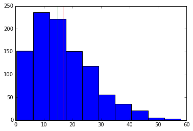
new_titanic_survival = titanic_survival.dropna(subset=["age", "sex"])
- Plot a histogram of the "age" column in new_titanic_survival.
- Add a green line for the median.
- Add a red line for the mean.
# We've loaded the clean version of the data into the variable new_titanic_survival
import matplotlib.pyplot as plt
import numpy


plt.hist(new_titanic_survival["age"])
plt.axvline(numpy.median(new_titanic_survival["age"]), color="g")
plt.axvline(new_titanic_survival["age"].mean(), color="r")
plt.show()
- Assign the mean of the
"age"column ofnew_titanic_survivaltomean_age. - Assign the median of the
"age"column ofnew_titanic_survivaltomedian_age. - Assign the skew of the
"age"column ofnew_titanic_survivaltoskew_age. - Assign the kurtosis of the
"age"column ofnew_titanic_survivaltokurtosis_age.
import numpy
from scipy.stats import skew
from scipy.stats import kurtosis
mean_age = new_titanic_survival["age"].mean()
median_age = numpy.median(new_titanic_survival["age"])
skew_age = skew(new_titanic_survival["age"])
kurtosis_age = kurtosis(new_titanic_survival["age"])
