前端初级学习阶段(2)
我们要讲什么
- CSS选择器(基本、层级、属性、伪类、伪状态)
- CSS常用样式属性
- CSS3 过渡、变换、动画
- CSS3 3D场景搭建与应用
CSS选择器(基本、层级、属性、伪类、伪状态)
基本选择器
| 选择器 | 例子 | 例子描述 | CSS规范级别 |
|---|---|---|---|
| ID 选择器 | #login |
选择 id=“login” 的元素 | 1 |
| 类别选择器 | .btn |
选择 class=“btn” 的所有元素 | 1 |
| 元素选择器 | div |
选择所有 div 标签 | 1 |
| 通配选择器 | * |
选择所有标签 | 2 |
| 属性选择器 | [type] |
选择有 type 属性的所有元素 | 2 |
| 属性选择器 | [type=file] |
选择 type=“file” 且 全匹配 的所有元素 | 2 |
| 属性选择器 | [class~=file] |
选择有 class=“file” 且 多值匹配 属性的所有元素 | 2 |
| 属性选择器 | [type|=file] |
选择有 type 属性 且 值为 file 或 file- 为前缀的所有元素 | 2 |
| 属性选择器 | [type^=file] |
选择有 type 属性 且 file 开头 的所有元素 | 3 |
| 属性选择器 | [type$=file] |
选择有 type 属性 且 file 结尾 的所有元素 | 3 |
| 属性选择器 | [type*=file] |
选择有 type 属性 且 包含 file 的所有元素 | 3 |
- CSS规范级别代表 CSS 1、CSS 2.1、CSS Selectors Level 3、Selectors Level 4。
[type|=file]实际为[type|=file],在表格中无法输入所以改成全角。(有会输入的可以告诉我~)
组合选择器
| 选择器 | 例子 | 例子描述 | CSS规范级别 |
|---|---|---|---|
| 分组 | html,body |
选择 |
1 |
后代 空格 |
ul li |
选择祖先元素为
|
1 |
| 下级 | ul>li |
选择父元素为
|
2 |
| 相邻兄弟 | div+div |
选择紧接在
元素之后的
元素。
|
2 |
| 兄弟 | h2~div |
选择在 元素之后的所有
|
3 |
- 后代选择器要注意嵌套问题如
ul{font-size: 1.5em;} - 下级选择器一般用在只希望子元素有,不希望更深层级有。
伪类选择器
| 选择器 | 例子 | 例子描述 | CSS规范级别 |
|---|---|---|---|
:link |
a:link |
未被访问的链接 | 1 |
:visited |
a:visited |
已被访问的链接 | 1 |
:hover |
a:hover |
(鼠标悬浮在上面)鼠标正在上面的链接 | 1 |
:active |
a:active |
鼠标正在按下的链接 | 1 |
:focus |
input:focus |
有焦点的input | 2 |
:first-child |
div :first-child |
代表父元素的第一个子元素 | 2 |
:last-child |
div :last-child |
代表父元素的最后一个子元素 | 3 |
:nth-child(n) |
div :nth-child(2n) |
代表父元素的中偶数位子元素 | 3 |
:empty |
div:empty |
空的 div | 3 |
:target |
:target |
匹配锚点元素 | 3 |
:disabled |
input:disabled |
不可用的input | 3 |
:checked |
:checked |
选中的 checkbox、radio、select | 3 |
:not(selector) |
div:not(:empty) |
所有不为空的 div | 3 |
:focus-within |
form:focus-within |
高亮获得焦点的表单 | 4 |
- a 标签使用伪类时要注意爱恨原则(LoVe/HAte)
:active也常用来做 tab 选择:focus单击、触摸、tab 都可以触发
伪元素选择器
| 选择器 | 例子 | 例子描述 | CSS规范级别 |
|---|---|---|---|
::after |
.icon:after |
在标签里面的最后增加一个行内元素 | 2 |
::before |
.icon:before |
在标签里面的最前面增加一个行内元素 | 2 |
::placeholder |
input::placeholder |
修改文本框的 placeholder 样式 | 4 |
- 你可能注意到第一列是双冒号,第二列是单冒号,放心不是我写错了,规范定义的是单冒号是伪类,双冒号是伪元素。但是浏览器厂商大哥不买账,嗯,目前来说单冒号会兼容性更好。
after和before需要content: '内容',不然会不显示。placeholder属于shadow DOM
上面是一些我们常用,或者说用途比较大的选择器。一些兼容不好,新规范,鸡肋一些的我没写出来。有兴趣可以去 MDN 中看。
差点忘记的权重计算(优先级)
下面列表中,选择器类型的优先级是递增的:
- 类型选择器(type selectors)(例如, h1)和 伪元素(pseudo-elements)(例如, ::before)
- 类选择器(class selectors) (例如,.example),属性选择器(attributes selectors)(例如,[type=“radio”]),伪类(pseudo-classes)(例如, :hover)
- ID选择器(例如, #example)
通配选择符(universal selector)(*), 关系选择符(combinators) (+, >, ~, ’ ') 和否定伪类(negation pseudo-class)(:not()) 对优先级没有影响。(但是,在 :not()内部声明的选择器是会影响优先级)。
给元素添加的内联样式 (例如, style=“font-weight:bold”) 总会覆盖外部样式表的任何样式,因此可看作是具有最高的优先级。.
当在一个样式声明中使用一个!important 规则时,此声明将覆盖任何其他声明。虽然技术上!important与优先级无关,但它与它直接相关。
2. CSS常用样式属性
这个就有点多了啊,
数值单位
px绝对单位,像素,最常用的em相对单位,相对于当前对象内文本的font-size的倍数remCSS3 相对单位,相对于**根元素(即html元素)**的font-size的倍数vw vhCSS3 相对单位,屏幕视口,均分一百份vmax vminCSS3 相对单位,屏幕视口,均分一百份,宽高最大、最小值0%/0px/0vw可以省略单位写为0- 忘了,还有
%,这个单位留作课后作业吧。
CSS 属性
| 类型 | 属性 |
|---|---|
| 定位 | position / z-index / top / right / bottom / left / clip |
| 布局 | display / float / clear / visibility / overflow / overflow-x / overflow-y |
| 盒子-大小 | width / min-width / max-width / height / min-height / max-height |
| 盒子-外 | margin / margin-top / margin-right / margin-bottom / margin-left |
| 盒子-内 | padding / padding-top / padding-right / padding-bottom / padding-left |
| 边框 | border / border-width / border-style / border-color / border-top / border-top-width / border-top-style / border-top-color / border-right / border-right-width / border-right-style / border-right-color / border-bottom / border-bottom-width / border-bottom-style / border-bottom-color / border-left / border-left-width / border-left-style / border-left-color / border-radius / border-top-left-radius / border-top-right-radius / border-bottom-right-radius / border-bottom-left-radius / box-shadow / border-image / border-image-source / border-image-slice / border-image-width / border-image-outset / border-image-repeat |
| 背景 | background / background-color / background-image / background-repeat / background-attachment / background-position / background-origin / background-clip / background-size |
| 颜色 | color / opacity / / Color Name / HEX / RGB / RGBA / HSL / HSLA / transparent / currentColor |
| 变换 | transform-origin / transform-style / perspective / perspective-origin / backface-visibility |
| 过渡 | transition / transition-property / transition-duration / transition-timing-function / transition-delay |
| 动画 | animation / animation-name / animation-duration / animation-timing-function / animation-delay / animation-iteration-count / animation-direction / animation-play-state / animation-fill-mode |
如上就是一些属性,还有一些放出来,感兴趣的可以去查一下。好了,下面我们简单介绍几个常用的
display 属性
- none:隐藏对象。与visibility属性的hidden值不同,其不为被隐藏的对象保留其物理空间
- inline:指定对象为内联元素。
- block:指定对象为块元素。
- inline-block:指定对象为内联块元素。(CSS2)
- table-cell:指定对象作为表格单元格。类同于html标签(CSS2)
- box:将对象作为弹性伸缩盒显示。(伸缩盒最老版本)(CSS3)
- inline-box:将对象作为内联块级弹性伸缩盒显示。(伸缩盒最老版本)(CSS3)
- flexbox:将对象作为弹性伸缩盒显示。(伸缩盒过渡版本)(CSS3)
- inline-flexbox:将对象作为内联块级弹性伸缩盒显示。(伸缩盒过渡版本)(CSS3)
- flex:将对象作为弹性伸缩盒显示。(伸缩盒最新版本)(CSS3)
- inline-flex:将对象作为内联块级弹性伸缩盒显示。(伸缩盒最新版本)(CSS3)
position 属性
- static:常规流。此时4个定位偏移属性不会被应用。
- relative:常规流,位置不变,定位偏移属性移动的只是显示效果。
- absolute:脱离常规流,偏移属性参照的是离自身最近的定位祖先元素,如果没有定位的祖先元素,则一直回溯到body元素。盒子的偏移位置不影响常规流中的任何元素,其margin不与其他任何margin折叠。
- fixed:与absolute一致,但偏移定位是以窗口为参考。当出现滚动条时,对象不会随着滚动。(IE、iOS 有兼容问题)
- sticky:对象在常态时遵循常规流。它就像是relative和fixed的合体,当在屏幕中时按常规流排版,当卷动到屏幕外时则表现如fixed。该属性的表现是现实中你见到的吸附效果。(CSS3)
center:与absolute一致,但偏移定位是以定位祖先元素的中心点为参考。盒子在其包含容器垂直水平居中。(CSS3)page:与absolute一致。元素在分页媒体或者区域块内,元素的包含块始终是初始包含块,否则取决于每个absolute模式。(CSS3)
3. CSS3 过渡、变换、动画
上面一节已经列出本节包含的属性了,这节我们讲一讲,具体应用。
transition 过渡
缩写形式 transition:property duration timing-function delay;,下面我们来分开说明一下
| 属性名 | 描述 | 默认值 |
|---|---|---|
| transition-property | 执行过渡动作的属性 | all |
| transition-duration | 动作执行时间 | 0 |
| transition-timing-function | 动作执行曲线 ease | ease |
| transition-delay | 延迟执行动画的时间 | 0 |
    transition: border-color .5s ease-in .1s,
            background-color .5s ease-in .1s,
            color .5s ease-in .1s;
等同于
    transition-property: border-color, background-color, color;
    transition-duration: .5s, .5s, 1s;
    transition-timing-function: ease-in, ease-in, ease-in;
    transition-delay: .1s, .1s, .1s;
意思是 border-color 的变化执行 0.5秒,使用 ease-in 曲线执行,等待 0.1秒后开始。
意思是 background-color 的变化执行 0.5秒,使用 ease-in 曲线执行,等待 0.1秒后开始。
意思是 color 的变化执行 1秒,使用 ease-in 曲线执行,等待 0.1秒后开始。
transition-timing-function 说明
这个属性的值比较有意思,可以做一些特别一些的动画。 图片来自MDN:timing-function。
cubic-bezier() 定义了一条 立方贝塞尔曲线(cubic Béziercurve)。这些曲线是连续的,一般用于动画的平滑变换,也被称为缓动函数(easing functions)。
一条立方贝塞尔曲线需要四个点来定义,P0 、P1 、P2 和 P3。P0 和 P3是起点和终点,这两个点被作为比例固定在坐标系上,横轴为时间比例,纵轴为完成状态。P0 是 (0, 0),表示初始时间和初始状态。P3 是(1, 1) ,表示终止时间和终止状态。

变换
transform 非常的灵魂,底层提供了 matrix(),matrix3d() 来操作,封装了 translate 移动、rotate 旋转 、scale 缩放、skew 斜切扭曲。刚才说的是 2D 的,加上 3D 就是 3D变换,如 translate3d()。有一个意外 perspective() 指定透视距离。
transform-origin 默认值:50% 50%。用来设置变换的基准点。
transform-style 默认值:flat ,默认是 2D 空间。设置为 preserve-3d 改成三维空间,元素将会创建局部堆叠上下文。
动画
过渡可以理解为两个关键帧的补间操作。动画就是一连串的关键帧。
-
animation-name:动画名称,需要@keyframes来定义动画@keyframes testanimations { from { opacity: 1; } to { opacity: 0; } } .testanimations{ animation: testanimations 1s; } -
animation-duration:动画的持续时间 -
animation-timing-function:动画执行曲线 -
animation-delay:延迟的时间 -
animation-iteration-count:循环次数。infinite:无限循环。:指定对象动画的具体循环次数。 -
animation-direction:在循环中是否反向运动normal:正常方向(默认值) reverse:反方向运行 alternate:动画先正常运行再反方向运行,并持续交替运行 alternate-reverse:动画先反运行再正方向运行,并持续交替运行 -
animation-fill-mode:结束时候的状态none:默认值。不设置对象动画之外的状态 forwards:动画结束时的状态 backwards:动画开始时的状态 both:动画结束或开始的状态 -
animation-play-state:动画暂停、开始状态。running:运动。paused:暂停。
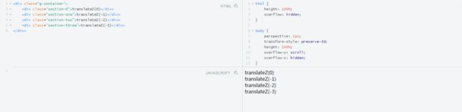
4. CSS3 3D场景搭建与应用
主要应用 perspective ,下面我们将要做一个视差滚动的例子,如下图:
最后,给大家推荐一个前端学习进阶内推交流群685910553(前端资料分享),不管你在地球哪个方位,
不管你参加工作几年都欢迎你的入驻!(群内会定期免费提供一些群主收藏的免费学习书籍资料以及整理好的面试题和答案文档!)
如果您对这个文章有任何异议,那么请在文章评论处写上你的评论。
如果您觉得这个文章有意思,那么请分享并转发,或者也可以关注一下表示您对我们文章的认可与鼓励。
愿大家都能在编程这条路,越走越远。
最后,给大家推荐一个前端学习进阶内推交流群685910553(前端资料分享),不管你在地球哪个方位,
不管你参加工作几年都欢迎你的入驻!(群内会定期免费提供一些群主收藏的免费学习书籍资料以及整理好的面试题和答案文档!)
查看更多文章:
前端HTML & CSS 基础入门(1)初识
前端HTML & CSS 基础入门(2)段落及文本
前端HTML & CSS 基础入门(3)列表及其样式
前端HTML & CSS 基础入门(4)边框与背景
前端HTML & CSS 基础入门(5)超链接
前端HTML & CSS 基础入门(6)表格
前端HTML & CSS 基础入门(7)表单
前端HTML & CSS 基础入门(8)CSS盒子
前端HTML & CSS 基础入门(9)布局与定位