python数据可视化——plotly篇(学习Python 第12天)
最近在**院实习,需要撰写土地全生命周期的年报,今年多期的数据需要可视化。以前的图片样式太过普通,领导想要一些样式精美的图表,无意发现了python的plotly库,可以绘制十分精美的图表。
学习资源:
1、官网在这里
2、plotly绘图说明,这篇博客讲解十分详细
3、本文参考这篇文章(可视化神器–Plotly)
安装plotly
#win7控制台安装
pip install plotly --user
使用
导入库文件
import plotly
import plotly.graph_objs as go
import numpy as np
import plotly.offline as py
1. 绘制折线图
n=100
rand_x = np.linspace(0,1,n)
rand_y1 = np.random.randn(n)+5
rand_y2 = np.random.randn(n)
rand_y3 = np.random.randn(n)-5

trace1 = go.Scatter(
	x = rand_x,
	y = rand_y1,
	mode = 'markers',
	name = 'markers'
)
trace2 = go.Scatter(
	x = rand_x,
	y = rand_y2,
	mode = 'lines+markers',
	name = 'lines+markers'
)
trace3 = go.Scatter(
	x = rand_x,
	y = rand_y3,
	mode = 'lines',
	name = 'lines'
)
data = [trace1,trace2,trace3]
py.iplot(data)
#

2. 绘制散点图
散点图同1,如下:
trace_markers = go.scatter(
	y = np.random.randn(500),
	mode = 'markers',
	marker = dict(
		size = 16,
		color = np.random.randn(500),
		colorscale = 'Viridis',
		showscale = True
	)
)
data = [trace_markers]
py.iplot(data)

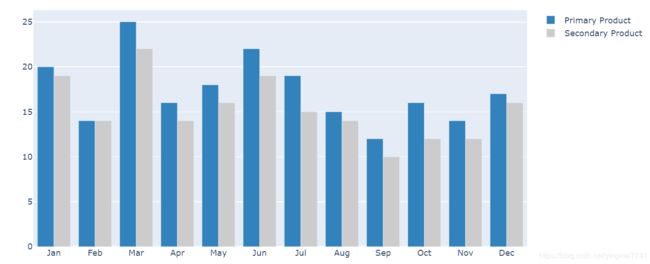
3. 绘制直方图
trace0 = go.Bar(
    x = ['Jan','Feb','Mar','Apr', 'May','Jun',
         'Jul','Aug','Sep','Oct','Nov','Dec'],
    y = [20,14,25,16,18,22,19,15,12,16,14,17],
    name = 'Primary Product',
    marker=dict(
        color = 'rgb(49,130,189)'
    )
)
trace1 = go.Bar(
    x = ['Jan','Feb','Mar','Apr', 'May','Jun',
         'Jul','Aug','Sep','Oct','Nov','Dec'],
    y = [19,14,22,14,16,19,15,14,10,12,12,16],
    name = 'Secondary Product',
    marker=dict(
        color = 'rgb(204,204,204)'
    )
)
data = [trace0,trace1]
py.iplot(data)
4. 绘制饼状图
import plotly
import plotly.graph_objs as go
import plotly.offline as py

fig = {
  "data": [
    {
      "values": [16, 15, 12, 6, 5, 4],
      "labels": ['A','B','C','D','E','F'],
      "domain": {"x": [0, 1]},#图形区域位置(绘制两个或者多个子图需要用到)
      "name": "GHG Emissions",
      "hoverinfo":"label+percent+name",
      "hole": .4,#内圈大小
      "type": "pie"
    }],
  "layout": {
        "title":"图例",
        "annotations": [
            {
                "font": {
                    "size": 20
                },
                "showarrow": False,
                "text": "GHG",
                "x": 0.5,
                "y": 0.5#内圈文本位置与上面图形位置对应
            }
        ]
    }
}
py.iplot(fig, filename='donut')

最后附上自己画的上海各个区的**监测结果图:
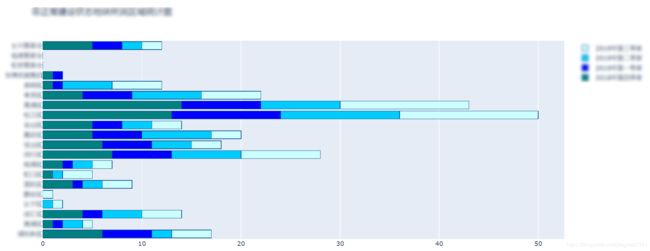
源码
#coding = utf-8
##############################333333333333333333333333333333333333
import plotly as py
import plotly.graph_objs as go

pyplt = py.offline.plot
trace1 = go.Bar(
    y = [],
    x = [],
    name = '2018年第四季度',
    orientation = 'h',
    marker = dict(
        color = '#008080',
        line = dict(
            color = '#104E8B',
            width = 1)
    )
)
trace2 = go.Bar(
    y = [],
    x = [],
    name = '2019年第一季度',
    orientation = 'h',
    marker = dict(
        color = '#0000FF',
        line = dict(
            color = '#104E8B',
            width = 1)
    )
)
trace3 = go.Bar(
    y = [],
    x = [],
    name = '2019年第二季度',
    orientation = 'h',
    marker = dict(
        color = '#00CCFF',
        line = dict(
            color = '#104E8B',
            width = 1)
    )
)

trace4 = go.Bar(
    y = [],
    x = [],
    name = '2019年第三季度',
    orientation = 'h',
    marker = dict(
        color = '#CCFFFF',
        line = dict(
            color = '#104E8B',
            width = 1)
    )
)

data = [trace1, trace2,trace3,trace4]
layout = go.Layout(
    title = '非正常建设状态地块所属区域统计图',
    barmode='stack'
)

fig = go.Figure(data=data, layout=layout)
pyplt(fig, filename='经营性非正常建设状态地块所属区域统计图.html')
效果还是不错滴。。。