Python数据字典处理Excel,并统计总数,画出饼图
之前给大家分享了使用pyechats库画折线图和柱状图,也是读取Excel表格中数据来画图的,这里我使用的是Python3;现在给大家分享使用matplotlib画图,也是读取本地Excel表格中的数据来画图,但是这个我们采用数据字典,可以统计Excel中的数据。而且今天分享的这个方法很实用,有很大的扩展性。很多画图的方法都可以采用这个代码;
现在也是给大家逐一讲解,这有利于大家理解和学习,可以更好的学习Python,后面会附上完整的代码运行结果截图,首先我们需要导入读取Excel的库xrld,和画图的库matplotlib。安装方法我就不多说了,这些库和之前安装库的方法基本是一样的。
导入所需的库,如下:
import xlrd
import numpy as np
from mpl_toolkits.mplot3d import Axes3D
import matplotlib.pyplot as plt
from pylab import *

from datetime import date,datetime
打开本地Excel表格,并读取相应的列和行:
# 打开文件
    workbook = xlrd.open_workbook(r'C:\Users\ASUS\Desktop\txt1\python3\yxz22.xlsx')
    # 获取所有sheet
    #print(workbook.sheet_names()) # [u'sheet1', u'sheet2']
    # 根据sheet索引或者名称获取sheet内容
    sheet1 = workbook.sheet_by_index(0) # sheet索引从0开始
    # sheet的名称,行数,列数
    #print(sheet1.name,sheet1.nrows,sheet1.ncols)
    # 获取整行和整列的值(数组)
    rows = sheet1.row_values(0)
    cols4 = sheet1.col_values(4)# 获取第四行内容
    cols3 = sheet1.col_values(3) # 获取第三列内容
    cols2 = sheet1.col_values(2)
    cols1 = sheet1.col_values(1)
    cols0 = sheet1.col_values(0)
接下来就是采用数据字体统计Excel中表格中相同的对象数据,同时把它存入数组a和数组b中:
dic={}#采用数据字典统计文章类型数目
    for item in cols0:
        if item in dic.keys():
            dic[item]+=1
        else:
            dic[item]=1
    a=[]
    b=[]
    for key in dic:
        a.append(key)
        b.append(dic[key])
之后根据上面数组a和数组b中的值进行基本的数学计算,算出每种相同的数据类型在总的类型数量中所占的比例,这里所使用的的数学的基本算法:
 for u in b:
        i=u/t
        size.append(i)
        plt.plot(size)
然后根据刚刚计算的结果导入到画图的库中,然后画图饼图:
plt.pie(size,labels=label,colors="rgb",autopct='%1.lf%%',shadow=True,startangle=90)以下就是完整的代码的:
import xlrd
import numpy as np
from mpl_toolkits.mplot3d import Axes3D
import matplotlib.pyplot as plt
from pylab import *

from datetime import date,datetime

def read_excel():
    # 打开文件
    workbook = xlrd.open_workbook(r'C:\Users\ASUS\Desktop\txt1\python3\yxz22.xlsx')
    # 获取所有sheet
    #print(workbook.sheet_names()) # [u'sheet1', u'sheet2']
    # 根据sheet索引或者名称获取sheet内容
    sheet1 = workbook.sheet_by_index(0) # sheet索引从0开始
    # sheet的名称,行数,列数
    #print(sheet1.name,sheet1.nrows,sheet1.ncols)
    # 获取整行和整列的值(数组)
    rows = sheet1.row_values(0)
    cols4 = sheet1.col_values(4)# 获取第四行内容
    cols3 = sheet1.col_values(3) # 获取第三列内容
    cols2 = sheet1.col_values(2)
    cols1 = sheet1.col_values(1)
    cols0 = sheet1.col_values(0)

    dic={}#采用数据字典统计文章类型数目
    for item in cols0:
        if item in dic.keys():
            dic[item]+=1
        else:
            dic[item]=1
    a=[]
    b=[]
    for key in dic:
        a.append(key)
        b.append(dic[key])
    plt.rcParams['font.sans-serif']=['SimHei']#正常显示中文标签
    size=[]
    t=sum(b)#统计总的发表篇幅
    label=a
    #计算每种类型所占的比例
    for u in b:
        i=u/t
        size.append(i)
        plt.plot(size)
    plt.title('文章类型比例图')
    plt.pie(size,labels=label,colors="rgb",autopct='%1.lf%%',shadow=True,startangle=90)
    #plt.axis('equal')
    plt.show()


if __name__ == '__main__':
    read_excel()
下面就是结果截图:
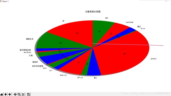
这个是我爬取某个博客存入Excel中的数据,经过刚才的代码读取,最终画出来的饼图;
好了,今天就分享到这里了,如果有什么疑问或者需求请给我留言,或许我能够解决一二!