transfrom translate transition animation傻傻分不清
之前一直还觉得很自信,感觉自己css部分掌握 的很不错,但是知识确实是需要经常回顾的,这半年很少写原生的东西,结果前两天看见一道题目,看见这四个单词我当场石化,完全分不清楚了…为了加深自己的记忆,我写这篇博客稍微总结一下:
- transition 触发式动画
- animation 主动动画
- transfrom 让…变形,是一个复合属性
- translate transfrom的一个属性.
1.触发式动画transition
所谓触发式动画就是需要用户有一个交互行为,动画才能发生.
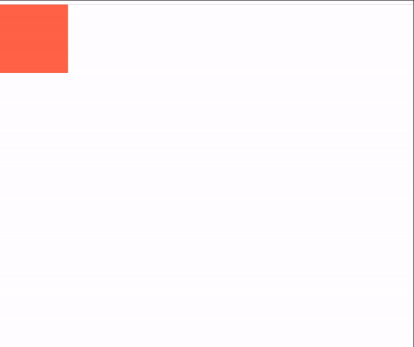
先看一个简单的例子,后面再逐个介绍他的属性:
        #box {
            width: 100px;
            height: 100px;
            background-color: tomato;
            transition:width  2s;
        }
        #box:hover{
            width: 500px;
        }
看下效果:
当我鼠标移到盒子上的时候就会触发动画.
transiton的常用属性:
| 属性 | 说明 |
|---|---|
| transition-duration | 一个动画持续的时间 |
| transition-delay | 动画延迟多少秒开始运行,不能设置负数或0,否则会失去动画效果 |
| transition-timg-fucntion | 动画运行时的速度变化曲线 |
| transition-property | 设置元素的哪个属性发生变化 |
transition-timg-fucntion的常用属性:
- ease 慢-快-很慢
- linear 匀速
- ease-in 先慢后快
- ease-out 先快后慢
- ease-in-out 慢-快-慢
transition的复合写法:
transition:property duration dealy timing-function
//如
transition:width 3s 1s ease
2.主动动画animation
如果要给元素添加动画,我们需要了解animation 属性以及 @keyframes 规则.animation属性用于控制动画的外观,@keyframes 规则控制动画中各个阶段的变化.总共有8个animation 属性.
| 属性 | 意义 |
|---|---|
| animation-name | 设置动画名称 |
| animation-duration | 动画执行所花费的时间(可以是小数,但必须是正数),例animation-duration:1s; |
| animation-delay | 在页面打开之后,动画延迟多长时间开始执行,例,animation-delay : 3s; |
| animation-timing-mode(运行结束的状态) | forwards 动画结束后停在最后一帧backforwards 动画结束后返回第一帧 |
| animation-iterator-count num(1,2,3…) 动画运行的次数 | infinite 动画一直循环往复运动 |
| animation-direction(运行方向) | alternate 正反交替运行 reverse 反向运行 lternate-revers 先倒着播放再顺着播放 |
| animation-play-state(播放状态) | running 当前动画正在运行pause 当前动画可以被停止 |
| animation-timing-function(画在每一动画周期中执行的节奏) | ease 慢-快-很慢linear 匀速ease-in 先慢后快ease-out 先快后慢ease-in-out 慢-快-慢 |
@keyframes 能够创建动画。 创建动画的原理是将一套 CSS 样式逐渐变化为另一套样式。具体是通过设置动画期间对应的“frames”的 CSS 的属性,以百分比来规定改变的时间,或者通过关键词“from”和“to”,等价于 0% 和 100%。打个比方,CSS 里面的 0% 属性就像是电影里面的开场镜头。CSS 里面的 100% 属性就是元素最后的样子,相当于电影里的演职员表或者鸣谢镜头。CSS 在对应的时间内给元素过渡添加效果。
下面举例说明 @keyframes 和动画属性的用法:
#anim {
  animation-name: colorful;
  animation-duration: 3s;
}
@keyframes colorful {
  0% {
    background-color: blue;
  }
  100% {
    background-color: yellow;
  }
}
id 为 anim 的元素,代码设置 animation-name 为 colorful,设置 animation-duration 为 3 秒。然后把 @keyframes 引用到名为 colorful 的动画属性上。 colorful 在动画开始时(0%)设置颜色为蓝色,在动画结束时(100%)设置颜色为黄色。注意不是只有开始和结束的过渡可以设置,0% 到 100% 间的任意百分比你都可以设置。
animation的复合写法
animation: name duration timing-function delay iteration-count direction fill-mode;
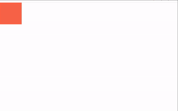
示例如下:
        #box {
            width: 100px;
            height: 100px;
            background-color: tomato;
            animation: demo 3s linear  infinite alternate forwards;
       }
        @keyframes demo {
            0%{
                width: 100px;
                height: 100px;
                background-color: tomato;
            }
            100%{
                width: 500px;
                height: 500px;
                background-color: teal;
            }
        }
3.变形transfrom
transfrom的常用属性如下:
| 属性 | 说明 |
|---|---|
| ratate() 旋转 | 角度值为deg 正值顺时针旋转 负值逆时针旋转 |
| scale(x) 缩放 | 0元素小消失 x>1放大元素 0 |
| skew(x,y) | 扭曲 倾斜 穿一个角度值 |
| translalte(x,y) | 移动 |
我只进行了简单的列举,具体可戳链接
https://www.runoob.com/cssref/css3-pr-transform.html
https://developer.mozilla.org/zh-CN/docs/Web/CSS/transform
示例如下:
        #box {
            width: 100px;
            height: 100px;
            background-color: tomato;

            animation: demo 3s linear   alternate forwards;
       }
        @keyframes demo {
            0%{

            }
            50%{
                transform: translate(200px,200px) scale(0.5);
            }
            100%{
                transform: translate(0px,0px) scale(1.2);
            }
        }
效果如下: