制作各类渐变线条
制作各类渐变线条
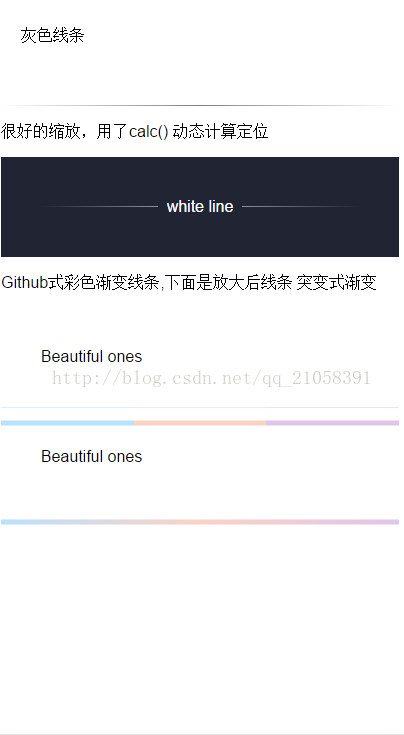
灰色线条
很好的缩放,用了calc() 动态计算定位
white line
Github式彩色渐变线条,下面是放大后线条
突变式渐变
Beautiful ones
Beautiful ones
body{
	font-family:"Helvetica";
}

.line-one{
	width:100%;
	height:100px;
	position:relative;
	box-sizing:border-box;
	padding:20px;
}

.line-one::after{
	position:absolute;
	width:100%;
	height:1px;
	content:"";
	display:block;
	background-image:linear-gradient(to right,white,black,white);
	left:0;
	bottom:0;
	transform:scaleY(0.5);
}


/*文字居中,2边加线条,一种常见的设计*/
.line-two{
	margin-top:10px;
	width:100%;
	height:100px;
	position:relative;
	box-sizing:border-box;
	padding:20px;
	background-color:#212433;
	color:white;
	line-height:60px;
	text-align:center;
}

.line-two::after{
	position: absolute;
    width: 30%;
    height: 1px;
    content: "";
    display: block;
    background-image: linear-gradient(to right,#212433,white);   /*使用to 可以很好的兼容*/
    left: calc(20% - 42px);                 /*宽度30% 左偏移20%可以居中线条,但是减去文字的宽度,这里细心调整,缩放后距离仍然一致*/
    left: -moz-calc(20% - 42px);
    left: -webkit-calc(20% - 42px);
    bottom: 50%;
    transform: scaleY(0.5);
}

.line-two::before{
	position: absolute;
    width: 30%;
    height: 1px;
    content: "";
    display: block;
    background-image: linear-gradient(to left,#212433,white);
 	left: calc(50% + 42px);
 	left: -moz-calc(50% + 42px);
 	left: -webkit-calc(50% + 42px);
    bottom: 50%;
    transform: scaleY(0.5);
}


/**/

.line-three{
	width:80%;
	padding:10%;
	height:20px;
	position:relative;
}

.line-three::after{
	position:absolute;
	left:0;
	bottom:0;
	content:"";
	display:block;
	width:100%;
	height:1px;
	transform:scaleY(0.5);
	background-image: linear-gradient(to right,
						 #b8e1ff 33.3333%,
						  #fcd2c5 33.3333%,
						  #fcd2c5 66.6666%,
						  #e0c5eb 66.6666%);
}

.line-three::before{
	position:absolute;
	left:0;
	bottom:-20px;
	content:"";
	display:block;
	width:100%;
	height:10px;
	transform:scaleY(0.5);
	background-image: linear-gradient(to right,
						 #b8e1ff 33.3333%,
						  #fcd2c5 33.3333%,
						  #fcd2c5 66.6666%,
						  #e0c5eb 66.6666%);
}


.line-four{
	width:80%;
	padding:10%;
	height:20px;
	position:relative;
}


.line-four::before{
	position:absolute;
	left:0;
	bottom:-20px;
	content:"";
	display:block;
	width:100%;
	height:10px;
	transform:scaleY(0.5);
	background-image: linear-gradient(to right,
						 #b8e1ff 0%,
						  #fcd2c5 50%,
						  #e0c5eb 100%);
}
另外补充一个小知识点:
linear-gradient( [| to ,]? [, ]+ )
角度是顺时针的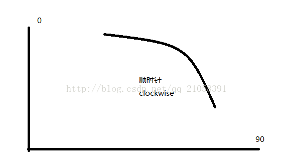
例如:background-image:linear-gradient(0deg,red,blue) 从下到上的 由红色变为蓝色
background-image:linear-gradient(90deg,red,blue) 从左到右的 由红色变为蓝色
跨浏览器实施渐变
这里包含了所有前缀的渐变设置。
.grad {
  background-color: #F07575; /* fallback color if gradients are not supported */
  background-image: -webkit-linear-gradient(top, hsl(0, 80%, 70%), #bada55); /* For Chrome 25 and Safari 6, iOS 6.1, Android 4.3 */
  background-image:    -moz-linear-gradient(top, hsl(0, 80%, 70%), #bada55); /* For Firefox (3.6 to 15) */
  background-image:      -o-linear-gradient(top, hsl(0, 80%, 70%), #bada55); /* For old Opera (11.1 to 12.0) */
  background-image:         linear-gradient(to bottom, hsl(0, 80%, 70%), #bada55); /* Standard syntax; must be last */
}