H5版基于uni-app实现自定义底部tabbar效果(支持底部图标选中时的渐变效果)
首先声明部分代码转载自 uniapp自定义tabbar导航解析
我自己又在基础上添加了一些功能,如实现tab的数字角标、tab页面跳转、tabbar选中状态的图标高亮渐变。
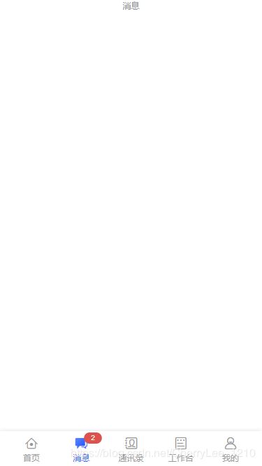
效果如下:
tabbar已经抽离成组件了。
tabbar组件代码
<template>
  <view class="tab-bar-container">
    <block v-for="(item, index) in tabList" :key="index">
      <view class="navigator" :class="[currentTabIndex === index ? 'on' : '']" @tap="switchTab(item, index)">
        <view class="icon">
          <text class="icon-style iconfont" :class="[currentTabIndex === index ? [item.iconActive, 'height-light'] : item.icon]" :style="[currentTabIndex === index ? '' : { color: color }]"></text>
        </view>
        <view class="text" :style="[currentTabIndex === index ? { color: tintColor } : { color: color }]">{{ item.text }}</view>
        <!-- 消息数字角标 -->
        <uni-badge class="num-badge" v-if="item.badgeNum" size="small" type="error" :text="item.badgeNum" @click="handleBadge(index)"></uni-badge>
      </view>
    </block>
  </view>
</template>

<script>
import uniBadge from "@/components/uni-badge/uni-badge.vue"
export default {
  components: {
    uniBadge
  },
  props: {
    current: {
      type: [Number, String],
      default: 0
    },
    backgroundColor: {
      type: String,
      default: '#fbfbfb'
    },
    color: {
      type: String,
      default: '#999'
    },
    tintColor: {
      type: String,
      default: '#3768FC'
    }
  },
  data() {
    return {
      // 数字角标
      /*
       * icon 默认图标
       * iconActive 选中图标
       * text 文字信息
       * path 页面路径
       */
      tabList: [
        {
          icon: 'icon-home',
          iconActive: 'icon-home-hl',
          text: '首页',
          path: '../index/index'
        },
        {
          icon: 'icon-tidings',
          iconActive: 'icon-tidings-hl',
          text: '消息',
          path: '../message/message',
          badgeNum: 2
        },
        {
          icon: 'icon-mailList',
          iconActive: 'icon-mailList-hl',
          text: '通讯录',
          path: '../contacts/contacts'
        },
        {
          icon: 'icon-workPlatform',
          iconActive: 'icon-workPlatform-hl',
          text: '工作台',
          path: '../workPlatform/workPlatform'
        },
        {
          icon: 'icon-user',
          iconActive: 'icon-user-hl',
          text: '我的',
          path: '../my/my'
        }
      ],
      currentTabIndex: this.current
    };
  },
  methods: {
    // 切换页面
    switchTab(tab, index) {
      this.currentTabIndex = index;

      if (this.currentTabIndex === index && tab.badgeNum) {
        this.$nextTick(function(){
          this.$set(this.tabList[index], 'badgeNum', 0)
        })
      }

      this.$emit('click', {
        path: tab.path,
        index
      });
    },
    // 点击数字角标
    handleBadge(index) {
      // if (this.currentTabIndex === index) {
      //   this.badgeNum = 0
      // }
    }
  }
};
</script>

<style scoped lang="scss">
.tab-bar-container {
  position: fixed;
  left: 0;
  bottom: 0;
  z-index: 999;
  width: 100%;
  height: 50px;
  box-shadow: 0 0 6px 0 rgba(0,0,0,0.12);
  display: flex;
  align-items: center;
  justify-content: space-between;
  padding: 0 50rpx;
  box-sizing: border-box;
  background-color: #fff;


  .navigator {
    height: 100%;
    width: 80rpx;
    display: flex;
    flex-direction: column;
    align-items: center;
    justify-content: center;
    position: relative;

    .icon-style {
      font-size: 20px;
    }

    /* 选中图标的高亮样式 */
    .height-light {
      background: linear-gradient(137deg, #507EFF 26%, #2A56F7 71%, #193EEE 100%);
      -webkit-background-clip: text;
      color: transparent;
    }

    .text {
      font-size: 24rpx;
    }

    .num-badge {
      position: absolute;
      top: 0;
      right: -26rpx;
    }
  }
}
</style>
tabbar组件的使用
<template>
  <view class="container">
    <text class="title">{{ name }}</text>

    <!-- 自定义tabbar -->
    <tab-bar :current="currentTabIndex" backgroundColor="#FFFFFF" color="#999" tintColor="#3768FC" @click="tabClick"></tab-bar>
  </view>
</template>

<script>
export default {
  data() {
    return {
      name: '消息',
      // 当前tab高亮索引
      currentTabIndex: 1
    };
  },
  methods: {
    // 进行tab页跳转
    tabClick(obj) {
      this.currentTabIndex = obj.index
      uni.redirectTo({
         url: obj.path
      })
    }
  }
};
</script>

<style>
.container {
  display: flex;
  flex-direction: column;
  align-items: center;
  justify-content: center;
}

.title {
  font-size: 24rpx;
  color: #8f8f94;
}
</style>