Understanding Auto Layout
理解自动布局
Auto Layout dynamically calculates the size and position of all the views in your view hierarchy, based on constraints placed on those views. For example, you can constrain a button so that it is horizontally centered with an Image view and so that the button’s top edge always remains 8 points below the image’s bottom. If the image view’s size or position changes, the button’s position automatically adjusts to match.
自动布局可以动态地计算视图层次中所有视图的尺寸和位置,它根据那些视图上设置的各种约束(constraints)。 举个例子,你可以给一个按钮设定一个约束,让它跟一个Image视图一起位于视图的水平中间位置,让它的上边总是跟图片的底边保持8points。 如果image视图的尺寸或位置发生改变,按钮的位置会自动调整。
This constraint-based approach to design allows you to build user interfaces that dynamically respond to both internal and external changes.
这种基于约束(constraint-based)方法的设计让你构建的用户界面可以动态地响应来自内部和外部的改变。
External Changes
一、外部改变
External changes occur when the size or shape of your superview changes. With each change, you must update the layout of your view hierarchy to best use the available space. Here are some common sources of external change:
当你的父视图的尺寸或形状改变时将发生外部改变(external changes)。 每次变化,你都必须更新视图层次中的布局以实现最合理的布局。 以下是一个常见的外部变化:
-
The user resizes the window (OS X).
用户改变了窗口尺寸(OS X)。
-
The user enters or leaves Split View on an iPad (iOS).
用户进入或离开iPad上的拆分视图(iOS)。
-
The device rotates (iOS).
设计旋转(iOS)。
-
The active call and audio recording bars appear or disappear (iOS).
来电和音频录音条的出现或消失(iOS)。
-
You want to support different size classes.
你想要支持不同尺寸的类。
-
You want to support different screen sizes.
你想要支持不同的屏幕尺寸。
Most of these changes can occur at runtime, and they require a dynamic response from your app. Others, like support for different screen sizes, represent the app adapting to different environments. Even through the screen size won’t typically change at runtime, creating an adaptive interface lets your app run equally well on an iPhone 4S, an iPhone 6 Plus, or even an iPad. Auto Layout is also a key component for supporting Slide Over and Split Views on the iPad.
大多数这些改变可以发生在运行时,并且它们向你的应用请求一个动态地响应。 其它像支持不同尺寸的屏幕,表示应用程序适用于不同的环境。 即使屏幕尺寸不需要在运行时(runtime)发生改变,创建一个可适配界面可以让你的应用程序同时运行在iPhone 4S, iPhone 6+,或者是iPad。 自动布局同时是iPad上支持Slide Over 和 Split Views的一个关键组件。
Internal Changes
二、内部改变
Internal changes occur when the size of the views or controls in your user interface change.
内部改变发生在当用户界面中的尺寸或空间发生改变时。
Here are some common sources of internal change:
以下是一些常见的内部改变:
-
The content displayed by the app changes.
应用程序显示的内容发生改变。
-
The app supports internationalization.
应用程序支持国际化。
-
The app supports Dynamic Type (iOS).
应用程序支持动态类型(iOS)。
When your app’s content changes, the new content may require a different layout than the old. This commonly occurs in apps that display text or images. For example, a news app needs to adjust its layout based on the size of the individual news articles. Similarly, a photo collage must handle a wide range of image sizes and aspect ratios.
Internationalization is the process of making your app able to adapt to different languages, regions, and cultures. The layout of an internationalized app must take these differences into account and appear correctly in all the languages and regions that the app supports.
Internationalization has three main effects on layout. First, when you translate your user interface into a different language, the labels require a different amount of space. German, for example, typically requires considerably more space than English. Japanese frequently requires much less.
Second, the format used to represent dates and numbers can change from region to region, even if the language does not change. Although these changes are typically more subtle than the language changes, the user interface still needs to adapt to the slight variation in size.
Third, changing the language can affect not just the size of the text, but the organization of the layout as well. Different languages use different layout directions. English, for example, uses a left-to-right layout direction, and Arabic and Hebrew use a right-to-left layout direction. In general, the order of the user interface elements should match the layout direction. If a button is in the bottom-right corner of the view in English, it should be in the bottom left in Arabic.
当应用程序的内容改变时,新内容或许跟就内容的布局不一样。 这种变化通常发生在应用程序中显示的文本或图片发生改变时。比如,一个新应用需要根据不同的新闻文章调整它的布局。 类似地,一个照片拼贴(photo collage)应用必须处理很多不同尺寸和长宽比的图片。国际化(Internationalization)是让你的应用程序可以让不同语言,地域和文化的用户同时使用的过程。一个国际化后的应用程序所需要的布局必须在账号(account)里考虑这些区别并在所有的语言和地域正确显示。国际化主要让布局发生以下三个改变。首先,当你把用户界面翻译成别的语言时,标签需要不同的空间。比如,德语通常比英语需要更多地空间。 日语常常要求的空间少得多。其次,即使语言一样,不同的地域表示日期和数字的格式不同。尽管这些变化比语言发生变化时表现的更细微,用户界面的尺寸仍需要做细微的调整。第三,语言的改变不仅仅影响文本的尺寸,它还会改变布局的组织结构。 不同的语言使用不同的布局方向。比如,英语使用从左到右布局方向,阿拉伯语和希伯来语使用从右向左布局方向。 通常,用户界面元素的顺序应该跟布局方向相匹配。 如果一个按钮在英语布局中位于视图的右下角,那它在阿拉伯语布局中应该位于左下角。
Finally, if your iOS app supports dynamic type, the user can change the font size used in your app. This can change both the height and the width of any textual elements in your user interface. If the user changes the font size while your app is running, both the fonts and the layout must adapt.
最后,如果你的iOS应用程序支持动态类型,用户可以改变应用程序中得字体尺寸。这样做可以同时改变用户界面中所有文本元素的高度和宽度。如果应用程序运行时,用户改变了字体尺寸,字体和布局都必须改变以匹配该变化。
Auto Layout Versus Frame-Based Layout
三、自动布局VS基于框架的布局
There are three main approaches to laying out a user interface. You can programmatically lay out the user interface, you can use autoresizing masks to automate some of the responses to external change, or you can use Auto Layout.
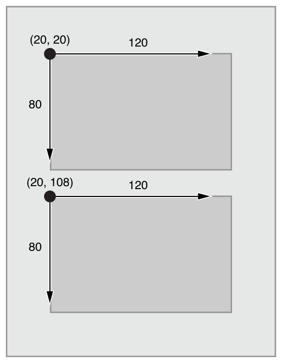
Traditionally, apps laid out their user interface by programmatically setting the frame for each view in a view hierarchy. The frame defined the view’s origin, height, and width in the superview’s coordinate system.
目前,有三种方法可以布局用户界面。 你可以通过代码布局用户界面,你也可以使用自动缩放遮罩(autoresizing masks)来自动响应一些外部变化,或者你还可以使用自动布局。 通常,应用程序通过代码设置一个视图层次中每个视图的框架。 框架定义了视图位于父视图坐标系统中的起始点(origin),高度和宽度。

To lay out your user interface, you had to calculate the size and position for every view in your view hierarchy. Then, if a change occurred, you had to recalculate the frame for all the effected views.
要想布置你的用户界面,你必须为视图层次中所有视图计算尺寸和位置。然后,如果视图发生了改变,你就不得不为所有受影响的视图重新计算它们的框架。
In many ways, programmatically defining a view’s frame provides the most flexibility and power. When a change occurs, you can literally make any change you want. Yet because you must also manage all the changes yourself, laying out a simple user interface requires a considerable amount of effort to design, debug, and maintain. Creating a truly adaptive user interface increases the difficulty by an order of magnitude.
在很多方面来说,通过代码定义一个视图的框架为视图提供了最大的灵活性和力量。 当视图发生改变时,你可以确实地实现你想要的任何改变。 但是因为你还是必须自己动手管理所有的改变,仅仅布置一个简单的用户界面就需要大量的努力来设计,测试并保持。创建一个真正适合的用户界面所增加的难度就是不止一个难度级别了。
You can use autoresizing masks to help alleviate some of this effort. An autoresizing mask defines how a view’s frame changes when its superview’s frame changes. This simplifies the creation of layouts that adapt to external changes.
However, autoresizing masks support a relatively small subset of possible layouts. For complex user interfaces, you typically need to augment the autoresizing masks with your own programmatic changes. Additionally, autoresizing masks adapt only to external changes. They do not support internal changes.
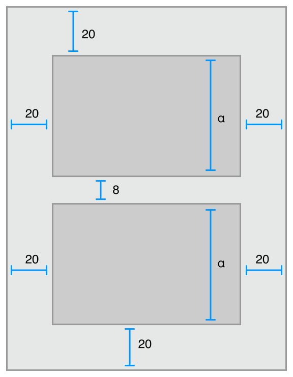
Although autoresizing masks are just an iterative improvement on programmatic layouts, Auto Layout represents an entirely new paradigm. Instead of thinking about a view’s frame, you think about its relationships.
Auto Layout defines your user interface using a series of constraints. Constraints typically represent a relationship between two views. Auto Layout then calculates the size and location of each view based on these constraints. This produces layouts that dynamically respond to both internal and external changes.
你可以用自动缩放遮罩(autoresizing masks)来帮你减轻一些困难。autoresizing mask 定义了,当一个视图的父视图框架发生改变时,它的框架如何改变。这样就可以简化适应外部变化的布局(layouts)的生成。然后,autoresizing masks只支持一小部分可能的布局(layouts)。对于复杂的用户界面来说,你通常需要通过你的代码来增加(augment)autoresizing masks。 另外,autorisizing masks只适合外部变化。 它们不支持内部变化。 尽管autoresizing masks 只能通过代码不断完善布局(layouts),自动布局却代表了一个全新的模式。它不考虑视图的框架,而是考虑它们的关系。 自动布局用一系列的约束(constraints)来定义你的用户界面。 约束通常表示两个视图之间的关系。 自动布局然后根据这些约束来计算每个视图的尺寸和位置。这样就可以动态地同时响应内部和外部改变。

The logic used to design a set of constraints to create specific behaviors is very different from the logic used to write procedural or object-oriented code. Fortunately, mastering Auto Layout is no different from mastering any other programming task. There are two basic steps: First you need to understand the logic behind constraint-based layouts, and then you need to learn the API. You’ve successfully performed these steps when learning other programming tasks. Auto Layout is no exception.
通过设计一系列约束来创建特定行为的逻辑跟写程序或面向对象的代码所使用的逻辑是很不一样的。 幸运地是,掌握自动布局跟掌握任何一门编程技术是一样的。 它们都包含两个基本步骤:首先你需要理解基于约束的布局背后的逻辑,然后你需要学习API。 当你学习其它编程技术时,你已经成功地完成了这些步骤。 那么自动布局也肯定难不倒你。
The rest of this guide is designed to help ease your transition to Auto Layout. The Auto Layout Without Constraints chapter describes a high-level abstraction that simplifies the creation of Auto Layout backed user interfaces. The Anatomy of a Constraint chapter provides the background theory you need to understand to successfully interact with Auto Layout on your own. Working with Constraints in Interface Builder describes the tools for designing Auto Layout, and the Programmatically Creating Constraints and Auto Layout Cookbookchapters describe the API in detail. Finally, the Auto Layout Cookbook presents a wide range of sample layouts of varying levels of complexity, you can study and use in your own projects, and Debugging Auto Layout offers advice and tools for fixing things if anything goes wrong.
本文剩下的内容是引导你更快地掌握自动布局。 Auto Layout Without Constraints 描述了一个高层次的抽象概念,它简化了用户界面背后的自动布局的创建。 Anatomy of a Constraint 提供了让你能够成功跟自动布局交互的背景知识。 Working with Constraints in Interface Builder 描述了设计自动布局的工具,而 Programmatically Creating Constraints 和 Auto Layout Cookbook 则详细讲述了API。 最后, Auto Layout Cookbook 则呈现了很多不同层次,大范围的实例,你可以学习并在你的项目中使用, Debugging Auto Layout 提供了当自动布局出错时可能需要的建议和工具。