CSS3 Media Queries在iPhone4和iPad上的运用
CSS3 Media Queries的介绍在本站上的介绍已有好几篇文章了,但自己碰到的问题与解决的文章还是相对的较少。前几天在《修复iPhone上submit按钮bug》上介绍了修复form中sumit按钮的bug。同一个项目,为了实现iPhone和iPad横板与竖板的风格,让我还是头疼了一翻。
一开始按照CSS3 Media Queries模板中的介绍来运用,虽然帮我解决了iPad的横板与竖板的风格渲染问题,但在iPhone4上还是存在问题的。后来结过网上的查找,总算是问题解决了,下面就来看看问题是如何解决的。
在具体开始之前,先来看看他的源码:
login form
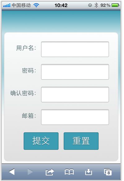
现在在iPhone4竖板是OK的,如下图所示
但现在需求是,在iPhone4的横板以及iPad的横板与竖板下,也需要让表单居中显示:
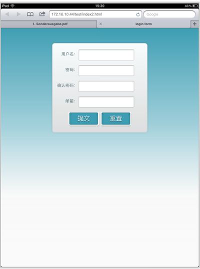
上图显示的是iPad竖板下的需求,横板下也需要类似的效果。
需求明确,做法也是有思路的,首先我按照:CSS3 Media Queries模板中的模板在样式中增加了代码:
	/*iPad竖板*/
	@media screen and (max-device-width: 768px) and (orientation: portrait) {
    form {
      margin: 0 25%;
    }
  }
	/*iPad横板*/
	@media screen and (max-device-width: 1024px) and (orientation: landscape) {
    form {
      margin: 0 25%;
    }
  }
	/*iPhone4*/
	@media only screen and (max-device-width: 480px),
    only screen and (-webkit-min-device-pixel-ratio: 2) {
			form {
        margin: 0 ;
			}
      .controls {
        width: 68%;
      }
	}
加上上面代码后在iPad下是正常了,而且不会有什么问题存在。但在iPhone4上依然存在一个怪异的现象:当你iPhone4加载页面是用横板加载,再旋转到竖板,不会存在任何问题,而且显示也是蛮正常的。但是初始加载页面是竖板,然后在旋转到横板,就有问题了,表单给放大了
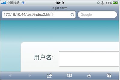
初步给我感觉就是放大了,但具体是不是因为这个原因,我也不太清楚,查找了一些资料,也尝试了无解决办法。最后也从横板竖板的思路出发查找资料,经过一试,给解决了,下面来看看这段代码:
	/* iPhone 4 竖板 */
@media
only screen and (-webkit-min-device-pixel-ratio : 1.5) and (orientation:portrait),
only screen and (min-device-pixel-ratio : 1.5)  and (orientation:portrait){
    form {
      margin:0;
    }
		.controls {
			width: 68%;
		}
}

/* iPhone 4 横板 */
@media
only screen and (-webkit-min-device-pixel-ratio : 1.5) and (orientation:landscape),
only screen and (min-device-pixel-ratio : 1.5)  and (orientation:landscape){
    form {
        margin:0 10%;
    }
		.controls {
			width: 68%;
		}
}
这样一来就OK了。在iPhone4和iPad的横竖板下都能正常让表单居中显示。

那么以后大家在iPhone4和iPad设备上,就可以按照横竖板来定样式了:
1、iPhone4竖板
	@media
	only screen and (-webkit-min-device-pixel-ratio : 1.5) and (orientation:portrait),
	only screen and (min-device-pixel-ratio : 1.5)  and (orientation:portrait){
		/*你的样式写在这里*/
	}
2、iPhone横板
		@media
		only screen and (-webkit-min-device-pixel-ratio : 1.5) and (orientation:landscape),
		only screen and (min-device-pixel-ratio : 1.5)  and (orientation:landscape){
			/*你的样式写在这里*/
		}
3、iPad竖板
	@media screen and (max-device-width: 768px) and (orientation: portrait) {
		/*你的样式写在这里*/
  }
4、iPad横板
	@media screen and (max-device-width: 1024px) and (orientation: landscape) {
		/*你样式写在这里*/
  }
上面四种CSS3 Media Queries就是用来对付iPhone4和iPad的,至于其他的运用,大家参考下面我重新整理的CSS3 Media Queries模板:
CSS3 Media Queries 模板:
1、Smartphones (竖板和横板)
		@media only screen and (min-device-width : 320px) and (max-device-width : 480px) {
			/* 你的样式写在这里 */
		}
		//===或者====//
		< link rel="stylesheet" href="smartphones.css" media="only screen and (min-device-width : 320px) and (max-device-width : 480px)" />
2、Smartphones (横板)
		@media only screen and (min-width : 321px) {
			/* 你的样式写在这里 */
		}

		//===或者====//
		< link rel="stylesheet" href="smartphones-landscape.css" media="only screen and (min-width : 321px)" />
3、Smartphones (竖板)
		@media only screen and (max-width : 320px) {
			/* 你的样式写在这里 */
		}
		//===或者====//
		< link rel="stylesheet" href="smartphones-portrait.css" media="only screen and (max-width : 320px)" />
4、iPad(竖板和横板)
		@media only screen and (min-device-width : 768px) and (max-device-width : 1024px) {
			/* 你的样式写在这里 */
		}
		//===或者====//
		< link rel="stylesheet" href="ipad.css" media="only screen and (min-device-width : 768px) and (max-device-width : 1024px)" />
5、iPad横板
		@media only screen and (min-device-width : 768px) and (max-device-width : 1024px)	and (orientation : landscape) {
			/* 你的样式写在这里 */
		}
		//===或者====//
		< link rel="stylesheet" href="ipad-landscape.css" media="only screen and (min-device-width : 768px) and (max-device-width : 1024px)	and (orientation : landscape)" />
6、iPad的竖板
		@media only screen and (min-device-width : 768px) and (max-device-width : 1024px) and (orientation : portrait) {
			/* 你的样式写在这里 */
		}

		//===或者====//
		< link rel="stylesheet" href="ipad-portrait.css" media="only screen and (min-device-width : 768px) and (max-device-width : 1024px) and (orientation : portrait)" />
7、Desktops and laptops
		@media only screen and (min-width : 1224px) {
			/* 你的样式写在这里 */
		}

		//===或者====//
		< link rel="stylesheet" href="desktops-and-laptops.css" media="only screen and (min-width : 1224px)" />
8、Large screens
		@media only screen and (min-width : 1824px) {
			/* 你的样式写在这里 */
		}
		//===或者====//
		< link rel="stylesheet" href="large-screens.css" media="only screen and (min-width : 1824px)" />
9、iPone4
		@media only screen and (-webkit-min-device-pixel-ratio : 1.5),only screen and (min-device-pixel-ratio : 1.5) {
			/* 你的样式写在这里 */
		}
		//===或者====//
		< link rel="stylesheet" href="iphone4.css" media="only screen and (-webkit-min-device-pixel-ratio : 1.5),only screen and (min-device-pixel-ratio : 1.5)" />
10、iPhone4竖板
	@media only screen and (-webkit-min-device-pixel-ratio : 1.5) and (orientation:portrait),	only screen and (min-device-pixel-ratio : 1.5)  and (orientation:portrait){
		/*你的样式写在这里*/
	}
	//===或者====//
		< link rel="stylesheet" href="iphone4-portrait.css" media="only screen and (-webkit-min-device-pixel-ratio : 1.5) and (orientation:portrait),	only screen and (min-device-pixel-ratio : 1.5)  and (orientation:portrait)" />
11、iPhone4横板
		@media only screen and (-webkit-min-device-pixel-ratio : 1.5) and (orientation:landscape),only screen and (min-device-pixel-ratio : 1.5)  and (orientation:landscape){
			/*你的样式写在这里*/
		}
		//===或者====//
		< link rel="stylesheet" href="iphone4-landscape.css" media="only screen and (-webkit-min-device-pixel-ratio : 1.5) and (orientation:landscape),only screen and (min-device-pixel-ratio : 1.5)  and (orientation:landscape)" />
上面罗列了常用的CSS3 Media Queries模板,特别是在移动设备上的几种,希望对大家在今后的移动开发端上的运用有所帮助。当然CSS3 Media Queries的运用条件往往不只这些,大家完全可以根据自己的需求去定义不同的条件,但个人建议,使用CSS3 Media Queries采用主流就Ok了。随着潮流走嘛。那么今天就扯到这了。如果大家有更好的经验,可以通过下面的评论与我们一起分享。
2012年04月16日更新:iPad 3 Media Query
@media only screen and (min-device-width: 1536px) and (max-device-width: 2048px) and (-webkit-min-device-pixel-ratio: 2)
{
  // your CSS
}