python数据可视化分析—matplotlib
文章目录
- Numpy
- 散点图
- 折线图
- 条形图
- 直方图
- 饼状图
- 箱型图
- 颜色和样式
- 面向对象VS Matiab Style
- 子图-subplot
- 多图-figure
- 网格
- 图例
- 坐标轴范围
- 坐标轴刻度
- 添加坐标轴
Numpy
numpy是什么
1、Numpy是Python的开源的数值计算扩展。
2、可用来存储和处理大型矩阵,比Python自身数据结构要高效。
3、Numpy将Python变成一种免费的强大的Matlab系统。
ndarray
1、三种创建方式:
a、从Python的基础对象转化。
import numpy as np
a=[1,2,3,4]
a
Out[18]: [1, 2, 3, 4]
x1 = np.array(a)
x1
Out[20]: array([1, 2, 3, 4])
type(x1)
Out[21]: numpy.ndarray
b、通过numpy内生的函数生成。
x = np.arange(11)
x
Out[23]: array([ 0,  1,  2,  3,  4,  5,  6,  7,  8,  9, 10])
c、从硬盘(文件)读取数据。
x = np.loadtxt('000001.csv',delimiter = ',',skiprows = 1,usecols = (1,4,6),unpack = False)
x.shape
Out[26]: (242, 3)
2、索引和切片
a、print c[1:5]
b、print c[:5]
c、print c[::-1]
3、常用函数
min ,max , median , mean(均值) ,variance(方差) ,sort
调用方法
a、np.func(x)
b、x.func()
import numpy as np
c =np.random.randint(1,100,10)
c
Out[32]: array([40, 29, 70, 48, 46, 17, 67, 96,  4, 26])
np.min(c)
Out[33]: 4
np.max(c)
Out[34]: 96
c.min()
Out[35]: 4
注意:
a、用np函数排序生成新序列,原序列不发生变换
b、用x.sort排序不生成新序列,原序列发生改变
散点图
散点图显示两组数据的值,每个点的坐标位置由变量的值决定。
由一组不连续的点完成,用于观察两种变量的相关性。
例如身高-—体重 温度—纬度等
相关性:正相关,负相关,不相关
import matplotlib.pyplot as plt
height = [161,170,182,175,173,165]
weight = [50,58,80,70,69,55]
plt.scatter(height,weight)
plt.show()

不相关
import numpy as np
import matplotlib.pyplot as plt

N =1000
x = np.random.randn(N)
y1 = np.random.randn(N)
plt.scatter(x,y1)
plt.show()

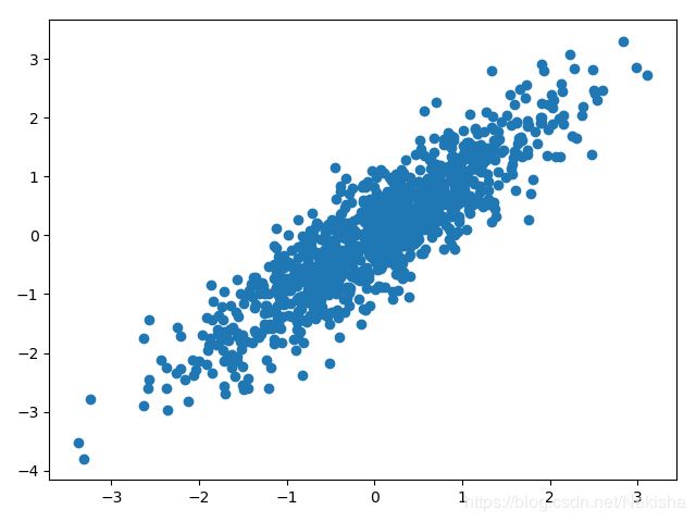
正相关(负相关则为-x)
import numpy as np
import matplotlib.pyplot as plt

N =1000
x = np.random.randn(N)
y = x+np.random.randn(N)*0.5
plt.scatter(x,y)
plt.show()
实例:股票价格涨幅(前一天和后一天对比)
import numpy as np
import matplotlib.pyplot as plt

open,close=np.loadtxt('000001.csv',delimiter = ',',skiprows=1,usecols=(1,4),unpack=True)
change =close - open

yesterday = change[:-1]
today = change[1:]

plt.scatter(yesterday,today)

plt.show()

说明:前一天和后一天涨幅变化为不相关
外观调整、
颜色:c 点大小:s 透明度:alpha 点形状:marker
#点大小为300,颜色为红色,形状为三角形,透明度为0.5
plt.scatter(yesterday,today,s =300,c = 'r',marker='<',alpha=0.5)

折线图
概念
1、折线图是用直线段将各数据连接起来组成的图形
2、常用来观察数据随时间变化的趋势
3、例如: 股票价格,温蒂变化等等
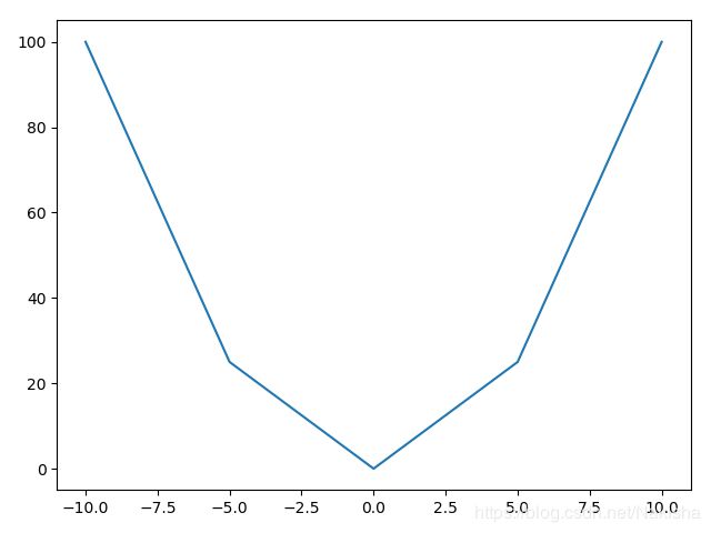
函数图(二次曲线图)
import numpy as np
import matplotlib.pyplot as plt
x = np.linspace(-10,10,5) #生成一组等区间的数值
y = x**2
plt.plot(x,y)
plt.show()
股票时间序列图-日期格式的转化
线型:linestyle 颜色:color 点形状:marker
import numpy as np
import matplotlib.pyplot as plt
import matplotlib.dates as mdates
date,open,close = np.loadtxt('000001.csv',delimiter=',',converters={0:mdates.bytespdate2num('%m/%d/%Y')},skiprows=1,usecols=(0,1,4),unpack=True)
#画图
plt.plot_date(date,open,linestyle= '--',color = 'green',marker = '<')
plt.plot_date(date,close,linestyle= '-',color = 'red',marker = 'o')
plt.show()

条形图
1、概念
以长方形的长度为变量的统计图表
用来比较多个项目分类的数据大小
通常利用于较小的数据集分析
例如不同季度的销量,不同国家的人口等
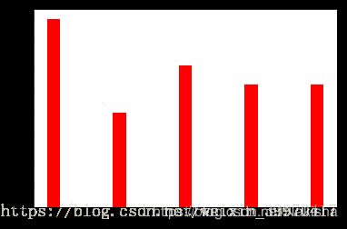
import numpy as np
import matplotlib.pyplot as plt

N = 5
y = [20, 10, 15, 13, 13]
index = np.arange(N)
pl = plt.bar(range(len(index)), height=y, color='red', width=0.8)
plt.show()
import numpy as np
import matplotlib.pyplot as plt
 N=5
y= [20,10,15,13,13]
index = np.arange(N)
pl = plt.bar(left=0,bottom=index,width=y,color='red',height=0.5,orientation='horizontal')
plt.show()

2.多个项目在一起的条形图(在开始的时候加上一个线宽,+bar_width)
import numpy as np
import matplotlib.pyplot as plt

index = np.arange(4)
sales_BJ = [52,55,63,53]
sales_SH = [44,66,55,41]

bar_width = 0.3

plt.bar(index,sales_BJ,bar_width,color = 'b')
plt.bar(index+bar_width,sales_SH,bar_width,color = 'r')
plt.show()

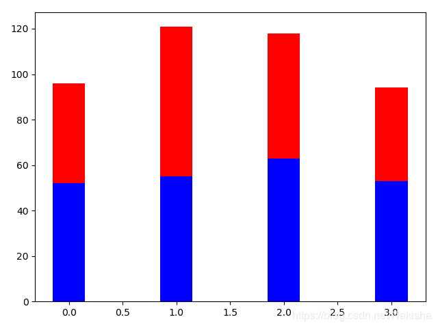
3.生成层叠的条形图
import numpy as np
import matplotlib.pyplot as plt

index = np.arange(4)
sales_BJ = [52,55,63,53]
sales_SH = [44,66,55,41]

bar_width = 0.3

plt.bar(index,sales_BJ,bar_width,color = 'b')
plt.bar(index,sales_SH,bar_width,color = 'r',bottom=sales_BJ)
plt.show()
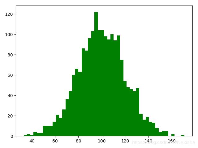
直方图
概念
由一系列高度不等的纵向条形组成,表示数据分布情况
例如某年级同学的身高分布情况
注意和条形图的区别
import numpy as np
import matplotlib.pyplot as plt

mu = 100 #mean of distribution
sigma = 20 #standard deviation of distribution
x = mu+sigma *np.random.randn(2000)

plt.hist(x,bins =50,color = 'green',normed=False)
plt.show()
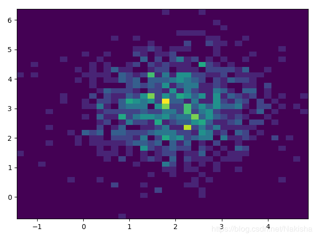
2、双变量的直方图表示频率大小
import numpy as np
import matplotlib.pyplot as plt

x = np.random.randn(1000)+2
y = np.random.randn(1000)+3

plt.hist2d(x,y,bins = 40)

plt.show()
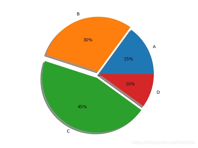
饼状图
1、概念
饼状图显示一个数据系列中各项的大小与各项总和的比例
饼状图中的数据显示为整个饼状图的百分比
如前十大品牌占市场份额图
import numpy as np
import matplotlib.pyplot as plt

labels = 'A','B','C','D'
fracs = [15,30,45,10]
explode = [0,0.05,0.08,0]
plt.axes(aspect = 1)
plt.pie(x = fracs,labels = labels,autopct='%.0f%%',explode=explode,shadow=True)

plt.show()
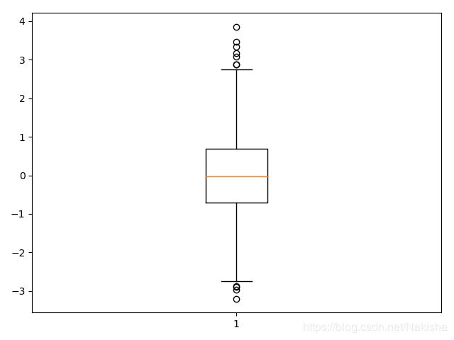
箱型图
1、概念
箱型图又称为盒须图,盒式图或箱线图。
是一种用作显示一组数据分散情况资料的统计图
上边缘,上四分位数,中位数,下四分位数,下边缘,异常值
import numpy as np
import matplotlib.pyplot as plt

np.random.seed(100)

data = np.random.normal(size=1000,loc = 0,scale=1)

plt.boxplot(data,sym = 'o',whis=1.5)

plt.show()
2、多组数据的箱型图
import numpy as np
import matplotlib.pyplot as plt

np.random.seed(100)

data = np.random.normal(size=(1000,4),loc = 0,scale=1)

labels = ['A','B','C','D']
plt.boxplot(data,labels = labels)

plt.show()

颜色和样式
1、颜色
八种内建默认颜色缩写:
b:blue
g: green
r: red
c: cyan
m: magenta
y: yellow
k: black
w: white
其他颜色表示方法
灰色阴影
html 十六进制
RGB元组
import numpy as np
import matplotlib.pyplot as plt

y = np.arange(1,5)

plt.plot(y, color = 'g')
plt.plot(y+1,color = '0.5')
plt.plot(y+2,color = '#FF00FF')
plt.plot(y+3,color = (0.1,0.2,0.3))

plt.show()

2、点和线的样式
23种点形状。注意不同点形状默认使用不同颜色
| “.” | point | “,” | pixel | “o” | circle | “v” | triangle_down |
|---|---|---|---|---|---|---|---|
| “^” | triangele_up | “<” | triangle_left | “>” | triangle_right | “1” | tri_down |
| “2” | tri_up | “3” | tri_left | “4” | tri_right | “8” | octagon |
| “s” | square | “p” | pentagon | “*” | star | “h” | hexagon1 |
| “H” | hexgon2 | “+” | plus | “x” | X | “D”(“d”) | diamond(thin_diamond) |
import numpy as np
import matplotlib.pyplot as plt

y = np.arange(1,5)

plt.plot(y, marker = 'o')
plt.plot(y+1,marker = 'D')
plt.plot(y+2,marker= '^')
plt.plot(y+3,marker= 'p')

plt.show()

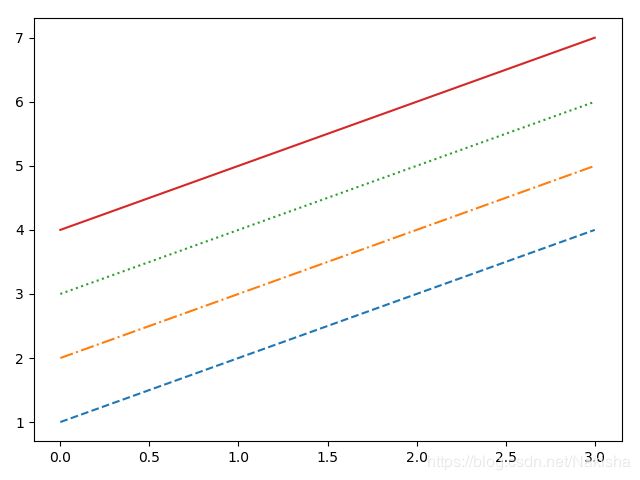
3、线形(4种)
import numpy as np
import matplotlib.pyplot as plt

y = np.arange(1,5)

plt.plot(y, '--')
plt.plot(y+1,'-.')
plt.plot(y+2, ':')
plt.plot(y+3,'-')

plt.show()
4、样式字符串
可以将颜色,点形,线形写成一个字符串,如
cx–
mo:
kp-
import numpy as np
import matplotlib.pyplot as plt

y = np.arange(1,5)
plt.plot(y, 'cx--')
plt.plot(y+1,'kp:')
plt.plot(y+2, 'mo-.')
plt.show()

面向对象VS Matiab Style
三种方式
1、pyplot:经典高层封装,到目前为止,我们所用的都是pyplot
优点:简单易用,交互使用时方便,可以根据命令实时作图
缺点:底层定制能力不足
2、pyplab:将Matplotlib和Numpy合并的模块,模拟Matlab的编程环境
完全封装,环境最接近Matlab,不推荐使用。
3、面向对象的方式: Matplotlib的精髓,更基和底层的方式
优点:接近Matplotlib基础和底层的方式,定制能力强。
缺点:难度大
常用导入模块
import numpy as np
import Maplotlib.pyplot as plt
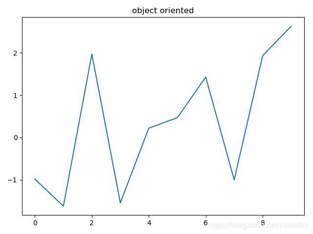
面向对象的方式
import numpy as np
import matplotlib.pyplot as plt

x = np.arange(0,10,1)
y = np.random.randn(len(x))

fig = plt.figure()
ax = fig.add_subplot(111)
l,= plt.plot(x,y)
t = ax.set_title('object oriented')

plt.show()
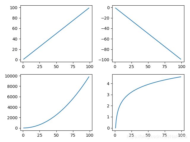
子图-subplot
1、Matplotlib对象:FigurCanvas Figure Axes
2、实践
fig = plt.figure()
ax = fig.add_subplot(111)
返回Axes实例
参数一:子图总行数 参数二:子图总列数 参数三:子图位置
面向对象的方式画子图
import numpy as np
import matplotlib.pyplot as plt

x = np.arange(1,100)
fig = plt.figure()
ax1 = fig.add_subplot(221)
ax1.plot(x,x)

ax2 = fig.add_subplot(222)
ax2.plot(x,-x)

ax3 = fig.add_subplot(223)
ax3.plot(x,x*x)

ax4 = fig.add_subplot(224)
ax4.plot(x,np.log(x))
多图-figure
import numpy as np
import matplotlib.pyplot as plt
fig1 = plt.figure()
ax1 = fig1.add_subplot(111)
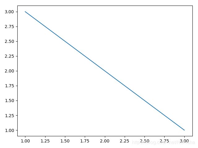
ax1.plot([1,2,3],[3,2,1])
fig2 = plt.figure()
ax2 = fig2.add_subplot(111)
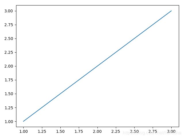
ax2.plot([1,2,3],[1,2,3])
plt.show()
结果生成两张图
网格
import matplotlib.pyplot as plt
import numpy as np
y = np.arange(1,5)
y
Out[7]: array([1, 2, 3, 4])
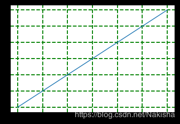
plt.plot(y,y*2)
plt.grid(True)
plt.grid(color = 'g')
plt.grid(linewidth = '2')
plt.grid(linestyle = '--')
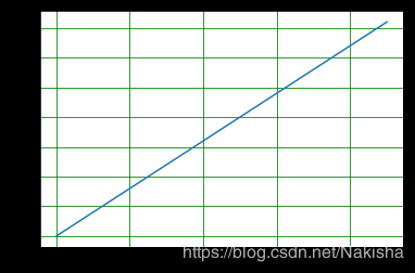
面向对象绘制网格(没有交互效果)
import numpy as np
import matplotlib.pyplot as plt
fig = plt.figure()
x = np.arange(0,10,1)
ax = fig.add_subplot(111)
plt.plot(x,x*2)
ax.grid(color = 'g')
plt.show()
图例
plt方式
import numpy as np
import matplotlib.pyplot as plt

x = np.arange(1,11,1)
plt.plot(x,x*2,label = 'Normal')
plt.plot(x,x*3,label = 'Fast')
plt.plot(x,x*4,label = 'Faster')
#画图例
plt.legend()
'''
loc(图例位置):0:best  1:upper right  2:upper left  3:lower left  4:lower right
ncol(图例内部分列):1:1个1列  2:2个1列  3:3个一列
'''
plt.show()
'''
plt.legend(['Normal','Fast','Faster'])
'''

面向对象的方法
x = np.arange(1,11,1)
fig = plt.figure()
ax = fig.add_subplot(111)
l, = plt.plot(x,x,label = 'Inline label')
ax.legend()
plt.show()

坐标轴范围
import numpy as np
import matplotlib.pyplot as plt

x = np.arange(-10,11,1)
plt.plot(x,x*x)
#改变x轴为-10——10 y轴为0——100
plt.axis([-10,10,30,90])
#改变x轴
plt.xlim()
xlim(xmin = 5,xmax = 10)
#改变y轴
plt.ylim()

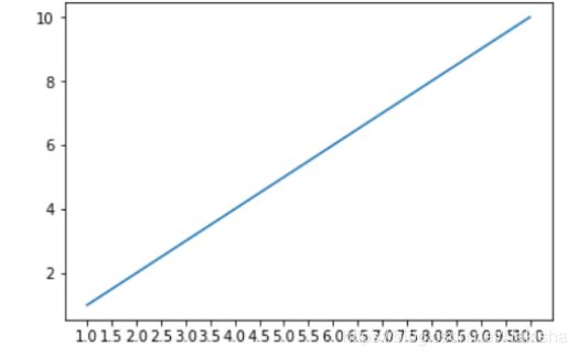
坐标轴刻度
x = np.arange(1,11,1)
plt.plot(x,x)
ax = plt.gca()
ax.locator_params('x',nbins = 20)
plt.show()
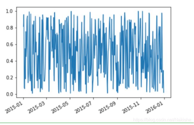
日期序列的调整
import numpy as np
import matplotlib.pyplot as plt
import matplotlib as mpl
import datetime

fig = plt.figure()
start = datetime.datetime(2015,1,1)
stop = datetime.datetime(2016,1,1)
delta= datetime.timedelta(days = 1)
dates = mpl.dates.drange(start,stop,delta)
y = np.random.rand(len(dates))
ax = plt.gca()
ax.plot_date(dates,y,linestyle = '-',marker = '')
date_format = mpl.dates.DateFormatter('%Y-%m')
ax.xaxis.set_major_formatter(date_format)
fig.autofmt_xdate()
plt.show()
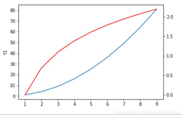
添加坐标轴
1、plt方法
import numpy as np
import matplotlib.pyplot as plt

x = np.arange(2,20,1)
y1 = x*x
y2 = np.log(x)
plt.plot(x,y1)
plt.twinx()
plt.plot(x,y2,'r')
plt.show()
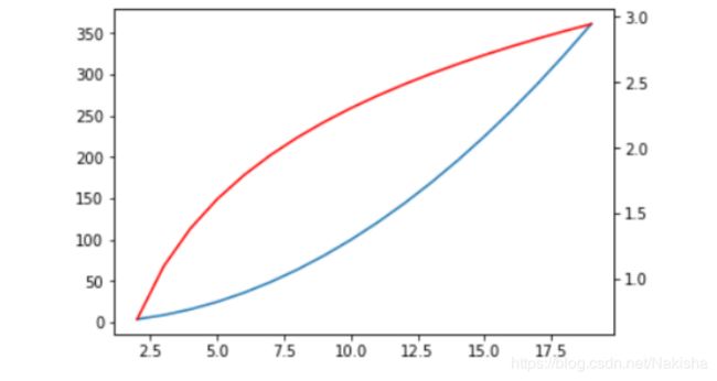
2、面向对象的方法
import numpy as np
import matplotlib.pyplot as plt

x = np.arange(2,20,1)
y1 = x*x
y2 = np.log(x)
fig = plt.figure()
ax1 = fig.add_subplot(111)
ax1.plot(x,y1)
ax1.set_ylabel('Y1')
ax2 = ax1.twinx()
ax2.plot(x,y2,'r')
ax2.set_xlabel('Compare Y1 and Y2')
plt.show()