matplotlib练习
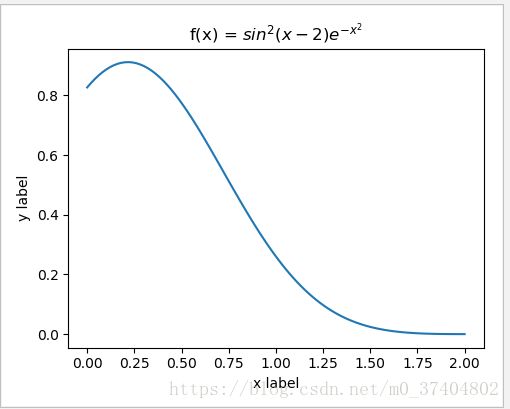
f(x) = sin2(x - 2)ex2 over the interval [0,2]. Add proper axis labels, a title, etc.
import numpy as np
import matplotlib.pyplot as plt

f,ax= plt.subplots(1,1,figsize = (5,4))

x = np.linspace(0,2,100)
tmp1 = np.sin(x-2)
#计算sin^2(x-2)
f1 = np.power(tmp1,2)
#计算e^(-x^2)
f2 = np.power(np.e,-1 * np.power(x,2))
y = np.multiply(f1,f2)
ax.plot(x,y)
# ax.set_xlim((0,2))
# ax.set_ylim((0,1))
ax.set_xlabel("x label")
ax.set_ylabel("y label")
ax.set_title("f(x) = $sin^2(x-2){e^{-x^2}}$")

plt.tight_layout()
plt.show()
Output:
Exercise 11.2: Data
Create a data matrix X with 20 observations of 10 variables. Generate a vector b with parameters Then generate the response vector y = Xb+z where z is a vector with standard normally distributed variables.
Now (by only using y and X), find an estimator for b, by solving
b^ = argminb||Xb - y||2
Plot the true parameters b and estimated parameters b. See Figure 1 for an example plot.
import numpy as np
import matplotlib.pyplot as plt

#10 var
val_x = np.linspace (0,9,10)

X = np.random.normal(0,1,(20,10))
b = np.random.normal(0,1,(10,1))
z = np.random.normal(0,1,(20,1))

y = np.dot(X,b) + z

#least squares
bb = np.dot(np.dot(np.linalg.inv(np.dot(X.T,X)),X.T),y)

#scatter plot display
plt.scatter(val_x,b.reshape(10,1),c="b",marker = 'o',label = " true parameters")
plt.scatter(val_x,bb.reshape(10,1),c = "g",marker = 'x',label = "estimated parameters ")

plt.ylabel("Index")
plt.xlabel("Value")
plt.legend()
plt.show()
Output:

Generate a vector z of 10000 observations from your favorite exotic distribution. Then make a plot that shows a histogram of z (with 25 bins), along with an estimate for the density, using a Gaussian kernel density estimator (see scipy.stats). See Figure 2 for an example plot.
import numpy as np
import matplotlib.pyplot as plt
from scipy.stats import gaussian_kde

f,ax= plt.subplots()
z = np.random.normal(0,1,size = 10000)
ax.hist(z,bins = 25,color = "blue",edgecolor = "red",density = True)
k = gaussian_kde(z)
val = np.linspace(-5,5,10000)
ax.plot(val,k.pdf(val))

plt.title('Histogram and density estimation')
plt.xlabel("x axis")
plt.ylabel("y axis")
plt.show()
