写完利用python代替EXCEL常用操作那篇文章后,一直想写一篇python作图的文章,之所以迟迟没有完成,一来是因为作图细节太多,不好总结,二来自己最初学习python的主要目的是做爬虫和文本处理,即使需要做图,也是用Python把数据处理好然后喂给EXCEL或者Tableau(老是觉得python做的图很丑),后来开始做机器学习的项目发现研究过程中还是用python作图效率更高些
作图方面细节非常多,不可能一次写完,正好最近在读《精益创业》,对书里介绍的MVP法则(最小可行产品),所以决定先写一个能看的版本,然后持续更新吧。。。
注:本文每个图都会用seaborn和matplotlib分别实现,seaborn用于快速出图,matplotlib可以设置更多参数实现个性化绘图(matplotlib设置确实很麻烦,还不如直接用Tableau实现,哈哈。。。)
一、准备工作
1、环境搭建
正式工作开始前,需要安装matplotlib,seaborn,pandas和wordcloud(词云)包,Anaconda已经集成了matplotlib,seaborn和pandas包,但是wordcloud包仍然需要自己下载安装,安装教程请参考
python安装第三方包
2、下载数据集
本文数据集下载地址
链接:https://pan.baidu.com/s/1804beamaiEKdT_WciSQqqg
密码:qnqx
本例数据集是拉钩网数据分析岗位明细数据,共有11个特征,分别为:薪酬下限、薪酬上限、工作地点、经验要求、学历要求、工作时间、公司、所处行业、公司融资情况、投资机构、岗位要求等
二、开始作图
1、导入相关包,导入数据
import matplotlib
import numpy as np
import pandas as pd
import seaborn as sns
import re
import matplotlib.pyplot as plt
matplotlib.rcParams['font.sans-serif'] = ['SimHei']
from wordcloud import WordCloud
df = pd.read_excel('la_gou.xlsx')
df_clean= df.drop(['Index', 'home_page', 'address', 'url', 'date_time'],axis=1)
df_clean = df_clean.drop_duplicates(['company', 'title', 'description'])
df_clean = df_clean.reset_index(drop=True)
2、散点图
稍后补
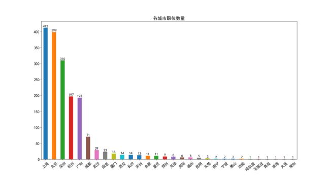
3、频数图
1)数据预处理
city_series = df_clean['city'].value_counts()
y_cor = list(city_series.values) #统计值
x_cor = list(np.arange(len(y_cor)))
2)频数图_seaborn
f, ax = plt.subplots(figsize=(18, 10)) #设定图片大小
sns.barplot(y=city_series.values, x=city_series.index,orient='v', alpha=0.8, color='red')
for x,y in zip(x_cor,y_cor):         #显示上方文字
    plt.text(x, y+1, '%s' % y, ha='center', va= 'bottom',fontsize=14)
plt.title('各城市职位数量', size = 18)
plt.show()

3)频数图_matplotlib
city_series.plot(kind='bar', figsize=(18,10), fontsize=15, rot=40)
for x,y in zip(x_cor,y_cor):
    plt.text(x, y+1, '%s' % y, ha='center', va= 'bottom',fontsize=14)
plt.title('各城市职位数量', size = 18)
plt.show()
4.1 频数图_重新排序
1)数据预处理
experience_series=df_city['experience_new'].value_counts()
experience_series=experience_series.reindex(['1年以下','1-3年','3-5年','5-10年','不限'])
2)频数图_重新排序_seaborn
sns.barplot(y=experience_series.values, x=experience_series.index,orient='v',
            alpha=0.8, palette="Set1")
plt.ylabel(u'频数', size=15)
plt.show()
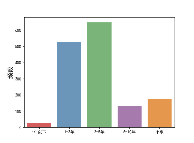
3)频数图_重新排序_matplotlib
experience_series.plot(kind='bar',figsize=(8,5), fontsize=15, rot=0)
plt.grid(color='#95a5a6', linewidth=1,axis='y',alpha=0.2)
plt.xticks(range(5), experience_series.index, size=15)
plt.ylabel('频数', size=15)
plt.show()

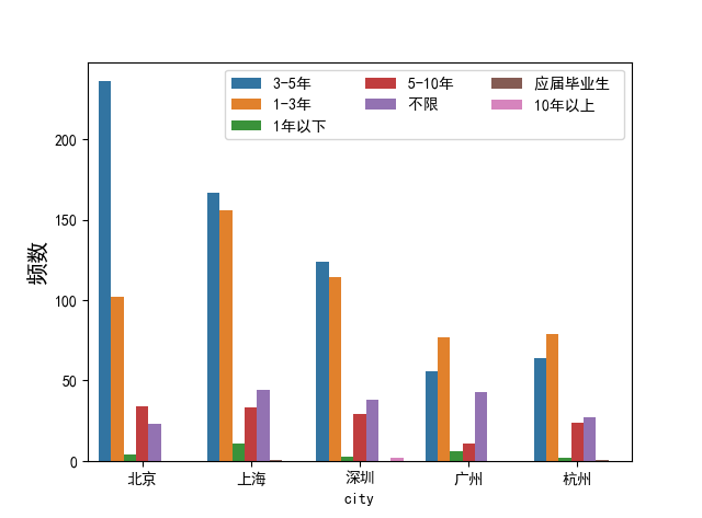
4.2、频数图_多变量
1)数据预处理
df_city=df_clean[df_clean['city'].isin(['北京','上海','深圳','广州','杭州'])]
df_city['fuzhu'] = 1
#替换前对中文数据去空格
df_city['experience_new'] = df_city['experience'].map(lambda s: s.strip())
df_city = df_city.replace({'experience_new':'应届毕业生'},'1年以下')
df_city = df_city.replace({'experience_new':'10年以上'},'5-10年')
df_xin = df_city.loc[:,['city', 'experience','fuzhu']]#选择多列
df_xin1 = df_city.loc[:,['city', 'experience']]#选择多列
2)频数图_多变量_seaborn
sns.countplot(x="city",hue="experience",data=df_xin1)
plt.legend(loc=0,ncol=3)#loc:0为最优,1右上角,2 左上角  ncol为标签有几列
plt.ylabel('频数', size=15)
plt.show()
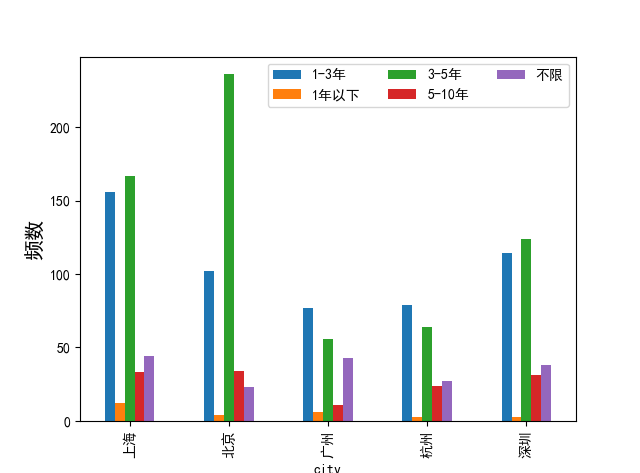
2)频数图_多变量_matplotlib
df_group = df_city.groupby(['city', 'experience_new'])#聚合
df_grouped = df_group['fuzhu'].agg('sum')
df_grouped.unstack().plot(kind='bar')#stacked=True 为堆积图
plt.legend(loc=0,ncol=3)#loc:0为最优,1右上角,2 左上角  ncol为标签有几列
plt.ylabel('频数', size=15)
plt.show()
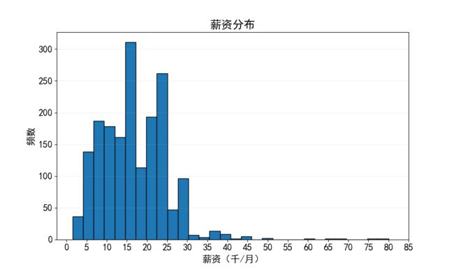
4、直方图
1)直方图_seaborn
sns.distplot(df_clean['salary_median'], color='red',kde=False) #kde=True 显示概率密度图
plt.xlabel('薪资(千/月)', size=15)
plt.ylabel('频数', size=15)
plt.title('薪资分布', size=18)
plt.show()

2)直方图_matplotlib
df_clean['salary_median'].hist(figsize=(10,6), bins=30, edgecolor='k', grid=False)
plt.xlabel('薪资(千/月)', size=15)
plt.ylabel('频数', size=15)
plt.title('薪资分布', size=18)
plt.xticks(range(0,90,5), size=15) #横坐标范围(0-90,刻度值为5)
plt.yticks(size=15)
plt.grid(axis='y', alpha=0.2) #显示网格
plt.show()
6、折线图
稍后补
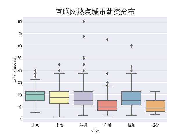
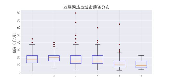
7、箱图
1)数据预处理
salary_groupby_city = df_clean.groupby('city')['salary_median']
large_city = city_series[0:6].index
df_city_large = df_clean.loc[df_clean['city'].isin(large_city)]
salary_of_city = []
for city in large_city:          #得到各城市对应的薪水的数组
    salary_value = salary_groupby_city.get_group(city).values
    salary_of_city.append(salary_value)
2)箱图_seaborn
plt.style.use('seaborn-darkgrid')
matplotlib.rcParams['font.sans-serif'] = ['SimHei']# 对于有些seaborn的style,必须同时运行此命令,否则还是不显示中文
sns.boxplot(x = df_city_large['city'],y = df_city_large['salary_median'],palette="Set3")
plt.title('互联网热点城市薪资分布', size=18)
plt.show()
3)箱图_matplotlib
plt.style.use('seaborn-darkgrid')
matplotlib.rcParams['font.sans-serif'] = ['SimHei']
# 对于有些seaborn的style,必须同时运行此命令,否则还是不显示中文
plt.figure(figsize=(10,5))
plt.boxplot(salary_of_city, boxprops = {'color':'blue'},
           flierprops = {'markerfacecolor':'red','color':'black','markersize':4})
plt.title('互联网热点城市薪资分布', size=18)
plt.ylabel('薪资(千/月)',size=15)
plt.xticks(np.arange(6)+1,large_city, size=15) #横坐标刻度值设置
plt.yticks(size=15)
plt.grid(color='#95a5a6', linewidth=1,axis='x',alpha=0.2)
plt.show()
6、核密度估计图
稍后补
7、词云
def get_skill(text):
    skill_list = re.findall('([a-zA-Z][0-9a-zA-Z]+|C\#|\.Net|R\d?|A\/B|算法)', text)
    for skill in skill_list:
        if skill.upper() == 'EXCEL' or skill.upper() == 'PPT':
            skill_list[skill_list.index(skill)] = 'office'
    return ','.join(skill_list).upper()
df_clean['skill'] = df_clean['description'].apply(get_skill)
print(df_clean['skill'][:10])
 #生成技能字典
import nltk
skill_list = []
#df_clean表skill列每一行数据插入skill_list列表中
for i in df_clean.index:
    if len(df_clean.loc[i, 'skill']) > 0:
        skill_list.extend(df_clean.loc[i, 'skill'].split(','))

skill_freq = dict(nltk.FreqDist(skill_list))
print(skill_freq)

# 删除主要的提取错误的键值
del skill_freq['AND']
del skill_freq['TO']
del skill_freq['IN']
del skill_freq['DATA']
del skill_freq['THE']
del skill_freq['OF']
del skill_freq['KPI']
del skill_freq['APP']
del skill_freq['WITH']
del skill_freq['SERVER']
print(skill_freq)
wc = WordCloud(width=800, height=400, background_color='white').generate_from_frequencies(skill_freq)
plt.figure(figsize=(8,4))
plt.imshow(wc)
plt.axis('off')
plt.show()