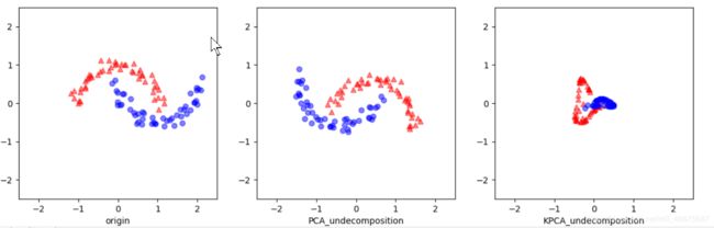
KPCA的可视化(高斯核)
前言
结合大佬博客还有B站视频,KPCA原理我是看懂了,但变换效果感觉一脸蒙蔽,不太理解,感觉实际应用只能瞎子摸象,试参数看效果,如果哪位小伙伴有更好KPCA的案例,麻烦评论区共享一下,谢谢!
源码
from sklearn.datasets import make_moons
from sklearn.datasets import make_circles
from sklearn.decomposition import PCA
from sklearn.decomposition import KernelPCA
import matplotlib.pyplot as plt
import numpy as np

x1, y1 = make_moons(n_samples=100,noise= 0.1, random_state=16)
x2, y2 = make_circles(n_samples=100,noise= 0.1, random_state=16, factor=0.6)
x, y = x1, y1
# x, y = x2, y2

if __name__ == "__main__":
    pca = PCA(n_components=2)
    x_spca = pca.fit_transform(x)

    kpca = KernelPCA(n_components=2, kernel='rbf', gamma=8)
    x_kpca = kpca.fit_transform(x)

    fig, ax = plt.subplots(nrows=1, ncols=3, figsize=(14, 4))
    ax[0].scatter(x[y == 0, 0], x[y == 0, 1], color='red', marker='^', alpha=0.5)
    ax[0].scatter(x[y == 1, 0], x[y == 1, 1], color='blue', marker='o', alpha=0.5)
    ax[1].scatter(x_spca[y == 0, 0], x_spca[y == 0, 1], color='red', marker='^', alpha=0.5)
    ax[1].scatter(x_spca[y == 1, 0], x_spca[y == 1, 1], color='blue', marker='o', alpha=0.5)
    ax[2].scatter(x_kpca[y == 0, 0], x_kpca[y == 0, 1], color='red', marker='^', alpha=0.5)
    ax[2].scatter(x_kpca[y == 1, 0], x_kpca[y == 1, 1], color='blue', marker='o', alpha=0.5)

    ax[0].set_xlabel('origin')
    ax[1].set_xlabel('PCA_undecomposition')
    ax[2].set_xlabel('KPCA_undecomposition')

    temp1 = -1.5
    temp2 = 1.5
    ax[0].set_xlim([temp1, temp2])
    ax[1].set_xlim([temp1, temp2])
    ax[2].set_xlim([temp1, temp2])

    ax[0].set_ylim([temp1, temp2])
    ax[1].set_ylim([temp1, temp2])
    ax[2].set_ylim([temp1, temp2])

    plt.show()
效果
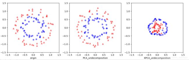
改变小圆大圆的半径比的动态效果
参考
机器学习-降维算法(KPCA算法)