【Flutter】九、Flutter之滑动条——Slider
【Flutter】九、Flutter之滑动条——Slider
- 一、Slider
- 1.1 Slider构造器
- 1.2 Slider属性说明
- 1.3 Slider示例
- 二、SliderTheme
- 2.1 SliderTheme构造器
- 三、SliderThemeData
- 3.1 SliderThemeData构造器
- 3.2 SliderThemeData属性说明
一、Slider
Slider是Flutter中的滑动条组件。
1.1 Slider构造器
const Slider({
    Key key,
    @required this.value,
    @required this.onChanged,
    this.onChangeStart,
    this.onChangeEnd,
    this.min = 0.0,
    this.max = 1.0,
    this.divisions,
    this.label,
    this.activeColor,
    this.inactiveColor,
    this.semanticFormatterCallback,
  }) : _sliderType = _SliderType.material,
       assert(value != null),
       assert(min != null),
       assert(max != null),
       assert(min <= max),
       assert(value >= min && value <= max),
       assert(divisions == null || divisions > 0),
       super(key: key);
1.2 Slider属性说明
| 属性 | 说明 |
|---|---|
| double value | 当前滑动条的值 |
| ValueChanged onChanged | 滑动条值改变事件,滑动中一直触发 |
| ValueChanged onChangeStart | 滑动条开始滑动回调 |
| ValueChanged onChangeEnd | 滑动条结束滑动回调 |
| double min | 最小值,默认0.0 |
| double max | 最大值,默认1.0 |
| int divisions | 将滑动条几等分 |
| String label | 拖动滑块时可在滑块上方显示的labeli |
| Color activeColor | 滑动条已划过部分及滑块颜色 |
| Color inactiveColor | 滑动条未划过部分的颜色 |
| SemanticFormatterCallback semanticFormatterCallback | 用于根据滑块值创建语义值的回调。 例: semanticFormatterCallback: (double newValue) {return '${newValue.round()} dollars}';}, |
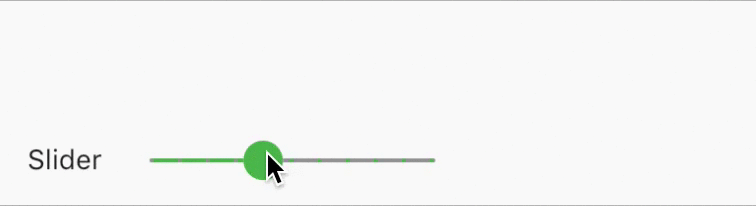
1.3 Slider示例
Row(
	children: <Widget>[
		Text('Slider'),
		Slider(
			value: _sliderValue,
			onChanged: (data){
				print('change:$data');
				setState(() {
					this._sliderValue = data;
				});
			},
			onChangeStart: (data){
				print('start:$data');
			},
			onChangeEnd: (data){
				print('end:$data');
			},
			min: 0.0,
			max: 10.0,
			divisions: 10,
			label: '$_sliderValue',
			activeColor: Colors.green,
			inactiveColor: Colors.grey,
			semanticFormatterCallback: (double newValue) {
				return '${newValue.round()} dollars}';
			},
		)
	],
)
二、SliderTheme
自定义滑动条样式
2.1 SliderTheme构造器
const SliderTheme({
    Key key,
    @required this.data,
    @required Widget child,
  }) : assert(child != null),
       assert(data != null),
       super(key: key, child: child);
| 属性 | 说明 |
|---|---|
| SliderThemeData data | 定义滑动条的相关数据,具体看下面介绍 |
| Widget child | Slider控件 |
三、SliderThemeData
用于自定义滑动条的数据
3.1 SliderThemeData构造器
const SliderThemeData({
    this.trackHeight,
    this.activeTrackColor,
    this.inactiveTrackColor,
    this.disabledActiveTrackColor,
    this.disabledInactiveTrackColor,
    this.activeTickMarkColor,
    this.inactiveTickMarkColor,
    this.disabledActiveTickMarkColor,
    this.disabledInactiveTickMarkColor,
    this.thumbColor,
    this.overlappingShapeStrokeColor,
    this.disabledThumbColor,
    this.overlayColor,
    this.valueIndicatorColor,
    this.overlayShape,
    this.tickMarkShape,
    this.thumbShape,
    this.trackShape,
    this.valueIndicatorShape,
    this.rangeTickMarkShape,
    this.rangeThumbShape,
    this.rangeTrackShape,
    this.rangeValueIndicatorShape,
    this.showValueIndicator,
    this.valueIndicatorTextStyle,
    this.minThumbSeparation,
    this.thumbSelector,
  });
3.2 SliderThemeData属性说明
| 属性 | 说明 |
|---|---|
| double trackHeight | 轨道高度 |
| Color activeTrackColor | 激活部分轨道颜色 |
| Color inactiveTrackColor | 未激活部分轨道颜色 |
| Color disabledActiveTrackColor | 滑动条无法使用时被激活轨道的颜色 |
| Color disabledInactiveTrackColor | 滑动条无法使用时未激活轨道的颜色 |
| Color activeTickMarkColor | 已激活轨道刻度线的颜色 |
| Color inactiveTickMarkColor | 未激活轨道刻度线的颜色 |
| Color disabledActiveTickMarkColor | 滑动条无法使用时已激活轨道刻度线的颜色 |
| Color disabledInactiveTickMarkColor | 滑动条无法使用时未激活轨道刻度线的颜色 |
| Color thumbColor | 滑块颜色 |
| Color overlappingShapeStrokeColor | |
| Color disabledThumbColor | 滑动条不可用时滑块的颜色 |
| Color overlayColor | 拖动过程中滑块周围绘制的覆盖层的颜色 |
| Color valueIndicatorColor | label背景色 |
| SliderComponentShape overlayShape | 拖动过程中滑块周围绘制的覆盖层的大小 RoundSliderOverlayShape(overlayRadius: 20.0) |
| SliderTickMarkShape tickMarkShape | 刻度形状 RoundSliderTickMarkShape(tickMarkRadius:2.0)//大于3会消失 |
| SliderComponentShape thumbShape | 滑块形状 RoundSliderThumbShape(enabledThumbRadius: 12.0,disabledThumbRadius: 3.0) |
| SliderTrackShape trackShape | 轨道形状 |
| SliderComponentShape valueIndicatorShape | |
| RangeSliderTickMarkShape rangeTickMarkShape | |
| RangeSliderThumbShape rangeThumbShape | |
| RangeSliderTrackShape rangeTrackShape | |
| RangeSliderValueIndicatorShape rangeValueIndicatorShape | |
| ShowValueIndicator showValueIndicator | 控制label显示 ShowValueIndicator.onlyForDiscrete:当divisions |
| TextStyle valueIndicatorTextStyle | label文本样式 |
| double minThumbSeparation | |
| RangeThumbSelector thumbSelector |