power bi 创建空表_使用Power BI创建足球热图
power bi 创建空表
When I watched the 2018 FIFA World Cup Russia match, at the end of the match I saw a very interesting and stunning soccer field heat map analysis. After this, I decided to create a soccer field heat map in Power BI. So I wrote this article!
当我观看2018年FIFA世界杯俄罗斯比赛时,在比赛结束时,我看到了一个非常有趣且令人惊叹的足球场热图分析。 之后,我决定在Power BI中创建一个足球场热图。 所以我写了这篇文章!
In this post, we will find the answer to these topics.
在这篇文章中,我们将找到这些主题的答案。
- What is a heat map? 什么是热图?
- How can I create a heat map in Power BI? 如何在Power BI中创建热图?
- How can I customize custom image? 如何自定义自定义图片?
- How can I design a soccer field heat map in Power BI? 如何在Power BI中设计足球场热图?
Heat map:
热点图:
The heat map is a graphical visualization of data with colors. When applied to websites, heat map analysis helps us to understand visitor behaviors on a website or any medium. This analysis method visualizes visitor scroll and clicks movements and other behavior. So, in this way, we may visualize how visitors use a web site and we can modify and improve the web site designs according to this information.
热图是带有颜色的数据的图形可视化。 当应用于网站时,热图分析可以帮助我们了解网站或任何媒体上的访问者行为。 此分析方法将访问者的滚动可视化,并单击移动和其他行为。 因此,通过这种方式,我们可以可视化访问者如何使用网站,并且可以根据此信息修改和改进网站设计。
如何在Power BI中创建热图 (How to create a heat map in Power BI)
In this demonstration, we will create population of European countries heat map. Our data will contain only two columns; country name and population. Country population value color indicates population density. The below chart illustrates some part of country population data. This data is obtained from European Countries by population 2018 (worldometers).
在此演示中,我们将创建欧洲国家人口热图。 我们的数据将仅包含两列; 国家名称和人口。 国家人口值颜色表示人口密度。 下图说明了部分国家人口数据。 此数据是按人口2018(世界计)从欧洲国家获得的。
| Country | Population |
| Germany | 82,293,457.00 |
| U.K. | 66,573,504.00 |
| France | 65,233,271.00 |
| Italy | 59,290,969.00 |
| Spain | 46,397,452.00 |
| Ukraine | 44,009,214.00 |
| … | … |
| 国家 | 人口 |
| 德国 | 82,293,457.00 |
| 英国 | 66,573,504.00 |
| 法国 | 65,233,271.00 |
| 意大利 | 59,290,969.00 |
| 西班牙 | 46,397,452.00 |
| 乌克兰 | 44,009,214.00 |
| … | … |
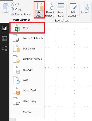
Open Power BI and click Get Data and select Excel.
打开Power BI,然后单击“获取数据”,然后选择Excel。
Select the related excel file and load it.
选择相关的excel文件并加载它。

After these steps of our demonstration, we will use custom visualizations for population of our heat map. Because Power BI does not contain a heat map component, we will import custom visualizations from marketplace.
在演示了这些步骤之后,我们将使用自定义可视化来显示我们的热图。 由于Power BI不包含热图组件,因此我们将从市场中导入自定义可视化。
Click Import from marketplace
单击从市场导入

Search heat map and add Heatmap custom visual.
搜索热图并添加Heatmap自定义视觉。

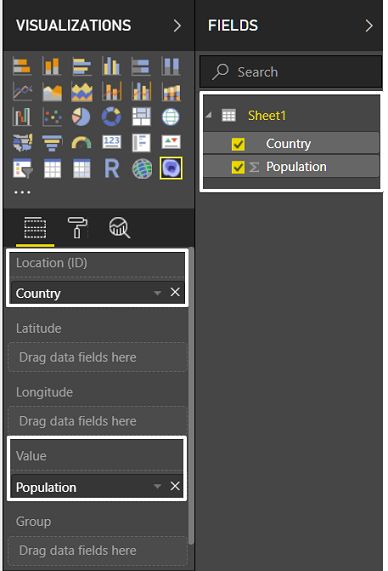
- Drag and drop custom visual Heatmap component to Power BI design panel 将自定义可视化Heatmap组件拖放到Power BI设计面板中
- Drag and drop Country field to Location(ID) 将国家/地区字段拖放到位置(ID)
Drag and drop Population field to Value
将“人口”字段拖放到“值”上
Click format properties of heat map and change Renderer format type to Heat
单击热图的格式属性,然后将“渲染器”格式类型更改为“热”。

As a result, our population of European countries heat map will look like this. In the top of heat map we can find the legend which represents the value ranges.
结果,我们的欧洲国家人口热图将如下所示。 在热图的顶部,我们可以找到表示值范围的图例。

In this simple demonstration of the heat map, we created population density of Europe visualization.
在热图的此简单演示中,我们创建了欧洲可视化的人口密度。
如何自定义自定义图片? (How to customize custom image?)
In the previous demonstration we used a prepared geographic map but in some cases, customers or clients want to use custom images (expect geographic maps) of heat maps. These images can be warehouse location layouts, theater seating plans or maybe other custom images.
在先前的演示中,我们使用了准备好的地理地图,但在某些情况下,客户或客户希望使用热图的自定义图像(预期的地理地图)。 这些图像可以是仓库位置布局,剧院座位图或其他自定义图像。
To handle this issue, we can use SYNOPTIC DESIGNER FOR POWER BI. SYNOPTIC DESIGNER is a helper tool for SYNOPTIC PANEL. This web-based designer tool provides us to create custom SVG (As per Wikipedia: Scalable Vector Graphics (SVG) is an XML-based vector image format for two-dimensional) file format. And this custom image format can only be used by Power BI. Now, we will generate our soccer field heat map infrastructure. First of all, we need a soccer field layout which is divided into zones. When you googled you can find a lot of images like the below one. But I created this custom soccer field in Paint.
要解决此问题,我们可以使用SYNOPTIC DESIGNER FOR POWER BI 。 SYNOPTIC DESIGNER是用于SYNOPTIC PANEL的帮助工具。 这个基于Web的设计器工具为我们提供了创建自定义SVG( 根据Wikipedia:可伸缩矢量图形(SVG)是用于二维的基于XML的矢量图像格式 )文件格式的功能。 此自定义图像格式只能由Power BI使用。 现在,我们将生成足球场热图基础结构。 首先,我们需要将足球场布局分为多个区域。 谷歌搜索时,您会发现很多类似下面的图像。 但是我在Paint中创建了这个自定义足球场。

Open the SYNOPTIC DESIGNER FOR POWER BI and load your soccer field layout. In this step, we can use an URL or load from local computer. Click GET.
打开SYNOPTIC DESIGNER FOR POWER BI并加载足球场布局。 在此步骤中,我们可以使用URL或从本地计算机加载。 单击获取。

Click Draw new areas and click the corner of all rectangles or click automatically discover bitmap areas. This option helps us to automatically find areas and divide to zone
单击“绘制新区域”,然后单击所有矩形的角,或单击“自动发现位图区域”。 此选项可帮助我们自动查找区域并划分为区域

Click the EXPORT TO POWER BI button.
单击导出到POWER BI按钮。

When you click GALLERY button you can find several prepared images. And Areas field represents the ID number and definition of zones. We will colorize and set dataset values over this zones ID numbers. You can label divided zones what you want but I will use this zone definitions as W and E.
单击“图库”按钮时,您可以找到几个准备好的图像。 “区域”字段代表ID号和区域定义。 我们将为此区域ID号着色并设置数据集值。 您可以将划分的区域标记为所需区域,但我将使用该区域定义作为W和E。
Click EXPORT TO POWER BI and save SVG file to your local.
单击“导出到POWER BI”,然后将SVG文件保存到本地。

After completing all these steps we will return to POWER BI and will create soccer field heat map.
完成所有这些步骤后,我们将返回POWER BI并创建足球场热图。
如何在Power BI中设计足球场热图? (How to design soccer field heat map in Power BI?)
This is the last section of soccer field heat map demonstration. In this section, we will add SYNOPTIC PANEL visual component and connect dataset values to soccer field heat map. We can add this visual component in Import from marketplace method.
这是足球场热点地图演示的最后一部分。 在本节中,我们将添加“概要面板”可视组件并将数据集值连接到足球场热图。 我们可以在从市场导入方法中添加此可视组件。
- Click Import from marketplace 单击从市场导入
Search Synoptic Panel by OKViz and click add
通过OKViz搜索Synoptic Panel,然后单击添加

Now we will load our data to Power BI. This data consists of two fields.
现在,我们将数据加载到Power BI。 此数据包含两个字段。
Zone: It defines soccer field zone ID.
区域:它定义了足球场的区域ID。
Minutes: This value indicating how many minutes the match has been played in this zone.
分钟:此值指示该区域中比赛进行了多少分钟。
| Zone | Minutes |
| W1 | 2 |
| W2 | 6 |
| W3 | 5 |
| W4 | 5 |
| W5 | 7 |
| W6 | 10 |
| W7 | 12 |
| E1 | 1 |
| E2 | 2 |
| E3 | 8 |
| E4 | 4 |
| E5 | 10 |
| E6 | 6 |
| E7 | 12 |
| 区 | 分钟 |
| W1 | 2 |
| W2 | 6 |
| W3 | 5 |
| W4 | 5 |
| W5 | 7 |
| W6 | 10 |
| W7 | 12 |
| 1号 | 1个 |
| E2 | 2 |
| E3 | 8 |
| E4 | 4 |
| E5 | 10 |
| E6 | 6 |
| E7 | 12 |
Click Get Data and load data from Excel file.
单击获取数据并从Excel文件加载数据。

- Add Synoptic Panel to Power BI designer panel. 将摘要面板添加到Power BI设计器面板中。
- Drag and drop Zone values to the Category field 将区域值拖放到“类别”字段
Drag and drop Minutes field to Measure field
将Minutes字段拖放到Measure字段

Click local maps and load custom SVG file which includes zone divided soccer field.
单击本地地图并加载包含区域划分的足球场的自定义SVG文件。

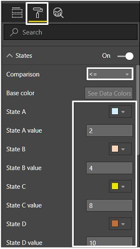
After this step, we will colorize the soccer field heat map. To accomplish this we will click format and set States properties. In this property, we can colorize zone with custom values. We will set this property like this
完成此步骤后,我们将为足球场热图着色。 为此,我们将单击格式并设置状态属性。 在此属性中,我们可以使用自定义值为区域着色。 我们将像这样设置此属性
If value of minutes is less than or equal to 2, then the color is blue …
如果分钟值小于或等于2,则颜色为蓝色…
<= 4, cyan.
<= 8, yellow.
<= 10, brown.
<= 12, red.
<= 4,青色。
<= 8,黄色。
<= 10,棕色。
<= 12,红色。
And finally, our soccer field heat map is ready!
最后,我们的足球场热点地图已经准备好!

This heat map illustrates that the match was mostly played in midfield and East5 and W6.
这张热图表明比赛主要在中场以及East5和W6进行。
结论 (Conclusions )
In this article, we demonstrated a custom Power BI heat map. Synoptic Panel helps us to create this heat map. You can find several properties over Synoptic Panel and can change your design. I want to add this last sentence “Synoptic Panel is open source component”.
在本文中,我们演示了自定义Power BI热图。 摘要面板可帮助我们创建此热图。 您可以在Synoptic Panel上找到几个属性,并且可以更改设计。 我要添加最后一句话“ Synoptic Panel是开源组件”。
参考资料 (References)
- Visual Awesomeness Unlocked – Using the Synoptic Panel 解锁视觉真棒–使用摘要面板
- Download a custom visual from the gallery 从图库中下载自定义图像
- Get data from Excel workbook files 从Excel工作簿文件中获取数据
翻译自: https://www.sqlshack.com/create-a-soccer-heat-map-with-power-bi/
power bi 创建空表