Android控件与布局——基础控件TextView
最近在用原生的控件和布局绘制一些界面并使用,虽然这些都是Android基本知识,但是有的时候真的感觉力不从心,感觉有必要对Android常用的控件和布局做一个系统的了解。后续一个月甚至更多的时间都会围绕这个主题展开,毕竟这里面还是有不少高级控件的,我也会尽量结合应用深入的进行了解。
项目GitHub地址入口
上一篇:Space 下一篇:EditText
今天我们的主题是TextView,在日常开发中最常见的一个控件之一了,我们打开TextView的源码可以发现,将近12000行,所以了我们主要结合日常使用的功能来展开,主线还是基于TextView的源码文档来,下面我们先看一个整体介绍:
* A user interface element that displays text to the user.
* To provide user-editable text, see {@link EditText}.
向用户展示文本的用户接口元素,其子类EditText提供用户可编辑文本的功能
今天,我们主要介绍TextView,下一篇才介绍EditText,所以后半句暂时不管,那总结来说,TextView就是给用户展示文本信息的,那究竟如何实现了,我们接着往下看:
** The following code sample shows a typical use, with an XML layout * and code to modify the contents of the text view: *
** <LinearLayout xmlns:android="http://schemas.android.com/apk/res/android" android:layout_width="match_parent" android:layout_height="match_parent"> * <TextView * android:id="@+id/text_view_id" * android:layout_height="wrap_content" * android:layout_width="wrap_content" * android:text="@string/hello" /> * </LinearLayout> **
下面的代码就演示了在XML布局文件中以及逻辑代码中修改文本内容的最典型应用
上面的代码再简单不过了,就是在布局文件中添加一个TextView并通过android:text属性来添加显示的文本,我们接着往下看:
* This code sample demonstrates how to modify the contents of the text view * defined in the previous XML layout: * ** public class MainActivity extends Activity { * * protected void onCreate(Bundle savedInstanceState) { * super.onCreate(savedInstanceState); * setContentView(R.layout.activity_main); * final TextView helloTextView = (TextView) findViewById(R.id.text_view_id); * helloTextView.setText(R.string.user_greeting); * } * } *下面的代码演示了如何通过逻辑代码修改之前在XML中定义的TextView控件的中文本内容
上面的代码就是通过TextView的setText()接口对TextView中的文本内容进行修改的逻辑,也很简单,那我们再接着往下看:
** To customize the appearance of TextView, see Styles and Themes. *
如果想自定义TextView的显示样式,可以参考上面的网址(建议搞个VPN)
上面给了我们自定义TextView样式的参考网址,不急,我们再接着往下看:
** XML attributes *
* See {@link android.R.styleable#TextView TextView Attributes}, * {@link android.R.styleable#View View Attributes} * * @attr ref android.R.styleable#TextView_text * @attr ref android.R.styleable#TextView_bufferType * @attr ref android.R.styleable#TextView_hint * @attr ref android.R.styleable#TextView_textColor * @attr ref android.R.styleable#TextView_textColorHighlight * @attr ref android.R.styleable#TextView_textColorHint * @attr ref android.R.styleable#TextView_textAppearance * @attr ref android.R.styleable#TextView_textColorLink * @attr ref android.R.styleable#TextView_textSize * @attr ref android.R.styleable#TextView_textScaleX * @attr ref android.R.styleable#TextView_fontFamily * @attr ref android.R.styleable#TextView_typeface * @attr ref android.R.styleable#TextView_textStyle * @attr ref android.R.styleable#TextView_cursorVisible * @attr ref android.R.styleable#TextView_maxLines * @attr ref android.R.styleable#TextView_maxHeight * @attr ref android.R.styleable#TextView_lines * @attr ref android.R.styleable#TextView_height * @attr ref android.R.styleable#TextView_minLines * @attr ref android.R.styleable#TextView_minHeight * @attr ref android.R.styleable#TextView_maxEms * @attr ref android.R.styleable#TextView_maxWidth * @attr ref android.R.styleable#TextView_ems * @attr ref android.R.styleable#TextView_width * @attr ref android.R.styleable#TextView_minEms * @attr ref android.R.styleable#TextView_minWidth * @attr ref android.R.styleable#TextView_gravity * @attr ref android.R.styleable#TextView_scrollHorizontally * @attr ref android.R.styleable#TextView_password * @attr ref android.R.styleable#TextView_singleLine * @attr ref android.R.styleable#TextView_selectAllOnFocus * @attr ref android.R.styleable#TextView_includeFontPadding * @attr ref android.R.styleable#TextView_maxLength * @attr ref android.R.styleable#TextView_shadowColor * @attr ref android.R.styleable#TextView_shadowDx * @attr ref android.R.styleable#TextView_shadowDy * @attr ref android.R.styleable#TextView_shadowRadius * @attr ref android.R.styleable#TextView_autoLink * @attr ref android.R.styleable#TextView_linksClickable * @attr ref android.R.styleable#TextView_numeric * @attr ref android.R.styleable#TextView_digits * @attr ref android.R.styleable#TextView_phoneNumber * @attr ref android.R.styleable#TextView_inputMethod * @attr ref android.R.styleable#TextView_capitalize * @attr ref android.R.styleable#TextView_autoText * @attr ref android.R.styleable#TextView_editable * @attr ref android.R.styleable#TextView_freezesText * @attr ref android.R.styleable#TextView_ellipsize * @attr ref android.R.styleable#TextView_drawableTop * @attr ref android.R.styleable#TextView_drawableBottom * @attr ref android.R.styleable#TextView_drawableRight * @attr ref android.R.styleable#TextView_drawableLeft * @attr ref android.R.styleable#TextView_drawableStart * @attr ref android.R.styleable#TextView_drawableEnd * @attr ref android.R.styleable#TextView_drawablePadding * @attr ref android.R.styleable#TextView_drawableTint * @attr ref android.R.styleable#TextView_drawableTintMode * @attr ref android.R.styleable#TextView_lineSpacingExtra * @attr ref android.R.styleable#TextView_lineSpacingMultiplier * @attr ref android.R.styleable#TextView_marqueeRepeatLimit * @attr ref android.R.styleable#TextView_inputType * @attr ref android.R.styleable#TextView_imeOptions * @attr ref android.R.styleable#TextView_privateImeOptions * @attr ref android.R.styleable#TextView_imeActionLabel * @attr ref android.R.styleable#TextView_imeActionId * @attr ref android.R.styleable#TextView_editorExtras * @attr ref android.R.styleable#TextView_elegantTextHeight * @attr ref android.R.styleable#TextView_letterSpacing * @attr ref android.R.styleable#TextView_fontFeatureSettings * @attr ref android.R.styleable#TextView_breakStrategy * @attr ref android.R.styleable#TextView_hyphenationFrequency * @attr ref android.R.styleable#TextView_autoSizeTextType * @attr ref android.R.styleable#TextView_autoSizeMinTextSize * @attr ref android.R.styleable#TextView_autoSizeMaxTextSize * @attr ref android.R.styleable#TextView_autoSizeStepGranularity * @attr ref android.R.styleable#TextView_autoSizePresetSizes */
以下是TextView的属性
上面列举了TextView的全部属性,这里全说不现实也没有必要,在后面的介绍中我们会把经常使用的属性引入进来,好了上面就是TextView的全部介绍了,好了,下面我们先来看看TextView是什么样:

默认TextView是不可交互的,只是应用文本展示,下面我们就来开始学习的它的属性了,先看下面几个:
- android:text:文本内容
- android:textSize:文本大小
- android:textColor:文本颜色
- android:textStyle:文本风格
示例:
        android:textStyle="bold"
        android:textSize="25sp"
        android:textColor="@color/colorPrimary"
        android:text="我是TextView"
上面介绍了关于text相关的几个基本属性,下面在介绍一下几个和hint(提示语,通常用于其子类EditText中使用):
- android:hint:提示语文本
- android:textColorHint:提示语颜色
- android:autofillHints(API26及以上):默认提示文本
- hint的size和style可以复用text的
示例:
        android:textStyle="italic"
        android:textSize="25sp"
        android:hint="我是提示文本"
        android:textColorHint="@color/colorPrimary"
好了,关于android:autofillHints属性在使用的时候参考一下文档:
* Sets the hints that help an {@link android.service.autofill.AutofillService} determine how * to autofill the view with the user's data. * *Typically, there is only one way to autofill a view, but there could be more than one. * For example, if the application accepts either an username or email address to identify * an user. * *
These hints are not validated by the Android System, but passed "as is" to the service. * Hence, they can have any value, but it's recommended to use the {@code AUTOFILL_HINT_} * constants such as: * {@link #AUTOFILL_HINT_USERNAME}, {@link #AUTOFILL_HINT_PASSWORD}, * {@link #AUTOFILL_HINT_EMAIL_ADDRESS}, * {@link #AUTOFILL_HINT_NAME}, * {@link #AUTOFILL_HINT_PHONE}, * {@link #AUTOFILL_HINT_POSTAL_ADDRESS}, {@link #AUTOFILL_HINT_POSTAL_CODE}, * {@link #AUTOFILL_HINT_CREDIT_CARD_NUMBER}, {@link #AUTOFILL_HINT_CREDIT_CARD_SECURITY_CODE}, * {@link #AUTOFILL_HINT_CREDIT_CARD_EXPIRATION_DATE}, * {@link #AUTOFILL_HINT_CREDIT_CARD_EXPIRATION_DAY}, * {@link #AUTOFILL_HINT_CREDIT_CARD_EXPIRATION_MONTH} or * {@link #AUTOFILL_HINT_CREDIT_CARD_EXPIRATION_YEAR}.
大概意思就是使用系统默认的自动填充的hint文本,它们都是View类中的字符串常量,比如:
public static final String AUTOFILL_HINT_CREDIT_CARD_EXPIRATION_DATE =
        "creditCardExpirationDate";
好了,我们接着往下看,关于TextView,我们还可以对其行数相关属性进行设置:
- android:lines:文本行数
- android:minLines:文本所占最少行数
- android:maxLines:文本所占最大行数
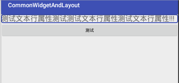
下面为了演示效果,我在TextView背景加了一个矩形边框背景,写两个TextView,然后直接在XML界面和Design界面切换演示,初始XML代码如下:
可见这几个属性之间优先级较高的minLines,其实line相关的属性主要用于TextView的高度测量,我们在源码中也可以得到验证:
/** * Sets the height of the TextView to be exactly {@code lines} tall. ** This value is used for height calculation if LayoutParams does not force TextView to have an * exact height. Setting this value overrides previous minimum/maximum height configurations * such as {@link #setMinLines(int)} or {@link #setMaxLines(int)}. {@link #setSingleLine()} will * set this value to 1. */
这个值主要用于TextView的布局高度测量
好了,我们接着往下看,上面只是介绍了和Line数量相关的几个属性,下面来看看和Line相关的其他几个属性:
- android:lineSpacingExtra:文本行间距
- android:lineSpacingMultiplier:文本显示比例(默认显示最后一行,这个值表示当有多行的时候前面行占一行总高度的比例)
下面就结合上面的属性来实现一个文本逐渐下拉显示的效果(我们这里只用了一个lineSpacingMultiplier一个属性):
 public void showText(View view) {
        if (!isOver) {
            final Timer timer = new Timer();
            timer.schedule(new TimerTask() {
                @Override
                public void run() {
                    percent += 0.05f;
                    if (percent <= 1) {
                        runOnUiThread(new Runnable() {
                            @Override
                            public void run() {
                                textView.setLineSpacing(0, percent);
                            }
                        });
                    } else {
                        isOver=true;
                        percent=0;
                        timer.cancel();
                    }
                }
            }, 100, 50);
        }
        else {
            isOver=false;
            textView.setLineSpacing(0,0);
        }
    }
好了,下面我们再来看一个属性,这个属性在以前的开发中可用于实现跑马灯的效果:
- android:ellipSize:主要用于当文本内容长于TextView控件宽度时候,采用省略的方式而非截断的方式
- android:singleLine:是否是单行
- android:marqueeRepeatLimit:跑马灯重复的次数
后面两个配合第一个使用,我们还是先看一下效果:
可见,当TextView显示不全内容时,默认会采取截断的方式,而android:ellipSize属性就提供这样一种通过不同的省略方案给用户一个更好的体验,下面,我们就结合上面的属性来实现一个简单跑马灯的效果:

注意,这里的文本需要比TextView宽度要宽,不然跑不起来。还有就是上面TextView还必须添加以下两个属性:
        android:focusable="true"
        android:focusableInTouchMode="true"
好了,下面我们接着往下看以下关于TextView中关于Drawable的相关属性:
- android:drawableLeft:在文本左侧放置的一个drawable
- android:drawableTop:在文本的上方放置一个drawable
- android:drawableBottom:在文本的下方放置一个drawable
- android:drawableRight:在文本的右侧放置一个drawable
- android:drawableStart:在文本的左侧放置一个drawable
- android:drawableEnd:在文本的右侧放置一个drawable
- android:drawablePadding:控制四周drawable的边距
比如:

上面的效果可以通过边距属性和控件的宽高属性来进行调整。

说到边距,关于padding的属性也是很多的,下面来简单看一些,这个部分都是比较容易理解属性:
- android:padding:控制文本到四周的边距
- android:paddingTop:文本到控件上边边距
- android:paddingBottom:文本到控件下边边距
- android:paddingLeft:文本到控件左边边距
- android:paddingRight:文本到控件右边边距
- android:paddingVertical:文本到控件上下边边距
- android:paddingHorizontal:文本到控件左右边边距
- android:paddingEnd:文本到控件右边边距
- android:paddingStart:文本到控件左边边距
演示上下左右边距:
演示水平和垂直边距:

对于四周边距和start以及end我这里就不在演示了。好了,其实TextView的主要作用是用于展示文本,目前系统可用属性有基本的颜色,大小,内容以及三种textStyle(粗体bold,斜体italic以及正常normal);其实TextView也提供了自定义样式的属性配置:
- android:textAppearance:文本的表现样式
关于自定义的方式这里就不展开了,就是自定义一个style,继承一个文本style,然后对文本的属性进行编辑,比如:
控件的style我们也可以自定义,也可以使用系统现有的,这个平时使用的较少。到这里,关于TextView的介绍就结束了,下一篇我们介绍EditText,是TextView的一个直接子类,我们到时候重点介绍其继承至TextView的inputType这个属性。这里可以结合上面的paddingDrawable等相关属性配合View的事件监听自己实现一个操纵杆动画图标的效果功能。
注:欢迎扫码关注
