DrawerLayout的使用
目前很多应用都有侧滑菜单,最初的侧滑菜单很多都有SildingMenu,相信很多人都用的很熟。Google推出了自己人侧滑菜单DrawerLayout,相信很多人已经在用了。这里记录一下DrawerLayout的使用。
DrawerLayout目前大体有两种形式吧。
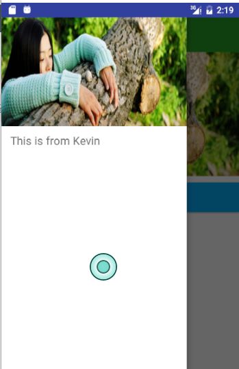
效果图
下面看一下效果图:
- 效果一

- 效果二

其实还有第三种效果,就是第一种的侧滑部分的状态栏加上。不过目前一般都是不带状态栏的,这样看起来效果会更好些。
两种效果其实写法都是一样的,只是ToolBar和DrawerLayout的布局位置不同而已。
布局代码
- 效果一布局
"1.0" encoding="utf-8"?>
.support.v4.widget.DrawerLayout
xmlns:android="http://schemas.android.com/apk/res/android"
xmlns:app="http://schemas.android.com/apk/res-auto"
xmlns:tools="http://schemas.android.com/tools"
android:id="@+id/drawer_layout"
android:layout_width="match_parent"
android:layout_height="match_parent"
android:fitsSystemWindows="true"
<--这里一定要添加,否则状态栏颜色达不到你要的效果-->
tools:context="com.student.kevin.drawerlayout.MainActivity">
"match_parent"
android:layout_height="match_parent"
android:orientation="vertical"
>
.support.v7.widget.Toolbar
android:id="@+id/tool_bar"
android:layout_width="match_parent"
android:layout_height="?attr/actionBarSize"
android:layout_marginTop="@dimen/topMargin"
android:background="@color/green"> .support.v7.widget.Toolbar>
//...这里略去其他布局代码
.support.v4.widget.DrawerLayout>- 效果二布局
"1.0" encoding="utf-8"?>
"http://schemas.android.com/apk/res/android"
              android:layout_width="match_parent"
              android:layout_height="match_parent"
              android:orientation="vertical">

    .support.v7.widget.Toolbar
        android:id="@+id/tool_bar"
        android:layout_width="match_parent"
        android:layout_height="?attr/actionBarSize"
        android:layout_marginTop="@dimen/topMargin"
        android:background="@color/blue">      .support.v7.widget.Toolbar>

    .support.v4.widget.DrawerLayout
        android:id="@+id/drawer_layout"
        android:layout_width="match_parent"
        android:layout_height="match_parent">

        //...这里略去其他布局代码

    .support.v4.widget.DrawerLayout>
当然,都是DrawerLayout+ToolBar,代码写法肯定是相同的。
代码
        mToolbar = (Toolbar) findViewById(R.id.tool_bar);
        mToolbar.setTitle("Kevin");//customize the title,个性化设置title
        mToolbar.setTitleTextColor(ContextCompat.getColor(this, R.color.white));//设置title颜色
        setSupportActionBar(mToolbar);
        getSupportActionBar().setDisplayHomeAsUpEnabled(true);//show back button and make it enabled
        mDrawerLayout = (DrawerLayout) findViewById(R.id.drawer_layout);

        mActionBarDrawerToggle = new ActionBarDrawerToggle(this, mDrawerLayout, mToolbar, R.string.drawer_layout_open, R.string.drawer_layout_close);
        mActionBarDrawerToggle.setDrawerIndicatorEnabled(true);
        mActionBarDrawerToggle.setHomeAsUpIndicator(R.mipmap.ic_launcher);//channge the icon,改变图标
        mActionBarDrawerToggle.syncState();////show the default icon and sync the DrawerToggle state,如果你想改变图标的话,这句话要去掉。这个会使用默认的三杠图标
        mDrawerLayout.setDrawerListener(mActionBarDrawerToggle);
        mDrawerLayout.setStatusBarBackgroundColor(ContextCompat.getColor(this, R.color.green));//设置状态栏颜色
上面代码就是DrawerLayout的基本使用
实现效果一
但是只使用这样的话达不到效果一的效果的,不过可以实现效果二。
要想实现效果一,加代码^_^
添加代码
/**
 * Created by Kevin on 2016/11/17.
 * Blog:http://blog.csdn.net/student9128
 * Description: this framelayout from the internet
 */
public class ScrimInsetsFrameLayout extends FrameLayout {
    private Drawable mInsetForeground;

    private Rect mInsets;
    private Rect mTempRect = new Rect();
    private OnInsetsCallback mOnInsetsCallback;

    public ScrimInsetsFrameLayout(Context context) {
        super(context);
        init(context, null, 0);
    }

    public ScrimInsetsFrameLayout(Context context, AttributeSet attrs) {
        super(context, attrs);
        init(context, attrs, 0);
    }

    public ScrimInsetsFrameLayout(
            Context context, AttributeSet attrs, int defStyle) {
        super(context, attrs, defStyle);
        init(context, attrs, defStyle);
    }

    private void init(Context context, AttributeSet attrs, int defStyle) {
        final TypedArray a = context.obtainStyledAttributes(attrs,
                R.styleable.ScrimInsetsView, defStyle, 0);
        if (a == null) {
            return;
        }
        mInsetForeground = a.getDrawable(
                R.styleable.ScrimInsetsView_insetForeground);
        a.recycle();

        setWillNotDraw(true);
    }

    @Override
    protected boolean fitSystemWindows(Rect insets) {
        mInsets = new Rect(insets);
        setWillNotDraw(mInsetForeground == null);
        ViewCompat.postInvalidateOnAnimation(this);
        if (mOnInsetsCallback != null) {
            mOnInsetsCallback.onInsetsChanged(insets);
        }
        return true; // consume insets
    }

    @Override
    public void draw(Canvas canvas) {
        super.draw(canvas);

        int width = getWidth();
        int height = getHeight();
        if (mInsets != null && mInsetForeground != null) {
            int sc = canvas.save();
            canvas.translate(getScrollX(), getScrollY());

            // Top
            mTempRect.set(0, 0, width, mInsets.top);
            mInsetForeground.setBounds(mTempRect);
            mInsetForeground.draw(canvas);

            // Bottom
            mTempRect.set(0, height - mInsets.bottom, width, height);
            mInsetForeground.setBounds(mTempRect);
            mInsetForeground.draw(canvas);

            // Left
            mTempRect.set(
                    0,
                    mInsets.top,
                    mInsets.left,
                    height - mInsets.bottom);
            mInsetForeground.setBounds(mTempRect);
            mInsetForeground.draw(canvas);

            // Right
            mTempRect.set(
                    width - mInsets.right,
                    mInsets.top, width,
                    height - mInsets.bottom);
            mInsetForeground.setBounds(mTempRect);
            mInsetForeground.draw(canvas);

            canvas.restoreToCount(sc);
        }
    }

    @Override
    protected void onAttachedToWindow() {
        super.onAttachedToWindow();
        if (mInsetForeground != null) {
            mInsetForeground.setCallback(this);
        }
    }

    @Override
    protected void onDetachedFromWindow() {
        super.onDetachedFromWindow();
        if (mInsetForeground != null) {
            mInsetForeground.setCallback(null);
        }
    }

    /**
     * Allows the calling container to specify a callback for custom
     * processing when insets change (i.e. when {@link #fitSystemWindows(Rect)}
     * is called. This is useful for setting padding on UI elements
     * based on UI chrome insets (e.g. a Google Map or a ListView).
     * When using with ListView or GridView, remember to set
     * clipToPadding to false.
     */
    public void setOnInsetsCallback(OnInsetsCallback onInsetsCallback) {
        mOnInsetsCallback = onInsetsCallback;
    }

    public static interface OnInsetsCallback {
        public void onInsetsChanged(Rect insets);
    }
}
注:此类来自网上。
使用:怎么使用呢?直接在布局中添加此FrameLayout即可。
"1.0" encoding="utf-8"?>
.support.v4.widget.DrawerLayout
xmlns:android="http://schemas.android.com/apk/res/android"
xmlns:app="http://schemas.android.com/apk/res-auto"
xmlns:tools="http://schemas.android.com/tools"
android:id="@+id/drawer_layout"
android:layout_width="match_parent"
android:layout_height="match_parent"
android:fitsSystemWindows="true"
tools:context="com.student.kevin.drawerlayout.MainActivity">
"match_parent"
android:layout_height="match_parent"
android:orientation="vertical"
>
.support.v7.widget.Toolbar
android:id="@+id/tool_bar"
android:layout_width="match_parent"
android:layout_height="?attr/actionBarSize"
android:layout_marginTop="@dimen/topMargin"
android:background="@color/green"> .support.v7.widget.Toolbar>
"match_parent"
android:layout_height="wrap_content"
android:scaleType="fitXY"
android:src="@drawable/icon_two"/>
<com.student.kevin.drawerlayout.ScrimInsetsFrameLayout
android:layout_width="300dp"
android:layout_height="match_parent"
android:layout_gravity="start"
android:background="@color/white"
android:fitsSystemWindows="true"
>
"match_parent"
android:layout_height="match_parent"
android:orientation="vertical">
"@+id/iv_menu_header"
android:layout_width="match_parent"
android:layout_height="wrap_content"
android:scaleType="fitXY"
android:src="@drawable/icon_two"/>
"@+id/tv_menu_item"
android:layout_width="match_parent"
android:layout_height="wrap_content"
android:layout_marginLeft="15dp"
android:layout_marginTop="10dp"
android:text="@string/menu_tips"
android:textSize="18sp"/>
com.student.kevin.drawerlayout.ScrimInsetsFrameLayout>
.support.v4.widget.DrawerLayout>这个类的效果是让侧滑菜单的Menu区域延伸到状态栏。
不过同时还要在主题方面加设置,目前只能达到第三种效果,就是带有状态栏的,而且是默认的状态栏,如下图
主题设置:
在res/values-v21/styles中设置:
好了这样就达到效果了。效果二和三就不用写了,因为效果一中减少一些设置就可以达到效果二和效果三了。
DrawerArrowToggle颜色和动画的设置
如果需要的话可以看看。:-)
有CSDN的可以下载一,没有的可以下载github。看方便喽