Python数据分析与机器学习实战笔记(3)- Matplotlib
文章目录
- Matplotlib
- 1. Matplotlib基本操作
- 1.1 matplotlib 概述
- 1.2 不同的线条,线条格式, 颜色
- 1.2.1 颜色
- 1.2.2 绘制多条线
- 1.2.3 指定线条宽度
- 1.3 子图与标注
- 1.3.1给图上加上注释
- 1.4 风格设置
- 1.5 条形图
- 1.6 条形图细节
- 1.7 盒图
- 1.8 小提琴图 violinplot
- 1.9 直方图和散点图
- 1.10 3D图绘制
- 1.11 Pie图与布局
- 1.12 Pandas与sklearn 结合实例
Matplotlib
1. Matplotlib基本操作
1.1 matplotlib 概述
import numpy as np
import matplotlib.pyplot as plt
%matplotlib inline // notebook中
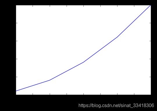
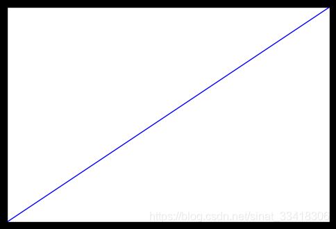
plt.plot([1,2,3,4,5],[1,4,9,16,25])
plt.xlabel('xlabel', fontsize = 16)
plt.ylabel('ylabel')
1.2 不同的线条,线条格式, 颜色
| 字符 | 类型 | 字符 | 类型 |
|---|---|---|---|
'-' |
实线 | '--' |
虚线 |
'-.' |
虚点线 | ':' |
点线 |
'.' |
点 | ',' |
像素点 |
'o' |
圆点 | 'v' |
下三角点 |
'^' |
上三角点 | '<' |
左三角点 |
'>' |
右三角点 | '1' |
下三叉点 |
'2' |
上三叉点 | '3' |
左三叉点 |
'4' |
右三叉点 | 's' |
正方点 |
'p' |
五角点 | '*' |
星形点 |
'h' |
六边形点1 | 'H' |
六边形点2 |
'+' |
加号点 | 'x' |
乘号点 |
'D' |
实心菱形点 | 'd' |
瘦菱形点 |
'_' |
横线点 |
plt.plot([1,2,3,4,5],[1,4,9,16,25],'-.')
plt.xlabel('xlabel',fontsize = 16)
plt.ylabel('ylabel',fontsize = 16)

1.2.1 颜色
表示颜色的字符参数有:
| 字符 | 颜色 |
|---|---|
‘b’ |
蓝色,blue |
‘g’ |
绿色,green |
‘r’ |
红色,red |
‘c’ |
青色,cyan |
‘m’ |
品红,magenta |
‘y’ |
黄色,yellow |
‘k’ |
黑色,black |
‘w’ |
白色,white |
plt.plot([1,2,3,4,5],[1,4,9,16,25],'-.',color='r')
plt.xlabel('xlabel',fontsize = 16)
plt.ylabel('ylabel',fontsize = 16)

plt.plot([1,2,3,4,5],[1,4,9,16,25],'ro')
plt.xlabel('xlabel',fontsize = 16)
plt.ylabel('ylabel',fontsize = 16)

1.2.2 绘制多条线
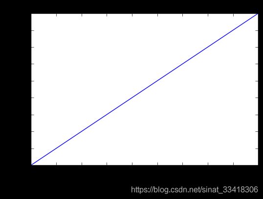
tang_numpy = np.arange(0,10,0.5)
plt.plot(tang_numpy,tang_numpy,'r--')
plt.plot(tang_numpy,tang_numpy**2,'bs')
plt.plot(tang_numpy,tang_numpy**3,'go')

plt.plot(tang_numpy,tang_numpy,'r--',
        tang_numpy,tang_numpy**2,'bs',
        tang_numpy,tang_numpy**3,'go')

1.2.3 指定线条宽度
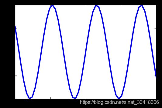
x = np.linspace(-10,10)
y = np.sin(x)
plt.plot(x,y,linewidth = 3.0)
plt.plot(x,y,color='b',linestyle=':',marker = 'o',markerfacecolor='r',markersize = 10)

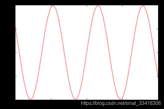
line = plt.plot(x,y)
plt.setp(line,color='r',linewidth = 2.0, alpha = 0.4)
1.3 子图与标注
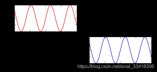
# 211 表示一会要画的图是2行一列的 最后一个1表示的是子图当中的第1个图
plt.subplot(211)
plt.plot(x,y,color='r')

# 212 表示一会要画的图是2行一列的 最后一个1表示的是子图当中的第2个图
plt.subplot(212)
plt.plot(x,y,color='b')

# 211 表示一会要画的图是1行2列的 最后一个1表示的是子图当中的第1个图
plt.subplot(121)
plt.plot(x,y,color='r')

# 212 表示一会要画的图是1行2列的 最后一个1表示的是子图当中的第2个图
plt.subplot(122)
plt.plot(x,y,color='b')

plt.subplot(321)
plt.plot(x,y,color='r')


plt.subplot(324)
plt.plot(x,y,color='b')
1.3.1给图上加上注释
plt.plot(x,y,color='b',linestyle=':',marker = 'o',markerfacecolor='r',markersize = 10)
plt.xlabel('x:---')
plt.ylabel('y:---')
plt.title('tang yu di:---')
plt.text(0,0,'tang yu di')
plt.grid(True)
plt.annotate('tangyudi',xy=(-5,0),xytext=(-2,0.3),arrowprops = dict(facecolor='red',shrink=0.05,headlength= 20,headwidth = 20))

x = range(10)
y = range(10)

fig = plt.gca()
plt.plot(x,y)

fig.axes.get_xaxis().set_visible(False)
fig.axes.get_yaxis().set_visible(False)
import math
x = np.random.normal(loc = 0.0,scale=1.0,size=300)
width = 0.5
bins = np.arange(math.floor(x.min())-width,math.ceil(x.max())+width,width)
ax = plt.subplot(111)

ax.spines['top'].set_visible(False)
ax.spines['right'].set_visible(False)

plt.tick_params(bottom='off',top='off',left = 'off',right='off')

plt.grid()

plt.hist(x,alpha = 0.5,bins = bins)

import matplotlib as mpl
mpl.rcParams['axes.titlesize'] = '10'
x = range(10)
y = range(10)

labels = ['tangyudi' for i in range(10)]
fig,ax = plt.subplots()
plt.plot(x,y)
plt.title('tangyudi')
ax.set_xticklabels(labels,rotation = 45,horizontalalignment='right')
x = np.arange(10)
for i in range(1,4):
    plt.plot(x,i*x**2,label = 'Group %d'%i)
plt.legend(loc='best')

fig = plt.figure()
ax = plt.subplot(111)

x = np.arange(10)
for i in range(1,4):
    plt.plot(x,i*x**2,label = 'Group %d'%i)
ax.legend(loc='upper center',bbox_to_anchor = (0.5,1.15) ,ncol=3)
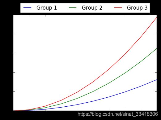
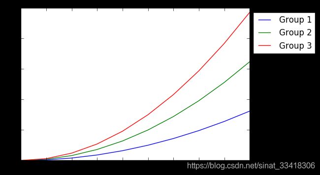
fig = plt.figure()
ax = plt.subplot(111)

x = np.arange(10)
for i in range(1,4):
    plt.plot(x,i*x**2,label = 'Group %d'%i)
ax.legend(loc='upper center',bbox_to_anchor = (1.15,1) ,ncol=1)
x = np.arange(10)
for i in range(1,4):
    plt.plot(x,i*x**2,label = 'Group %d'%i,marker='o')
plt.legend(loc='upper right',framealpha = 0.1)

1.4 风格设置
plt.style.available

x=np.linspace(-10,10)
y=np.sin(x)
plt.plot(x,y)

plt.style.use('dark_background')
plt.plot(x,y)
1.5 条形图
 np.random.seed(0)
 x=np.arange(5)
 y = np.random.randn(5)

fig.axes=plt.subplots(ncols=2)
v_bars = axes[0].bar(x,y,color='red')
b_bars = axes[1].barh(x,y,color='red')
plt.show()


#条形图加线
axes[0].axhline(0,color='grey', linewidth=2)
axe[1].axvline(0,color='grey',linewidth=2)

#条形图大于零一个颜色,小于零另一个颜色
fig.ax=plt.subplots()
v_bars= ax.bar(x,y, color='lightblue')
for bar,height in zip(v_bars,y):
	if height<0:
		bar.set(edgecolor='darked', color='green',linewidth=3)
plt.show()


x = np.random.randn(100).cumsum()
y = np.linspace(0,10,100)
#图形填充
fig.ax = plt.subplots()
ax.fill_between(x,y)
ax.fill_between(x,y,color='lightblue')
plt.show()


x= np.linspace(0,10,200)
y1=2*x+1
y2=3*x+1.2

y_mean=0.5*x*np.cos(2*x)+2.5*x+1.1

fig.ax=plt.subplots()
ax.fill_between(x,y1,y2,color='red')
ax.plot(x,y_mean,color='black')
plt.show()
1.6 条形图细节
import numpy as np
import matplotlib
matplotlib.use('nbagg')
import matplotlib.pyplot as plt
np.random.seed(0)
x = np.arange(5)
y = np.random.randint(-5,5,5)
print (y)
fig,axes = plt.subplots(ncols = 2)
v_bars = axes[0].bar(x,y,color='red')
h_bars = axes[1].barh(x,y,color='red')

axes[0].axhline(0,color='grey',linewidth=2)
axes[1].axvline(0,color='grey',linewidth=2)
plt.show()

fig,ax = plt.subplots()
v_bars = ax.bar(x,y,color='lightblue')
for bar,height in zip(v_bars,y):
    if height < 0:
        bar.set(edgecolor = 'darkred',color = 'green',linewidth = 3)
plt.show()

x = np.random.randn(100).cumsum()
y = np.linspace(0,10,100)

fig,ax = plt.subplots()
ax.fill_between(x,y,color='lightblue')
plt.show()
x = np.linspace(0,10,200)
y1 = 2*x +1
y2 = 3*x +1.2
y_mean = 0.5*x*np.cos(2*x) + 2.5*x +1.1
fig,ax = plt.subplots()
ax.fill_between(x,y1,y2,color='red')
ax.plot(x,y_mean,color='black')
plt.show()

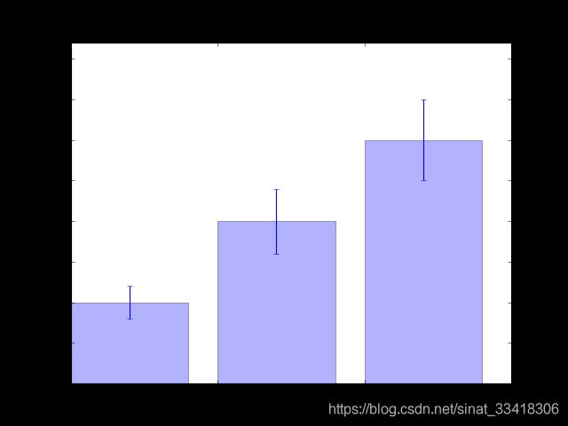
mean_values = [1,2,3]
variance = [0.2,0.4,0.5]
bar_label = ['bar1','bar2','bar3']

x_pos = list(range(len(bar_label)))
plt.bar(x_pos,mean_values,yerr=variance,alpha=0.3)
max_y = max(zip(mean_values,variance))
plt.ylim([0,(max_y[0]+max_y[1])*1.2])
plt.ylabel('variable y')
plt.xticks(x_pos,bar_label)
plt.show()
x1 = np.array([1,2,3])
x2 = np.array([2,2,3])

bar_labels = ['bat1','bar2','bar3']
fig = plt.figure(figsize = (8,6))
y_pos = np.arange(len(x1))
y_pos = [x for x in y_pos]

plt.barh(y_pos,x1,color='g',alpha = 0.5)
plt.barh(y_pos,-x2,color='b',alpha = 0.5)

plt.xlim(-max(x2)-1,max(x1)+1)
plt.ylim(-1,len(x1)+1)
plt.show()

green_data = [1, 2, 3]
blue_data = [3, 2, 1]
red_data = [2, 3, 3]
labels = ['group 1', 'group 2', 'group 3']

pos = list(range(len(green_data)))
width = 0.2
fig, ax = plt.subplots(figsize=(8,6))

plt.bar(pos,green_data,width,alpha=0.5,color='g',label=labels[0])
plt.bar([p+width for p in pos],blue_data,width,alpha=0.5,color='b',label=labels[1])
plt.bar([p+width*2 for p in pos],red_data,width,alpha=0.5,color='r',label=labels[2])
plt.show()

data = range(200, 225, 5)
bar_labels = ['a', 'b', 'c', 'd', 'e']
fig = plt.figure(figsize=(10,8))
y_pos = np.arange(len(data))
plt.yticks(y_pos, bar_labels, fontsize=16)
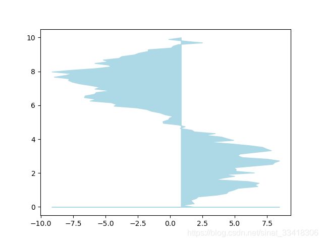
bars = plt.barh(y_pos,data,alpha = 0.5,color='g')
plt.vlines(min(data),-1,len(data)+0.5,linestyle = 'dashed')
for b,d in zip(bars,data):
plt.text(b.get_width()+b.get_width()*0.05,b.get_y()+b.get_height()/2,'{0:.2%}'.format(d/min(data)))
plt.show()

mean_values = range(10,18)
x_pos = range(len(mean_values))

import matplotlib.colors as col
import matplotlib.cm as cm

cmap1 = cm.ScalarMappable(col.Normalize(min(mean_values),max(mean_values),cm.hot))
cmap2 = cm.ScalarMappable(col.Normalize(0,20,cm.hot))

plt.subplot(121)
plt.bar(x_pos,mean_values,color = cmap1.to_rgba(mean_values))

plt.subplot(122)
plt.bar(x_pos,mean_values,color = cmap2.to_rgba(mean_values))

plt.show()

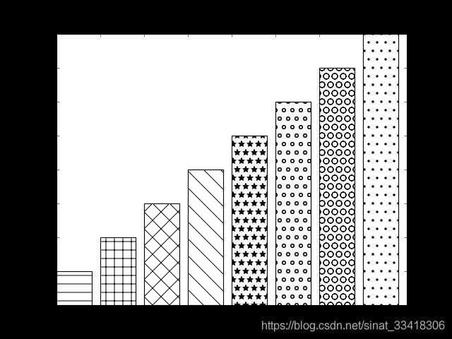
patterns = ('-', '+', 'x', '\\', '*', 'o', 'O', '.')

fig = plt.gca()

mean_value = range(1,len(patterns)+1)
x_pos = list(range(len(mean_value)))

bars = plt.bar(x_pos,mean_value,color='white')

for bar,pattern in zip(bars,patterns):
    bar.set_hatch(pattern)
plt.show()
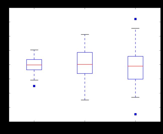
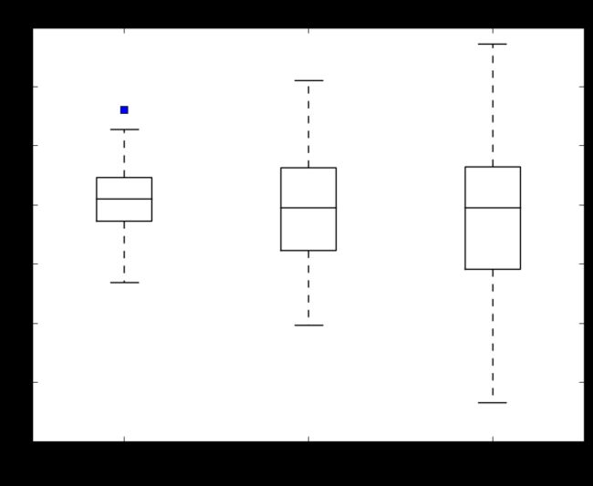
1.7 盒图

%matplotlib inline
import matplotlib.pyplot as plt
import numpy as np

tang_data = [np.random.normal(0,std,100) for std in range(1,4)]
fig = plt.figure(figsize = (8,6))
plt.boxplot(tang_data,notch=False,sym='s',vert=True)

plt.xticks([y+1 for y in range(len(tang_data))],['x1','x2','x3'])
plt.xlabel('x')
plt.title('box plot')
tang_data = [np.random.normal(0,std,100) for std in range(1,4)]
fig = plt.figure(figsize = (8,6))
bplot = plt.boxplot(tang_data,notch=False,sym='s',vert=True)

plt.xticks([y+1 for y in range(len(tang_data))],['x1','x2','x3'])
plt.xlabel('x')
plt.title('box plot')

for components in bplot.keys():
    for line in bplot[components]:
        line.set_color('black')
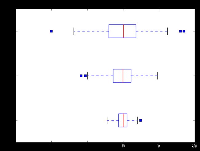
tang_data = [np.random.normal(0,std,100) for std in range(1,4)]
fig = plt.figure(figsize = (8,6))
plt.boxplot(tang_data,notch=False,sym='s',vert=False)

plt.yticks([y+1 for y in range(len(tang_data))],['x1','x2','x3'])
plt.ylabel('x')
plt.title('box plot')
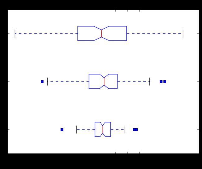
tang_data = [np.random.normal(0,std,100) for std in range(1,4)]
fig = plt.figure(figsize = (8,6))
plt.boxplot(tang_data,notch=True,sym='s',vert=False)

plt.xticks([y+1 for y in range(len(tang_data))],['x1','x2','x3'])
plt.xlabel('x')
plt.title('box plot')
tang_data = [np.random.normal(0,std,100) for std in range(1,4)]
fig = plt.figure(figsize = (8,6))
bplot = plt.boxplot(tang_data,notch=False,sym='s',vert=True,patch_artist=True)

plt.xticks([y+1 for y in range(len(tang_data))],['x1','x2','x3'])
plt.xlabel('x')
plt.title('box plot')

colors = ['pink','lightblue','lightgreen']
for pathch,color in zip(bplot['boxes'],colors):
    pathch.set_facecolor(color)

1.8 小提琴图 violinplot
fig,axes = plt.subplots(nrows=1,ncols=2,figsize=(12,5))
tang_data = [np.random.normal(0,std,100) for std in range(6,10)]
axes[0].violinplot(tang_data,showmeans=False,showmedians=True)
axes[0].set_title('violin plot')

axes[1].boxplot(tang_data)
axes[1].set_title('box plot')

for ax in axes:
    ax.yaxis.grid(True)
    ax.set_xticks([y+1 for y in range(len(tang_data))])
plt.setp(axes,xticks=[y+1 for y in range(len(tang_data))],xticklabels=['x1','x2','x3','x4'])

1.9 直方图和散点图
import numpy as np
import matplotlib.pyplot as plt

data = np.random.normal(0,20,1000)
bins = np.arange(-100,100,5)

plt.hist(data,bins=bins)
plt.xlim([min(data)-5,max(data)+5])
plt.show()

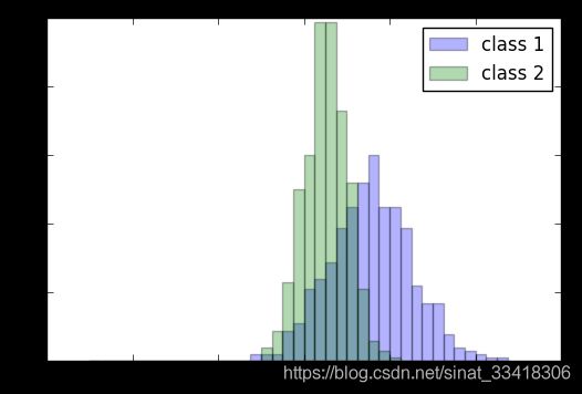
import random
data1 = [random.gauss(15,10) for i in range(500)]
data2 = [random.gauss(5,5) for i in range(500)]
bins = np.arange(-50,50,2.5)

plt.hist(data1,bins=bins,label='class 1',alpha = 0.3)
plt.hist(data2,bins=bins,label='class 2',alpha = 0.3)
plt.legend(loc='best')
plt.show()
mu_vec1 = np.array([0,0])
cov_mat1 = np.array([[2,0],[0,2]])

x1_samples = np.random.multivariate_normal(mu_vec1, cov_mat1, 100)
x2_samples = np.random.multivariate_normal(mu_vec1+0.2, cov_mat1+0.2, 100)
x3_samples = np.random.multivariate_normal(mu_vec1+0.4, cov_mat1+0.4, 100)

plt.figure(figsize = (8,6))
plt.scatter(x1_samples[:,0],x1_samples[:,1],marker ='x',color='blue',alpha=0.6,label='x1')
plt.scatter(x2_samples[:,0],x2_samples[:,1],marker ='o',color='red',alpha=0.6,label='x2')
plt.scatter(x3_samples[:,0],x3_samples[:,1],marker ='^',color='green',alpha=0.6,label='x3')
plt.legend(loc='best')
plt.show()

x_coords = [0.13, 0.22, 0.39, 0.59, 0.68, 0.74, 0.93]
y_coords = [0.75, 0.34, 0.44, 0.52, 0.80, 0.25, 0.55]

plt.figure(figsize = (8,6))
plt.scatter(x_coords,y_coords,marker='s',s=50)

for x,y in zip(x_coords,y_coords):
    plt.annotate('(%s,%s)'%(x,y),xy=(x,y),xytext=(0,-15),textcoords = 'offset points',ha='center')
plt.show()

mu_vec1 = np.array([0,0])
cov_mat1 = np.array([[1,0],[0,1]])
X = np.random.multivariate_normal(mu_vec1, cov_mat1, 500)
fig = plt.figure(figsize=(8,6))
R=X**2
R_sum=R.sum(axis = 1)
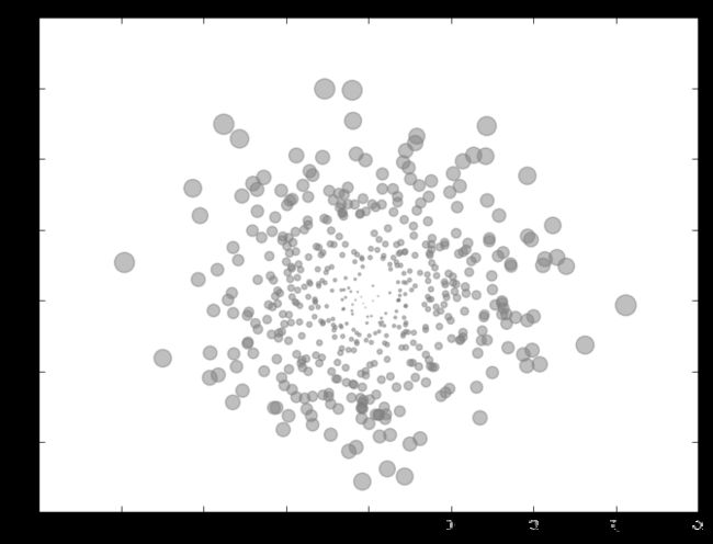
plt.scatter(X[:,0],X[:,1],color='grey',marker='o',s=20*R_sum,alpha=0.5)
plt.show()
1.10 3D图绘制
import matplotlib.pyplot as plt
import numpy as np
from mpl_toolkits.mplot3d import Axes3D
fig = plt.figure()
ax = Axes3D(fig)

x = np.arange(-4,4,0.25)
y = np.arange(-4,4,0.25)

X,Y = np.meshgrid(x,y)

Z = np.sin(np.sqrt(X**2+Y**2))
ax.plot_surface(X,Y,Z,rstride = 1,cstride = 1,cmap='rainbow')
ax.contour(X,Y,Z,zdim='z',offset = -2 ,cmap='rainbow')

ax.set_zlim(-2,2)
plt.show()

import matplotlib.pyplot as plt
from mpl_toolkits.mplot3d import Axes3D

fig = plt.figure()
ax = fig.add_subplot(111,projection = '3d')
plt.show()

fig = plt.figure()
ax = fig.gca(projection='3d')

theta = np.linspace(-4 * np.pi, 4 * np.pi, 100)
z = np.linspace(-2, 2, 100)
r = z**2 + 1
x = r * np.sin(theta)
y = r * np.cos(theta)

ax.plot(x,y,z)
plt.show()

np.random.seed(1)
def randrange(n,vmin,vmax):
    return (vmax-vmin)*np.random.rand(n)+vmin


fig = plt.figure()
ax = fig.add_subplot(111,projection = '3d')
n = 100
for c,m,zlow,zhigh in [('r','o',-50,-25),('b','x','-30','-5')]:
    xs = randrange(n,23,32)
    ys = randrange(n,0,100)
    zs = randrange(n,int(zlow),int(zhigh))
    ax.scatter(xs,ys,zs,c=c,marker=m)

ax.view_init(40,0)
plt.show()

fig = plt.figure()
ax = fig.add_subplot(111, projection='3d')

for c, z in zip(['r', 'g', 'b', 'y'], [30, 20, 10, 0]):
    xs = np.arange(20)
    ys = np.random.rand(20)
    cs = [c]*len(xs)
    ax.bar(xs,ys,zs = z,zdir='y',color = cs,alpha = 0.5)
plt.show()

1.11 Pie图与布局
%matplotlib inline
import matplotlib.pyplot as plt
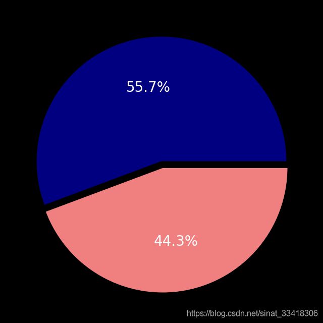
m = 51212.
f = 40742.
m_perc = m/(m+f)
f_perc = f/(m+f)

colors = ['navy','lightcoral']
labels = ["Male","Female"]

plt.figure(figsize=(8,8))
paches,texts,autotexts = plt.pie([m_perc,f_perc],labels = labels,autopct = '%1.1f%%',explode=[0,0.05],colors = colors)

for text in texts+autotexts:
    text.set_fontsize(20)
for text in autotexts:
    text.set_color('white')
ax1 = plt.subplot2grid((3,3),(0,0))
ax2 = plt.subplot2grid((3,3),(1,0))
ax3 = plt.subplot2grid((3,3),(0,2),rowspan=3)
ax4 = plt.subplot2grid((3,3),(2,0),colspan = 2)
ax5 = plt.subplot2grid((3,3),(0,1),rowspan=2)

import numpy as np

x = np.linspace(0,10,1000)
y2 = np.sin(x**2)
y1 = x**2

fig,ax1 = plt.subplots()

left,bottom,width,height = [0.22,0.45,0.3,0.35]
ax2 = fig.add_axes([left,bottom,width,height])

ax1.plot(x,y1)
ax2.plot(x,y2)

import matplotlib.pyplot as plt
from mpl_toolkits.axes_grid1.inset_locator import inset_axes

def autolabel(rects):
    for rect in rects:
        height = rect.get_height()
        ax1.text(rect.get_x() + rect.get_width()/2., 1.02*height,
        "{:,}".format(float(height)),
        ha='center', va='bottom',fontsize=18)

top10_arrivals_countries = ['CANADA','MEXICO','UNITED\nKINGDOM',\
                            'JAPAN','CHINA','GERMANY','SOUTH\nKOREA',\
                            'FRANCE','BRAZIL','AUSTRALIA']
top10_arrivals_values = [16.625687, 15.378026, 3.934508, 2.999718,\
                         2.618737, 1.769498, 1.628563, 1.419409,\
                         1.393710, 1.136974]
arrivals_countries = ['WESTERN\nEUROPE','ASIA','SOUTH\nAMERICA',\
                      'OCEANIA','CARIBBEAN','MIDDLE\nEAST',\
                      'CENTRAL\nAMERICA','EASTERN\nEUROPE','AFRICA']
arrivals_percent = [36.9,30.4,13.8,4.4,4.0,3.6,2.9,2.6,1.5]

fig, ax1 = plt.subplots(figsize=(20,12))
tang = ax1.bar(range(10),top10_arrivals_values,color='blue')
plt.xticks(range(10),top10_arrivals_countries,fontsize=18)
ax2 = inset_axes(ax1,width = 6,height = 6,loc = 5)
explode = (0.08, 0.08, 0.05, 0.05,0.05,0.05,0.05,0.05,0.05)
patches, texts, autotexts = ax2.pie(arrivals_percent,labels=arrivals_countries,autopct='%1.1f%%',explode=explode)

for text in texts+autotexts:
    text.set_fontsize(16)
for spine in ax1.spines.values():
    spine.set_visible(False)

autolabel(tang)

import numpy as np
from matplotlib.patches import Circle, Wedge, Polygon, Ellipse
from matplotlib.collections import PatchCollection
import matplotlib.pyplot as plt

fig, ax = plt.subplots()

patches = []

# Full and ring sectors drawn by Wedge((x,y),r,deg1,deg2)
leftstripe = Wedge((.46, .5), .15, 90,100)           # Full sector by default
midstripe = Wedge((.5,.5), .15, 85,95)
rightstripe = Wedge((.54,.5), .15, 80,90)
lefteye = Wedge((.36, .46), .06, 0, 360, width=0.03)  # Ring sector drawn when width <1
righteye = Wedge((.63, .46), .06, 0, 360, width=0.03)
nose = Wedge((.5, .32), .08, 75,105, width=0.03)
mouthleft = Wedge((.44, .4), .08, 240,320, width=0.01)
mouthright = Wedge((.56, .4), .08, 220,300, width=0.01)
patches += [leftstripe,midstripe,rightstripe,lefteye,righteye,nose,mouthleft,mouthright]

# Circles
leftiris = Circle((.36,.46),0.04)
rightiris = Circle((.63,.46),0.04)
patches += [leftiris,rightiris]

# Polygons drawn by passing coordinates of vertices
leftear = Polygon([[.2,.6],[.3,.8],[.4,.64]], True)
rightear = Polygon([[.6,.64],[.7,.8],[.8,.6]], True)
topleftwhisker = Polygon([[.01,.4],[.18,.38],[.17,.42]], True)
bottomleftwhisker = Polygon([[.01,.3],[.18,.32],[.2,.28]], True)
toprightwhisker = Polygon([[.99,.41],[.82,.39],[.82,.43]], True)
bottomrightwhisker = Polygon([[.99,.31],[.82,.33],[.81,.29]], True)
patches+=[leftear,rightear,topleftwhisker,bottomleftwhisker,toprightwhisker,bottomrightwhisker]

# Ellipse drawn by Ellipse((x,y),width,height)
body = Ellipse((0.5,-0.18),0.6,0.8)
patches.append(body)

# Draw the patches
colors = 100*np.random.rand(len(patches)) # set random colors
p = PatchCollection(patches, alpha=0.4)
p.set_array(np.array(colors))
ax.add_collection(p)

# Show the figure
plt.show()

1.12 Pandas与sklearn 结合实例
import pandas as pd
import numpy as np
import matplotlib.pyplot as plt

np.random.seed(0)
df = pd.DataFrame({'Condition 1': np.random.rand(20),
                   'Condition 2': np.random.rand(20)*0.9,
                   'Condition 3': np.random.rand(20)*1.1})
df.head()
fig,ax = plt.subplots()
df.plot.bar(ax=ax,stacked=True)
plt.show()

from matplotlib.ticker import FuncFormatter

df_ratio = df.div(df.sum(axis=1),axis=0)
fig,ax = plt.subplots()
df_ratio.plot.bar(ax=ax,stacked=True)
ax.yaxis.set_major_formatter(FuncFormatter(lambda y,_:'{:.0%}'.format(y)))
plt.show()

url = 'https://archive.ics.uci.edu/ml/machine-learning-databases/00383/risk_factors_cervical_cancer.csv'
df = pd.read_csv(url, na_values="?")
df.head()
from sklearn.preprocessing import Imputer

impute =  pd.DataFrame(Imputer().fit_transform(df))
impute.columns = df.columns
impute.index = df.index

impute.head()
%matplotlib notebook
import numpy as np
import seaborn as sns
import matplotlib.pyplot as plt
from sklearn.decomposition import PCA
from mpl_toolkits.mplot3d import Axes3D
features = impute.drop('Dx:Cancer', axis=1)
y = impute["Dx:Cancer"]

pca = PCA(n_components=3)
X_r = pca.fit_transform(features)

print("Explained variance:\nPC1 {:.2%}\nPC2 {:.2%}\nPC3 {:.2%}"
      .format(pca.explained_variance_ratio_[0],
              pca.explained_variance_ratio_[1],
              pca.explained_variance_ratio_[2]))

fig = plt.figure()
ax = Axes3D(fig)

ax.scatter(X_r[:, 0], X_r[:, 1], X_r[:, 2], c=y, cmap=plt.cm.coolwarm)

# Label the axes
ax.set_xlabel('PC1')
ax.set_ylabel('PC2')
ax.set_zlabel('PC3')

plt.show()
