iOS AutoLayout使用间隔视图进行均匀间距
This is the second tutorial in the series of iOS AutoLayout tutorial. In the first tutorial we looked into the basic features of AutoLayout and played around with them on a UIButton in the Interface Builder. In this tutorial, we’ll look into some other nuances of AutoLayout. AutoLayout is enabled by default when you create a new project.
这是iOS AutoLayout教程系列的第二篇教程。 在第一个教程中,我们研究了AutoLayout的基本功能,并在Interface Builder中的UIButton上进行了试用。 在本教程中,我们将研究AutoLayout的其他一些细微差别。 创建新项目时,默认情况下会启用自动版式。
iOS AutoLayout概述 (iOS AutoLayout Recap)
As we had discussed in the previous tutorial, AutoLayout is a layout system that describes how the view is laid out using descriptive constraints. Let’s add 4 buttons on the four corners of the screen along the guidelines.
正如我们在上一教程中所讨论的,AutoLayout是一个布局系统,它描述如何使用描述性约束对视图进行布局。 让我们按照指南在屏幕的四个角上添加4个按钮。
Observe the two preview images in the right hand side of the image. They correspond to 3.5 and 5.5 inch screen respectively. As you can see the preview doesn’t show the bottom left and right images in the 3.5 inch screen (try switching to the landscape view too as shown). In the case of 5.5 inch screen the buttons are nowhere close to the margins as we had kept them in the interface builder. Let’s fix them to the margins.
观察图像右侧的两个预览图像。 它们分别对应于3.5英寸和5.5英寸的屏幕。 如您所见,预览不会在3.5英寸的屏幕上显示左下和右下图像(也请尝试如图所示切换到横向视图)。 在5.5英寸屏幕的情况下,按钮与边缘的距离不远,就像我们在界面生成器中保留的那样。 让我们将它们固定在边缘。
As you can see we’re pinning the buttons to the respective margins ( bottom-left/right for the bottom buttons). You can do the corresponding for the buttons at the top too.
如您所见,我们将按钮固定在相应的边距(底部按钮的左下/右下)。 您也可以为顶部的按钮执行相应操作。
The buttons are surrounded with the orange boxes. To fix those misplaced views, change the constraint values as suggested in the image below.
按钮被橙色框包围。 要修复这些错位的视图,请按照下图所示更改约束值。
Note: An easier way to do the same is to click on the warning icon and chose “Fix Misplacement”.
注意:执行此操作的更简单方法是单击警告图标,然后选择“修复错位”。
The horizontal constraints, essentially the constraints for the left and right of the views are named as leading and trailing constraints. The image below shows the constraints for the view controller and the leading space to container margin.
水平约束(本质上是视图左侧和右侧的约束)被称为前导约束和尾随约束。 下图显示了视图控制器的约束以及到容器边距的前导空间。
Another quick example before we move onto evenly spacing views is adding a View Object and covering the full screen. Let’s give it some background color from the attributes inspector. Now the current screen preview would be similar to the image given below.
在我们进入均匀间隔视图之前的另一个快速示例是添加一个“视图对象”并覆盖整个屏幕。 让我们从属性检查器中为其提供一些背景颜色。 现在,当前的屏幕预览将类似于下面给出的图像。
Again! We need to set the constraints to specify the edges of the View object. The following image demonstrates the procedure.
再次! 我们需要设置约束以指定View对象的边缘。 下图演示了该过程。
Now let’s get onto spacing views evenly.
现在,让我们均匀地进入间距视图。
均匀分布的视图 (Evenly Spaced Views)
To evenly space views across screens of different sizes, there are two approaches:
为了在不同大小的屏幕上均匀分布视图,有两种方法:
- Using Spacer Views 使用间隔视图
- Using Multipliers 使用乘数
Let’s implement using the first approach. The second approach will be covered in the next tutorial.
让我们使用第一种方法来实现。 第二种方法将在下一个教程中介绍。
使用间隔视图 (Using Spacer Views)
We’ve termed spacer views as the UIViews that are between the content views.
We’ll have four spacer views that would be present along the edges and between the content views. The image below shows an initial glimpse of the interface builder with the views.
我们将间隔视图称为内容视图之间的UIView。
我们将在边缘和内容视图之间有四个间隔视图。 下图显示了界面构建器与视图的初步概览。
We’ve named every View in the left pane of the screen. The black views are the spacer views.
As you can see in the preview, the views aren’t being exactly displayed in a screen of different dimensions. In the following steps we’ll show the procedure to set the constraints such that the content views are evenly spaced.
我们已经在屏幕的左窗格中命名了每个视图。 黑色视图是间隔视图。
正如您在预览中看到的那样,视图没有完全显示在不同尺寸的屏幕中。 在下面的步骤中,我们将显示设置约束的过程,以使内容视图均匀分布。
设定约束 (Setting the Constraints)
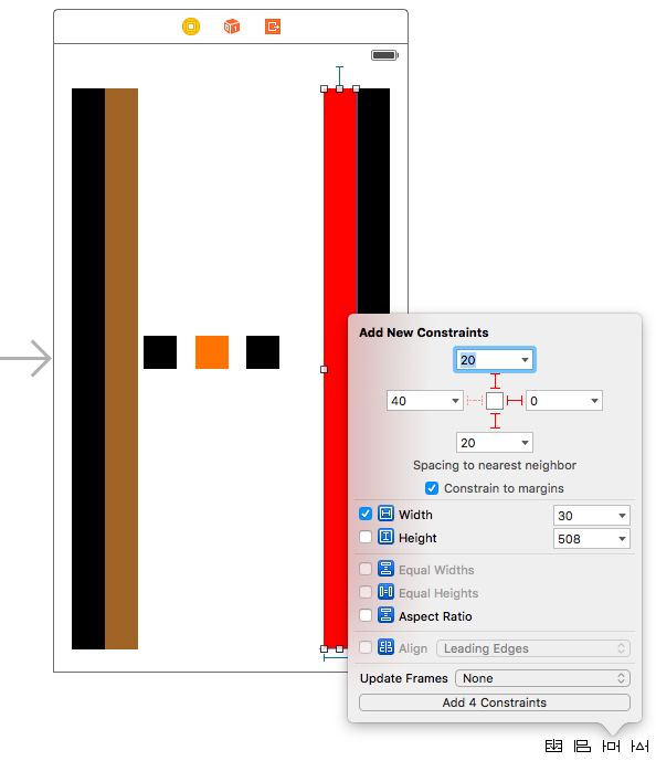
- For the First Spacer View, add the constraints to the top, left and bottom margins as 20, 0 and 20 respectively from the pin button at the bottom of the screen. To not leave any missing constraints, we’ll fix the width of the view too(though we’ll later get rid of these explicit widths). The image below describes this step.
Select Update Frame from the resolve AutoLayout issues button at the bottom. This updates the current spacer view according to the constraints specified
从底部的“解决自动布局问题”按钮中选择“更新框架”。 这将根据指定的约束更新当前的间隔视图
- Repeat the above step for the Fourth Spacer View by adding the top, right and bottom constraints as 20,0 and 20 respectively. Set the width constraints too. The current Interface Builder should look similar to the image below.
Have a look at the constraints defined in the left pane. Do they match yours?
看一下在左窗格中定义的约束。 他们符合您的要求吗?
- Now select the Left Content View.
Note: Make sure that this view doesn’t overlap with the First Spacer View. Else the left margin constraint of this view would be set to the Superview instead of the spacer view.Set the top, left and bottom constraints of the view as 20, 0 and 20. Set the width constraint too and update the frame. Do the analogous for the Right Content View. The View Controller Scene should like this.
注意:请确保该视图与“第一个垫片视图”不重叠。 否则,该视图的左边界约束将设置为“ Superview”而不是“ spacer”视图。将视图的顶部,左侧和底部约束设置为20、0和20。也设置宽度约束并更新框架。 对“正确的内容视图”执行类似操作。 View Controller Scene应该是这样的。
- Select the Second Spacer View and set the top, bottom and left constraints to 20, 20 and 0 respectively. Set the width and update the frames. Do the same for the Third Spacer View 选择“第二个垫片视图”,并将顶部,底部和左侧约束分别设置为20、20和0。 设置宽度并更新框架。 对第三个垫片视图执行相同的操作
- Now choose the Middle Content View and set the constraints for the top, bottom, left and right as 20, 20 0 and 0. The image below shows how all the views are displayed.
现在,选择“中间内容视图”并将顶部,底部,左侧和右侧的约束设置为20、20 0和0。下图显示了如何显示所有视图。

- Now to make the content views evenly space we need to delete the width constraints of the spacer views and set them to equal widths. Then delete the explicit widths from the left and right content views and set customisable width constraints to the three content views as you like.
The image below demonstrates the above step and shows the final output.
下图演示了上述步骤并显示了最终输出。
Note: Don’t forget to Update All the Frames. Select all the spacer views and change their background to white.
注意 :不要忘记更新所有框架。 选择所有间隔视图并将其背景更改为白色。
This brings and end to iOS AutoLayout even spacing using Spacer view tutorial. Isn’t the above procedure a long and tedious one? We’ll implement a more efficient workaround in our next tutorial.
这将使用Spacer视图教程带来并结束iOS AutoLayout均匀间距。 上面的过程不是一个漫长而乏味的过程吗? 在下一个教程中,我们将实现更有效的解决方法。
翻译自: https://www.journaldev.com/10828/ios-autolayout-even-spacing-spacer-views