本教程案例在线演示
免费配套视频教程
教程配套源码资源
本章目标

LESS
1.什么是less
Less 是一门 CSS 预处理语言,它扩展了 CSS 语言,增加了变量、Mixin、嵌套等特性。Less的语法更简洁,可以被翻译为CSS。
在vs code安装less的编译插件
安装插件Easy LESS,如下图所示

有了这个后,可以在编辑器新建less文件,后缀名是.less,保存后会自动编译成css
2. 变量
less可以声明变量,在其它地方直接引用。
@background-color: #ffffff;
@text-color: #1A237E;

p{
  background-color: @background-color;
  color: @text-color;
  padding: 15px;
}

ul{
  background-color: @background-color;
}

li{
  color: @text-color;
}
将其编译成 CSS 代码如下:
p{
    background-color: #ffffff;
    color: #1A237E;
    padding: 15px;
}

ul{
    background-color: #ffffff;
}

li{
    color: #1A237E;
}
现在我们要切换二者的值,也就是黑色的背景和白色的文本,我们只需要修改两个变量的值就可以了,而不是手动的去修改每个值。
3. Mixins
Less 允许我们将常用的样式,打包封装到 class 或 id 选择器中。 其它地方可以方便的引用。
#circle{
  background-color: #4CAF50;
  border-radius: 100%;
}

#small-circle{
  width: 50px;
  height: 50px;
  #circle
}

#big-circle{
  width: 100px;
  height: 100px;
  #circle
}
将其转换成 CSS 代码如下
#circle {
    background-color: #4CAF50;
    border-radius: 100%;
}
#small-circle {
    width: 50px;
    height: 50px;
    background-color: #4CAF50;
    border-radius: 100%;
}
#big-circle {
    width: 100px;
    height: 100px;
    background-color: #4CAF50;
    border-radius: 100%;
}
如果只用于样式打包,而不出现在css代码中,那么请在它的后面加上括号:
#circle(){
    background-color: #4CAF50;
    border-radius: 100%;
}

#small-circle{
    width: 50px;
    height: 50px;
    #circle
}

#big-circle{
    width: 100px;
    height: 100px;
    #circle
}
此时编译成 CSS :
#small-circle {
    width: 50px;
    height: 50px;
    background-color: #4CAF50;
    border-radius: 100%;
}
#big-circle {
    width: 100px;
    height: 100px;
    background-color: #4CAF50;
    border-radius: 100%;
}
Mixin 另一个比较酷的功能就是它支持传入参数,下面这个例子就为 circle 传入一个指定宽高的参数,默认是 25px。 这将创建一个 25×25的小圆和一个 100×100 的大圆。
#circle(@size: 25px){
    background-color: #4CAF50;
    border-radius: 100%;

    width: @size;
    height: @size;
}

#small-circle{
    #circle
}

#big-circle{
    #circle(100px)
}
转换成 CSS :
#small-circle {
    background-color: #4CAF50;
    border-radius: 100%;
    width: 25px;
    height: 25px;
}
#big-circle {
    background-color: #4CAF50;
    border-radius: 100%;
    width: 100px;
    height: 100px;
}
4. 嵌套
嵌套可用于以与页面的HTML结构相匹配的方式构造样式表,同时减少了冲突的机会。下面是一个无序列表的例子。
ul{
    background-color: #03A9F4;
    padding: 10px;
    list-style: none;

    li{
        background-color: #fff;
        border-radius: 3px;
        margin: 10px 0;
    }
}
编译成 CSS 代码:
ul {
    background-color: #03A9F4;
    padding: 10px;
    list-style: none;
}
ul li {
    background-color: #fff;
    border-radius: 3px;
    margin: 10px 0;
}
就像在其它高级语言中一样, Less 的变量根据范围接受它们的值。如果在指定范围内没有关于变量值的声明, less 会一直往上查找,直至找到离它最近的声明。
回到 CSS 中来,我们的 li 标签将有白色的文本,如果我们在 ul 标签中声明 @text-color 规则。
@text-color: #000000;

ul{
    @text-color: #fff;
    background-color: #03A9F4;
    padding: 10px;
    list-style: none;

    li{
        color: @text-color;
        border-radius: 3px;
        margin: 10px 0;
    }
}
编译生成的 CSS 代码如下:
ul {
    background-color: #03A9F4;
    padding: 10px;
    list-style: none;
}
ul li {
    color: #ffffff;
    border-radius: 3px;
    margin: 10px 0;
}
5. 运算
你可以对数值和颜色进行基本的数学运算。比如说我们想要两个紧邻的 div 标签,第二个标签是第一个标签的两倍宽并且拥有不同的背景色。
@div-width: 100px;
@color: #03A9F4;

div{
    height: 50px;
    display: inline-block;
}

#left{
    width: @div-width;
    background-color: @color;
}

#right{
    width: @div-width * 2;
    background-color: @color;
}
编译成 CSS 如下:
div {
    height: 50px;
    display: inline-block;
}
#left {
    width: 100px;
    background-color: #03a9f4;
}
#right {
    width: 200px;
    background-color: #03a9f4;
}
vw单位
vw是css的一个属性,和px,rem等类似,属于长度单位。
在浏览器中, 1 vw = viewport 的宽度 /100
根据这个特性,vw 可以帮助我们实现移动端自适应布局,其优点在于所见即所得,甚至优于rem,因为完全不用使用额外的计算。
推荐和sass、less这种css预处理语言一起使用,因为其可以定义变量及函数,会在使用vw上提供巨大帮助。
@vv:7.5vw;

.circle{
  width: 100/@vv;
  height: 100/@vv;
  border: 1px solid red;
  border-radius: 50%;
  font-size: 16/@vv;
  text-align: center;
  line-height: 100/@vv;
}

header.clear{
  width: 100%;
  height: 80/@vv;
  font-size: 42/@vv;
  background: #ededed;
  line-height: 80/@vv;
  text-align: center;
}
    vw布局练习


        这是header


        circle
下面三张图分别是在iphone 6|7|8 和ihone 6P|7P|8P 以及ipad Pro中的表现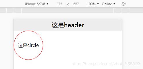


原理
以设计稿为750为例,假设viewport代表窗口宽度
750 => viewport
7.5 => viewport/100
//得到
1vw => 7.5
// 元素list 宽为300px
300 => 300/7.5 vw
//得到
@vv = 7.5vw
300 => 300/@vv
阿里图标库iconfont使用
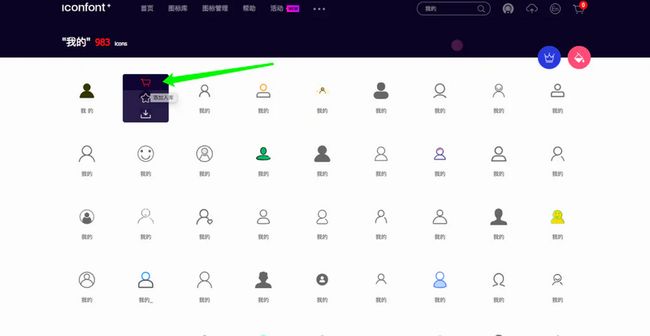
话不多说 进入官网 https://www.iconfont.cn/
搜索你想要的 ,比如【我的】

出来以后加入购物车
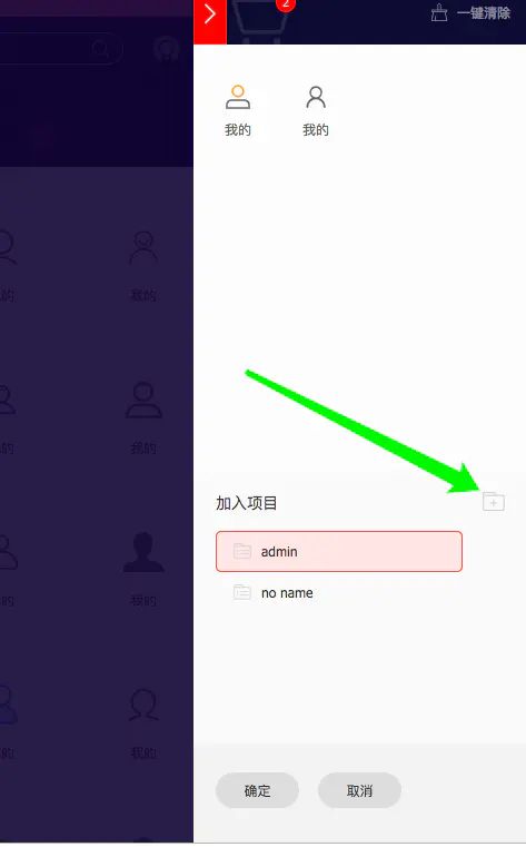
点击购物车

点击添加至项目 这时你如果没登录的话 ,会让你登陆随便选择一个登陆方式比如 github

登陆成功之后你可以选择新建也可以选择老的项目
确定好之后会是这样一个页面,然后下载至本地
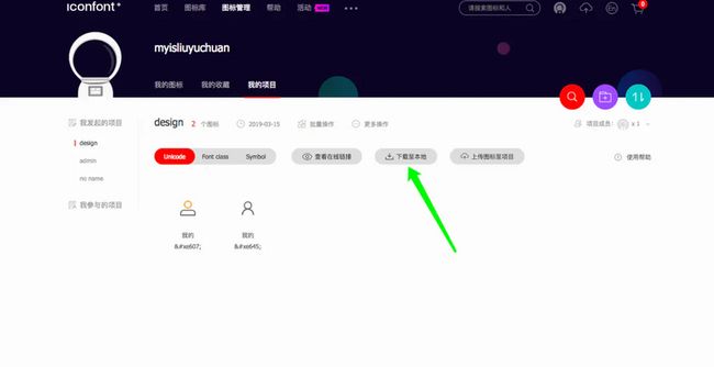
下载后解压会是一些这样的文件
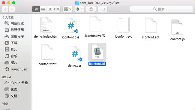
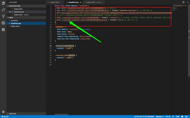
然后像我这样把字体文件和css文件拿到你的项目里


看下效果
移动端首页制作
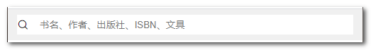
顶部搜索框
html
Document
less
@vv:3.75vw;

/*默认样式重置(css reset)*/
*{
  margin: 0;
  font-size: 12/@vv; /* 中文字体大小的最小值 */
  /* font-family: xx; 也可以设置字体 */
}
ol,ul {
  list-style: none; /* 去除列表样式 */
  padding: 0;
  margin: 0;
}

a {
  color: #464646;
  text-decoration: none;
}

a:hover {
  color: #f60;
  text-decoration: underline;
}

.com-header-area{
  background-color: #f0f0f0;
  padding: 6/@vv 10/@vv;
  .search-box{
    background-color: #fff;
    display: flex;
    align-items: center;
    input{
      border: 0;
      padding: 6/@vv 0;
      width: 100%;
    }
    span{
      font-size: 12/@vv;
    }
  }
}
热门搜索

html
css
.com-content{
  background-color:#e1e5ee;
  .hot-search{
    display: flex;
    align-items: center;
    background-color: #fff;
    padding: 2/@vv;
    li{
      margin: 0 4/@vv;
      &.hot{
        color: orange;
      }
      a{
        color: #ccc;
      }
    }
  }
}
轮播图

html

css
.slide {
img {
width : 375/@vv;
height: 187.5/@vv;
}
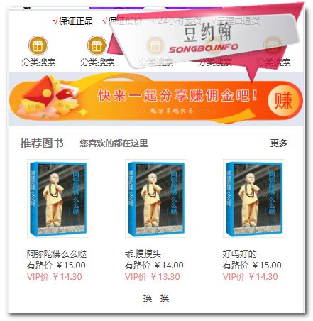
}保证条款
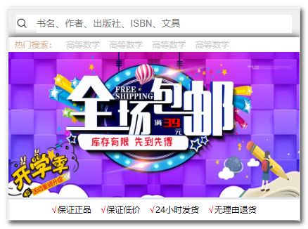
html
        √保证正品
        √保证低价
        √24小时发货
        √无理由退货
css
  .guarantee-g {
    display        : flex;
    justify-content: center;
    background     : #fff;

    .guarantee-span {
      margin   : 6/@vv;
      .check {
        color: red;
      }
    }
  }
五大模块

html
 分类搜索
分类搜索css
  .tab {
    display        : flex;
    justify-content: space-around;
    background     : #fff;
    a {
      display       : flex;
      flex-direction: column;
      align-items   : center;
      padding       : 6/@vv;
      img {
        width : 26/@vv;
        height: 26/@vv;
      }
    }
  }
中栏广告

html

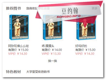
推荐图书

html
css
.book-items {
    background: #fff;
    color     : #757070;

    .item {
      line-height: 42/@vv;
      display    : flex;
      font-weight: bold;
      .book_recommend {
        font-size  : 14/@vv;
        margin-left: 14/@vv;
      }

      .left-arrow {
        margin-left: 20/@vv;
      }

      a {
        margin-left : auto;
        margin-right: 20/@vv;
      }
    }
  }
推荐图书列表

html

css
 .list-recommend ul {
      display: flex;
      li {
        display        : flex;
        flex-direction: column;
        align-items: center;
        flex           : 1;
        img {
          max-width    : 80/@vv;
          margin-bottom: 10/@vv;
        }
        .priceVip {
          color: #f28181;
        }
      }
    }
换一换
html
css
.book-refresh {
display : flex;
justify-content: center;
line-height : 40/@vv;
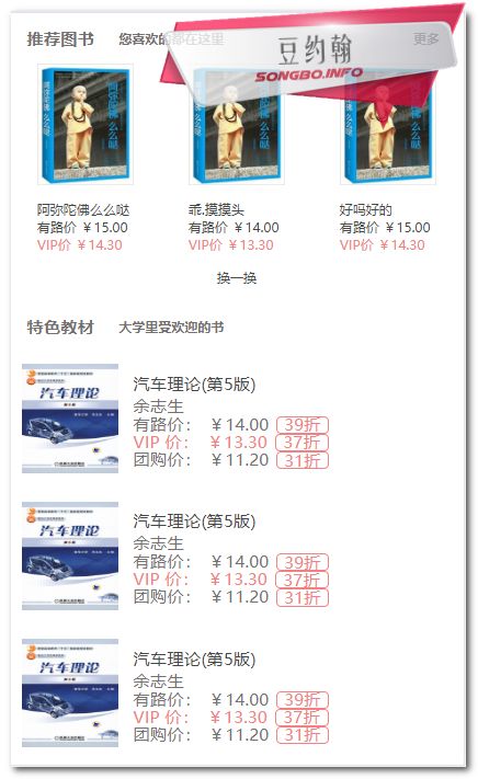
}特色教材
html
            特色教材
            大学里受欢迎的书
特色教材列表
html

css
  .bookInfo {
      font-size: 14/@vv;
      .bi_li {
        display: flex;
        padding: 10 / @vv;
        align-items: center;
        .bi-l img {
          max-height: 90 / @vv;
          width: 80 / @vv;
        }
        .bi-r {
          margin-left: 12 / @vv;
          .priceVip {
            color: #f28181;
          }
          .price {
            display: flex;
            line-height: 14 / @vv;
            span {
              flex: 1 1 auto;
              margin-left: 6 / @vv;
            }
            span:first-child {
              margin-left: 0;
            }
            span:last-child {
              color: #f28181;
              border-color: #f28181;
              display: flex;
              align-items: center;
              padding: 0 6 / @vv;
              font-weight: 400;
              border: 0.5/ @vv solid #f28181;
              border-radius: 4 / @vv;
            }
          }
        }
      }
    }
底部导航

html
css
.footer_nav {
  width           : 100%;
  position        : fixed;
  bottom          : 0;
  background-color: #fcfcfc;
  z-index         : 99;
  .footer-tab {
    display        : flex;
    justify-content: space-between;
    a {
      height         : 50/@vv;
      display        : flex;
      flex-direction: column;
      justify-content: center;
      align-items    : center;
      flex           : 1;
      .icon-fangdajing{
        font-size: 26/@vv;
      }
    }
  }
}
完整代码
html
Title
√保证正品
√保证低价
√24小时发货
√无理由退货
less
@vv:3.75vw;

/*默认样式重置(css reset)*/
body,p,h1,h2,h3,h4,h5,h6,dl,dd{
  margin: 0;
  font-size: 12/@vv;
  /* font-family: xx; 也可以设置字体 */
}
ol,ul {
  list-style: none; /* 去除列表样式 */
  padding: 0;
  margin: 0;
}

a {
  color: #464646;
  text-decoration: none;
}

a:hover {
  color: #f60;
  text-decoration: underline;
}

.com-header-area {
  background: #f0f0f0;
  padding: 6 / @vv 10 / @vv 6 / @vv 10 / @vv;
  .search-box {
    background: #fff;
    display: flex;
    align-items: center;
    input {
      font-size: 12/@vv;
      padding: 5 / @vv 0;
      margin: 0;
      border: 0;
      width: 100%;
      color: #999;
      margin-left: 12 / @vv;
    }
    span{
      font-size: 12/@vv;
    }
  }
}

.com-content {
  background: #e1e5ee;
  box-shadow: 0 0 10 / @vv #000;
  .hot-search ul {
    display: flex;
    align-items: center;
    background: #fff;
    padding: 2 / @vv 2 / @vv;
    li {
      margin: 0 6 / @vv;
      .hot {
        color: #ddb496;
      }
      a {
        color: #ccc;
      }
    }
  }
  .slide {
    img {
      width: 375 / @vv;
      height: 187.5 / @vv;
    }
  }
  .guarantee-g {
    display: flex;
    justify-content: center;
    background: #fff;

    .guarantee-span {
      margin: 6 / @vv;
      .check {
        color: red;
      }
    }
  }

  .tab {
    display: flex;
    justify-content: space-around;
    background: #fff;
    a {
      display: flex;
      flex-direction: column;
      align-items: center;
      padding: 6 / @vv;
      img {
        width: 26 / @vv;
        height: 26 / @vv;
      }
    }
  }

  .book-items {
    background: #fff;
    color: #757070;

    .item {
      line-height: 42 / @vv;
      display: flex;
      font-weight: bold;
      .book_recommend {
        font-size: 14 / @vv;
        margin-left: 14 / @vv;
      }

      .left-arrow {
        margin-left: 20 / @vv;
      }

      a {
        margin-left: auto;
        margin-right: 20 / @vv;
      }
    }

    .list-recommend ul {
      display: flex;
      li {
        display: flex;
        flex-direction: column;
        align-items: center;
        flex: 1;
        img {
          max-width: 80 / @vv;
          margin-bottom: 10 / @vv;
        }
        .priceVip {
          color: #f28181;
        }
      }
    }
    .book-refresh {
      display: flex;
      justify-content: center;
      line-height: 40 / @vv;
    }

    .bookInfo {
      font-size: 14/@vv;
      .bi_li {
        display: flex;
        padding: 10 / @vv;
        align-items: center;
        .bi-l img {
          max-height: 90 / @vv;
          width: 80 / @vv;
        }
        .bi-r {
          margin-left: 12 / @vv;
          .priceVip {
            color: #f28181;
          }
          .price {
            display: flex;
            line-height: 14 / @vv;
            span {
              flex: 1 1 auto;
              margin-left: 6 / @vv;
            }
            span:first-child {
              margin-left: 0;
            }
            span:last-child {
              color: #f28181;
              border-color: #f28181;
              display: flex;
              align-items: center;
              padding: 0 6 / @vv;
              font-weight: 400;
              border: 0.5/ @vv solid #f28181;
              border-radius: 4 / @vv;
            }
          }
        }
      }
    }
  }
}

.footer_nav {
  width           : 100%;
  position        : fixed;
  bottom          : 0;
  background-color: #fcfcfc;
  z-index         : 99;
  .footer-tab {
    display        : flex;
    justify-content: space-between;
    a {
      height         : 50/@vv;
      display        : flex;
      flex-direction: column;
      justify-content: center;
      align-items    : center;
      flex           : 1;
      .icon-sousuo{
        font-size: 20/@vv;
      }
    }
  }
}