python_数据_matplotlib.pyplot_1
matplotlib.pyplot
start
import matplotlib.pyplot as plt
图像
'''cmap : Accent, Accent_r, Blues, Blues_r, BrBG, BrBG_r, BuGn, BuGn_r, BuPu, BuPu_r,
CMRmap, CMRmap_r, Dark2, Dark2_r, GnBu, GnBu_r, Greens, Greens_r, Greys, Greys_r,
OrRd, OrRd_r, Oranges, Oranges_r, PRGn, PRGn_r, Paired, Paired_r, Pastel1, Pastel1_r,
Pastel2, Pastel2_r, PiYG, PiYG_r, PuBu, PuBuGn, PuBuGn_r, PuBu_r, PuOr, PuOr_r, PuRd,
PuRd_r, Purples, Purples_r, RdBu, RdBu_r, RdGy, RdGy_r, RdPu, RdPu_r, RdYlBu, RdYlBu_r,
RdYlGn, RdYlGn_r, Reds, Reds_r, Set1, Set1_r, Set2, Set2_r, Set3, Set3_r, Spectral, Spectral_r,
Wistia, Wistia_r, YlGn, YlGnBu, YlGnBu_r, YlGn_r, YlOrBr, YlOrBr_r, YlOrRd, YlOrRd_r, afmhot,
afmhot_r, autumn, autumn_r, binary, binary_r, bone, bone_r, brg, brg_r, bwr, bwr_r, cividis,
cividis_r, cool, cool_r, coolwarm, coolwarm_r, copper, copper_r, cubehelix, cubehelix_r, flag,
flag_r, gist_earth, gist_earth_r, gist_gray, gist_gray_r, gist_heat, gist_heat_r, gist_ncar, gist_ncar_r,
gist_rainbow, gist_rainbow_r, gist_stern, gist_stern_r, gist_yarg, gist_yarg_r, gnuplot, gnuplot2, gnuplot2_r,
gnuplot_r, gray, gray_r, hot, hot_r, hsv, hsv_r, inferno, inferno_r, jet, jet_r, magma, magma_r, nipy_spectral,
nipy_spectral_r, ocean, ocean_r, pink, pink_r, plasma, plasma_r, prism, prism_r, rainbow, rainbow_r, seismic,
seismic_r, spring, spring_r, summer, summer_r, tab10, tab10_r, tab20, tab20_r, tab20b, tab20b_r, tab20c, tab20c_r,
terrain, terrain_r, twilight, twilight_r, twilight_shifted, twilight_shifted_r, viridis, viridis_r, winter, winter_r
'''
plt.imshow(Img,cmap='gray')
cmap : str or
~matplotlib.colors.Colormap, optional
A Colormap instance or registered colormap name. The colormap
maps scalar data to colors. It is ignored for RGB(A) data.
Defaults to :rc:image.cmap.
- It is ignored for RGB(A) data.三通道RGB,cmap不起作用
- out:


img = plt.imread('2.png')
img[:,:,0] = img[:,:,0] * 0  # r
img[:,:,1] = img[:,:,1] * 0  # g
img[:,:,2] = img[:,:,2] * 1  # b
plt.figure(figsize=(12,9))
plt.imshow(img)
- 将红绿通道的值设为零

根据重要性及其它指标,将三个分量以不同的权值进行加权平均。由于人眼对绿色的敏感最高,对蓝色敏感最低,因此,按下式对RGB三分量进行加权平均能得到较合理的灰度图像。
f(i,j)=0.30R(i,j)+0.59G(i,j)+0.11B(i,j)
img = Img.copy()
img[:,:,0] = img[:,:,0] * 0.299
img[:,:,1] = img[:,:,1] * 0.587
img[:,:,2] = img[:,:,2] * 0.114
plt.figure(figsize=(12,9))
plt.imshow(img)
- out:

import numpy as np
w = np.array([0.299,0.587,0.114])
result = Img.dot(w)   # 矩阵叉乘
plt.imshow(result,cmap='ocean')
- 可以先将三通道转成单通道,调用cmap的各种效果

作图
x = np.linspace(0,2 * np.pi,50)
y = np.sin(x)
plt.plot(x,y)
- out:

plt.figure(figsize=(5,5))
plt.plot(np.sin(x),np.cos(x))
- out:

fig = plt.figure(figsize=(15,5))
axis = fig.add_subplot(1,3,1)
axis.plot(np.sin(x),np.cos(x))
axis.grid(linestyle='dashed')   # grid 绘制网格线  linestyle:线型
axis = fig.add_subplot(1,3,2)
axis.plot(np.sin(np.sin(x)),np.cos(np.sin(x)))
axis.grid(alpha=0.2)  # alpha 透明度
axis = fig.add_subplot(1,3,3)
axis.plot(np.sin(np.sin(x)),np.cos(np.tan(x)),color='blue')    # color 绘制曲线的颜色  可简写为c
axis.grid(color = 'red')  # color 网格线的颜色
axis-----
plt.plot(x,y)
plt.axis([-2,10,-1,2])  #  设置横纵坐标
'''  Value    Description
    ======== ==========================================================
    'on'     Turn on axis lines and labels.
    'off'    Turn off axis lines and labels.
    'equal'  Set equal scaling (i.e., make circles circular) by
             changing axis limits.
    'scaled' Set equal scaling (i.e., make circles circular) by
             changing dimensions of the plot box.
    'tight'  Set limits just large enough to show all data.
    'auto'   Automatic scaling (fill plot box with data).
    'normal' Same as 'auto'; deprecated.
    'image'  'scaled' with axis limits equal to data limits.
    'square' Square plot; similar to 'scaled', but initially forcing
             ``xmax-xmin = ymax-ymin``.'''
plt.axis('off')   # 隐藏坐标系
plt.plot(np.sin(x),np.cos(x))
plt.axis('equal')
plt.xlim([-2,2])    # 设置x坐标轴坐标范围
plt.title('circle圆',fontproperties='KaiTi',fontsize=25)  # 设置title,展示中文,楷体,字号25
plt.xlabel('x',color='red',fontsize=20)
plt.ylabel('y')
- out:

'''
plot([x], y, [fmt], [x2], y2, [fmt2], ..., **kwargs)
'''
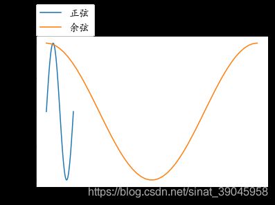
plt.plot(x,np.sin(x),np.cos(x)) # 未给定x时,默认0~50
plt.legend(['正弦','余弦'],loc=(0,1)) # loc 值是相对于图片的比例
- out :
存储
axis = plt.subplot(1,1,1,facecolor='red')  # 坐标系背景红色
axis.plot(x,np.sin(x),np.tan(x))
axis.legend(['sin','tan'],loc=(0.23,0.8),ncol = 2)
axis.grid()
plt.savefig('2.png',dpi=100,facecolor='green')   # 画布背景绿色
- 保存的图像见上
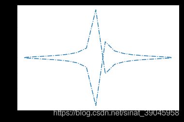
plt.figure(figsize=(6,6))
x = np.linspace(-np.pi,np.pi,50)
axis = plt.subplot(facecolor='red')
axis.plot(np.sin(x),np.cos(x),c='b',marker='>',ls='--')    # marker 的数量与x相当
- out:

Markers
============= ===============================
character description
============= ===============================
'.'point marker
','pixel marker
'o'circle marker
'v'triangle_down marker
'^'triangle_up marker
'<'triangle_left marker
'>'triangle_right marker
'1'tri_down marker
'2'tri_up marker
'3'tri_left marker
'4'tri_right marker
's'square marker
'p'pentagon marker
'*'star marker
'h'hexagon1 marker
'H'hexagon2 marker
'+'plus marker
'x'x marker
'D'diamond marker
'd'thin_diamond marker
'|'vline marker
'_'hline marker
============= ===============================
Line Styles
============= ===============================
character description
============= ===============================
'-'solid line style
'--'dashed line style
'-.'dash-dot line style
':'dotted line style
============= ===============================
plt.figure(figsize=(6,6))
x = np.linspace(-np.pi,np.pi,40)
axis = plt.subplot(facecolor='y')
axis.plot(np.sin(x),np.cos(x),c='b',marker='*',markersize=15,markeredgecolor='r',markerfacecolor='green',markeredgewidth=2,alpha=0.5,ls='-.')
- out:

简写 颜色+marker+线型
plt.plot(x,np.sin(x),'ro-.',np.sin(x),np.tan(x),'b*')
plt.axis([-1.5,1.5,-10,10])
- out:

Line2D对象
x = np.linspace(-np.pi,np.pi,50)
line, = plt.plot(np.cos(x),np.tan(x))
plt.setp(line,ls = '-.')
print(line)   # Line2D(_line0)
- out:
setp
setp(“set property”) andgetpto set and get object propertiesline, = plot([1,2,3])
setp(line, linestyle=’–’)
存储
with fopen(‘output.log’) as f:
setp(line, file=f)
自定义坐标(yticks,xticks)与希腊字母
x = np.linspace(-np.pi,np.pi,100)
line, = plt.plot(np.tan(x),np.sin(x))
plt.setp(line,marker='8')
plt.yticks([-1,0,1],['min',0,'max'],fontsize=20,color='r')
plt.xticks([-20 * np.pi,-10 * np.pi,0,10 * np.pi,20 * np.pi],["-20$\pi$","-10$\pi$",'0',"10$\pi$","20$\pi$"])
plt.grid()
- out:

直方图
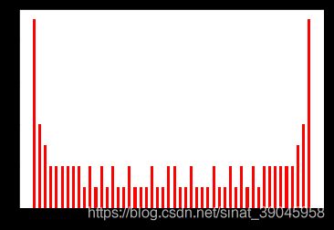
plt.hist(np.sin(x),bins = 50,color='r',rwidth=0.5)
- 只需一个参数,y轴是频率,频率总数为x取样数量
- bin是划分的区间数,rwidth =0.5 即展示宽度减半
- out:
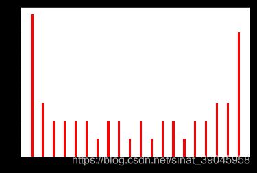
x = np.linspace(-np.pi,np.pi,1000)
plt.hist(np.cos(x),bins = 20,color='r',rwidth=0.2,density=True)     # 归10化
- density 可以统计密度代替频率
- out :
条形图
x = np.linspace(-np.pi,np.pi,50)
plt.bar(np.cos(x),np.tan(x),color=['r','g','b'],width=0.1)
- out:

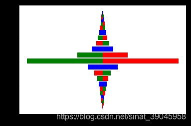
水平条形图
x = np.linspace(-np.pi,np.pi,50)
plt.barh(np.cos(x),np.tan(x),color=['r','g','b'],height=0.1,align='edge')
- out:
注释
x = np.linspace(-5,5,100)
plt.plot(x,np.sin(x))
plt.title('Sin')
plt.text(0,0,s='begen')    # 定点值
plt.figtext(0.3,0.4,s='median')   # figtext 相对值
- out:

箭头注释
x = np.linspace(-10,10,100)
plt.figure(figsize=(12,8))
plt.plot(np.cos(x),np.tan(x))
# plt.grid()
'''    ``'arrowstyle'`` are:

    ============   =============================================
    Name           Attrs
    ============   =============================================
    ``'-'``        None
    ``'->'``       head_length=0.4,head_width=0.2
    ``'-['``       widthB=1.0,lengthB=0.2,angleB=None
    ``'|-|'``      widthA=1.0,widthB=1.0
    ``'-|>'``      head_length=0.4,head_width=0.2
    ``'<-'``       head_length=0.4,head_width=0.2
    ``'<->'``      head_length=0.4,head_width=0.2
    ``'<|-'``      head_length=0.4,head_width=0.2
    ``'<|-|>'``    head_length=0.4,head_width=0.2
    ``'fancy'``    head_length=0.4,head_width=0.4,tail_width=0.4
    ``'simple'``   head_length=0.5,head_width=0.5,tail_width=0.2
    ``'wedge'``    tail_width=0.3,shrink_factor=0.5'''
plt.annotate(s='this is a import point',xy=(-1,0),xytext=(-1,10),arrowprops={'arrowstyle':'->'})
- out:

饼图
plt.figure(figsize=(6,6))
p = [0.3,0.33,0.15,0.05,0.07,0.1]  # 各部分的比例
_ = plt.pie(p,labels=['USA','China','Japan','Gemon','Austira','Osia'],autopct='%0.1f%%',explode=[0,1,0,0,1,0])
- autopct : 展示
- explode : 1表示对应部分分离
- out:

散点图
X = np.random.randn(1000,2)
plt.scatter(X[:,0],X[:,1],marker='d',c=np.random.rand(1000,3),s = np.random.normal(15,scale=5,size=1000))
- out: