matplotlib学习笔记(一)几种绘图方法,颜色,标签,图例等
matplotlib入门笔记(一)
学习《利用Python进行数据分析》第2版,一些笔记将在后续更新
内容部分引用于《利用Python进行数据分析》第2版(Wes McKinney著,徐敬一译)、慕课网上的课程内容笔记以及我个人总结笔记,仅供大家一起学习交流
绘图是数据分析中最重要的任务之一!
matplotlib是一个用于生成出版级质量图表的桌面绘图包,在python环境下进行matlab风格的绘图
在matplotlib的官网里有相关的参考文档,如有需要可自行查询
===============================================
需要开发环境的可以看下我之前写的,我是用pycharm,传送门在此
安装Anaconda,使用pycharm开发环境
当然,最简单的方式是在Jupyter notebook中使用交互式绘图
安装Jupyter Notebook的方法(使用anaconda)
===============================================
本篇中使用 jupyter 来编写
导入matplotlib
import matplotlib.pyplot as plt
========================
绘制折线
import numpy as np
import matplotlib.pyplot as plt
data=np.arange(10)
plt.plot(data)

========================
使用plt.figure生成一个空白绘图窗口
fig=plt.figure()
需要使用add-subplot创建一个或多个子图
注意:jupyter在每个单元格运行后,图表都被重置,因此这里我们要将所有绘图命令放在同一个单元格里,即打完一行直接回车,不加shift
fig=plt.figure()
ax1=fig.add_subplot(2,2,1)
ax2=fig.add_subplot(2,2,2)
ax3=fig.add_subplot(2,2,3)
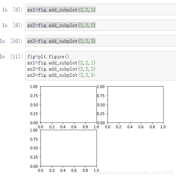 是不是感觉和matlab语法很像呢!!!
========================
试试画图
fig=plt.figure()
ax1=fig.add_subplot(2,2,1)
ax2=fig.add_subplot(2,2,2)
ax3=fig.add_subplot(2,2,3)
plt.plot(np.random.randn(50).cumsum(),'k--')
会在最后一个子图上绘制图像
 这里的 np.random.randn() 函数是生成随机正态分布的数据
cumsum() 返回给定axis上的累计和
========================
画直方图
fig=plt.figure()
ax1=fig.add_subplot(2,2,1)
ax1.hist(np.random.randn(100),bins=20,color='k',alpha=0.3)
bins 柱子个数,alpha 透明度
========================
画散点图
fig=plt.figure()
ax2=fig.add_subplot(2,2,2)
ax2.scatter(np.arange(30),np.arange(30)+3*np.random.randn(30))
========================
子图的间距调整
使用 subplots-adjust 方法
wspace 宽
hspace 高
========================
颜色
用绿色破折号绘制x对y的线
用 ax.plot(x,y,‘g–’) 或者 后面 color=‘g’
========================
线类型、标记
必须写在颜色后面
plt.plot(np.random.randn(30).cumsum(), color='k', linestyle='dashed', marker='o')
========================
生成图例
plt.plot(np.random.randn(30).cumsum(), 'ko-', label='Mark')
plt.plot(np.random.randn(30).cumsum(), 'k-', drawstyle='steps-post', label='steps-post')
plt.legend(loc='best')
 由于向plot传递了label,我们可以使用plt.legend为每条线生成一个用以区分的图例
========================
对于大多数图表修饰工作,有2种主要方式:
- 使用matplotlib.pyplot 接口
- 面向对象的原生 matplotlib API
pyplot 接口设计为交互式使用,包含像xlim、xticks、xticklabels等方法
用以控制绘图范围,刻度位置,刻度标签
plt.xlim() 返回当前的x轴范围
plt.xlim([0,10]) 将x轴的范围设置为0到10
========================
自定义轴
fig=plt.figure()
ax=fig.add_subplot(1,1,1)
ax.plot(np.random.randn(1000).cumsum())
绘制随机漫步

set_xticks 在数据范围内设定刻度的位置
set_xticklabels 为标签赋值
fig=plt.figure()
ax=fig.add_subplot(1,1,1)
ax.plot(np.random.randn(1000).cumsum())
ticks=ax.set_xticks([0,250,500,750,1000])
fig=plt.figure()
ax=fig.add_subplot(1,1,1)
ax.plot(np.random.randn(1000).cumsum())
labels=ax.set_xticklabels(['','one','two','three','four','five','six'],rotation=30,fontsize='small')
ax.set_title('My plot')
ax.set_xlabel('Stages')
 ========================
添加注释
text 、arrow、 annote 方法
========================
图片保存到文件
plt.savefig 方法
plt.savefig('figpath.png',dpi=400,bbox_inches'tight')
将图片写到所有文件型对象中
from io import BytesIO
buffer=BytesIO()
plt.savefig(buffer)
plot_data=buffer.getvalue()
先写这么多,我要好好学习好好学习,有空更~
如有错误,请多指教,笔记会持续更新的~
谢谢大家!