CSS3实现各种格子纹理效果
原文出处:https://blog.csdn.net/life66881/article/details/46400323
先上图: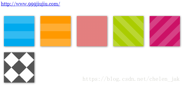
body {
  font-family: Georgia, serif;
}

.stripes {
  height: 250px;
  width: 375px;
  float: left;
  margin: 10px;
  -webkit-background-size: 50px 50px;
  -moz-background-size: 50px 50px;
  background-size: 50px 50px;
  -moz-box-shadow: 1px 1px 8px gray;
  -webkit-box-shadow: 1px 1px 8px gray;
  box-shadow: 1px 1px 8px gray;
}

.angled {
  background-color: #ac0;
  background-image: -webkit-gradient(linear, 0 100%, 100% 0, color-stop(.25, rgba(255, 255, 255, .2)), color-stop(.25, transparent), color-stop(.5, transparent), color-stop(.5, rgba(255, 255, 255, .2)), color-stop(.75, rgba(255, 255, 255, .2)), color-stop(.75, transparent), to(transparent));
  background-image: -moz-linear-gradient(45deg, rgba(255, 255, 255, .2) 25%, transparent 25%, transparent 50%, rgba(255, 255, 255, .2) 50%, rgba(255, 255, 255, .2) 75%, transparent 75%, transparent);
  background-image: -o-linear-gradient(45deg, rgba(255, 255, 255, .2) 25%, transparent 25%, transparent 50%, rgba(255, 255, 255, .2) 50%, rgba(255, 255, 255, .2) 75%, transparent 75%, transparent);
  background-image: linear-gradient(45deg, rgba(255, 255, 255, .2) 25%, transparent 25%, transparent 50%, rgba(255, 255, 255, .2) 50%, rgba(255, 255, 255, .2) 75%, transparent 75%, transparent);
}

.angled-135 {
  background-color: #c16;
  background-image: -webkit-gradient(linear, 0 0, 100% 100%, color-stop(.25, rgba(255, 255, 255, .2)), color-stop(.25, transparent), color-stop(.5, transparent), color-stop(.5, rgba(255, 255, 255, .2)), color-stop(.75, rgba(255, 255, 255, .2)), color-stop(.75, transparent), to(transparent));
  background-image: -moz-linear-gradient(-45deg, rgba(255, 255, 255, .2) 25%, transparent 25%, transparent 50%, rgba(255, 255, 255, .2) 50%, rgba(255, 255, 255, .2) 75%, transparent 75%, transparent);
  background-image: -o-linear-gradient(-45deg, rgba(255, 255, 255, .2) 25%, transparent 25%, transparent 50%, rgba(255, 255, 255, .2) 50%, rgba(255, 255, 255, .2) 75%, transparent 75%, transparent);
  background-image: linear-gradient(-45deg, rgba(255, 255, 255, .2) 25%, transparent 25%, transparent 50%, rgba(255, 255, 255, .2) 50%, rgba(255, 255, 255, .2) 75%, transparent 75%, transparent);
}

.horizontal {
  background-color: #0ae;
  background-image: -webkit-gradient(linear, 0 0, 0 100%, color-stop(.5, rgba(255, 255, 255, .2)), color-stop(.5, transparent), to(transparent));
  background-image: -moz-linear-gradient(rgba(255, 255, 255, .2) 50%, transparent 50%, transparent);
  background-image: -o-linear-gradient(rgba(255, 255, 255, .2) 50%, transparent 50%, transparent);
  background-image: linear-gradient(rgba(255, 255, 255, .2) 50%, transparent 50%, transparent);
}

.vertical {
  background-color: #f90;
  background-image: -webkit-gradient(linear, 0 0, 100% 0, color-stop(.5, rgba(255, 255, 255, .2)), color-stop(.5, transparent), to(transparent));
  background-image: -moz-linear-gradient(0deg, rgba(255, 255, 255, .2) 50%, transparent 50%, transparent);
  background-image: -o-linear-gradient(0deg, rgba(255, 255, 255, .2) 50%, transparent 50%, transparent);
  background-image: linear-gradient(0deg, rgba(255, 255, 255, .2) 50%, transparent 50%, transparent);
}

.checkered {
  background-image: -webkit-gradient(linear, 0 0, 100% 100%, color-stop(.25, #555), color-stop(.25, transparent), to(transparent)), -webkit-gradient(linear, 0 100%, 100% 0, color-stop(.25, #555), color-stop(.25, transparent), to(transparent)), -webkit-gradient(linear, 0 0, 100% 100%, color-stop(.75, transparent), color-stop(.75, #555)), -webkit-gradient(linear, 0 100%, 100% 0, color-stop(.75, transparent), color-stop(.75, #555));
  background-image: -moz-linear-gradient(45deg, #555 25%, transparent 25%, transparent), -moz-linear-gradient(-45deg, #555 25%, transparent 25%, transparent), -moz-linear-gradient(45deg, transparent 75%, #555 75%), -moz-linear-gradient(-45deg, transparent 75%, #555 75%);
  background-image: -o-linear-gradient(45deg, #555 25%, transparent 25%, transparent), -o-linear-gradient(-45deg, #555 25%, transparent 25%, transparent), -o-linear-gradient(45deg, transparent 75%, #555 75%), -o-linear-gradient(-45deg, transparent 75%, #555 75%);
  background-image: linear-gradient(45deg, #555 25%, transparent 25%, transparent), linear-gradient(-45deg, #555 25%, transparent 25%, transparent), linear-gradient(45deg, transparent 75%, #555 75%), linear-gradient(-45deg, transparent 75%, #555 75%);
}

.picnic {
  background-color: white;
  background-image: -webkit-gradient(linear, 0 0, 0 100%, color-stop(.5, transparent), color-stop(.5, rgba(200, 0, 0, .5)), to(rgba(200, 0, 0, .5))), -webkit-gradient(linear, 0 0, 100% 0, color-stop(.5, transparent), color-stop(.5, rgba(200, 0, 0, .5)), to(rgba(200, 0, 0, .5)));
  background-image: -moz-linear-gradient(transparent 50%, rgba(200, 0, 0, .5) 50%, rgba(200, 0, 0, .5)), -moz-linear-gradient(0deg, transparent 50%, rgba(200, 0, 0, .5) 50%, rgba(200, 0, 0, .5));
  background-image: -o-linear-gradient(transparent 50%, rgba(200, 0, 0, .5) 50%, rgba(200, 0, 0, .5)), -o-linear-gradient(0deg, transparent 50%, rgba(200, 0, 0, .5) 50%, rgba(200, 0, 0, .5));
  background-image: linear-gradient(transparent 50%, rgba(200, 0, 0, .5) 50%, rgba(200, 0, 0, .5)), linear-gradient(0deg, transparent 50%, rgba(200, 0, 0, .5) 50%, rgba(200, 0, 0, .5));
}

#footer {
  text-align: center;
  clear: both;
  padding-top: .5em;
  border-top: 1px solid #ccc;
  font-variant: small-caps;
}