详解用 matplotlib 绘制动态条形图
详解用 matplotlib 绘制动态条形图
端午安康!
近日看到联合国网站提供的世界人口数据集,其中一个子数据集包含了各国 1950-2015年的人口数据。
假日值班,有自由的时间,就基于这个数据集,用 matplotlib 实现了一个世界人口 66 年变化的动态条形图。
最后的 gif 图:
下面把实现的主要步骤记录下来。原始数据、详细的源代码请到 QQ群:python草堂,457079928 下载,有问题也可以到那里讨论。
数据集介绍
‘population_estimates.csv’ ,逗号分隔符,utf-8编码,csv格式。
18018 rows × 4 columns
有4 个字段:
- Region,国家和地区的英文名称;
- Country Code,国家和地区的代码;
- Year,4位数的年份;
- Population,人口数,单位:千人。
不仅有各个国家的人口数据,还包括大的地区的人口统计数据,如世界总人口,亚洲、东亚、北美洲等。

导入用到的库
%matplotlib inline

import pandas as pd
import numpy as np
import pprint
import matplotlib.pyplot as plt
import matplotlib.ticker as ticker
import matplotlib.animation as animation
from IPython.display import HTML
import matplotlib.colors as colors
数据清洗
我想制作2015年人口最多的10个国家,66年人口变化的动态条形图。所以,
我需要对数据做如下处理:
- 提取其中226个国家的历年人口数据;
- 提取2015年人口最多的10个国家的名称;
- 提取2015年人口最多的10个国家的历年人口数据;
- 有些国家的名称有点长,弄短一点;
- 在两个用到的数据集中,美国的名称不一致,统一下。
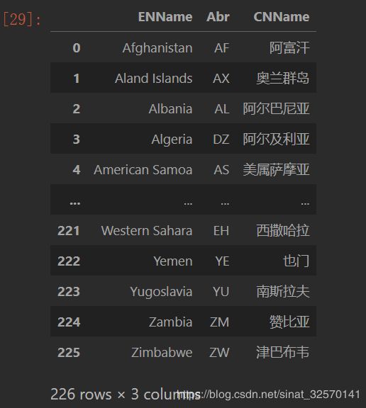
为了提取其中226个国家的历年人口数据,我找到一个226个国家的中、英文名称对照表,Countries_Name.csv,格式同上
读入数据文件
读入世界人口数据:
pe = pd.read_csv('population_estimates.csv',
                 #usecols=['Region','Year','Population'],
                 dtype={'Region':str,'Year':int,'Population':float}
                )
pe, population_estimates 的首字母缩写。
读入国家名称中英文数据:
ct = pd.read_csv('Countries_Name.csv')

ct  # countries
由于在两个数据集中美国的英文名称不一致,在这个数据集中是:‘United States of America’,而在国家名称数据表中是:'United States’。需要先将两个数据集中统一为:'United States’。
合并两个数据集
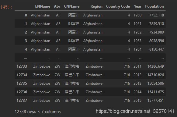
由于两个数据集中的国家不完全一致,最后得到193个主权国家的历年人口数据。
由于俄罗斯的英文全称是 ‘Russian Federation’,长了点,我把它替换为’Russian’,以便在动态条形图中显示。
提取2015年人口 top10 国家的名称
提取2015年人口 top10 国家的名称,并将它们存为列表备用。
['China',
 'India',
 'United States',
 'Indonesia',
 'Brazil',
 'Pakistan',
 'Nigeria',
 'Bangladesh',
 'Russian',
 'Japan']
生成 Top10 国家的历年人口数据
pe_ct_top10 = pe_ct[pe_ct['Region'].isin(top10_region)].sort_values('Population',ascending=True)

pe_ct_top10

10 个国家,66年的人口数据。
绘制10个国家2015年的静态条形图
fig, ax = plt.subplots(figsize = (15, 10))

ax.clear()

df_2015 = pe_ct_top10[pe_ct_top10.Year == 2015].sort_values('Population',ascending=False)

x = df_2015['Region']
y = df_2015['Population']
cn = df_2015['CNName'].values.tolist()
cvalues = list(colors.TABLEAU_COLORS.values())

eb = ax.barh(x, y, color= cvalues)

for b in eb:
    if b.get_width() < y.mean():
        alpha = b.get_width()/y.mean()
    else:
        alpha = 1.0
    b.set_alpha(alpha)

dx = y.max()/200

for i, (p, r, c) in enumerate(zip(y, x, cn)):

    ax.text(p-dx, i, r, size=12, weight=400, ha='right', va='bottom')
    ax.text(p-dx, i-.25, c,
            fontproperties='SimHei',
            size=12, ha='right', va='baseline')
    ax.text(p+dx, i, f'{p/10:,.0f}', size=12, ha='left', va='center',family='Arial')

ax.text(1, 0.4, 2015, transform=ax.transAxes, color='#777777', size=46, ha='right', weight=900)
ax.text(0, 1.07, 'Population (thousands)', transform=ax.transAxes, size=12, color='#777777')

ax.xaxis.set_major_formatter(ticker.StrMethodFormatter('{x:,.0f}'))
ax.xaxis.set_ticks_position('top')

ax.tick_params(axis='x', colors='#777777', labelsize=12)
ax.set_yticks([])
ax.margins(0, 0.01)
ax.grid(which='major', axis='x', linestyle='--')
ax.set_axisbelow(True)

fig.suptitle('2015年世界人口最多的国家',fontsize=24,
             weight=600, family='SimHei')

plt.box(False)

封装为函数
将上面绘制条形图的代码封装为函数:
def dynamic_bar(year):

    df_year = pe_ct_top10[pe_ct_top10.Year == year].sort_values('Population',ascending=False)

    ax.clear()
    #ax.set_xlim([1000, pe_ct_top10['Population'].max()])

    x = df_year['Region']
    y = df_year['Population']
    cn = df_year['CNName'].values.tolist()
    cvalues = list(colors.TABLEAU_COLORS.values())

    eb = ax.barh(x, y)

    for b in eb:
        if b.get_width() < y.median():
            facecolor = '#ff7f0e'
            alpha = b.get_width()/y.median()*0.5
        else:
            facecolor = '#1f77b4'
            alpha = b.get_width()/y.max()

        b.set_alpha(alpha)
        b.set_color(facecolor)

    dx = y.max()/200

    for i, (p, r, c) in enumerate(zip(y, x, cn)):
        ax.text(p-dx, i, r, size=12, weight=400, ha='right', va='bottom')
        ax.text(p-dx, i-.25, c,
                family='SimHei',
                size=12, ha='right', va='baseline')
        ax.text(p+dx, i, f'{p/10:,.0f}', size=12,
                ha='left', va='center',family='Arial')

    ax.text(1, 0.4, year, transform=ax.transAxes, color='#777777',
            size=46, ha='right', weight=900)
    ax.text(0, 1.07, 'Population (thousands)',
            transform=ax.transAxes, size=12, color='#777777')

    ax.xaxis.set_major_formatter(ticker.StrMethodFormatter('{x:,.0f}'))
    ax.xaxis.set_ticks_position('top')

    ax.tick_params(axis='x', colors='#777777', labelsize=12)
    ax.set_yticks([])
    ax.margins(0, 0.01)

    ax.grid(which='major', axis='x', linestyle='--')
    ax.set_axisbelow(True)

    fig.suptitle('人口 TOP10 国家1950-2015年的人口变化', fontsize=24, weight=500, family='SimHei')

    plt.box(False)
生成动图
fig, ax = plt.subplots(figsize = (15, 8))

popu_growth = animation.FuncAnimation(fig, dynamic_bar,
                                   frames=range(pe_ct_top10['Year'].min(), pe_ct_top10['Year'].max()))

HTML(popu_growth.to_jshtml())
在我的 jupyterlab 中就会输出如下带控制器的动图:

将动图保存为gif
popu_growth.save('popu_growth.gif', writer='pillow')
就会在代码主文件所在目录下生成一个 gif 图:
说明:
- 我以中位数为分割,大于中位数的颜色相同,用alpha变化表达与最大值的比较;
- 小于中位数的颜色相同,用alpha变化表达与中位数的比较;
- 请注意观察中位数国家的变化、印度人口与中国人口的变化比较;
- 俄罗斯人口在不同时期的较大变化;
- …
很幸运,该 gif 文件接近,但没有超过 5 M,能够传上来。
你可以根据需要观察不同国家的人口变化。
原始数据、完整的 ipynb 文件请移步 python草堂,457079928 下载。