微信小程序学习笔记三(常用的组件)
视图容器
view
| 属性名 | 类型 | 默认值 | 说明 |
|---|---|---|---|
| hover-class | String | none | 指定按下去的样式类,为none时,没有点击态效果 |
| hover-stop-propagation | Boolean | false | 指定是否组织本节点的祖先节点出现点击态 |
| hover-start-time | Number | 50 | 按住多久后出现点击态,单位毫秒 |
| hover-stay-time | Number | 400 | 手指松开后点击态保留时间,单位毫秒 |
可滚动视图区域
scroll-view
| 属性名 | 类型 | 默认值 | 说明 |
|---|---|---|---|
| scroll-x | Boolean | false | 允许横向滚动 |
| scroll-y | Boolean | false | 允许纵向滚动 |
| upper-threshold | Number | 50 | 距顶部/左边多远时,触发scrolltoupper事件 |
| lower-threshold | Number | 50 | 距底部/右边多远时,触发scrolltolower事件 |
| scroll-top | Number | 设置竖向滚动条位置 | |
| scroll-left | Number | 设置横向滚动条位置 | |
| scroll-into-view | String | 为某个子元素的id,设置哪个方向可滚动,则在哪个方向滚动到该元素 | |
| scroll-with-animation | Boolean | false | 设置滚动条位置时,使用动画过渡 |
| enable-back-to-top | Boolean | false | IOS点击顶部状态栏,安卓双击标题栏时,滚动条返回顶部,只支持竖向 |
| bindscrolltoupper | EventHandle | 滚动到顶部/左边,会触动scrolltoupper事件 | |
| bindscrolltolower | EventHandle | 滚动到底部/右边,会触动scrolltolower事件 | |
| bindscroll | EventHandle | 滚动时触发该事件 |
滑动视图容器
如图所示:
(可以用来制作轮播图)

swiper
| 属性名 | 类型 | 默认值 | 说明 |
|---|---|---|---|
| indicator-dots | Boolean | false | 是否显示小圆点 |
| indicator-color | Color | 指示小圆点的颜色 | |
| indicator-active-color | Color | 当前选中的小圆点的颜色 | |
| autoplay | Boolean | false | 是否自动切换 |
| current | Number | 0 | 当前所在滑块的index |
| current-item-id | String | “” | 当前所在滑块的item-id,不能被current同时被指定 |
| interval | Number | 5000 | 自动切换时间间隔 |
| duration | Number | 500 | 滑动动画时长 |
| circular | Boolean | false | 是否采用衔接滑动 |
| vertical | Boolean | false | 滑动方向是否纵向 |
| previous-margin | Number | “0px” | 前边距,露出前一项的一部分 |
| next-margin | Number | “0px” | 后边距,露出后一项的一部分 |
| display-multiple-items | Number | 1 | 同时显示的滑块数量 |
| skip-hidden-item-layout | Boolean | false | 会否跳未显示的滑块布局 |
| bindchange | EventHandle | current改变时,会触发change事件 | |
| bindanimationfinish | EventHandle | 动画结束时触发 |
<swiper
    bindchange="changeSwiper"
    previous-margin='10rpx'
    next-margin='10rpx'
    interval='3000' circular='true' autoplay='true'
    indicator-dots='true' indicator-color='red'
    indicator-active-color='yellow'>
    <swiper-item item-id="item" wx:for="{{picSource}}" wx:for-item="item" wx:key="unique">
        <image src="{{item.link}}">image>
    swiper-item>
swiper>
Page({
data: {
picSource: [
{
link: 'http://img02.tooopen.com/images/20150928/tooopen_sy_143912755726.jpg'
},
{
link: 'http://img06.tooopen.com/images/20160818/tooopen_sy_175866434296.jpg'
},
{
link: 'http://img06.tooopen.com/images/20160818/tooopen_sy_175833047715.jpg'
}
]
},
changeSwiper : function() {
console.log("滑动了!!")
}
})movable-area
是 movable-view的可移动区域
必须设置宽高,,不设置默认为10px
属性名: scale-area 当里面的movable-view设置为支持双指缩放时,设置此值可将缩放手势生效区域修改为整个movable-area
movable-view 可移动的视图容器,在页面中可以拖拽滑动
<movable-area
        scale-area="true"
        style="background-color: rgba(255,0,0,0.1);width: 750rpx;height: 500rpx;">
        <movable-view
                  bindchange="changing"
                  out-of-bounds="true"
                  inertia="true" direction="all"
                  scale="true"
                  style="background-color: green;width: 50rpx;height: 50rpx;" >
    </movable-view>
</movable-area>
changing : function(e){
  /*
    其中有一个detail属性,可以显示当前滑块在滑块区域内的坐标值
  */
  console.log(e);
  console.log("我正在运动!!!");
 }
cover-view
覆盖在原生组件上的文本视图。
可覆盖的原生组件包括:map、video、canvas、camera。
只支持嵌套cover-view、cover-image。
<map>
    <cover-view>这是一张地图
        <cover-image src="http://img02.tooopen.com/images/20150928/tooopen_sy_143912755726.jpg">cover-image>
    cover-view>
map>


<video id="myVideo"  src="http://wxsnsdy.tc.qq.com/105/20210/snsdyvideodownload?filekey=30280201010421301f0201690402534804102ca905ce620b1241b726bc41dcff44e00204012882540400&bizid=1023&hy=SH&fileparam=302c020101042530230204136ffd93020457e3c4ff02024ef202031e8d7f02030f42400204045a320a0201000400" controls="{{false}}" event-model="bubble">
   <cover-view class="controls">
        <cover-view class="play" bindtap="play">
            <cover-image class="img" src="/path/to/icon_play" />
        cover-view>
    <cover-view class="pause" bindtap="pause">
        <cover-image class="img" src="/path/to/icon_pause" />
    cover-view>
    <cover-view class="time">00:00cover-view>
    cover-view>
video>
play() {
      this.videoCtx.play()
},
pause() {
  this.videoCtx.pause()
 }
icon 图标
| 属性名 | 类型 | 说明 |
|---|---|---|
| type | String | icon的类型: success、success_no_circle、 info、warn、waiting、 cancel、download、search、clear |
| size | Number | icon的大小,单位为px,默认为23 |
| color | Color | icon的颜色 |
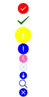
    <view><icon type="success" size='30' color="red" />view>
    <view><icon type="success_no_circle" size='35' color="green" />view>
    <view><icon type="info" size='45' color='yellow' />view>
    <view><icon type="warn" size='30' color="blue" />view>
    <view><icon type="waiting" color="hotpink" />view>
    <view><icon type="cancel" color="skyblue" />view>
    <view><icon type="download" color="blue" />view>
    <view><icon type="search" color="blue" />view>
    <view><icon type="clear" color="blue" />view>
text 文本
| 属性名 | 类型 | 说明 |
|---|---|---|
| selectable | Boolean | 文本是否可选 |
| space | String | 显示连续空格。 ensp:中文字符空格的一半大小、 emsp:中文字符空格大小、 nbsp : 根据字体设置的空格大小 |
| decode | Boolean | 是否解码 |
注意:
decode可以解析 < > & ' 。
progress 进度条
| 属性 | 作用 |
|---|---|
| percent | 百分比0-100 |
| show-info | 在进度条右侧显示百分比 |
| stroke-width | 设置进度条的宽度 |
| color | 设置进度条的颜色 (不建议使用) |
| active-color | 已选择的进度条的颜色 |
| backgroundColor | 未选择的进度条的颜色 |
| active | 进度条从左往右的动画 |
| active-mode | backwards 动画从头播 |
| forwards | 动画从上次结束点接着播 |
<progress style="margin-top: 20rpx;">progress>
<progress style="margin-top: 20rpx;" percent='20' show-info='true'>progress>
<progress style="margin-top: 20rpx;" percent='40' color="pink">progress>
<progress style="margin-top: 20rpx;" percent='60' active="true">progress>
<progress style="margin-top: 20rpx;" percent='80' stroke-width='25'>progress>
button 按钮
| 属性 | 作用 |
|---|---|
| size | mini default |
| type | primary warn default |
| loading | 是否带loading图标 |
| form-type | submit提交表单 reset重置表单 |
| open-type | contact 打开客服会话、share、getUserInfo |
| hover-class | 表示聚焦时的类名 |
| hover-start-time | 表示聚焦开始样式的时间间隔 |
| hover-stay-time | 表示聚焦样式的停留时间 |

-->
checkbox-group
利用bindchange事件,当其中的checkbox状态发生变化时,就会触动事件,且,其中该事件的event中有个detail属性,中的value属性是一个数组。选中了的checkbox的数组
    <checkbox-group bindchange="changecheck">
        <checkbox value='aaa'>checkbox>aaa
        <checkbox checked='true' value='bbb'>checkbox>bbb
        <checkbox value='ccc'>checkbox>ccc
        <checkbox value='ddd'>checkbox>ddd
        <checkbox value='eee'>checkbox>eee
        <checkbox value='fff'>checkbox>fff
    checkbox-group>
form表单
使用form表单,有bindsubmit和bindreset两个事件。
- 当form表单中formType为reset的按钮被点击时,会触动form表单的reset事件
- 当form表单中formType为submit的按钮被点击时,会触动form表单的submit事件
会将表单组件的value值进行提交,且表单组件必须要有name属性的才能被提交,否则就不会有 - bindsubmit事件中的event中有个detail属性中有携带的数据的详细信息
<form bindsubmit='formSubmit' bindreset='formReset'>
      <view>用户名:
          <input name="username" placeholder='请输入用户名' />
      view>
      <switch name="gender" />男
      <button formType="reset">resetbutton>
      <button formType="submit">submitbutton>
form>