1. Leave room for longer translations
If your design includes words, make sure you have enough space to fit longer translations. If you don’t, you might end up with overlapping text or text that gets cut off.
One way I estimate translation lengths is by using Google Spreadsheets. Using theGoogleTranslatefunction, I can get machine translations in a bunch of languages at once. Within seconds, I can get a rough idea of how long the translations might be in each language.
support.google.com/docs/answer/3093331
IBM’s globalization sitehas a useful chart that shows how much extra space is needed when translating from English:
www-01.ibm.com/software/globalization/guidelines/a3.html
2. Avoid putting text in narrow columns
When you put text in narrow columns, there’s a good chance some translations will wrap into more lines. A safer choice is to use wide rows instead of narrow columns. That’ll give your text more room to grow without breaking your layout.
3. Don’t embed text in images
Use lines instead of text:Sometimes you don’t have to use real words to get your message across. It’s amazing what a few fuzzy lines can do.
Overlay text with CSS:The text in the green circle below isn’t actually part of the image. The text was just added on top using CSS.
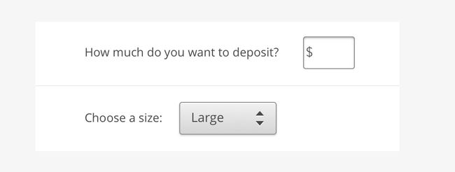
4. Don’t create sentences with UI elements
There are a few reasons why this is a pain for internationalization:
Different word order:Languages have different ways of ordering words. If you translate “Buy 3 shirts” into Japanese, the word “Buy” will move to the end of the sentence. If your design depends on words to be in a certain order, it won’t work in every language.
Pluralization:In English, we have one singular form and one plural form for each noun: “1 picture” and “__ pictures.” But in Russian, there are 3 possible forms. So if a user needs to enter a number in the middle of a sentence, that sentence might end up with a grammatical error depending on the number they enter.
Gender:Some languages have gender-specific forms for nouns and adjectives. In French, the word “large” could be translated as “grand,” “grande,” “grands,” or “grandes” depending on the thing it describes. If you place a dropdown in a sentence, that sentence might end up with a grammatical error depending on the words around it.
So what do you do instead? A better alternative is to keep the UI element out of the sentence:
5. Watch out for metaphors
Product design is all about metaphors. Every icon, every button, and every interaction is a metaphor for something in the physical world.The Dropbox icon is a metaphor for a storage box. Click-and-drag is a metaphor for picking things up with your hand.
If possible, it’s a good idea to do some research on metaphors before including them in your design. At Dropbox, we’ll often ask our Internationalization team to review icons or illustrations if we’re worried about how they’ll be perceived internationally.
6. Use descriptive feature names
To avoid translation problems, it’s safer to use descriptive terms for feature names. Descriptive terms might seem a bit boring, but they’re better for translation and for usability, too.
7. Provide alternates for translation
For cases like this, we’ll sometimes write two versions: one version for English and an alternate version for translation.
You can do this by adding comments for translators for anything that’s tricky to translate. We’re currently writing labels for stickers used in Dropbox.We decided to use “OMG cat” as the label for the sticker below.
When translators work on this, they’ll see a comment saying this can be also translated as “Surprised cat.” That way, translators have the freedom to use a playful translation, but they can fall back on a more literal translation if needed.