2018-5-2刚学的flex总结(实战讲解)
flex布局虽然强大,毕竟对于一些兼容性要求高的系统、网站不建议使用。(h5移动端布局应用很爽),先简单复习一下......
1. 设置在flex容器上面的属性:
设置主轴的方向:row(水平向右),row-reverse(水平左),column(垂直向下),column-reverse(垂直向上)。
flex-direction: row(默认值) | row-reverse | column | column-reverseflex项目一般都沿着一条轴线排列,这个属性设置当一条轴线排不下的时候,项目怎么换行: nowrap(不换行) ,wrap (往下换行),wrap-reverse(往上换行)。
flex-wrap: nowrap(默认值) | wrap | wrap-reverse设置flex项目在主轴上的对齐方式: flex-start(左对齐) ,flex-end(右对齐),center (居中对齐), space-between(两端对齐),space-around(flex项目两侧间隔相等)
justify-content: flex-start(默认值) | flex-end | center | space-between | space-around设置flex项目在纵轴上的对齐方式: flex-start(上对齐) ,flex-end(下对齐),center (居中对齐),baseline(以flex项目的第一行文字底部对齐),stretch(如果flex项目高度为auto | 没有设置高度,那么占满flex容器的高度)
align-items: flex-start(默认值) | flex-end | centerflex-direction与flex-wrap的简写,按序赋值就好。
flex-flow: row nowrap(默认值) | ...这个属性没怎么用过,设置多根轴线在纵轴上的对齐方式。
align-content: stretch(默认值) | flex-start | flex-end | center | space-between | space-around2. 设置在flex项目上的属性:
当轴线上存在多余空间时,设置flex项目的扩大比例,默认值为0,即不扩大,扩大值还可取任意正数。
flex-grow: 0(默认值) | 任意正数当轴线上空间不足时,设置flex项目的缩小比例,默认值为1,即自动缩小,缩小值还可取0和任意正数。
flex-shrink: 1(默认值) | 0 | 任意正数重新分配轴线上的空间之前,该flex项目所占据的空间,默认值为auto,即它本身大小。
flex-basic: auto(默认值) | 任意表示大小的值设置单个flex项目与其它项目不同的对齐方式,会覆盖flex容器的align-items的值,默认值为auto,即flex容器的align-items属性的值是什么,这个flex项目在纵轴上的对齐方式就是什么,其它值的解释与align-items的值相同。
align-self: auto(默认值) | flex-start | flex-end | center | baseline | stretch设置项目的排序循序,数值小的在前,大的在后。
order: 0(默认值) | 整数值flex-grow、flex-shringk与flex-basic的简写,按序赋值就好,后面两个属性值为可选。
flex:0 1 auto(默认值) | ...
就以上面这个首页为例子讲解:


.top-menu{ display: flex; width: 6.9rem; margin:0 auto; justify-content: space-between; height: 0.88rem; align-items: center;}
.top-menuson:nth-of-type(2) input{ width: 5.7rem; height: 0.6rem; background: rgba(255,255,255,0.5); border-radius: 16rem; color: #fff; font-size: 0.28rem; text-indent: 0.2rem;}
input:-ms-input-placeholder{color: #fff;opacity:1;text-align: center;}
input::-webkit-input-placeholder{color: #fff;opacity:1;text-align: center; background: url(../images/search.png) 1.6rem center no-repeat;}
.top-menuson:nth-of-type(1) img{ width: 0.38rem; vertical-align: middle;}
.top-menuson:nth-of-type(3) img{ width: 0.38rem; vertical-align: middle;}
.top-menuson:nth-of-type(2){ position: relative;}
flex项目容器为top-menu,flex,子项目为top-menuson。
给父级设置:display: flex; justify-content 可以设置主轴对齐方式,常见值有space-between/center/flex-end/flex-start/space-around.align-items可以设置侧轴的对其方式,常见值有baseline/flex-start/flex-end/center/stretch,nth-of-type(2)选择器用于选择子项目很方便。结合box-sizing:border-box盒子属性也很好用。(后面代码经常用到)注意这里选择input的placeholder属性进行重新定义,可以加背景图片。input::-webkit-input-placeholder{color: #fff;opacity:1;text-align: center; background: url(../images/search.png) 1.6rem center no-repeat;}img一般都会加上这个属性vertical-align: middle;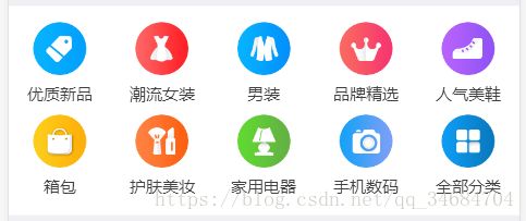
这块最典型flex布局了。很方便。
 优质新品
优质新品
 潮流女装
潮流女装
 男装
男装
 品牌精选
品牌精选
 人气美鞋
人气美鞋
 箱包
箱包
 护肤美妆
护肤美妆
 家用电器
家用电器
 手机数码
手机数码
 全部分类
全部分类
.center-menu{ align-items: center;  align-content: center; flex-wrap: wrap; width: 100%; box-sizing: border-box; height: 3.24rem; background: #fff; margin-top: 0.15rem;display: flex;}
.center-menuson{ flex-basis: 20%; text-align: center;}
.center-menuson img{ width: 0.82rem; vertical-align: middle;}
.center-menuson span{ display: block; font-size: 0.24rem; color: #3f3f3f; height: 0.6rem; line-height: 0.6rem;}
.center-menuson:nth-of-type(1),.center-menuson:nth-of-type(2),.center-menuson:nth-of-type(3),.center-menuson:nth-of-type(4),.center-menuson:nth-of-type(5){ margin-top: 0.1rem;}
flex-wrap: wrap;此属性可以让子项目换行,默认值是no-wrap不换行。align-content: center;当有多行子项目是可以使用。设置每行项目之间空间排版方式。常见值有 space-between/center/flex-end/flex-start/space-around/stretchflex-basis: 20%;此属性在子项目上使用,可以设置子项目宽度(可以用固定px,也可以用百分数),另外还有flex-grow,flex-shrink属性.
 HLA/海澜之家半高领修身长袖T恤......
¥98.00
 商场同款-诗篇2017夏季新品简约宽......
¥146.00
 BE连帽t恤男长袖韩版潮学生 .
¥249.00
商场同款-诗篇2017夏季新品简约宽......¥146.00
HLA/海澜之家半高领修身长袖T恤......¥98.00
BE连帽t恤男长袖韩版潮学生 .¥249.00
.closezs{width: 100%;justify-content: space-around;box-sizing: border-box;display: flex;align-items: center;margin: 0.1rem 0 1rem 0;flex-wrap: wrap;}
.closezs-son{text-align: center;flex-basis: 30%;background: #fff;margin-bottom: 0.3rem;}
.closezs-son img{ width: 2.2rem;}
.closezs-son span{ display: block; font-size: 0.22rem; color: #7f8699; box-sizing: border-box; padding: 0 0.05rem;}
.closezs-son p{ color: #ff4c4c; font-size: 0.24rem; text-align: center; line-height: 0.6rem;}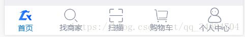
 首页
首页
 找商家
找商家
 购物车
购物车
 扫描
扫描
 个人中心
个人中心