python信用评分卡(附代码,博主录制)
https://study.163.com/course/introduction.htm?courseId=1005214003&utm_campaign=commission&utm_source=cp-400000000398149&utm_medium=share
![]()
banking case1
http://ucanalytics.com/blogs/data-visualization-case-study-banking/
A Scientist & An Artist
几个星期前,在文艺复兴的发源地佛罗伦萨四处闲逛时,我无法逃脱达芬奇的思想:有史以来最伟大的博学者。 莱昂纳多的杰出作品包括画家,发明家,物理学家,天文学家,工程师,生物学家,解剖学家,地质学家和建筑师等称号 - 不开玩笑! 一只聪明的猫将不得不过她九年的生命来获得莱昂纳多一生中掌握的九个冠军头衔。 今天,在讨论数据可视化的各个方面时,我们应该向莱昂纳多叔叔致敬,因为我们跨越了艺术和科学的领域。
A few weeks ago while wandering around in Florence, the birthplace of the Renaissance, I could not escape the thought of Leonardo da Vinci : the greatest polymath of all times. Leonardo’s illustrious resume contains titles such as painter, inventor, physicist, astronomer, engineer, biologist, anatomist, geologist, and architect – no kidding! A smart cat would have to live all her nine lives to acquire the nine titles Leonardo had mastered in one lifetime. Today, while discussing facets of data visualization, we should pay homage to Uncle Leonardo as we cross the realm of both art and science.
Art and Science of Data Visualization
Data Visualization – by Roopam
如前所述,数据可视化既是艺术又是科学。 我个人更喜欢长时间查看数据,在进入严格的数学建模之前以各种方式绘制数据。 你可能已经注意到我对艺术的偏爱,同时浏览了我在博客上所有帖子中展示的艺术作品。 这句话 - 一张图片胜过千言万语 - 在数据分析过程中也是如此。 如果您没有在数据探索阶段花费足够的时间,那么分析中的模型可能会出现严重错误 - 这些都是关于数据可视化的。 让我提出一个案例研究示例来解释探索阶段数据可视化的各个方面。
Data visualization, as mentioned earlier, is both art and science. I personally prefer to have a long look at the data, plotting them in various ways before jumping into rigorous mathematical modeling. You might have noticed my penchant for art while going through my artwork presented in all the posts on this blog. The saying – a picture is worth thousand words – holds true during data analysis as well. Models in analytics can go horribly wrong if you have not spent enough time on the data exploratory phase – which is all about data visualization to me. Let me present a case study example to explain the aspects of data visualization during the exploratory phase.
Banking Case Study Example – Risk Management
假设您是CyndiCat银行的首席风险官(CRO),该银行在2012年4月至6月期间在该季度发放了60816个汽车贷款。今天,自贷款发放以来大约一年零四个季度,您知道贷款已经过时或者糟糕 贷款被标记为更加确定(阅读详细讨论)。 你注意到在60816笔已发放贷款中,不良贷款率约为2.5%或1524。
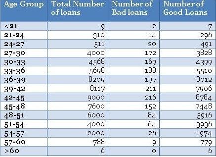
在您跳转到多变量分析和信用评分(阅读有关信用评分的详细讨论)之前,您需要分析几个单独变量的不良率。 根据您的经验,您有预感,借款人在贷款发放时的年龄是不良利率的关键区别因素。 因此,您根据借款人的年龄对贷款进行了划分,并创建了一个类似下面的表格。
Assume you are the chief risk officer (CRO) for CyndiCat bank that has disbursed支付 60816 auto loans in the quarter between April–June 2012. Today, about a year and a quarter since the loans disbursal, you know that the loans have seasoned or bad loans are tagged to a greater certainty (read a detailed discussion). You have noticed a bad rate of around 2.5% or 1524 bad loans out of total 60816 disbursed loans.
Before you jump to multivariate analysis and credit scoring (read a detailed discussion on credit scoring), you want to analyze the bad rate across several individual variables. You have a hunch based on your experience that borrower’s age at the time of loan disbursal is a key distinguishing factor for bad rates. Therefore, you have divided the loans based on the age of the borrowers and created a table something like the one below.
Using the above table, you have created a histogram and zoomed into the area of interest (close to the bad loans) as shown in the plots below.
不同年龄组的贷款分配是一个相当平滑的正态分布曲线,没有太多的异常值。年龄经常为大多数产品展示这种模式。但是,不要指望业务场景中其他常见变量的类似平滑曲线。通常,您可能必须解决变量转换以使分布平滑。
•最大不良贷款年龄为42至45岁。这当然并不意味着风险也是最高的,但是,一旦我听到有人在季度业务审查会议上得出类似的结论 - 这是一个愚蠢的错误。注意,最高贷款也在42至45年。绝对数字不能提供足够的信息,因此我们需要创建一个标准化的图。
•条纹桶(即<21和> 60年组)的数据非常薄,只有9个和6个数据点 - 处理这些薄数据时要小心。在模型开发时,修改这些边缘桶的良好业务知识非常有用。例如,您知道对于年龄在60岁以上的贷款可能存在高风险,但在这些数据中,我们没有足够的证据证明这一点,因为我们没有足够的数据来验证我们的假设。在这种情况下,我们应该补充正确的风险权重 - 但是,这样做时要非常小心。
You must have noticed the following
• The distribution of loans across age groups is a reasonably smooth normally distributed curve, without too many outliers. Age often display this kind of pattern for most products. However, do not expect similar smooth curves for other commonly found variables in a business scenario. Often, you may have to resolve to variable transformation to make the distributions smooth.
• The maximum bad loans are in the age bucket 42 to 45 years. This certainly does not mean the risk is also the highest in this bucket, however, once I have heard someone drawing a similar conclusion in a quarterly business review meeting –a silly mistake. Note, the maximum loans are also in the bucket 42 to 45 years. Absolute numbers do not provide enough information hence we need to create a normalized plot.
• The data is really thin on the fringe buckets (i.e. <21 and >60 years groups) with only 9 and 6 data points – be careful when dealing with such thin data. Sound business knowledge to modify these fringe buckets is extremely helpful while a model development. For instance, you know that for age above 60 for loans could be highly risky, but in this data, we do not have enough evidence for the same since we do not have enough data to validate our hypothesis. We should supplement a right risk weight in such situation – however, be very careful while doing so.
Normalized Plot
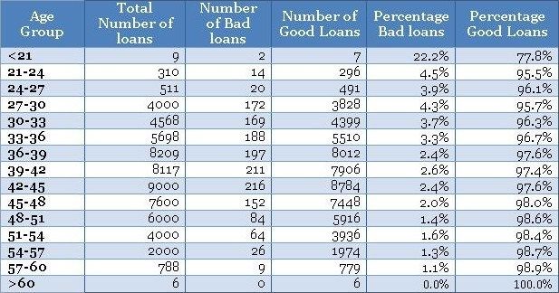
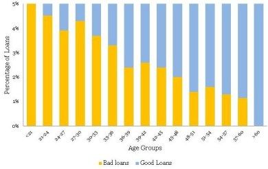
The normalized plot is easy to construct. The idea is to scale each age group to 100% and overlay bad and good percentage of records on top. We could extend the table shown above to get the values for the normalized plot as shown below.
Now, once you have the table ready you could create a normalized plot quite easily, as shown below (again we have zoomed into the plot to get a clear view of bad rates).
在不良率和年龄组方面存在明显的趋势。 随着借款人变老,他们不太可能拖欠贷款。 这是一个很好的见解。
•同样,条纹(即<21和> 60年组)具有薄数据,不能从标准化图获得该信息。 因此,您需要使用频率图来方便地处理不同的瘦数据。 一个方便的经验法则是在认真对待信息之前至少有10个(好的和坏的)病例的记录 - 否则,它没有统计学意义。
These plots are completely different from the original frequency count plot and presenting the information in a completely different light. The following are the things one could conclude from the plots.
• There is a definite trend in terms of the bad rates and the age groups. As the borrowers are getting older, they are less likely to default on their loans. That is a good insight.
• Again, the fringes (i.e. <21 and >60 years groups) have thin data, this information cannot be obtained from the normalized plot. Hence, you need to have the frequency plot handy to treat thin data differently. A handy rule of thumb is to have at least 10 records of both (good & bad) cases before taking the information seriously – otherwise, it is not statistically significant.
I must conclude by saying that, data visualization is the beginning of modeling process and not the destination. However, it is a good & creative beginning.
Sign-off Note
我必须总结说,数据可视化是建模过程的开始,而不是目的地。 然而,这是一个良好的创造性开端。
签字笔记
凭借大数据,数据分析工具和技术,科学进步和民主环境 - 我们可以生活在我们这个时代的文艺复兴时期。 但是,我们需要更多的达芬奇才能让这些时间变得非常特别。
With big data, data analysis tools & technologies, scientific progress and democratic environment – we could be living in the Renaissance of our times. However, we will need more Leonardo da Vincis to make these times really special.
banking case2(数据细分和变量比)
http://ucanalytics.com/blogs/data-visualization-case-study-banking-part-2/
Sherlock Holmes & Data Visualization
As a kid, a friend of mine used to own a Sherlock Holmes toy kit – the source of envy for all the other friends. The kit had a Sherlock Holmes cap, a pipe, a watch and a magnifying glass. The magnifying glass was the most coveted item in the kit. The pleasure of focusing the magnifying glass on an object and seeing it in detail to derive meaning was my first lesson in detective investigation – something that I still relish as an analyst. This is also the core of data visualization. Later, I learned more about Mr. Holmes through the books written by Sir Arthur Conon Doyle. The first book, A Study in Scarlet, describes Mr. Holmes’ inclination for scientific knowledge and the science of deduction – analysis. I realized being a detective is no different from being an experimental scientist or analyst. You start with gathering a set of observations, using which you built your case through logic and deduction. The following quote by Mr. Holmes’ perfectly describes the process of investigation – when you have eliminated the impossible, whatever remains, however improbable, must be the truth
小时候,我的一个朋友曾经拥有一个夏洛克·福尔摩斯玩具包 - 这是所有其他朋友羡慕的源头。该套件有一个Sherlock Holmes帽,一个管子,一块手表和一个放大镜。放大镜是套件中最令人垂涎的项目。将放大镜聚焦在物体上并详细观察它以获得意义的乐趣是我在侦探调查中的第一课 - 我仍然喜欢作为分析师。这也是数据可视化的核心。后来,我通过阿瑟·康恩·道尔爵士写的书,更多地了解了霍姆斯先生。第一本书“血色研究”描述了霍姆斯先生对科学知识和演绎科学的倾向 - 分析。我意识到自己是一名侦探与做实验科学家或分析师并无二致。您首先收集一组观察结果,通过逻辑和演绎来构建您的案例。霍姆斯先生的以下引言完美地描述了调查的过程 - 当你消除了不可能的事物时,无论遗骸多么不可能,都必须是真理
Data Visualization – A Case Study Example
In our last article, we started with a case study example about CyndiCat bank that has disbursed 60816 auto loans in the quarter between April–June 2012. You were playing the role of the Chief Risk Officer (CRO) for this bank. Additionally, you had noticed around 2.5% of bad rate or 1524 bad loans out of total 60816 disbursed loans. You started with a hunch预感/直觉 about the relationship between the age of the borrowers and the bad rates. After your analysis, you observed a definitive inversely proportional relationship between the two. Age of the borrowers certainly seemed like a strong contender for your credit risk model. You are feeling good and want to find a few more variables for your multivariate model. (Read the previous article)
在我们的上一篇文章中,我们从一个关于CyndiCat银行的案例研究示例开始,该银行在2012年4月至6月期间在该季度发放了60816个汽车贷款。您担任该银行首席风险官(CRO)的角色。 此外,在60816笔已发放贷款中,您注意到约2.5%的不良利率或1524笔不良贷款。 你开始预感借款人的年龄与不良利率之间的关系。 在分析之后,您观察到两者之间的确定的反比关系。 借款人的年龄当然似乎是您信用风险模型的有力竞争者。 您感觉良好,并希望为您的多变量模型找到更多变量。 (阅读上一篇文章)
国内某些数据测试,年龄与 坏客户率成正比,也许还有第三方因素决定,比如政策法规。美国政策严格。
The Case Study Example Continues…
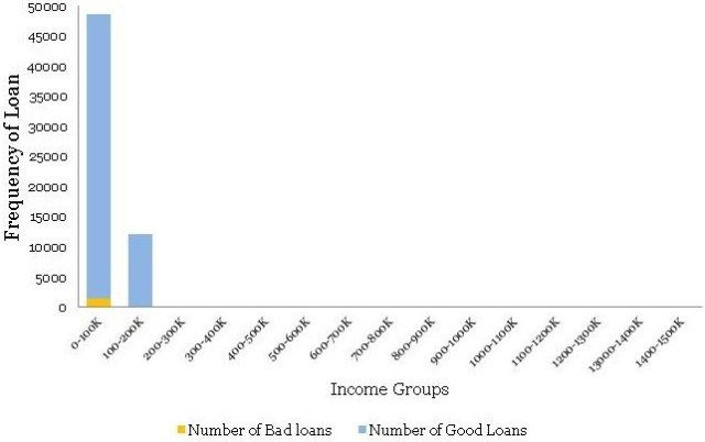
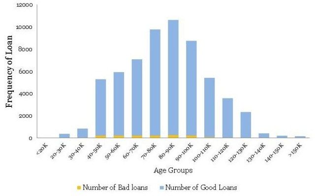
You also believe that income of the applicants should have some sort of relationship with the bad rates. You are feeling confident about your understanding of the tools you have used last time around i.e. histogram and normalized histogram (overlaid with good / bad borrowers). You immediately start by plotting an equal interval histogram and observe the following:
您还认为申请人的收入应该与不良利率有某种关系。 您对自己对上次使用的工具的理解充满信心,即直方图和标准化直方图(覆盖好/坏借款人)。 您可以立即绘制相等的间隔直方图,并观察以下内容:
Ouch! This is nothing like the smooth bell curve histogram you have observed for the age groups. Even the normalized histogram, shown below, is completely uninformative.
哎哟! 这与您在年龄组中观察到的平滑钟形曲线直方图完全不同。 即使是如下所示的标准化直方图也完全无法提供信息。
So, what is going on here? Income, unlike age, has a few extreme outliers – almost invisible in the histogram. There is a High-Net worth-Individual (HNI) with $1.47 million annual salary and few other outliers in the middle. Incidentally, this loan to the HNI customer has gone bad – quite unfortunate for the Bank. Have a look at the distribution table – almost 99.8% population is in the first two income buckets.
那么,这里发生了什么? 与年龄不同,收入有一些极端异常值 - 在直方图中几乎不可见。 有一个高净值个人(HNI),年薪为147万美元,中间几乎没有其他异常值。 顺便提一下,这笔给HNI客户的贷款变坏了 - 这对银行来说非常不幸。 看一下分配表 - 几乎99.8%的人口都在前两个收入桶中。
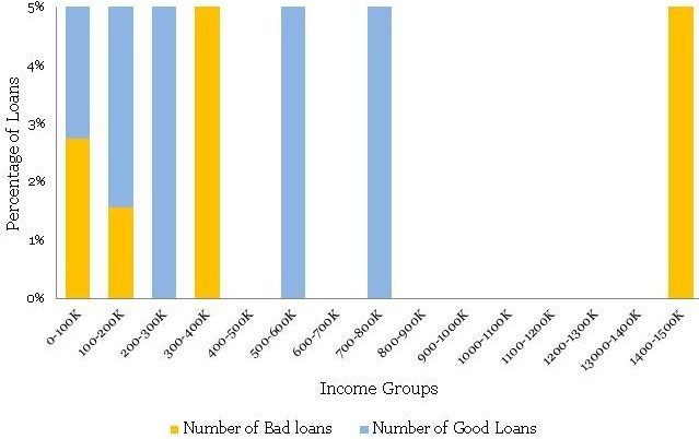
Here, as an analyst, you need to take a call whether you want to include these extreme cases, with thin data, in your model or create an income boundary for which the model is applicable for the majority of the customers. In my opinion, the latter option is a prudent choice. Going further with your exploratory analysis and data visualization, you have decided to zoom into the regions with a predominant number of data points i.e. first two buckets and re-plotted the histogram. The following is what you observed
在这里,作为分析师,您需要接听电话,无论您是想在模型中包含这些具有少量数据的极端情况,还是创建适用于大多数客户的模型的收入边界。 在我看来,后一种选择是谨慎的选择。 进一步研究探索性分析和数据可视化,您决定放大(细分)具有大量数据点的区域,即前两个数据区域,并重新绘制直方图。 以下是您观察到的内容
This time, the histogram is reasonably smooth and hence does not require transformation. Presented below is the normalized histogram for the above histogram.
这次,直方图相当平滑,因此不需要变换。 下面给出的是上述直方图的归一化直方图。
The following conclusions can be drawn from the above
• There is a definite trend in terms of the bad rates and the income groups. As the borrowers are earning a higher salary, they are less likely to default on their loans. This seems like a good insight.
• For the Last bucket i.e. >150 K, the risk jumps up – a break in the trend. This is attributed to the thin data in this bucket – not just in terms of data count but this data is also spread across a very large interval 150 to 1500 K.
Now you have two variables that are possible governing bad rates for the borrowers – age and income. However, your further analysis of income with age shows that there is a high correlation between the two variables – 0.76 to be precise. You cannot use them both in the model because it will be problematic because of multicollinearity. The correlation between age and income makes sense. Since income is a function of years of experience for a professional, this further depends on upon her age. Hence, you have decided to drop income from the model. The leaves us with a question, is there a way of bringing income back in our multivariate model?
在不良利率和收入群体方面存在明显的趋势。由于借款人的薪水较高,他们不太可能拖欠贷款。这似乎是一个很好的见解。
•对于最后一桶,即> 150 K,风险会上升 - 趋势中断。这归因于此数据库中的数据太少 - 不仅仅是数据计数,而且这些数据也分布在150到1500 K的非常大的区间内。
现在你有两个变量可以控制借款人的不良利率 - 年龄和收入。然而,您对年龄收入的进一步分析表明,两个变量之间存在高度相关性 - 准确地说是0.76。你不能在模型中使用它们,因为它会因多重共线性而成为问题。年龄和收入之间的相关性是有道理的。由于收入是专业人士多年经验的函数,这进一步取决于她的年龄。因此,您决定从模型中减少收入。给我们留下一个问题,是否有办法将收入带回我们的多元模型?
Financial Ratios
组合变量-Fixed Obligation to Income Ratio固定债务和收入比率 (FOIR)
When corporate analysts try to analyze financials of a company they often work with several financial ratios. Working with ratios has a definite advantage over working with plain vanilla variables. Combined variables often convey much higher information. Seasoned analysts understand this really well. Moreover, variables creation is a creative exercise that requires sound domain knowledge. For credit analysis, the ratio of the sum of obligations to income is highly informative since this provides an insight about percentage disposable income for the borrower.
Let us try to understand this with an example. Susan has an annual income of 100 thousand dollars. She has a home loan with an annual obligation (EMI) of 40 thousand dollars and a car loan with 10 thousand dollars. Hence, she is spending 10+40 thousand dollars on paying the EMIs out of her income of 100 thousand dollars. Her Fixed Obligation to Income Ratio固定债务和收入比率 (FOIR) in this case is equal to 50/100 = 50%. She is left with just 50% of her income to run her other expenses.
The following is the normalized histogram plot for FOIR.
财务比率
当企业分析师试图分析公司的财务状况时,他们经常使用多种财务比率。使用比率与使用普通的vanilla变量相比具有明显的优势。组合变量通常会传达更高的信息。经验丰富的分析师非常了解这一点。此外,变量创建是一项创造性的练习,需要良好的领域知识。对于信用分析,债务与收入之和的比率具有很高的信息量,因为这可以提供有关借款人可支配收入百分比的见解。
让我们试着通过一个例子来理解这一点。苏珊的年收入为10万美元。她有一笔住房贷款,年度义务(EMI)为4万美元,汽车贷款为1万美元。因此,她花费10 + 4万美元从她的收入10万美元中支付EMI。在这种情况下,她的固定义务收入比率(FOIR)等于50/100 = 50%。她只有50%的收入用于支付其他费用。
以下是FOIR的标准化直方图。
Clearly, there is a directly proportional relationship between FOIR and bad rate. Additionally, FOIR has little correlation with age, just 0.18. Now, you have another variable FOIR , along with age, for your multivariate model. Congratulations! Like, Sherlock Holmes, you are building your case evidence by evidence – a process in science.
Sign-off Note
I hope after this you are feeling inspired to pick up the magnifying glass and follow the legacy of the great Sherlock Holmes – this time the mystery is hiding in data!
显然,FOIR与不良率之间存在直接比例关系。 此外,FOIR与年龄几乎没有相关性,仅为0.18。 现在,您的多变量模型还有另一个变量FOIR和年龄。恭喜! 就像Sherlock Holmes一样,你正在通过证据建立你的案件证据 - 一个科学过程。
签字笔记
我希望在此之后你会感到鼓舞,拿起放大镜并追随伟大的夏洛克福尔摩斯的遗产 - 这一次神秘隐藏在数据中!
Logistic Regression – Banking Case Study Example (Part 3)
http://ucanalytics.com/blogs/case-study-example-banking-logistic-regression-3/
The Beautiful Formula
Mathematicians often conduct competitions for the most beautiful formulae of all. The first position, almost every time, goes to the formula discovered by Leonhard Euler. Displayed below is the formula.
![]()
This formula is phenomenal because it is a combination of the five most important constants in mathematics i.e.
0 : Additive Identity
1 : Multiplicative Identity
π : King of geometry and trigonometry
i : King of complex algebra
e: King of logarithms
It is just beautiful how such a simple equation links these fundamental constants in mathematics. I was mesmerized when I learned this Euler’s formula in high school and still am. Euler is also responsible for coining the symbol e (our king of the logarithm), which is sometimes also known as Euler’s constant. The name is an apt choice for another reason – Euler is considered the most prolific mathematician of all time. He used to produce novel mathematics at an exponential rate. This is particularly startling since Euler was partially blind for more than half his life and completely blind for around last two decades of his life. Incidentally, he was producing a high-quality scientific paper a week for a significant period when he was completely blind.
Today, before we discuss logistic regression, we must pay tribute to the great man, Leonhard Euler as Euler’s constant (e) forms the core of logistic regression.
数学家经常为最美丽的公式进行比赛。几乎每次都是第一个位置,由Leonhard Euler发现的公式。下面显示的是公式。
e ^ {i \ pi} + 1 = 0
这个公式是惊人的,因为它是数学中五个最重要的常数的组合,即
0:附加标识
1:乘法身份
π:几何和三角学之王
我:复杂代数之王
e:对数之王
如此简单的方程如何将这些基本常数与数学联系起来,这真是太好了。当我在高中学习欧拉的公式并且仍然是我时,我被迷住了。欧拉还负责创造符号e(我们的对数之王),有时也称为欧拉常数。这个名字是另一个原因的合适选择 - 欧拉被认为是有史以来最多产的数学家。他曾经以指数速度创作出新的数学。这尤其令人吃惊,因为欧拉在他生命的一半以上部分失明,并且在他生命的最后二十年里完全失明。顺便说一下,在他完全失明的一段时间里,他每周都会制作一份高质量的科学论文。
今天,在我们讨论逻辑回归之前,我们必须向伟大的人莱昂哈德欧拉致敬,因为欧拉常数(e)构成了逻辑回归的核心。
Case Study Example – Banking
In our last two articles (part 1) & (Part 2), you were playing the role of the Chief Risk Officer (CRO) for CyndiCat bank. The bank had disbursed 60816 auto loans in the quarter between April–June 2012. Additionally, you had noticed around 2.5% of bad rate. You did some exploratory data analysis (EDA) using tools of data visualization and found a relationship between age (Part 1) & FOIR (Part 2) with bad rates. Now, you want to create a simple logistic regression model with just age as the variable. If you recall, you have observed the following normalized histogram for age overlaid with bad rates.
We shall use this plot for creating the coarse classes to run a simple logistic regression. However, the idea over here is to learn the nuances of logistic regression. Hence, let us first go through some basic concepts in logistic regression.
在我们的最后两篇文章(第1部分)和(第2部分)中,您扮演的是CyndiCat银行的首席风险官(CRO)。 该银行在2012年4月至6月期间在该季度发放了60816份汽车贷款。此外,您注意到大约2.5%的不良率。 您使用数据可视化工具进行了一些探索性数据分析(EDA),并发现年龄(第1部分)和FOIR(第2部分)与不良率之间的关系。 现在,您想要创建一个简单的逻辑回归模型,仅将年龄作为变量。 如果你还记得,你已经观察到以下标准化的直方图,其中年龄覆盖了不良率。
我们将使用此图创建粗类以运行简单的逻辑回归。 然而,这里的想法是学习逻辑回归的细微差别。 因此,让我们首先介绍逻辑回归中的一些基本概念
Logistic regression
In a previous article (Logistic Regression), we have discussed some of the aspects of logistic regression. Let me reuse a picture from the same article. I would recommend that you read that article, as it would be helpful while understanding some of the concepts mentioned here.
在前一篇文章(Logistic回归)中,我们讨论了逻辑回归的一些方面。 让我重复使用同一篇文章中的图片。 我建议你阅读那篇文章,因为在理解这里提到的一些概念时会有所帮助
In our case z is a function of age, we will define the probability of bad loan as the following
在我们的案例中,z是年龄的函数,我们将如下定义不良贷款的概率。
你必须注意到欧拉常数对逻辑回归的影响。 贷款或P(不良贷款)的概率在Z =-∞时变为0,在Z = +∞时变为1。 这使得概率范围在无限远的两侧保持在0和1之内
.
You must have noticed the impact of Euler’s constant on logistic regression. The probability of loan or P(Bad Loan) becomes 0 at Z= –∞ and 1 at Z = +∞. This keeps the bounds of probability within 0 and 1 on either side at infinity.
Additionally, we know that probability of good loan is one minus probability of bad loan hence:
你必须注意到欧拉常数对逻辑回归的影响。 贷款或P(不良贷款)的概率在Z =-∞时变为0,在Z = +∞时变为1。 这使得概率范围在无限远的两侧保持在0和1之内。
If you have ever indulged in betting of any sorts, the bets are placed in terms of odds. Mathematically, odds are defined as the probability of winning divided by the probability of losing. If we calculate the odds for our problem, we will get the following equation.
如果你曾经沉迷于任何种类的投注,那么投注就是赔率。 在数学上,赔率被定义为获胜概率除以失败概率。 如果我们计算出问题的几率,我们将得到以下等式。
Here we have the Euler’s constant stand out in all its majesty.
在这里,我们让欧拉的不变在其所有的威严中脱颖而出。
Coarse Classing
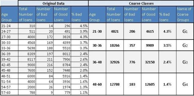
Now, let create coarse classes from the data-set we have seen in the first article of this series for age groups. Coarse classes are formed by combining the groups that have similar bad rates while maintaining the overall trend for bad rates. We have done the same thing for age groups as shown below.
现在,让我们从本系列第一篇文章中为年龄组看到的数据集创建粗类。 粗类通过组合具有相似不良率的组而形成,同时保持不良率的整体趋势。 我们为年龄组做了同样的事情,如下所示。
We will use the above four coarse classes to run our logistic regression algorithm. As discussed in the earlier article the algorithm tries to optimize Z. In our case, Z is a linear combination of age groups i.e Z = G1+G2+G3+Constant. You must have noticed that we have not used G4 in this equation. This is because the constant will absorb the information for G4. This is similar to using dummy variables in linear regression. If you want to learn more about this, you could post your questions on this blog and we can discuss it further.
我们将使用上述四个粗类来运行逻辑回归算法。 正如在前面的文章中所讨论的,算法试图优化Z.在我们的例子中,Z是年龄组的线性组合,即Z = G1 + G2 + G3 +常数。 你一定注意到我们没有在这个等式中使用G4。 这是因为常数将吸收G4的信息。 这类似于在线性回归中使用虚拟变量。 如果您想了解更多相关信息,可以在此博客上发布您的问题,我们可以进一步讨论。
Logistic Regression
Now, we are all set to generate our final logistic regression through a statistical program for the following equation.
现在,我们都准备通过以下等式的统计程序生成我们的最终逻辑回归。
`
You could either use a commercial software (SAS, SPSS or Minitab) or an open source software (R) for this purpose. They will all generate a table similar to the one shown below:
您可以使用商业软件(SAS,SPSS或Minitab)或开源软件(R)来实现此目的。 它们都将生成一个类似于下图所示的表:
| Logistic Regression Results (Age Groups and Bad Rates) | |||||
| Predictor | Coefficient |
Std. Er |
Z |
P |
Odds Ratio |
| Constant | -4.232 |
0.074456 |
-56.84 |
0 |
|
| G1 | 1.122 |
0.103026 |
10.9 |
0 |
3.07 |
| G2 | 0.909 |
0.0919 |
9.89 |
0 |
2.48 |
| G3 | 0.508 |
0.082846 |
6.14 |
0 |
1.66 |
Let us quickly decipher this table and understand how the coefficients are estimated here. Let us look at the last column in this table i.e. Odds Ratio. How did the software arrive at the value of 3.07 for G1? The odds (bad loans/good loans) for G1 are 206/4615 = 4.46% (refer to above Table 1 – Coarse Class). Additionally, odds for G4 (the baseline group) are 183/12605 =1.45%. The odds ratio is the ratio of these two numbers 4.46%/1.45% = 3.07. Now, take the natural log of 3.07 i.e. ln(3.07) = 1.123 – this is our c for G1. Similarly, you could find the coefficient for G2 and G3 as well. Try it with your calculator!
These coefficients are the β values to our original equation and hence the equation will look like the following
让我们快速解读这个表,并了解如何估计系数。 让我们看看这个表中的最后一列,即优势比。 G1软件如何达到3.07的价值? G1的赔率(不良贷款/优惠贷款)为206/4615 = 4.46%(参见上表1 - 粗类)。 此外,G4(基线组)的赔率为183/12605 = 1.45%。 优势比是这两个数字的比率4.46%/ 1.45%= 3.07。 现在,取3.07的自然对数,即ln(3.07)= 1.123 - 这是G1的c。 同样,您也可以找到G2和G3的系数。 试试你的计算器吧!
3.5/1.4=2.5
2.4/1.4
Out[5]: 1.7142857142857144
这些系数是我们原始方程的β值,因此方程式如下所示
`
Remember, G1, G2 and G3 can only take values of either 0 or 1. Additionally, since they are mutually exclusive when either of them is 1 the remaining will automatically become 0. If you make G1 = 1 the equation will take the following form.
请记住,G1,G2和G3只能取0或1的值。此外,由于当它们中的任何一个为1时它们是互斥的,剩余的将自动变为0.如果你使G1 = 1,则等式将采用以下形式。
`
Similarly, we could find the estimated value of bad rate for G1
![]()
`
This is precisely the value we have observed. Hence, the logistic regression is doing a good job for estimation of bad rate. Great! We have just created our first model.
Sign-off Note
Euler, though blind, showed us the way to come so far! Let me also reveal some more facts about the most beautiful formulae we have discussed at the beginning of this article. In the top five places, you will find two more formulae discovered by Leonhard Euler. That is 3 out of 5 most beautiful formulae. Wow! I guess we need to redefine blind.
To learn more about leonhard Euler watch the following You Tube Video by William Dunham (Video)
欧拉虽然是盲目的,却向我们展示了到目前为止的方式! 让我也揭示一些关于我们在本文开头讨论过的最美丽公式的更多事实。 在前五名中,你会发现Leonhard Euler发现的另外两个公式。 这是5种最美丽的配方中的3种。 哇! 我想我们需要重新定义盲目。
Information Value (IV) and Weight of Evidence (WOE) – A Case Study from Banking (Part 4)
http://ucanalytics.com/blogs/information-value-and-weight-of-evidencebanking-case/
This is a continuation of our banking case study for scorecards development. In this part, we will discuss information value (IV) and weight of evidence. These concepts are useful for variable selection while developing credit scorecards. We will also learn how to use weight of evidence (WOE) in logistic regression modeling. The following are the links where you can find the previous three parts (Part 1), (Part 2) & (Part 3).
Experts in Expensive Suits
A couple of weeks ago I was watching this show called ‘Brain Games’ on the National Geographic Channel. In one of the segments, they had a comedian dressed up as a television news reporter. He had a whole television camera crew along with him. He was informing the people coming out of a mall in California that Texas has decided to form an independent country, not part of the United States. Additionally, while on camera he was asking for their opinion on the matter. After the initial amusement, people took him seriously and started giving their serious viewpoints. This is the phenomenon psychologists describe as ‘expert fallacy’ or obeying authority, no matter how irrational the authorities seem. Later after learning the truth, the people on this show agreed that they believed this comedian because he was in an expensive suit with a TV crew.
Nate Silver in his book The Signal and The Noise described a similar phenomenon. He analyzed the forecasts made by the panel of experts on the TV program The McLaughlin Group. The forecasts turned out to be true only in 50% cases; you could have forecasted the same by tossing a coin. We do take experts in expensive suits seriously, don’t we? These are not few-off examples. Men in suits or uniforms come in all different forms – from army generals to security personnel in malls. We take them all very seriously.
We have just discovered that rather than accept an expert’s opinion, it would be better to look at the value of the information and make decisions oneself. Let us continue with the theme and try to explore how to assign the value to information using information value and weight of evidence. Then we will create a simple logistic regression model using WOE (weight of evidence). However, before that let us recapture the case study we are working on.
几个星期前,我在国家地理频道观看这个名为“脑游戏”的节目。在其中一个片段中,他们有一个扮成电视新闻记者的喜剧演员。他和他一起有一整个电视摄制组。他告诉从加利福尼亚州的一个商场出来的人们,德克萨斯州决定组建一个独立的国家,而不是美国的一部分。此外,他在镜头前询问他们对此事的看法。在最初的娱乐之后,人们认真地对待他并开始给予他们认真的观点。这是心理学家所描述的“专家谬误”或服从权威的现象,无论当局看起来多么不合理。在得知真相之后,这个节目的人们同意他们相信这个喜剧演员,因为他是一个昂贵的电视工作人员。
Nate Silver在他的着作“信号与噪音”中描述了类似的现象。他分析了电视节目The McLaughlin Group的专家小组所做的预测。仅在50%的情况下,预测结果是正确的;你可以通过掷硬币来预测同样的事情。我们认真对待昂贵西装的专家,不是吗?这些都不是很少的例子。穿西装或制服的男子有各种形式 - 从军队将军到商场的保安人员。我们非常重视他们。
我们刚刚发现,不要接受专家的意见,最好是查看信息的价值并自己做出决定。让我们继续讨论主题,并尝试探索如何使用信息值和证据权重为信息赋值。然后我们将使用WOE(证据权重)创建一个简单的逻辑回归模型。但是,在此之前让我们重新审视我们正在研究的案例研究。
Case Study Continues ..
This is a continuation of our case study on CyndiCat bank. The bank had disbursed 60816 auto loans with around 2.5% of the bad rate in the quarter between April–June 2012. We did some exploratory data analysis (EDA) using tools of data visualization in the first two parts (Part 1) & (Part 2). In the previous article, we have developed a simple logistic regression model with just age as the variable (Part 3). This time, we will continue from where we left in the previous article and use weight of evidence (WOE) for age to develop a new model. Additionally, we will also explore the predictive power of the variable (age) through information value.
信息价值是模型构建过程中变量选择的一个非常有用的概念。 我认为,信息价值的根源在于克劳德·香农提出的信息理论。 我相信的原因是相似性信息值与信息论中广泛使用的熵概念有关。 Chi Square值是一种广泛使用的统计量度量,是IV(信息值)的良好替代品。 然而,IV是业内流行且广泛使用的措施。 这样做的原因是与IV相关的变量选择的一些非常方便的经验法则 - 这些非常方便,您将在本文后面发现。 信息值的公式如下所示。
Information Value (IV) and Weight of Evidence (WOE)
Information value is a very useful concept for variable selection during model building. The roots of information value, I think, are in information theory proposed by Claude Shannon. The reason for my belief is the similarity information value has with a widely used concept of entropy in information theory. Chi Square value, an extensively used measure in statistics, is a good replacement for IV (information value). However, IV is a popular and widely used measure in the industry. The reason for this is some very convenient rules of thumb for variables selection associated with IV – these are really handy as you will discover later in this article. The formula for information value is shown below.
信息价值是模型构建过程中变量选择的一个非常有用的概念。 我认为,信息价值的根源在于克劳德·香农提出的信息理论。 我相信的原因是相似性信息值与信息论中广泛使用的熵概念有关。 Chi Square值是一种广泛使用的统计量度量,是IV(信息值)的良好替代品。 然而,IV是业内流行且广泛使用的措施。 这样做的原因是与IV相关的变量选择的一些非常方便的经验法则 - 这些非常方便,您将在本文后面发现。 信息值的公式如下所示。
![]()
What distribution good/bad mean will soon be clear when we will calculate IV for our case study. This is probably an opportune moment to define Weight of Evidence (WOE), which is the log component in information value.
![]()
Hence, IV can further be written as the following.
![]()
If you examine both information value and weight of evidence carefully then you will notice that both these values will break down when either the distribution good or bad goes to zero. A mathematician will hate it. The assumption, a fair one, is that this will never happen while a scorecard development because of the reasonable sample size. A word of caution, if you are developing non-standardized scorecards with smaller sample size use IV carefully.
如果仔细检查信息的价值和证据的重量,那么你会注意到,当分布好坏都归零时,这两个值都会崩溃。 数学家会讨厌它。 假设是合理的,因为合理的样本量,在记分卡开发时这种情况永远不会发生。 需要注意的是,如果您正在开发样本量较小的非标准化记分卡,请谨慎使用IV。
Back to the Case Study
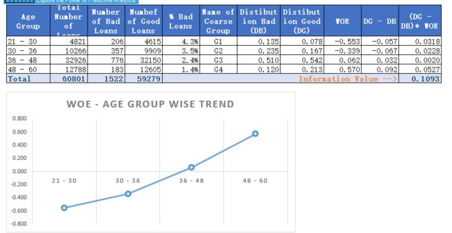
In the previous article, we have created coarse classes for the variable age in our case study. Now, let us calculate both information value and weight of evidence for these coarse classes.
Let us examine this table. Here, distribution of loans is the ratio of loans for a coarse class to total loans. For the group 21-30, this is 4821/60801 = 0.079. Similarly, distribution bad (DB) = 206/1522 = .135 and distribution good = 4615/59279 (DG) = 0.078. Additionally, DG-DB = 0.078 – 0.135 = – 0.057. Further, WOE = ln(0.078/0.135) = -0.553.
 Download the attached Excel to understand this calculation : Information Value (IV) and Weight of Evidence (WOE) Download the attached Excel to understand this calculation : Information Value (IV) and Weight of Evidence (WOE) |
Finally, component of IV for this group is (-0.057)*(-0.553) = 0.0318. Similarly, calculate the IV components for all the other coarse classes. Adding these components will produce the IV value of 0.1093 (last column of the table). Now the question is how to interpret this value of IV? The answer is the rule of thumb described below.
| Information Value | Predictive Power |
| < 0.02 | useless for prediction |
| 0.02 to 0.1 | Weak predictor |
| 0.1 to 0.3 | Medium predictor |
| 0.3 to 0.5 | Strong predictor |
| >0.5 | Suspicious or too good to be true |
信息价值预测能力
<0.02无法用于预测
0.02到0.1弱预测值
0.1到0.3中等预测值
0.3到0.5强预测器
> 0.5可疑或太好不可能
Typically, variables with medium and strong predictive powers are selected for model development. However, some school of thoughts would advocate just the variables with medium IVs for a broad-based model development. Notice, the information value for age is 0.1093 hence it is barely falling in the medium predictors’ range.
通常,选择具有中等和强预测能力的变量用于模型开发。 然而,一些学派只会提倡具有中等IV的变量来进行基础广泛的模型开发。 请注意,年龄的信息值为0.1093,因此在中期预测器的范围内几乎没有下降。
Logistic Regression with Weight of Evidence (WOE)
Finally, let us create a logistic regression model with weight of evidence of the coarse classes as the value for the independent variable age. The following are the results generated through a statistical software.
最后,让我们创建一个逻辑回归模型,其中粗类的证据权重作为自变量年龄的值。 以下是通过统计软件生成的结果。
| Logistic Regression Results (Age Groups and Bad Rates) | |||||
| Predictor | Coefficient |
Std. Er |
Z |
P |
Odds Ratio |
| Constant | -3.66223 | 0.0263162 |
-139.16 | 0 |
|
| WOEAge | -1 |
0.0796900 |
-12.55 |
0 |
0.37 |
If we estimate the value of bad rate for the age group 21-30 using the above information.
This is precisely the value we have obtained the last time (See the previous part) and is consistent with the bad rate for the group.
Sign-off note
I wish there was an instrument similar to information value available with us to estimate the value of information coming from so called experts. However, next time when an expert on a business channel gives you the advice to buy a certain stock, take that advice with a pinch of salt.
我希望有一种类似于信息价值的工具可用于估算来自所谓专家的信息的价值。 但是,下次商业渠道专家为您提供购买某种库存的建议时,请尽量不予理睬。
Read the remaining part of credit scoring series
- Part 1: Data visualization for scoring
- Part 2: Creating ratio variables for better scoring
- Part 3: Logistic regression
- Part 5: Reject inference
- Part 6: Population stability index for scorecard monitoring
References
1. Credit Risk Scorecards: Developing and Implementing Intelligent Credit Scoring – Naeem Siddiqi
2. Credit Scoring for Risk Managers: The Handbook for Lenders – Elizabeth Mays and Niall Lynas
Reject Inference & Scorecards – Banking Case (Part 5)
http://ucanalytics.com/blogs/reject-inference-scorecards-banking-case-part-5/
Reject Inference is a topic that separates credit scoring from the other classification problems such as marketing propensity models for cross / upselling, etc. As you will discover later, reject inference is about patching information gaps that exist during the development of application scorecards. Let us try to gain a more holistic perspective about patching information gaps through the way human beings have evolved.
拒绝推理是一个将信用评分与其他分类问题(如交叉/向上销售的营销倾向模型等)分开的主题。正如您稍后将发现的,拒绝推断是关于修补应用程序记分卡开发过程中存在的信息差距。 让我们尝试通过人类进化的方式获得更全面的视角来修补信息空白。
Connecting the Dots
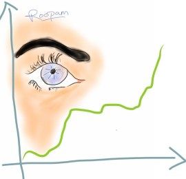
Connect the dots (reject inference) – by Roopam
Recently I watched a Hindi movie called ‘Ankhon Dekhi’, the movie title translates to ‘seen with your eyes’. In the beginning, the central character of this movie, after a dramatic event in his life, decides to believe only what he sees with his eyes. What follows are his adventures / misadventures while doing so. Although the theme of this movie has a high potential, I think it became a bit pretentious in its presentation especially towards the end. The idea of believing your eyes seems appropriate but it has its own shortcomings. Evolution has trained our brain to superseded our vision to make split second decisions. Numerous optical illusions are proofs of this phenomenon. We will explore some optical illusions / illustrations that will highlight how our brain and eyes work in this article. But before that, let us consider an example of split second decision making as a necessity for survival.
Imagine a human ancestor in the middle of the dark. Our ancestor is hungry, he hasn’t eaten in days. He sees a silhouette of a creature lurking in front of him. This creature could be his next meal. On the other hand, this could be a predatory creature and our ancestor will become a delicious meal for this creature. The reason why humans are still around on this planet is because our ancestors’ eyes and brain have created some simple rules to deal with this situation. One of the instruments evolution has equipped humans with is ..
连接点
最近我看了一部名为“Ankhon Dekhi”的印地语电影,电影名称翻译为“用你的眼睛看”。一开始,这部电影的中心人物,在他生命中的戏剧性事件之后,决定只相信他用眼睛看到的东西。接下来是他这样做的冒险/不幸事件。虽然这部电影的主题具有很高的潜力,但我认为它在演示中变得有点自命不凡,特别是在最后。相信你的眼睛的想法似乎是合适的,但它有其自身的缺点。进化训练我们的大脑取代我们的视野,做出分裂的第二个决定。许多视错觉都是这种现象的证据。我们将探讨一些视觉错觉/插图,以突出我们的大脑和眼睛在本文中的工作方式。但在此之前,让我们考虑一下分裂第二决策作为生存必需品的一个例子。
想象一下在黑暗中的人类祖先。我们的祖先很饿,他几天没有吃东西。他看到一个潜伏在他面前的生物的轮廓。这个生物可能是他的下一顿饭。另一方面,这可能是一种掠夺性生物,我们的祖先将成为这种生物的美味佳肴。人类仍然在这个星球上的原因是因为我们的祖先的眼睛和大脑已经创造了一些简单的规则来处理这种情况。进化为人类配备的仪器之一是.....
Power of Context
As promised earlier, let me present a couple of illustrations to emphasize the power of context. In the first of these illustrations (shown adjacent), try to compare the length of two yellow lines and decide which one is longer. In this case, you will most probably identify the top yellow line as longer than the bottom yellow line. In this illusion, your brain will supersede the information received through your eyes based on the context or surrounding patterns around the yellow lines. As you might appreciate our three-dimensional world will rarely, or most probably never, offer a pattern similar to the optical illusion of illustration 1. Hence, for most practical purposes our brain has made the right decision though may seem ridiculous in this case.
Now, let us have a look at the second illustration as shown adjacent. Notice B and 13 in the middle of the top and the bottom sequences, they are identical. You read the top sequence ABC and the bottom sequence 12,13,14. This is phenomenal, what your brain has just done in a split second is something most text mining and artificial intelligence algorithms try to do painstakingly. I must point out, CAPTCHA is a proof that most of these algorithms fail to capture what nature has equipped us with – the ability to join missing links.
Our brain tries to fill the gap in our information using the available information. This is precisely what we try to do while using reject inference for credit scoring.
正如之前所承诺的那样,让我提出一些插图来强调语境的力量。在第一个插图(显示为相邻)中,尝试比较两条黄线的长度并确定哪一条更长。在这种情况下,您很可能将顶部黄线识别为比底部黄线长。在这种幻觉中,你的大脑将取代基于黄色线周围的环境或周围模式通过你的眼睛接收的信息。你可能会欣赏我们的三维世界很少,或者很可能永远不会提供类似于插图1的视错觉的模式。因此,对于大多数实际目的,我们的大脑做出了正确的决定,尽管在这种情况下可能看起来很荒谬。
现在,让我们看看相邻的第二个插图。注意顶部和底部序列中间的B和13,它们是相同的。您阅读了顶部序列ABC和底部序列12,13,14。这是惊人的,你的大脑刚刚在瞬间完成的是大多数文本挖掘和人工智能算法试图做的苦心事。我必须指出,CAPTCHA证明了大多数这些算法无法捕捉大自然为我们提供的东西 - 加入缺失链接的能力。
我们的大脑试图利用现有信息填补我们信息的空白。这正是我们在使用拒绝推理进行信用评分时尝试做的事情。
Reject Inference
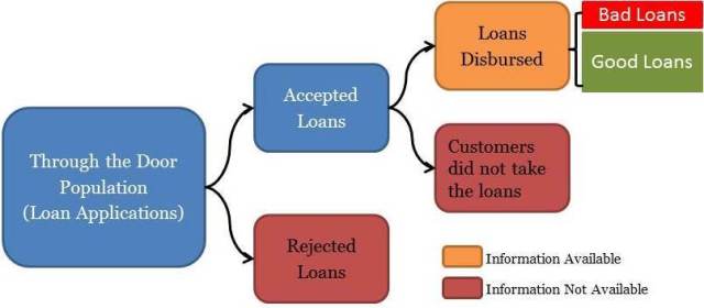
Let us try to understand the dynamics of the loan application process before establishing the necessity for reject inference. The ‘through-the-door’ loan applications are assessed by underwriters to establish the creditworthiness of the applicants. The underwriters will either accept or reject the applications based on the credentials of the applicants. Moreover, the customers with accepted applications will either avail the loans or not. This is shown in the schematic below:
拒绝推理
在确定拒绝推理的必要性之前,让我们试着了解贷款申请流程的动态。 审批人员对“通过'贷款申请进行评估,以确定申请人的信誉。审批人员将根据申请人的证书接受或拒绝申请。 此外,接受申请的客户将利用或不利用贷款。 这显示在下面的示意图中:
正如您在上面的示意图中所看到的,我们有关于已支付贷款的信息,根据其业绩将其标记为好或坏。 但是,要为整个门户群体创建整体记分卡,我们需要推断被拒绝贷款的行为。 这种补充信息的过程称为拒绝推断,对于开发整体记分卡至关重要。 以下部分介绍了一些常用的执行拒绝推理的方法。 我还必须指出,尽管在工业中广泛使用,但以下方法并不完美。
Use Credit Bureaus
This method involves using information from credit bureaus to fill the gaps. If other lenders have disbursed loans to your rejected applicants then it makes sense to tag the rejected customers good or bad based on their performance with the other lenders. Although this method is possibly the best way to infer rejects with concrete information, it has the following challenges
- It unlikely that all the rejected loans have got a loan with some other lenders around the development period of the scorecard
- Difference in collection process and reporting among lenders could influence dubious tagging for customers’ performance
In most cases using credit bureaus information alone won’t be sufficient enough to tag the entire through-the-door population. That is why we need analytical methods for reject inference as discussed in the next segment.
使用信用局
这种方法涉及使用信用局的信息填补空白。 如果其他贷款人已向您被拒绝的申请人发放贷款,那么根据他们与其他贷方的表现来判断被拒绝的客户是好还是坏是有意义的。 虽然这种方法可能是用具体信息推断拒绝的最佳方法,但它存在以下挑战
所有被拒绝的贷款都不可能在记分卡的开发期间与其他一些贷款人一起获得贷款
贷款人收集流程和报告的差异可能会影响客户绩效的可疑标记
在大多数情况下,单独使用信用局信息不足以标记整个门户人口。 这就是我们需要分析方法进行拒绝推理的原因,如下一部分所述。
Augmentation through Parceling
Augmentation in different forms is the most commonly used methodology for reject inference. Now as shown in the above schematic we have fairly concrete tagging of good and bad loans for all the disbursed loans. We can easily run a classification algorithm like logistic regression (follow this link Part 3), neural nets or decision tree to create a Known-Good-Bad (KGB) model. The same KGB model is used to score the rejected loans. Once the scoring is completed the analyst could create a table similar to the one shown below:
通过Parceling进行扩充
不同形式的增强是最常用的拒绝推理方法。 现在如上图所示,我们对所有已发放贷款的好坏贷款进行了相当具体的标记。 我们可以轻松地运行分类算法,如逻辑回归(遵循此链接第3部分),神经网络或决策树来创建一个已知 - 良好 - 坏(KGB)模型。 同样的克格勃模型用于对被拒绝的贷款进行评分。 评分完成后,分析师可以创建一个类似于下图所示的表格:
| Score Range | Disbursed % Bad | Disbursed % Good |
Total Rejected Applications |
RejectsInferred Bad |
RejectsInferred Good |
| 0–231 | 27.0% | 73.0% | 1,838 | 496 | 1342 |
| 232–241 | 22.0% | 78.0% | 2,295 | 505 | 1790 |
| 242–251 | 17.0% | 83.0% | 3,162 | 538 | 2624 |
| 252–261 | 15.0% | 85.0% | 3,659 | 549 | 3110 |
| 262–271 | 9.0% | 91.0% | 3,298 | 297 | 3001 |
| 272–281 | 7.0% | 93.0% | 3,893 | 273 | 3620 |
| 282–291 | 4.0% | 96.0% | 2,627 | 105 | 2522 |
| 292–301 | 1.5% | 98.5% | 2,612 | 39 | 2573 |
| 302–311 | 0.7% | 99.3% | 2,441 | 17 | 2424 |
| 312+ | 0.3% | 99.7% | 1,580 | 5 | 1575 |
As you may notice in the above table, we have divided rejected applications into the same proportion of good / bad as in the disbursed loans for the score range. For instance, the score range of 232-241 has 22% bad loans. We have divided 2295 rejected applicants in this bucket into 505 (this is 22% of 2295) bad loans and 1790 good loans. We will randomly choose 505 rejected applications in the score range of 232-241 and assign them as bad loans (the remaining loans in this bucket will be assigned as good). Now we will create a holistic scorecard by re-running the classification algorithm i.e. logistic regression on the entire through-the-door population.
I hope you have noticed that we have used the principles of power-of-context discussed above by using score ranges as the criteria for augmentation.
正如您在上表中所注意到的那样,我们将被拒绝的申请分为与分数范围的已支付贷款相同的好/坏比例。 例如,232-241的得分范围有22%的不良贷款。 我们已将2295名被拒绝的申请人分为505(这是2295的22%)不良贷款和1790良好贷款。 我们将在232-241的分数范围内随机选择505个被拒绝的申请,并将其分配为不良贷款(此桶中的剩余贷款将被分配为好)。 现在我们将通过重新运行分类算法来创建整体记分卡,即对整个门户群体进行逻辑回归。
我希望你注意到我们使用得分范围作为扩充的标准,使用了上面讨论的上下文的原则。
Fuzzy Augmentation
A fuzzy augmentation is an extended form of parceling, here rather than randomly assigning loans as good and bad we will create multiple copies of rejected loans in the proportion of good / bad % in the score range. For instance, 22 copies of a single rejected loan in the score range of 232-241 will be tagged as bad and 78 copies as good. The process will be repeated for all the rejected loans. This is similar to the workings of fuzzy logic. Fuzzy augmentation is believed to be a superior method for reject inference to produce holistic scorecards.
模糊增强
模糊增值是一种扩展形式的分割,这里不是随意分配贷款的好坏我们将按分数范围内好/坏百分比的比例创建多个被拒绝贷款的副本。 例如,在分数范围232-241的单个被拒绝贷款的22份副本将被标记为坏,78份副本被标记为好。 所有被拒绝的贷款将重复该过程。 这类似于模糊逻辑的工作方式。 模糊增强被认为是拒绝推理以产生整体记分卡的优良方法。
Sign-off Note
I know all the above methods for reject inference have their shortcomings. I have seen several experts and academicians cringe at the mention of the above methods for reject inference. However thus far, these are the best methods we have for reject inference with our current knowledge of mathematics and logic. I must say, nature is still hiding a few brilliant tricks under her sleeves such as our own ability to decipher CAPTCHAs. Some day when we will learn more about the inner workings of our own brain we might crack the bigger code for reject inference and millions of similar problems. Nature does reveal herself in piecemeal so there is still tremendous hope!
签字笔记
我知道拒绝推理的所有上述方法都有其缺点。 我看到有几位专家和学者在提到拒绝推理的上述方法时感到畏缩。 然而到目前为止,这些是我们用现有的数学和逻辑知识进行拒绝推理的最佳方法。 我必须说,大自然仍然隐藏在她的袖子下的一些聪明的技巧,比如我们自己破解CAPTCHA的能力。 有一天,当我们将更多地了解我们自己大脑的内部运作时,我们可能会破解更大的拒绝推理和数百万类似问题的代码。 大自然确实零碎地展示自己,所以仍有巨大的希望!
References
1. Credit Risk Scorecards: Developing and Implementing Intelligent Credit Scoring – Naeem Siddiqi
2. Credit Scoring for Risk Managers: The Handbook for Lenders – Elizabeth Mays and Niall Lynas
![]()
