CSS3新增伪类选择器,选项案例,优化后土豆案例,CSS3盒子模型border-box,滤镜filter、calc函数,过渡属性,进度条案例296
CSS3新增伪类选择器

        /* 必须要有content属性 */
        div::before{

            content: '前';
        }
        div::after{

            content: '后';
        }
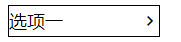
选项案例
    <style>
      @font-face {

        font-family: "icomoon";
        src: url("fonts/icomoon.eot?tomleg");
        src: url("fonts/icomoon.eot?tomleg#iefix") format("embedded-opentype"),
          url("fonts/icomoon.ttf?tomleg") format("truetype"),
          url("fonts/icomoon.woff?tomleg") format("woff"),
          url("fonts/icomoon.svg?tomleg#icomoon") format("svg");
        font-weight: normal;
        font-style: normal;
        font-display: block;
      }

      div {

          position: relative;
        width: 150px;
        height: 30px;
        border: 1px solid black;
      }
      /* 必须要有content属性 */
      div::before {

          position: absolute;
          top: 3px;
          left: 0px;
        content: "选项一";
        font-size: 18px;
      }
      div::after {

          position: absolute;
          top: 6px;
          right: 0px;
        font-family: "icomoon";
        /* 字体图标也可以加反斜杠 */
        content: "\e920";
        font-size: 18px;
      }
    </style>
经过伪类元素选择器优化后的土豆视频案例
<!DOCTYPE html>
<html lang="en">
<head>
    <meta charset="UTF-8">
    <meta name="viewport" content="width=device-width, initial-scale=1.0">
    <title>Document</title>
    <style>
        .tudou{

            position: relative;
            width: 444px;
            height: 320px;
            margin: 100px auto;
        }
        .tudou img{

            width: 100%;
            height: 100%;
        }
        .tudou::before{

            content: '';
            display: none;
            position: absolute;
            top: 0;
            left: 0;
            width: 100%;
            height: 100%;
            background: rgba(0, 0, 0, .3) url(images/arr.png) no-repeat center;
        }
        /* 鼠标经过时让mask盒子显示出来 */
        .tudou:hover::before{

            display: block;
        }
    </style>
</head>
<body>
    <div class="tudou">
        <img src="images/tudou.jpg" alt="">
    </div>
    <div class="tudou">
        <img src="images/tudou.jpg" alt="">
    </div>
    <div class="tudou">
        <img src="images/tudou.jpg" alt="">
    </div>
</body>
</html>
CSS3盒子模型border-box
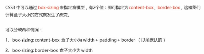
默认代码:
        *{

            margin: 0;
            padding: 0;
            box-sizing: border-box;
        }
CSS3滤镜filter
filter: blur(5px);
CSS3 calc函数
width: calc(100%-30px);
CSS3 过渡属性


        div{

            width: 200px;
            height: 50px;
            background-color: blue;
            /* 写多个属性加逗号就可以了 */
            transition: width 1s ease .5s,height 1s ease 1s
        }
        div:hover{

            width: 400px;
            height: 100px;
        }
            /* 所有属性都改变 */
            transition: all 0.5s;
进度条案例
<!DOCTYPE html>
<html lang="en">
<head>
    <meta charset="UTF-8">
    <meta name="viewport" content="width=device-width, initial-scale=1.0">
    <title>Document</title>
    <style>
        .bar{

            width: 100px;
            height: 14px;
            border: 1px solid red;
            border-radius: 7px;
        }
        .bar-in{

            width: 0;
            height: 100%;
            background-color: red;
            transition: all 3s;
        }
        .bar:hover .bar-in{

            width: 100%;
        }
    </style>
</head>
<body>
    <div class="bar">
        <div class="bar-in"></div>
    </div>
</body>
</html>
小米logo旋转案例
<!DOCTYPE html>
<html lang="en">
<head>
    <meta charset="UTF-8">
    <meta name="viewport" content="width=device-width, initial-scale=1.0">
    <title>Document</title>
    <style>
        .logo{

            position: relative;
            width: 32px;
            height: 28px;
            background-color: #ff6700;
        }
        .logo img{

            position: absolute;
            top: 0px;
            left: 0px;
            transition: all .3s;
        }
        .logo:hover img{

            left: -38px;
        }
    </style>
</head>
<body>
    <div class="logo">
        <img src="images/mi.png" alt="" >
    </div>
</body>
</html>
加上进度条案例
<!DOCTYPE html>
<html lang="en">
<head>
    <meta charset="UTF-8">
    <meta name="viewport" content="width=device-width, initial-scale=1.0">
    <title>Document</title>
    <style>
        *{

            margin: 0;
            padding: 0;
        }
        em{

            font-style: normal;
        }
        .box{

            position: relative;
            width: 290px;
            height: 420px;
            background-color: #ffffff;
            margin: 100px auto;
        }
         img{

             width: 100%;
        }
        .name{

            margin-left: 18px;
            font-size: 14px;
        }
        .name h4{

            font-weight: 400;
            margin: 20px 0 9px 0;
        }
        .hd{

            margin:  5px 0 0 18px;
            position: relative;
        }
        .price{

            font-size: 14px;
        }
        .price .now {

            color:red;
            font-size: 24px;
        }
        .price .now em{

            font-size: 14px;
        }
        .price .before{

            color: gray;
            text-decoration:line-through;
        }
        .progress span{

            color: gray;
        }
        .bar{

            display: inline-block;
            width: 88px;
            height: 8px;
            border: 1px solid transparent;
            background-color: #e6e6e6;
            border-radius: 7px;
        }
        .bar-in{

            width: 0;
            height: 100%;
            background-color: red;
            border-radius: 7px;
            transition: all 3s;
        }
        .bar:hover .bar-in{

            width: 100%;
        }
        .hd .buy{

            position: absolute;
            top: 5px;
            right: 10px;
            width: 80px;
            height: 40px;
            background-color:#df0021;
            color: white;
            border: none;
            font-size: 16px;
        }
    </style>
</head>
<body>
    <div class="box">
        <img src="images/phone.png" alt="">
        <div class="name">
            <h4>华为P40 5G手机</h4>
            <span>12期免息</span>
        </div>
        <div class="hd">
            <span class="price">
                <span class="now"><em>¥</em>4458</span>
                <span class="before"><em>¥</em>4599</span>
            </span>
            <div class="progress">
                <span >已售10%</span>
                <div class="bar">
                    <div class="bar-in"></div>
                </div>
            </div>
            <button class="buy">立即抢购</button>
        </div>
    </div>
</body>
</html>
