组件简介
基于antd的Table、Form、等组件封装的一个可编辑表格组件,支持单行编辑、多行编辑,编辑之后数据自动保存更新,简化控件之间的联动实现,简化表格类数据编辑
啥也不说了直接上代码:
- 基础使用,全表可编辑编辑
import React from 'react';
import { Editable } from 'dumi';
import { Input, Button, InputNumber } from 'antd';
const fields = [
{
title: '姓名',
id: 'name',
width: '30%',
editable: true,
},
{
title: '简介',
id: 'info',
children: [
{
title: '年龄',
id: 'age',
editable: true,
renderFormInput: () => {
return {
console.log(val);
}} />
;
};效果: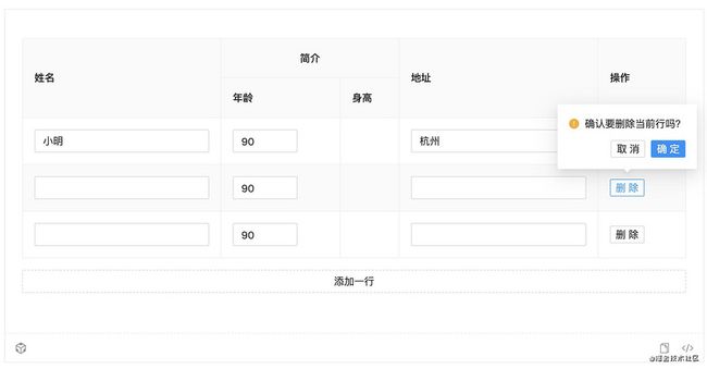
- 选项联动
import React from 'react';
import { Editable } from 'dumi';
import { Input, Button, InputNumber } from 'antd';

const fields = [
  {
    title: '姓名',
    width: '30%',
    id: 'name',
    editable: true,
    children: [
      {
        title: '姓氏',
        id: 'firstName',
        editable: true,
        renderFormInput: (record, { value, onChange }, form) => {
          return  {
              if (onChange) onChange(val);
              form.setFieldsValue({
                allName: `${val?.target?.value}-${record?.lastName || ''}`,
              })
            }} />
        },
      },
      {
        title: '名字',
        id: 'lastName',
        editable: true,
        renderFormInput: (record, { value, onChange }, form) => {
          return  {
              if (onChange) onChange(val);
              form.setFieldsValue({
                allName: `${record?.firstName || ''}-${val?.target?.value}`,
              })
            }} />
        },
      },
      {
        title: '全名',
        id: 'allName',
        column: {
          render: (text) => {
            return {text}
          }
        }
      }
    ]
  },
  {
    title: '地址',
    id: 'address',
    editable: true,
    renderFormInput: () => {
      return
    },
    trigger: 'onBlur',
  }
]

export default () => {
  return
     {
        console.log(val);
      }} />
  ;
};
效果:
使用API:
- EditableProps
| 参数 | 说明 | 类型 | 默认值 | |
|---|---|---|---|---|
| value | tabe列表的值 | FieldType |
- | |
| fields | 表格列的配置描述,具体项见下表 | FieldType[] |
- | |
| onChange | 表格数据改变的回调 | (value: object[]) => void; |
- | |
| multiple | 是否开启多行编辑功能 | boolean |
true |
|
| defaultData | 表格新增单元格默认数据 | object |
- | |
| getActionRef | 获取组件操作函数组的回调 | (ref: React.MutableRefObject |
- | |
| deleteBtnText | 删除按钮文案 | React.ReactNode |
删除 | |
| hideAddBtn | 是否隐藏底部的新增按钮 | Boolean |
false |
|
| addBtnProps | 新增按钮配置项, 配置同antd的Button | ButtonProps |
- | |
| addBtnText | 新增按钮文案 | React.ReactNode |
添加一行 | |
| tableProps | 表格的配置项,同antd里的Table组件配置,但是组件拦截了配置项中的:pagination、rowKey、components、dataSource、columns、onRow |
TableProps |
- | |
| max | 列表最大长度 | number |
- | |
| onRowValuesChange | 行数据变化的回调函数,可用于数据联动; | onRowValuesChangeType |
- | |
| deleteBtnProps | 删除按钮配置选项 | ButtonProps |
- | |
| deleteBtnText | 删除按钮文案 | string |
删除 | |
| editBtnProps | 编辑按钮配置选项 | ButtonProps |
- | |
| editBtnText | 编辑按钮文案 | string |
编辑 | |
| saveBtnProps | 保存按钮配置选项 | ButtonProps |
- | |
| saveBtnText | 保存按钮文案 | string |
保存 | |
| cancelBtnProps | 取消按钮配置选项 | ButtonProps |
- | |
| cancelBtnText | 取消按钮文案 | string |
取消 | |
| optionExtraBefore | 操作选项前面的元素;注意:单行编辑时,编辑状态下不显示 |
- | - | |
| optionExtraAfter | 操作选项后面的元素;注意:单行编辑时,编辑状态下不显示 |
- | - | |
| optionSpaceProps | 当操作选项有多个元素时,会使用Space包裹,optionSpaceProps 为Space组件的配置,或者配置成false,不使用组件包裹 | `SpaceProps | Boolean` | - |
| optionRender | 自定义操作选项 | (r: Record, optionNodes: object) => React.ReactChild |
- |
fields
| 参数 | 说明 | 类型 |
|---|---|---|
| title | 表格标题 | string |
| id | 当前列对应字段名 | 表格的dataIndex,formItem的name配置项的默认值 |
| formItemProps | FormItem 组件配置项 | |
| column | 同Table表格的column数据,但拦截了children属性,如需要相关配置请使用fields的children属性 | |
| children | 子配置项,配置同field选项 | |
| renderFormInput | 可编辑单元格输入框生成函数, 细节如下 | renderFormInput |
| editable | 当前行是否可编辑 |
- ActionRef
| 名称 | 说明 | 类型 |
|---|---|---|
| setRowsData | 更新行数据 | (rowData: R, rowIndex: number) => void |
| handleAdd | 新增一行, 函数参数作为新增数据的默认值,当没有参数时使用defaultData作为默认值 |
(v?: R) => void |
| handleDelete | 删除一行 | (key: rowIndex) => void |
| handleEdit | 单行编辑时,开启编辑某行 | (key: rowIndex) => void |
组件主页:https://yigexiaoairen.github.io/
github地址:https://github.com/yigexiaoairen/am-editable
备注:后期会逐渐完善功能,比如:新增排序功能、全表编辑支持提交校验等