python可视化 Task03
学习参考:
https://github.com/datawhalechina/fantastic-matplotlib
文章目录
-
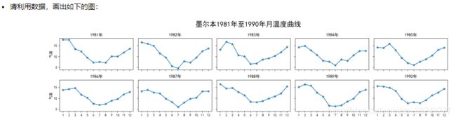
- 1. 墨尔本1981年至1990年的每月温度情况
- 2. 画出数据的散点图和边际分布
import numpy as np
import pandas as pd
import matplotlib.pyplot as plt
plt.rcParams['font.sans-serif'] = ['SimHei']
plt.rcParams['axes.unicode_minus'] = False
1. 墨尔本1981年至1990年的每月温度情况
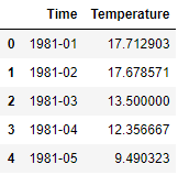
ex1 = pd.read_csv('data/layout_ex1.csv')
ex1.head()
#time_list = ex1['Time'].tolist()
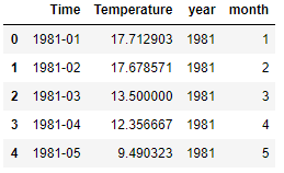
ex1['year'] = ex1['Time'].apply(lambda x:int(x.split("-")[0]))
ex1['month'] = ex1['Time'].apply(lambda x:int(x.split("-")[1]))
ex1.head()
year_array = ex1['year'].unique()
fig,axs = plt.subplots(2, 5, figsize=(14, 3), sharex=True, sharey=True)
fig.suptitle('墨尔本1981至1990年月温度曲线', x = 0.5,y = 1.05,size=15)

for i in range(len(year_array)):
    year = year_array[i]
    r,c = i//5,i%5
    tmperature = ex1.loc[ex1.year == year,'Temperature'].tolist()
    month = ex1.loc[ex1.year == year,'month'].tolist()
    axs[r][c].plot(month,tmperature,marker = "*")  # marker参数控制点的形状
    axs[r][c].set_xticks(month)  # 控制x轴刻度显示
    axs[r][c].set_xticklabels(labels = month,fontsize = 9)  # 控制x轴刻度标签大小
    axs[r][c].set_title('%d年'%year)
    if r==1: axs[r][c].set_xlabel('月份')
    if c==0: axs[r][c].set_ylabel('气温')

fig.tight_layout()

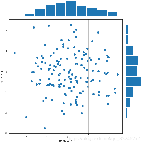
2. 画出数据的散点图和边际分布
用 np.random.randn(2, 150) 生成一组二维数据,使用两种非均匀子图的分割方法,做出该数据对应的散点图和边际分布图
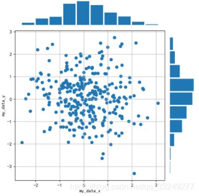
np.random.seed(0)
x,y = np.random.randn(2, 150)
#method1
fig = plt.figure(figsize=(7, 7))
spec = fig.add_gridspec(nrows=2, ncols=2, width_ratios=[5,1], height_ratios=[1,5])
#hist plot1
ax1 = fig.add_subplot(spec[0,0])
ax1.hist(x,density = True,rwidth = 0.9)  # rwidth控制竹子宽度
ax1.axis("off")
#scatter plot
ax2 = fig.add_subplot(spec[1,0])
ax2.scatter(x,y)
ax2.set_xlabel("my_data_x")
ax2.set_ylabel("my_data_y")
ax2.grid()
#hist plot2
ax3 = fig.add_subplot(spec[1,1])
ax3.hist(y,orientation='horizontal',density = True,rwidth = 0.9)  # rwidth控制竹子宽度
ax3.axis("off")
fig.tight_layout()

fig = plt.figure(figsize=(7, 7))
spec = fig.add_gridspec(nrows=7, ncols=7)  # (nrows,ncols) == figsize

#hist plot1
ax1 = fig.add_subplot(spec[0:1,0:6])
ax1.hist(x,density = True,rwidth = 0.9)  # rwidth控制竹子宽度
ax1.axis("off")
#scatter plot
ax2 = fig.add_subplot(spec[1:7,0:6])
ax2.scatter(x,y)
ax2.set_xlabel("my_data_x")
ax2.set_ylabel("my_data_y")
ax2.grid()
#hist plot2
ax3 = fig.add_subplot(spec[1:7,6:7])
ax3.hist(y,orientation='horizontal',density = True,rwidth = 0.9)  # rwidth控制竹子宽度
ax3.axis("off")
fig.tight_layout()